economics: great recession

Cross-posted at Ms.

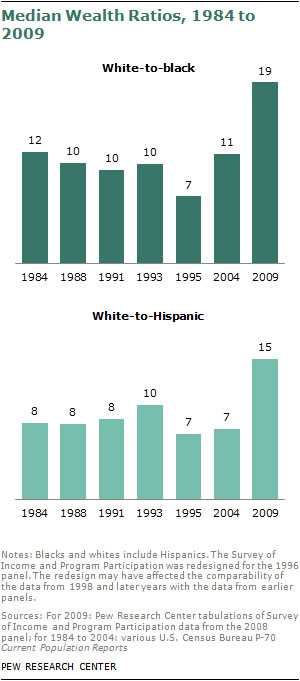
A new study from the Pew Research Center reports staggering racial gaps in median wealth — a person’s accumulated assets minus her debt — between whites ($113,149), blacks ($5,677) and Latinos ($6,325). That’s a 20-to-1 white-to-black ratio of wealth and a 18-to-1 white-to-Latino ratio.

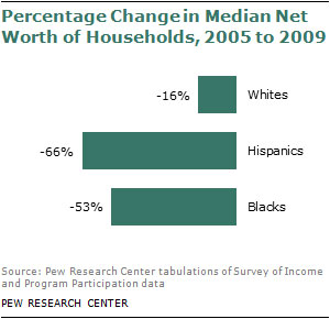
Essentially, all of the economic gains made by people of color since the Civil Rights Movement have been erased in a few years by the Long Recession. Whites experienced a net wealth loss of 16 percent from 2005 to 2009, while blacks lost about half of their wealth (53 percent) and Latinos lost two-thirds of their wealth.

Media outlets reporting on the Pew study point to housing loss as the primary culprit, since the net worth of blacks and Latinos is heavily reliant on home ownership, while whites are more likely to have retirement accounts and stock.

While this is certainly accurate, it obscures the core racism at play. Public policy decisions have been responsible for the speedy recovery of the financial market and the slow recovery of the housing market. From the start, the Troubled Asset Relief Program (TARP) favored Wall Street recovery over homeowner recovery, with only $12 billion of the $700 billion bailout spent on foreclosure programs. (To be fair, most of the Wall Street money was eventually paid back.)

So prioritization of corporate interests disproportionately assisted whites in the recovery — but (perhaps) not intentionally. The same cannot be said for actual lending practices.

Rampant– — and racist — fraud in the home loan industry was a primary contributor to the collapse, with 61 percent of sub-prime loan holders actually qualifying for prime loans that would have been easier to maintain. Blacks and Latinos were especially targeted for sub-prime loans, a practice called “reverse redlining.” Wells Fargo loan officer-turned-whistle blower Elizabeth Jacobson admitted that her company specifically went after African Americans for sub-prime loans through “wealth building” conferences hosted in black churches.

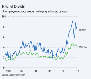
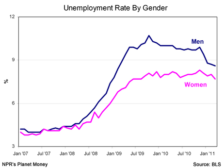
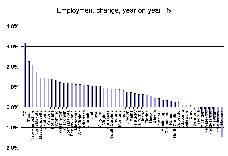
The employment gap between whites and blacks is also a contributor to the wealth gap. While white American are suffering through the Long Recession with 7.9 percent unemployment, blacks are experiencing Great Depression-like figures of 16.1 percent unemployment. This figure jumps to 31.4 percent for blacks ages 16 to 24, and black Americans have consistently had the higher rate of unemployment compared to white Americans since 2007.

Not surprisingly, the employment gap, too, has racist origins. The Center for American Progress analyzed unemployment data from the last three recessions and found that black unemployment starts earlier, rises faster and lingers longer. Explanations include the concentration of black workers in the stumbling manufacturing sector, the cutting of public sector jobs — and racial discrimination. This last finding is no shock given that employers are more likely to call back a white job applicant with a criminal record than a similarly qualified black man without a record.

The role of racism in poverty is important to keep in mind at a time Washington politicians are manufacturing crises that will slash the entitlement programs that 1 in 6 Americans rely on. It’s ironic that we’re cutting safety nets for the poor just as we’re experiencing the highest poverty rate since 1960, with blacks and Latinos three times as likely to live in poverty. Public policy is supposed to knock down racial and other non-meritorious barriers to pursuing life, liberty, and happiness, not jack them higher.

Over at Reuters, Felix Salmon posted a chart I found rather stunning given that we’re hearing new warnings about the dire situation the economy is in and the slow job growth we’re experiencing. Using Bureau of Economic Analysis data, he looked at total U.S. domestic profits, as well as the proportion of all domestic profits earned by the financial sector, between 2001 and the end of 2010. And what we see is that both overall corporate profits, and the finance sector so central to the economic crisis, have bounced back quite well, returning to the levels we saw just before the peak of the boom period:

Now, one caveat here: the data are annualized quarterly figures. That means to get the total profits for the year, you don’t just add them up, as you’d expect — each annualized quarterly data point apparently represents profits for the entire year if the growth rate at that point had continued. If you really care, here’s one explanation of annualizing and why you’d do it. If you want, the BEA website allows you to look at profits annually, instead of quarterly, so you don’t have to worry about it.

Anyway! Point is, it complicates the general perception we might get from news reports that everything in the economy is awful and there are no profits to be made. Ongoing job stagnation and media focus on the negative economic news doesn’t mean all parts of the economy are suffering equally, or that as soon as corporate earnings rebound, the benefits would quickly reach workers in the form of new job opportunities.

Cross-posted at Family Inequality.

I haven’t yet seen any definitive evidence that the recession has had an effect on divorce rates. But if I’m going to pick on other people for this, I should offer a few ideas.

In a previous post I cited a lot of reasons to expect divorce would increase as a result of family stress and instability. Others claim these hard times are bringing couples together in the face of adversity. And either – or both – of these influences is woven into the long term trends in divorce. Here are three graphs looking at the question.

Long-term trends

The overall divorce trend doesn’t seem to be moved much one way or the other by recessions (shown in blue), at least for the last 60 years:

That national data is only available through 2009, so a little early to see a major effect. Still, no disruption of the trend at the national level, just a continuous decline in the divorce rate. (Here’s a great recent Census report on divorce trends.)

State patterns

The official divorce rates are available from 38 states, but they’re only considered reliable through 2008 so far. By putting together two years of changes — 2006-2007 and 2007-2008 — this figure has 76 dots (two for each state), showing whether changes in divorce are related to changes in unemployment rates. This gives a rough idea of the relationship between how hard states were hit by the recession and any changes in divorce:

I made the dots larger according to the population sizes, and weighted the red trend line so that the larger states have more effect (this positive relationship is statistically significant at the 99% confidence level). This is just a start, but it leans in the direction of unemployment increasing divorces. At least it doesn’t look like the recession is driving divorce down.

Google

Finally, what about divorce on the American brain? For a glimpse inside, we turn to Google trends. If it works for the flu, it might work for divorce, too. Here are the trends for “divorce attorney” and “divorce lawyer”:

The trend for both searches looks basically flat except for seasonal variation, and some turbulence in 2008. But nothing to suggest a major trend one way or the other. (You can play with these yourself, starting with mine, here.)

My conclusion so far: no national evidence of a recession effect on divorce yet, but some suggestive hints worth keeping an eye on — leaning in the direction of recession causing more divorces — in opposition to a long-term downward trend. Maybe if and when the housing market loosens up more unhappy spouses will take the plunge and move out. The divorce rate may continue to fall, as it has been since the early 1980s, but that doesn’t mean this recession has a “silver lining” for families.

People with a college degree are less likely to be unemployed than people without one (source: Andrew Sullivan):

But a college degree helps blacks less than it  helps whites, especially in this recession (source: Andrew Sullivan):

See also Devah Pager’s stunning data on race, drug convictions, and employment prospects (in text or video).  (Hint: it’s better to be a white felon than a black person with no felony record).

Lisa Wade, PhD is an Associate Professor at Tulane University. She is the author of American Hookup, a book about college sexual culture; a textbook about gender; and a forthcoming introductory text: Terrible Magnificent Sociology. You can follow her on Twitter and Instagram.

Captain Crab sent us an article by David Johnston in the Willamette Week that looks at changes in income inequality in the U.S. since 1950.Based on an analysis of research by Saez and Piketty (2007, with updated 2008 data available at Saez’s website–the first entry under “Income and Wealth Inequality”), Johnston calculated changes in income for various income percentiles in the U.S. Between 1950 and 1980, the bottom 90% of income earners saw their incomes increase by 75% (a gain of $13,222), a rate higher than or comparable to the highest income groups. However, between 1980 and 2008, incomes of the bottom 90% has largely stagnated, while the incomes of the super rich have soared (all data in constant 2008 dollars, adjusted for inflation):

As a result the difference between the median wage and the mean wage has widened (data from the Social Security Medicare Database):

Johnston also includes data on changes in corporate income tax rates, based on IRS data. The actual tax rate — how much corporations pay after various loopholes and tax breaks — fell between 2000 and 2008:

On a similar topic, Deeb K. sent in a link to images at Think Progress showing the actual tax rate of the 400 richest Americans between 1995 and 2007, based on IRS data. During that period, the effective tax rate of this group fell by 13 percentage points:

Their incomes, on the other hand, jumped significantly:

Also see my recent post on various illustrations of inequality in the U.S.

Sangyoub Park, who teaches sociology at Washburn University, sent us an interesting article posted by NPR on various aspects of unemployment. The overall official unemployment rate of 8.8 percent (as of March 2011) hides a lot of variation. For instance, the unemployment rate during this recession has been consistently worse for men than for women:

Nearly half of people have been out of work for at least 6 months:

The unemployment rate for those with a college education is under 5%, while for those who didn’t graduate high school, it’s nearly 10 percentage points higher:

Check out the NPR story for more discussion and a few more graphs.

The NPR article doesn’t include data on race, but Sangyoub found some racial data at the BLS website. As of March 2011, the unemployment rate for Whites was 7.9%, while for Blacks it was 15.5%.

The “poverty line” is an income, set by the federal government, used to measure whether one is in or out of poverty.  But this line, of course, is both sociological and political.  What is poverty?

A nonprofit organization called Wider Opportunities for Women has released a study challenging the federal poverty lines.  According to the New York Times article on their work, their aim is to “…set thresholds for economic stability rather than mere survival, and takes into account saving for retirement and emergencies.”  Their “lines,” then, deviate significantly from those of the federal government.

Lisa Wade, PhD is an Associate Professor at Tulane University. She is the author of American Hookup, a book about college sexual culture; a textbook about gender; and a forthcoming introductory text: Terrible Magnificent Sociology. You can follow her on Twitter and Instagram.

For those keeping track of unemployment in the U.S., The Economist posted this graph showing job gains and losses by state, based on Bureau of Labor Statistics data:

According to the BLS, as of January 2011, the U.S. unemployment rate had dropped to 9.0%. The lowest unemployment rate is in North Dakota, at 3.8%, while the highest is still in Nevada, at 14.2%.

The BLS has detailed state-level employment data here.