class

Cross-posted at Montclair SocioBlog.

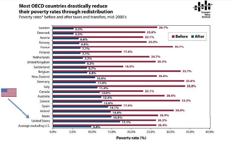
The poverty rate in the US in the mid-2000s was about 17%.  In Sweden, the poverty rate was 5.3%; in Germany, 11%.   That was the rate after adding in government transfers.  In Germany, the poverty rate before those transfers was 33.6%, ten points higher than that in the US.  Sweden’s pre-transfer poverty rate was about the same as ours.

Jared Bernstein has this chart showing pre-transfer and post-transfer rates for the OECD countries (click to enlarge):

Three  points:

1.  Governments have the power to reduce poverty, and reduce it a lot.  European governments do far more towards this goal than does the US government.

2.  It’s unlikely that America’s poor people are twice as lazy or unskilled or dissolute as their European counterparts.  Individual factors may explain differences between individuals, but these explanations have little relevance for the problem of overall poverty.  The focus on individual qualities also has little use as a basis for policy.  European countries have fewer people living in poverty, but not because those countries exhort the poor to lead more virtuous lives and punish them for their improvident ways.  European countries have lower poverty rates because the governments provide money and services to those who need them.

3.  The amount of welfare governments provide does not appear to have a dampening effect on the overall economy.

Cross-posted at Reports from the Economic Front.

The media has focused on the lack of jobs as a major election issue.  But the concern needs to go beyond jobs to the quality of those jobs.

As a report by the National Employment Law Project makes clear, we are experiencing a low wage employment recovery.  This trend, the result of an ongoing restructuring of economic activity, has profound consequences for issues of poverty, inequality, and community stability.

The authors of the report examined 366 occupations and divided them into three equally sized groups by wage.  The lower-wage group included occupations which paid median hourly wages ranging from $7.69 to $13.83.  The mid-wage group range was from $13.84 to $21.13.   The higher-wage group range was from $21.14 to $54.55.

The figure below shows net employment changes in each of these groups during the recession period (2008Q1 to 2010Q1) and the current recovery (2010Q1 to 2012Q1).   Specifically:

  • Lower-wage occupations were 21 percent of recession losses, but 58 percent of recovery growth.
  • Mid-wage occupations were 60 percent of recession losses, but only 22 percent of recovery growth.
  • Higher-wage occupations were 19 percent of recession job losses, and 20 percent of recovery growth.

The next figure shows the lower-wage occupations with the fastest growth and their median hourly wages.  According to the report, three low-wage industries (food services, retail, and employment services) added 1.7 million jobs over the past two years, 43 percent of net employment growth.  According to Bureau of Labor Statistics projections these are precisely the occupations that can be expected to provide the greatest number of new jobs over the next 5-10 years.

 As the final figure shows, the decline in mid-wage occupations predates the recession.  Since the first quarter of 2001, employment has grown by 8.7 percent in lower-wage occupations and by 6.6 percent in higher-wage occupations.  By contrast, employment in mid-wage occupations has fallen by 7.3.


Significantly, as the report also notes, “the wages paid by these occupations has changed. Between the first quarters of 2001 and 2012, median real wages for lower-wage and mid-wage occupations declined (by 2.1 and 0.2 percent, respectively), but increased for higher-wage occupations (by 4.1 percent).”

A New York Times article commenting on this report included the following:

This “polarization” of skills and wages has been documented meticulously… A recent study found that this polarization accelerated in the last three recessions, particularly the last one, as financial pressures forced companies to reorganize more quickly.

“This is not just a nice, smooth process,” said Henry E. Siu, an economics professor at the University of British Columbia… “A lot of these jobs were suddenly wiped out during recession and are not coming back.”

Steady as she goes is just not going to do it and changes in taxes and spending programs, regardless of how significant, cannot compensate for the increasingly negative trends generated by private sector decisions about the organization and location of, as well as compensation for production.

In 1956 sociologist C. Wright Mills published a book titled The Power Elite.  In it, he argued that our democracy was corrupt because the same people exercised power in business, the military, and politics.  This small group, with so many important roles and connections, had an influence on our society that was far out-of-proportion with their numbers.  This, he concluded, was a dire situation.

Fast forward to 2012 and Lambert Strether posted a series of Venn diagrams at Naked Capitalism.  Strether writes:

[This] nifty visualization… shows how many, many people, through the operations of Washington’s revolving door, have held high-level positions both in the Federal government and in major corporations. To take but one example, the set of all Treasury Secretaries includes Hank Paulson and Bob Rubin, which overlaps with the set of all Goldman Sachs COOs. The overlapping is pervasive. Political scientists and the rest of us have names for such cozy arrangements — oligarchy, corporatism, fascism, “crony capitalism” — but one name that doesn’t apply is democracy.

UPDATE: I’ve included a criticism of the methodology after the diagrams; the overlap portrayed here is almost exclusively among Democratic politicians and the diagrams were explicitly intended to point out connections among progressives.

See for yourself:

On the methods for putting together these diagrams, Strether writes about the person who’s behind the diagrams:

Herman’s honest: Her goal is to “expose progressive corporatism,” and — assuming for the sake of the argument that D[emocrat]s are progressive, and that “progressives” are progressive — her chart does exactly that, and very effectively, too.

But what her data does not do is expose corporatism as such; there are very, very few Rs listed; it strains credulity that Hank Paulson was the only high-level GS operative in the Bush administration, for example, and if GS isn’t the R[epublican]s’ favorite bank, there’s surely another.

Hence, Herman’s chart, if divorced from context[2], might lead somebody — say, a child of six — to conclude that the only corporatists in Washington DC are D[emocrat]s.

Thanks to Carolyn Taylor for pointing out the methods bias.

Lisa Wade, PhD is an Associate Professor at Tulane University. She is the author of American Hookup, a book about college sexual culture; a textbook about gender; and a forthcoming introductory text: Terrible Magnificent Sociology. You can follow her on Twitter and Instagram.

Cross-posted at Racialicious.

Race as biology has largely been discredited, yet beliefs about one race being biologically superior to another still seem to pervade one social arena: sports.  Claims that different races have genetic advantages to play particular sports persists both because individual athletic ability obviously has some basis in biology (even though that does not mean it is racial biology at play) and athletics appears to be one social arena where racial minorities succeed over whites in certain sports.

For example, according to the Institute for Diversity and Ethics in Sports’ 2011 Racial and Gender Report Card on The National Football League (http://www.tidesport.org), over 2/3rds of players in the NFL are African American — far higher than the proportion of Blacks in the general population of the United States.  This report also shows that all other racial groups are under-represented in the NFL relative to their proportion in the general population, including Asians who make up only 2% of the players in the league.

These statistics compel many to assume that racial biology plays a large part in athletic success.  However, the 60 Minutes investigation Football Island debunks this assumption during a trip to the place where most of the Asian players in the NFL come from: American Samoa.   This small island is a U.S. Territory in the Pacific and has a population small enough to seat comfortably in most professional football stadiums.  Yet the average Samoan child “is 56 times more likely to get into the NFL than any other kid in America.”

60 Minutes finds Samoans succeed at football only in small part because of their size and strength.  Rather, their success grows mostly out of a “warrior culture” that instills a strong work ethic in young men.  Also, on the island the daily chores that are a necessary part of survival provide a lifetime of athletic conditioning.  In short, many of the Asian players in the NFL are successful because of their nurturing, and not their nature.

[vimeo]https://vimeo.com/60688464[/vimeo]

Samoans are also driven to succeed at football because they come from a place plagued by poverty and often their only chance at a better life is through athletics (that, or follow another Samoan tradition and join the Armed Forces).  In the video, the most famous Samoan player, Troy Palamalu of the Pittsburgh Steelers, explains “football is a ‘meal ticket.’  Just like any marginalized ethnic group, you know, if you don’t make it to the NFL, what do you have to go back to?”

—————————-

Jason Eastman is an Assistant Professor of Sociology at Coastal Carolina University who researches how culture and identity influence social inequalities.

Lisa Wade, PhD is an Associate Professor at Tulane University. She is the author of American Hookup, a book about college sexual culture; a textbook about gender; and a forthcoming introductory text: Terrible Magnificent Sociology. You can follow her on Twitter and Instagram.

Cross-posted at Montclair SocioBlog.

As I speculated years ago (here and here), it may be hard for Americans to imagine a world where the law guarantees them at least 20 paid vacation days per year.  But such a world exists.  It’s called Europe.*

Americans are the lucky ones.  As Mitt Romney has warned us “European-style benefits” would   “poison the very spirit of America.”  Niall Ferguson, who weighs in frequently on history and economics, contrasts America’s “Protestant work ethic” with what you find in Europe – an “atheist sloth ethic.”

The graph is a bit misleading. It shows only what the law requires of employers.  Americans do get vacations.  But here in America, how much vacation you get, or whether you get any at all, and whether it’s paid – that all depends on what you can negotiate with your employer.

Since American vacations depend on what the boss will grant, some people get more paid vacation, some get less, and some get none.  So it might be useful to ask which sectors of our economy are beehives of the work ethic and which are sloughs of sloth.  (Ferguson’s employer, for example, Harvard University, probably gives him three months off in the summer, plus a week or two or more in the winter between semesters, plus spring break, and maybe a few other days.  I wonder how he would react if Harvard did away with these sloth-inducing policies.)

The Wall Street Journal recently (here) published a graph of BLS data on access to paid vacations; they break it up by industry near the bottom.

Those people who are cleaning your hotel room and serving your meals while you’re on vacation — only about one in four can get any paid vacation days.  And at the other end, which economic sector is most indulgent of sloth among its workforce?  Wall Street.  Four out of five there get paid vacation.

How much paid vacation do we get?  That depends on sector, but it also depends on length of service.  As the Journal says,

Europeans also get more time off: usually a bare minimum of four weeks off a year. Most Americans have to stay in a job for 20 years to get that much, according to BLS data.

—————————

* The graph is from five years ago, but I doubt things have changed much. The US still has no federal or state laws requiring any paid vacation days.

Most people assume that the various benefits we collectively describe as “welfare” go to people who aren’t working.  The truth is, however, that some people with full-time jobs still find themselves below the poverty line.  The U.S. federal minimum wage is $7.25 an hour.  A full-time employee who doesn’t miss a single day of work for a year earns $290 a week; that’s 15,080 a year.  According to how the government measures poverty, that’s enough to support a single adult.  For a single adult with a child, however, it’s officially below the poverty line. It’s $4,000 below the poverty line for a family of three.  When a person has a full-time job, but still lives in poverty, they are what sociologists call the “working poor.”

Some welfare benefits, then, go to people who do work.  The  Supplemental Nutrition Assistance Program, better known as food stamps, is an example.  Working parents have always comprised a large percentage of people receiving food stamps.  Today the number of working families who rely on food stamps is higher than it’s been in over 20 years (source).  These numbers reflect the impact of the recession generally, but also the extra-burden placed on already struggling families.  The first chart shows the rise of poor families, the second shows the increase in the working poor using food stamps.

This kind of data inspires me to ask if this is what a functional economy looks like.  We have policies — e.g., the federal minimum wage and somewhat laissez faire free market policies — that create a situation in which working full time doesn’t allow a single parent to support even one child.  When we hear criticisms of people who receive benefits, then, we should be careful to remember that their economic crisis is not a straightforwardly personal characteristic, one that can be explained by a poor work ethic or disorderly personality. There are structural reasons that people end up in need.  We have three choices: let them suffer and perhaps die, help them, or change our society.

Lisa Wade, PhD is an Associate Professor at Tulane University. She is the author of American Hookup, a book about college sexual culture; a textbook about gender; and a forthcoming introductory text: Terrible Magnificent Sociology. You can follow her on Twitter and Instagram.

Today is the first day of school at the college where I teach, so I thought it would be a nice time to re-post this oldie-but-goodie on the relationship between income and SAT scores.  I’m sure all of our students are brilliant, of course, but whether the SAT measures intelligence fairly is up for debate.

The College Board is an education association that, among other things, administers the SAT college entrance examination.  A report on the scores from 2009, reviewed by the New York Times, included a break down of scores by the household income of the student. Scores correlate strongly and positively with income:

I can think of two explanations for the correlation.

First, it is certainly true that children with more economic resources, on average, end up better prepared for standardized tests.  They tend to have better teachers, more resource-rich educational environments, more educated parents who can help them with school and, sometimes, expensive SAT tutoring.

Second, the test itself may be biased towards wealthier students.  These tests tend to be written and evaluated by privileged individuals who may inadvertently include class-based knowledge, not just knowledge, in the exam (asking questions, for example, that rely on background information about golf instead of basketball).

In any case, this correlation should give us pause; it calls into question, quite profoundly, the extent to which the SAT is functioning as a fair measure.  Perhaps it measures preparedness for college, but whether it measures potential is up for debate.

Lisa Wade, PhD is an Associate Professor at Tulane University. She is the author of American Hookup, a book about college sexual culture; a textbook about gender; and a forthcoming introductory text: Terrible Magnificent Sociology. You can follow her on Twitter and Instagram.

The Pew Research Center has released the results of a poll of 2,508 adults about social class and life experiences.

An important caveat to start with: the poll asked people to categorize themselves as upper (2% of respondents), upper-middle (15%), middle (49%), lower-middle (25%), or lower class (7%). We know that there’s a tendency among people in the U.S. to identify as middle class, even when their actual income falls far below or above what could reasonably be considered middle class, and the survey didn’t ask about incomes or assets to compare to individuals’ self-identification. There’s likely to be some overlap between the categories if we actually looked at the income/wealth of participants. The graphs below combine those who defined themselves as upper or upper-middle class together into the “upper class” category, while those who said lower-middle are assigned to the “lower class” group.

Not surprisingly, there were large differences by social class in a number of quality-of-life areas. The higher one’s class, the more likely they were to say they were better off than they were 10 years ago and were happy with life and rarely experience stress (though apparently we’re generally pretty stressed overall):

The lower class is much more likely than the other groups to say they are in worse shape than they were before the recession, indicating that they continue to suffer disproportionately from the effects of the economic meltdown and the slow recovery:

Those defined as lower class were much less satisfied with family life, their level of education, and their housing situation:

They were also much more likely to report specific difficulties in the past year, including trouble paying rent/mortgage and other bills, losing a job, and problems paying for medical care:

The results show a consistent, unsurprising pattern: the rich are weathering the slow recovery relatively well, while the poor suffer disproportionately. Check out the full report for information on participants’ perceptions of the wealthy, the fairness of the tax burden across classes, and which political party best represents each group.