class

In survey questions, the result you get might depend on the choices you offer.

An article at The Atlantic explains “Why Americans All Believe They’re Middle Class.”  But is that what we all believe?  The author, Anat Shenker-Osorio, started with from these figure from a September 2012 Pew report.
1
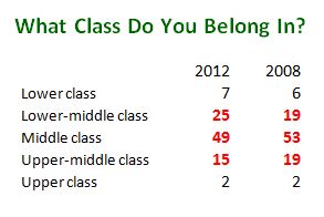
Only 8-9% of Americans put themselves in the lower or upper class.  The other 91% say that they are “middle class,” some with a modifier (upper or lower), some without.  Shenker-Osorio continues:

Researching how people’s unconscious assumptions affect their perception of economic issues, I explored the linguistic dynamics behind the term “middle class,” especially in comparison to other economic groupings.

That would be fine, except that both she and Pew made one huge omission.  The Pew survey didn’t include “working class” as an option.  Out of sight, out of unconscious assumptions.

Language and Surveys

How big an omission is this?  Since 1972, the GSS has asked a similar question to tap “subjective social class” (i.e., what class people think they are regardless of their objective circumstances).  But the GSS includes “working” along with the upper, middle, and lower.

2

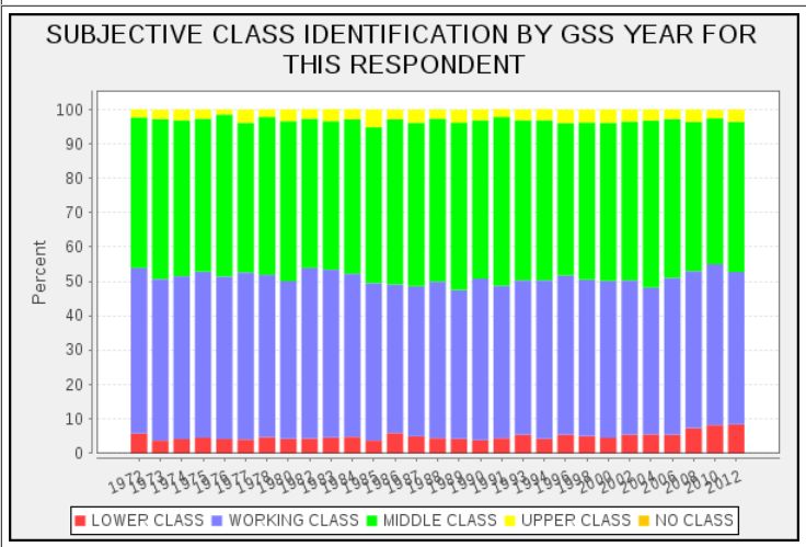
Like the Pew survey, the GSS finds less than 10% putting themselves in the upper or lower class.  But for the past forty years, the remaining nine-tenths of the population have been evenly split between “working” and “middle.”

Shenker-Osorio’s linguistic analysis runs into other data conflicts.  It’s not always easy to know what Americans mean by upper, lower, or middle class because:

Americans are relatively skittish about mentioning class. Contrasting databases of text from U.S. and UK sources, we find that Brits use “upper class” and “lower class” more readily; we prefer “wealthy” and “poor.”

But another database, the books in Google nGrams, shows something much different.

Contrasting Data

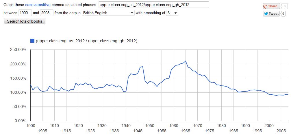
I constructed a ratio of American to British for the terms “upper class” and “lower class.”  A ratio of more than 100% means that the term appeared more frequently in American books.

Ratio for “upper class”:

3

Ratio for “lower class”:

4

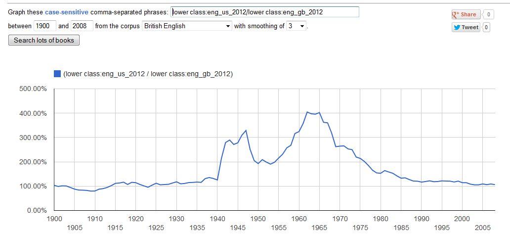
In general, since 1900, US and UK books used these terms at about the same frequency.  But from 1955-1965, the US heard a crescendo in class talk.  By 1965, US books mentioned the “lower class” four times as often as did UK books.  Since then class talk in the US declined as rapidly as it had increased. (For some reason, Shenker-Osorio was unaware of my earlier post on these matters.)

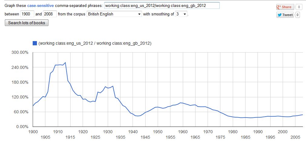
The real US-UK difference is in “working class,” a term that Shenker-Osorio ignores. Since 1935, it has appeared less frequently in US books.  For the last 30 years, British books have mentioned the working class twice as often.

Ratio for “working class”:

5

It may be that the databases Shenker-Osorio used are better than nGrams, and it’s frustrating to find different sources of data pointing in different directions.  More important, we still don’t know what people mean when they say they are middle class.  Shenker-Osorio sees it as a category of exclusion.  The images we have of upper and lower are so extreme as to apply to almost nobody.

Not finding popular depictions of wealth and poverty similar to our own lived experiences, we determine we must be whatever’s left over.

True perhaps, but it tells only what people think middle class is not. I’m not familiar with the research on subjective social class, but it seems that we still don’t know what people think “middle class” actually is.  Nor do we know what they have in mind when they say they are working class.  I have my own hunches, but I will leave them for a later post.

Cross-posted at Montclair SocioBlog.

Jay Livingston is the chair of the Sociology Department at Montclair State University. You can follow him at Montclair SocioBlog or on Twitter.

Gender job segregation is the practice of filling certain occupations with mostly male or mostly female workers.  Today 40% of women work in jobs that are 3/4ths female or more and 45% of men work in jobs that are more than 3/4ths male (source).  Job segregation is the main cause of the wage gap between men and women because jobs that employ women pay somewhere between 5% and 19% less than ones that employ men (source).

Job segregation decreased during the decades following the women’s movement, but progress towards integration stalled out in the ’90s and hasn’t budged since.  There are lots of reasons why job segregation why gender persists; one of them is recruitment and selection.  That is, employers sometimes have preferences for whether a man or woman is suited for a job.  Usually these preferences match historical trends/stereotypes.

Philip Cohen offered an example of this over at The Atlantic.  It’s a photograph of a recruitment banner for a window replacement company that he came across in the University of Maryland Student Union.  The banner features men as representatives of employees who do sales and installation, but a female in the role of customer support.

1

Cohen also observed the behavior of the white male job recruiters accompanying the banner.   He writes:

In 20 minutes, as dozens of people walked by, the recruiters approached 18 men and 0 women, asking them, “You guys looking for a job?” (or, in the case of a black man, “Hey man, you looking for a job?”).

This is one way that jobs remain segregated by gender. We have an idea of who is suited for what jobs, we illustrate that supposed “fit” in imagery, and employers actively recruit men into “male jobs” and women into “female jobs.”  Doing so doesn’t just slot men and women into different jobs, but into different and unequal ones.

See also: boys learn to play doctor, girls learn to play nursefortune teller tells you your gendered occupational future, and who does what for airlines.

Lisa Wade, PhD is an Associate Professor at Tulane University. She is the author of American Hookup, a book about college sexual culture; a textbook about gender; and a forthcoming introductory text: Terrible Magnificent Sociology. You can follow her on Twitter and Instagram.

Any improvement in living and working conditions in the United States is going to require far more than tinkering at the margins.  The fact is that U.S. economic dynamics have undergone a major transformation.

Figure 1, taken from an article by Gerald Friedman, shows that profits and investment are no longer positively related.  Since the early 2000s, profits have soared as a percent of GDP and net private investment has plummeted.  Even during the 1990s, when high-technology was celebrated as the engine of never-ending growth, net investment as a share of GDP remained below 1970s and 1980s highs.

Figure 1: Net Private Investment and Profits, 1970-2011

Our leading companies, the ones that shape government policy, are now able to make healthy profits without spending on plant and equipment much beyond replacement.  Their profits are now largely secured by globalizing manufacturing production, financialization, intensification of work, wage suppression, and government tax-breaks and subsidies.  Of course, that means that their quest for profits will continue to lead to policies likely to undermine progress in reversing negative trends in majority living and working conditions.

A case in point is their aggressive push, supported by the Obama administration, for new free trade agreements: the Trans-Pacific Partnership Free Trade Agreement and the Trans-Atlantic Free Trade Agreement. President Obama took the lead in securing passage of the Korea-U.S. Free Trade Agreement, arguing that it would improve our trade balance with Korea and by extension U.S. jobs.  Well, the returns are in, and in line with the record of past agreements, the outcome is the exact opposite.

The Eyes on Trade blog offers the following summary:

April [2013] was another record-breaking month for U.S. trade with Korea under the U.S.-Korea Free Trade Agreement (FTA).  The monthly U.S. trade deficit with Korea soared to its highest point in history, topping $2.5 billion for the month of April alone.

According to a ratio used by the Obama administration, the unprecedented deficit surge implies 13,500 U.S. jobs lost to trade with Korea in just thirty days.  April’s trade deficit with Korea was 30% higher than in April 2012 — the first full month of FTA implementation — and 90% higher than in April 2011, before the FTA took effect.

The deficit increase owes largely to a dramatic drop in U.S. exports to Korea since enactment of the FTA.  U.S. exports to Korea in April once again fell below the levels seen in any given month in the year before the FTA took effect.  The sorry track record defies the promise (FTA = more exports) that the Obama administration used to pass the FTA.  Undeterred by the facts, today the administration is using the same worn-out promise to sell the Trans-Pacific Partnership.

April 2013

Unwilling to pursue policies that directly threaten corporate interests, the Obama administration has relied on monetary policy, or more specifically lower interest rates, to boost investment and employment.  As Figure 2 from Friedman’s article makes clear, while lower rates generally boost investment, data points for 2009, 2010, and 2011 strongly suggest that monetary policy has lost its effectiveness.

Figure 2: Net Private Investment and Interest Rates, 1946-2011

President Obama can talk all he wants about the need for more investment and better jobs, but unless he is pushed to pursue dramatically different policies, it is hard to see any real gains for working people over the next decades.

Martin Hart-Landsberg is a professor of economics at Lewis and Clark College. You can follow him at Reports from the Economic Front.

McDonald’s has distributed a pamphlet showing employees how to make a budget and stick to it.  As you can see, the pamphlet is a joint effort by McDonald’s, VISA, and (apparently said with a straight face), Wealth Watchers International.  The “key to your financial freedom,” they say, is keeping a budget journal.

Screenshot_1

Here’s the sample budget McDonald’s uses:

Budget 1 pg

The budget is encouraging, to say the least.  With an income of $2060 a month, a 2-earner family can save $100 each month.

But do you notice anything missing?  Food, for example. Presumably, that comes out of the $27 a day in spending money.  Transportation costs? Car payments are included, but not gasoline or upkeep. On an income of $24,000 a year, will this family have a car that needs no maintenance?  And if the two earners have only one car, it’s likely someone will have to take public transportation to work.  Oh, wait  – maybe they both work at the same McDonald’s. And they never buy clothes.

I’m not sure how McDonald’s employees get health insurance for $20.  Or home heating for free.

I compared this budget with those found at the The Economic Policy Institute, which has a “Family Budget Calculator.”  You enter the location and the number of adults and children, and it shows the budget for “a secure yet modest living standard.”  Since McDonald’s used a 2-earner family, I imagined a family with two adults and one child.  Here’s what they would need in San Antonio.

Budget SanAntonio

Here’s a northern city, Akron.

Budget Akron

Both cities require a monthly income of $4400 for a modest living, more than double what McDonald’s envisions for its employees.  The big difference is health care – $1200 a month is a lot more than $20.  Then comes transportation ($600 vs. $0).  Then there’s the $580 for childcare, an item that is also absent from the McDonald’s budget.  (Apparently, workers at Golden Arches are part of that low-fertility problem that some observers in the Wall Street Journal worry about – here for example).

As for daily spending, food alone, at $600, more than wipes out what the McDonald’s budget suggests. Perhaps McDonald’s assumes that the family eats most of their meals on site, taking advantage of the 50% employee discount.

So much for the spending part of the McDonald’s budget.  What about the income part?  The Glass Door  posted these pay ranges for various positions.

Budget wages

Workers might get as little as $6 or even $5 per hour.  The average seems closer to $7.  Fast food is not covered by federal minimum wage, but let’s use that $7.25 as a default estimate.  A forty-hour week, four weeks a month, comes in at $1160 – very close to the $1105 in the McDonald’s sample budget. So that side of the balance sheet is fairly realistic.

That annual income of just under $24,720 is above the official poverty line – $19,530 – but not by all that much.  Given the omissions in the expense column, I would think that a family would find it very hard to live on that little.  And I doubt they could sock away $100 in savings, no matter how much “journaling” they did.

Cross-posted at Montclair SocioBlog.

Jay Livingston is the chair of the Sociology Department at Montclair State University. You can follow him at Montclair SocioBlog or on Twitter.

Cross-posted at Reports from the Economic Front.

Wealth data is not easy to get.  Still for three years now, Credit Suisse Research Institute has published an annual Global Wealth Databook which attempts to estimate global wealth holdings.  The most recent issue includes data covering 2012.  According to Credit Suisse, the goal “is to provide the best available estimates of the wealth holdings of households around the world for the period since the year 2000.”

According to the publication, global household wealth was $222.7 trillion in mid-2012, equal to $48,500 for each of the 4.6 billion adults in the world.  Wealth is defined as “the marketable value of financial assets plus non-financial assets (principally housing and land) less debts.”

Not surprisingly, as the figure below shows, average global wealth varies considerably across countries and regions.

picture wealth

Also significant are the values of the mean vs the median wealth in each of the countries.  Mean or average wealth is calculated by dividing the total wealth of a country by its adult population.   Median wealth is the wealth holdings of the adult in the middle of the wealth distribution. The median is generally considered a far more reliable indicator of wealth because it is less sensitive to extremes at the top or bottom of the distribution.  The greater the divergence of mean and median wealth, the greater is the wealth inequality.

The table below provides mean and median wealth estimates for those countries with generally reliable data. As you can see, the U.S. ranks high in terms of mean wealth, trailing only 5 countries.  Things are quite different when it comes to median wealth; the U.S. trails 26 countries!  Not surprisingly, then, the U.S. is No. 1 when it comes to the mean/median wealth ratio, or wealth inequality.

global wealth

We clearly dominate in the number of millionaires and the upper global wealth categories.  Are we a wealthy country? Definitely.  Is that wealth concentrated in relatively few hands?  Definitely.

Martin Hart-Landsberg is a professor of economics at Lewis and Clark College. You can follow him at Reports from the Economic Front.

In the early 1990s, Bill Moyers began following two Milwaukee families, the Neumanns and the Stanleys, as they struggled to keep a foothold in the middle class in the face of economic changes that largely destroyed the city’s decently-paid, unionized manufacturing jobs. An earlier documentary, Surviving the Good Times, showcased the two incredibly hard-working families’ efforts to adapt to the new economic reality. Their stories highlight the difficulty of trying to achieve the American Dream on a series of jobs that rarely pay a living wage or offer any benefits.

And how about now? Twenty years after he first started following their lives, Moyers returned to Milwaukee to see how they had fared during the housing bubble and subsequent economic crisis. Two American Families shows the increasing economic precariousness each family experiences over two decades and the impacts this has on the opportunities they can provide their children. It’s a heartbreaking look at the effects of large-scale economic changes on individual families.

PBS has also posted interviews with a few of the family members about why they participated in the new film, as well as an update on how they’re doing since they were last filmed. And you can find a number of charts on the changing economy and its impacts on families here, and some data about Milwaukee specifically here.

Gwen Sharp is an associate professor of sociology at Nevada State College. You can follow her on Twitter at @gwensharpnv.

Cross-posted at Family Inequality.

The other day I was surprised that a group of reporters failed to call out what seemed to be an obvious exaggeration by Republican Congresspeople in a press conference. Did the reporters not realize that a 25% unemployment rate among college graduates in 2013 is implausible, were they not paying attention, or do they just assume they’re being fed lies all the time so they don’t bother?

Last semester I launched an aggressive campaign to teach the undergraduate students in my class the size of the US population. If you don’t know that – and some large portion of them didn’t – how can you interpret statements such as, “On average, 24 people per minute are victims of rape, physical violence, or stalking by an intimate partner in the United States.” In this case the source followed up with, “Over the course of a year, that equals more than 12 million women and men.” But, is that a lot? It’s a lot more in the United States than it would be in China. (Unless you go with, “any rape is too many,” in which case why use a number at all?)

1

Anyway, just the US population isn’t enough. I decided to start a list of current demographic facts you need to know just to get through the day without being grossly misled or misinformed – or, in the case of journalists or teachers or social scientists, not to allow your audience to be grossly misled or misinformed. Not trivia that makes a point or statistics that are shocking, but the non-sensational information you need to know to make sense of those things when other people use them. And it’s really a ballpark requirement; when I tested the undergraduates, I gave them credit if they were within 20% of the US population – that’s anywhere between 250 million and 380 million!

I only got as far as 22 facts, but they should probably be somewhere in any top-100. And the silent reporters the other day made me realize I can’t let the perfect be the enemy of the good here. I’m open to suggestions for others (or other lists if they’re out there).

They refer to the US unless otherwise noted:

Description Number Source
World Population 7 billion 1
US Population 316 million 1
Children under 18 as share of pop. 24% 2
Adults 65+ as share of pop. 13% 2
Unemployment rate 7.6% 3
Unemployment rate range, 1970-2013 4% – 11% 4
Non-Hispanic Whites as share of pop. 63% 2
Blacks as share of pop. 13% 2
Hispanics as share of pop. 17% 2
Asians as share of pop. 5% 2
American Indians as share of pop. 1% 2
Immigrants as share of pop 13% 2
Adults with BA or higher 28% 2
Median household income $53,000 2
Most populous country, China 1.3 billion 5
2nd most populous country, India 1.2 billion 5
3rd most populous country, USA 315 million 5
4th most populous country, Indonesia 250 million 5
5th most populous country, Brazil 200 million 5
Male life expectancy at birth 76 6
Female life expectancy at birth 81 6
National life expectancy range 49 – 84 7

Sources:
1. http://www.census.gov/main/www/popclock.html
2. http://quickfacts.census.gov/qfd/states/00000.html
3. http://www.bls.gov/
4. Google public data: http://bit.ly/UVmeS3
5. https://www.cia.gov/library/publications/the-world-factbook/rankorder/2119rank.html
6. http://www.cdc.gov/nchs/hus/contents2011.htm#021
7. https://www.cia.gov/library/publications/the-world-factbook/rankorder/2102rank.html

Philip N. Cohen is a professor of sociology at the University of Maryland, College Park, and writes the blog Family Inequality. You can follow him on Twitter or Facebook.

Re-posted in honor of the 19 firefighters who lost their lives in Arizona yesterday. Cross-posted at BlogHer and The Huffington Post.

Firefighters put their lives on the line to protect other people’s property and lives.  Why do they choose to take such dangerous work?  Sociologist Matthew Desmond asks this question in his book, On the Fireline: Living and Dying with Wildland Firefighters, and the answer is truly surprising.

Desmond, who put himself through college fighting fires in Arizona, returned to his old job as a graduate student in order to study his fellow firefighters.  When he asked them why they were willing to put their lives at risk to fight fires, the firefighters responded, “Risk? What risk?”

It turned out that the firefighters didn’t think that their work was dangerous.  How is this possible?

Desmond explains that most of the firefighters were working-class men from the country who had been working with nature all of their lives.  They raised cattle and rode horses; they cut down trees, chopped firewood, and built fences; they hunted and fished as often as they could.  They were at home in nature.  They felt that they knew nature.  And they had been manipulating nature all their lives.   Desmond wrote:  “…my crewmembers are much more than confident on the fireline.  They are comfortable.”

To these men, fire was just another part of nature.  They believed that if you understood the forest, respected fire, and paid attention, then you could keep yourself safe.  Period. Fire wasn’t dangerous.  One of the firefighters put it like this:

Cause, personally, I don’t consider my life in danger.  I think that the people I work with and with the knowledge I know, my life isn’t in danger… If you know, as a firefighter, how to act on a fire, how to approach it, this and that, I mean you’re, yeah, fire can hurt you.  But if you know, if you can soak up the stuff that has been taught to you, it’s not a dangerous job.

When these men were called “heroes,” they laughed.  Desmond wrote: “The thought of dying on the fireline is so distant from firefighters’ imaginations that they find the idea comedic.”

When a fellow firefighter did tragically die on the fireline during Desmond’s study, he discovered just how deep this went.  Unwilling to consider the possibility that fire was dangerous (at least in front of each other), the only way to make sense of the death was to find fault in an individual, or even blame the dead firefighter for being “stupid.”  Desmond recounts this conversation:

“That sucks,” J.J. said.

“Someone fucked up,” Donald responded, immediately.  “I’ll tell you what happened:  Someone fucked up…”

Heads nodded.

Craig Neilson, the Fire Prevention Officer, added, “Their communications might have been fucked. . . . The fire was under them and burned up.”

“They probably weren’t paying attention,” Donald said…

“They’re probably stupid.  Probably weren’t talking to their crew,” Peter guessed.

“Yep.  They’re fuckin’ stupid, not talking to anyone.  They should’ve known better than to build a helispot on top of the fire,” said Donald.

Heads continued to nod…

Desmond’s answer to why firefighters take such a risky job — because they don’t think it’s risky — was a fabulous counterpoint to dominant theories of risk taking at the time, which tended to suggest that men who did risky things were trying to prove their masculinity or seek adoration as a hero.

It’s easy to conclude that the firefighters are delusional for thinking that fire isn’t risky, but Desmond does a wonderful job of showing that their denial of risk is mundane.  We do it every day that we jump into a car and approach 70 miles per hour on the freeway.  If we are worried about our safety, it’s usually because we are concerned about the skills and attention of other drivers.  Most of us think that we, personally, are pretty decent, even great drivers.  The firefighters tend to feel the same about fire.

Today’s deaths remind us that fire is dangerous.  We should also remember that risky jobs are disproportionately filled by the least powerful members of our society.  Wildland firefighters are typically low income men from rural backgrounds; in Desmond’s study, they were also disproportionately Latino and American Indian.  As Desmond wrote: “Certain bodies, deemed precious, are protected, while others, deemed expendable, protect.”  Let’s take a moment to remember the 19 who lost their lives yesterday, as well as the other men and women who do the dangerous work of America.  And be careful everybody.

Note for Instructors: I teach this book in Soc 101, with great success.  I wrote a review in Teaching Sociology and you can download my lecture notes here. And Talking Points Memo posted a slideshow of photos of a wildfire in Arizona.

Lisa Wade, PhD is an Associate Professor at Tulane University. She is the author of American Hookup, a book about college sexual culture; a textbook about gender; and a forthcoming introductory text: Terrible Magnificent Sociology. You can follow her on Twitter and Instagram.