class


Compared to some European countries, the United States has a weak tradition of labor-based activism.  All too often, this leads to the invisibility of labor issues.  Take for example, this commercial for Simply Orange® brand orange juice. In an attempt to present their product as a natural alternative to other brands, Simply Orange juxtaposes images of natural orange growth with common phrases relating to the structure of a manufacturing organization. The tree is their “plant” (a marvelous pun), the orange blossoms are the “workers” that produce the fruit, and the sun itself becomes “upper management.”

Even though this commercial is humorously centered on the process of producing orange juice, there is not a single human being present in any of the images. It is a story about making a product in which nobody actually makes anything! This message cleverly sells the product, but it also obscures the real labor that went into growing, picking, and juicing the oranges and downplays the contributions to the process made by real people. All that productive effort is condensed into the image of an orange blossom, as if it can be assumed that such production will just naturally occur like an annual blooming.

The reality of orange juice production is much less sunny. According to statistics recently compiled by the Southern Poverty Law Center, there are roughly 20,000 undocumented workers in Florida that are subjected to harsh working conditions as growers compete with imported oranges in a “race to the bottom” for a cheaper production process. The illegal status of many of these workers makes them easily exploited for substandard wages, because they are often afraid to challenge the policies of their employers.

In a Marxist theoretical perspective, the way that these workers are rendered invisible by the public image of the commercial is a prime example of alienation: a tension in modern capitalism in which the workers in a mass-producing industry are separated from the fruits of their labor. Where at first it was merely the physical product that was taken from those who produced it to be sold in the market, now the credit for even participating in the process is being abstractly torn away.

This commercial also challenges the realities of the labor process, associating modern concepts of work organization such as “the plant” and “upper management” with images of natural growth. These associations allow the commercial to imply that their methods of labor organization are somehow rooted in a simpler way of doing things that is more harmonious with the natural order. By hearkening back to these roots, the organization is rendered harmless, as if to say the complexities of modern labor relations do not apply to the simple production of orange juice. All together, the choice to portray the associations in this commercial serves to hide the realities of agricultural production in the United States and limit the viewer’s potential curiosity about the way the process really works.

Evan Stewart is a Ph.D student at the University of Minnesota studying political culture. He is also a member of The Society Pages’ graduate student board, and you can follow him on Twitter

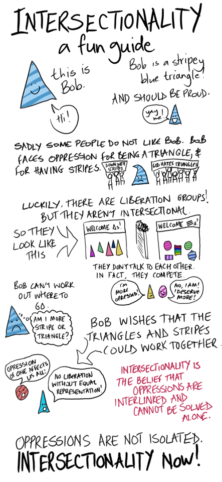
In the U.S., we tend to organize politically according to identities.  For example, we have a Gay Liberation Movement, a Women’s Movement, and the Civil Rights Movement, to name three big ones.  All of these are personal characteristics made political.

The cartoon below, by Miriam Dobson, does a great job of showing one of the downsides of fighting for progressive social change in this way.  For one, it can make people who carry multiple marginalized identities (for example, gay black men) feel unwelcome. And, two, it makes it seem like people without the identity can’t be part of the movement.

One solution is to think about oppressions in terms of intersectionality: we are all a mix of identities that resonate with each other in complicated ways.  This is a rich idea, but one lesson that it has taught us is that the strategy of divide-and-conquer has been an effective way to keep multiple groups marginalized.

Instead of emphasizing identities, we could identify issues. And if our issue is oppression, we can join-to-resist.  As the graphic explains: “oppression of one affects us all.”

1

Via Sociology SourceAnother Angry Woman, and The Sociological Imagination.

Lisa Wade, PhD is an Associate Professor at Tulane University. She is the author of American Hookup, a book about college sexual culture; a textbook about gender; and a forthcoming introductory text: Terrible Magnificent Sociology. You can follow her on Twitter and Instagram.

Screen Shot 2013-09-19 at 8.08.15 AM

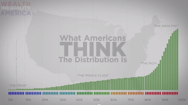
Earlier this week, Marty posted about the increasingly huge share of income going to the richest Americans. And as we’ve seen in the past, Americans tend to way — way — underestimate how unequal the U.S. is.

This video (via Upworthy) does a great job illustrating the distribution of wealth, and how it compares to Americans’ perceptions of both the real and ideal distribution. Even if you know all this stuff, and can recite the statistics, the visual representation of exactly what that means is still jarring.

Gwen Sharp is an associate professor of sociology at Nevada State College. You can follow her on Twitter at @gwensharpnv.

The great majority of Americans might find the post-recession expansion disappointing, but not the top earners.

The following table reveals that our economic system is operating much differently than in the recent past.  The rightmost column shows that the top 1% captured 68% of all the new income generated over the period 1993 to 2012, but a full 95% of all the real income growth during the 2009-2012 recovery from the Great Recession.  In contrast, the top 1% only captured 45% of the income growth during the Clinton expansion and 68% during the Bush expansion.

piketty_saez

Of that weren’t enough, the next chart offers another perspective on how well top income earners are doing. In the words of the New York Times article that included it:

…the top 10% of earners took more than half of the country’s total income in 2012, the highest level recorded since the government began collecting the relevant data a century ago… The top 1% took more than one-fifth of the income earned by Americans, one of the highest levels on record since 1913 when the government instituted an income tax.

We have a big economy.  Slow growth isn’t such a big deal if you are in the top 1% and 22.5% of the total national income is yours and you can capture 95% of any increase.  As for the rest of us…

One question rarely raised by those reporting on income trends: What policies are responsible for these trends?

Cross-posted at Reports from the Economic Front.

Martin Hart-Landsberg is a professor of economics at Lewis and Clark College. You can follow him at Reports from the Economic Front.

As the Wall Street Journal reports:

Four years into the economic recovery, U.S. workers’ pay still isn’t even keeping up with inflation. The average hourly pay for a nongovernment, non-supervisory worker, adjusted for price increases, declined to $8.77 last month from $8.85 at the end of the recession in June 2009, Labor Department data show.

In other words, as the chart below illustrates, the great majority of workers are experiencing real wage declines over this expansion”

image

Growth also remains sluggish, increasing “at a seasonally adjusted annual pace of less than 2% for three straight quarters — below the pre-recession average of 3.5%.”  But by intensifying the pace of work and reducing the pay of their employees, corporations have been able to boost their profits despite the slow growth.

The following chart from an Economic Policy Institute study shows the continuing and growing disconnect between productivity and private sector worker compensation (which includes wages and benefits) using two different measures of compensation.

epi trends

As the Economic Policy Institute study explains, “there has been no sustained growth in average compensation since 2004. The stagnation began even earlier, in 2003, when considering wages alone. Since 2003, wages as measured by both the ECI and the ECEC (not shown) have not grown at all — a lost decade for wages.”

The point then is that we need a real jobs program, one that is designed to create new meaningful jobs and boost the well-being of those employed.  Government efforts to sustain the existing expansion have certainly been responsive to corporate interests.  It should now be obvious that such efforts offer workers very little.

Martin Hart-Landsberg is a professor of economics at Lewis and Clark College. You can follow him at Reports from the Economic Front.

In the late 1990s, I turned down my publisher’s offer to do a third edition of my criminology textbook.  It wasn’t just that editions one and two had failed to make me a man of wealth and fame.  But it was clear that crime had changed greatly.  Rates of murder and robbery had fallen by nearly 50%; property crimes like car theft and burglary were also much lower.  Anybody writing an honest and relevant book about crime would have a lot of explaining to do.  And that would be a lot of work.

I politely declined the publisher’s offer.  They didn’t seem too upset.

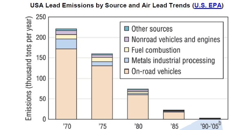
If I had undertaken the project, I probably would have relied heavily on the research articles in The Crime Drop in America, edited by Al Blumstein and Joel Wallman. They rounded up the usual suspects – the solid economy, new police strategies, the incarceration boom, the stabilization of drug markets, anti-gun policies.  But we all missed something important – lead.  Children exposed to high levels of lead in early childhood are more likely to have lower IQs, higher levels of aggression, and lower impulse-control.  All those factors point to crime when children reach their teens if not earlier.

Lead had long been suspected as a toxin, and even before World War I many countries acted to ban or reduce lead in paint and gasoline.  But the U.S., thanks to the anti-regulatory efforts of the industries and support from anti-regulation, pro-business politicians, did not undertake serious lead reduction until the 1970s.

Kevin Drum at Mother Jones has been writing about lead and crime. Because race differences on both variables are so great, it’s useful to look at Blacks and Whites separately.  In the late 1970s, 15% of Black children under age three had dangerously high rates of lead in their blood (30 mcg/dl or higher). Among Whites, that rate was only 2.5%.  By 1990, even with a lower criterion level of 25 mcg/dl, those rates had fallen to 1.4% and 0.4%, respectively.

1 2

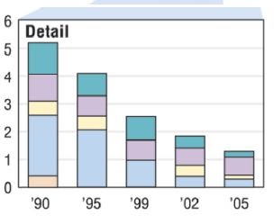
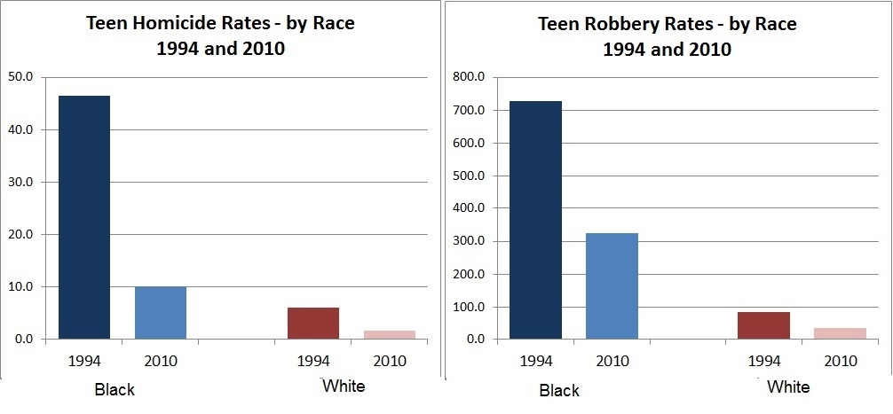
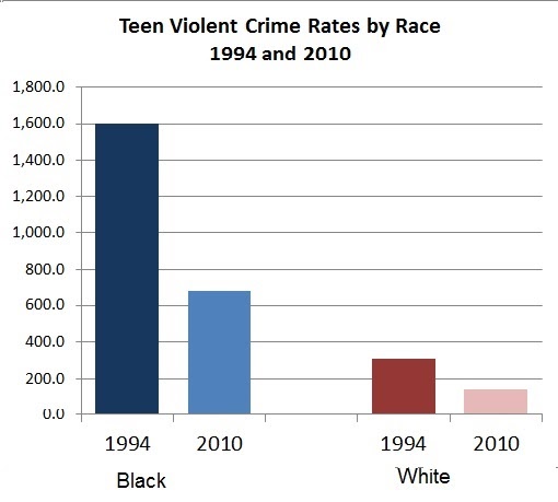
The huge reduction in lead was matched – years later when those children were old enough to commit crimes – with a reduction in crime. (note that the graphs show rates of arrest, which may somewhat exaggerate Black rates of offending):


3

4

Much of the research pointing to lead as an important cause of crime looks at geographical areas rather than individuals.  A study might compare cities, measuring changes in lead emissions and changes in violent crime 20 years later.  But studies that follow individuals have found the same thing.  Kids with higher blood levels of lead have higher rates of crime.  The lead-crime hypothesis is fairly recent, and the evidence is not conclusive.  But my best guess is that further research will confirm the idea that getting the lead out was, and will remain, an important crime-reduction policy.

Kevin Drum also emphasizes race differences.  And here the evidence is less solid:

[A]rrest rates for violent crime have fallen much faster among black juveniles than among white juveniles…  black juvenile crime rates fell further than white juvenile crime rates because they had been artificially elevated by lead exposure at a much higher rate.

But that  depends on how you intepret the data. As the graphs of arrests show, the percentage reductions are roughly similar across races.  Among Black youths, the arrest rates for all violent crime fell from 1600 per 100,000 to less than 700 – a 57% reduction.  For Whites the reduction was from 307 to 140 or 54%. But in absolute numbers, because Black rates of criminality were so much higher, the reduction seems all the more impressive. In that sense, those rates “fell further.”

Arrest rates for Blacks are still double those of Whites for property crimes, five times higher for homicide, and nine times higher for robbery.  Lead may be a factor in those differences.  Remember the lag time between childhood lead exposure and later crime. Twenty years ago, high blood levels of lead among children 1-5 years were three times as high for Blacks as for Whites.

Cross-posted at Montclair SocioBlog.

Jay Livingston is the chair of the Sociology Department at Montclair State University. You can follow him at Montclair SocioBlog or on Twitter.

Pink, as we all know, is all about gender – it’s for girls.  And sissies.

The University of Iowa… for decades has painted the locker room used by opponents pink to put them “in a passive mood” with a “sissy color,” in the words of a former head football coach, Hayden Fry.

That’s from Frank Bruni’s NY Times op-ed today.  But not all cultures link pink to femininity.  The Palermo soccer team wears pink uniforms as do other European teams.  In the U.S., it was only in the 1950s that pink took on its “boys keep out” message, and even then, a charcoal gray suit was often matched with a pink shirt or necktie.  In The Great Gatsby, set in 1922, Nick writes of Gatsby:

His gorgeous pink rag of a suit made a bright spot of color against the white steps, and I thought of the night when I first came to his ancestral home, three months before.

1
DiCaprio as Gatsby in the recent Baz Luhrman film.

.

In the previous chapter, Tom Buchanan says that he has been “making a small investigation” of Gatsby’s past.

“And you found he was an Oxford man,” said Jordan helpfully.

“An Oxford man!” He was incredulous. “Like hell he is! He wears a pink suit.”

Gatsby’s choice of suit colors reveals not his sexuality but his class origins.  An educated, upper-class gentleman – an Oxford man – would not wear a pink suit.  Anna Broadway cites this passage in her Atlantic article and adds,

According to an interview with the costume designer for Baz Luhrmann’s recent film, the color had working-class connotations.

Today, that class connotation is reversed.  It’s the preppie type men at the country club who are wearing pink shirts or even, on the golf course, pants.   That trend may be reinforced by something entirely fortuitous – a name.  The upscale fashion designer Thomas Pink, perhaps because of his name, does not shy away from pink as a color for men’s clothes.

2

Do you agree that pink still has class connotations?  And how do they intersect with the color’s gendered meaning today?

Cross-posted at Montclair SocioBlog.

Jay Livingston is the chair of the Sociology Department at Montclair State University. You can follow him at Montclair SocioBlog or on Twitter.

Our favorite economist, Martin Hart-Landsberg, has written a detailed account of what is causing the rise of income inequality around the world.  Here I’d like to highlight just one of his really interesting observations.

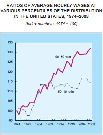
While we usually think that rising income inequality is caused by the rich getting richer and the poor getting poorer, a more complex picture is emerging.  The graph below plots the hourly wages of the 90th percentile (Americans who make more than 89% of the population) relative to the wages of the 50th percentile (the purple line) and the wages of the 50th compared to the 10th percentile (the dotted blue line).

In English: it asks how quickly the richest people (90th) are pulling away from the average person (50th) and how quickly the average person is pulling away from the poorest (10th).  The answer?  Income inequality has been increasing since the 70s but, since the late ’80s, rich people have continued pulling ahead of the average American, but the average American has not been gaining on the poor.

Wage-ratios

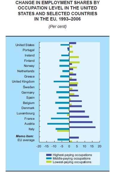
Another indicator that the middle class is shrinking is changes in the share of jobs that are low-, middle-, or high-paid.  The next graph shows that, across a wide range of countries, high- and low-paying jobs are on the rise, but middle-paying jobs are on the decline.  So, middle income jobs are disappearing, but there are more of both high- and low-income jobs.

Jobs (1)

Hart-Landsberg suggests that the reason for this shift in the economy involves the globalization of production.  For more, visit Reports from the Economic Front.

Lisa Wade, PhD is an Associate Professor at Tulane University. She is the author of American Hookup, a book about college sexual culture; a textbook about gender; and a forthcoming introductory text: Terrible Magnificent Sociology. You can follow her on Twitter and Instagram.