
In a perfect example of the tendency to sexualize women but not men, MM sent in a screen capture of an image for the graphic t-shirts section of the Urban Outfitters website, in which the men are all fully clothed and the women…less so:

In a perfect example of the tendency to sexualize women but not men, MM sent in a screen capture of an image for the graphic t-shirts section of the Urban Outfitters website, in which the men are all fully clothed and the women…less so:
 Students of mine who are unversed in race politics frequently use the phrase “colored people.” They hear me use the phrase “people of color” and assume that the phrases are equivalent. This is a truly reasonable assumption, even as people familiar with race-based struggle know for sure that “colored” is an offensive term and “people of color” is typically not considered so.
Occasionally a student asks me what the difference is and, to be frank, I’m not quite sure. I’ve simply absorbed the rules of talking-about-race and have a good idea of how to do so in ways that reflect grass roots language claims.
Accordingly, I was really excited to see a clip of famed activist Loretta Ross at Racialicious explaining the history of the phrase “women of color,” and later “people of color.” She explains that, while “colored people” was a phrase used to delegitimate black- and brown-skinned people, “people of color” was coined by activists hoping to bring all non-white people together into a coalition against racism.
(Thanks to decius for placing a transcript in the comments. I’ve pasted it in after the jump.)

Yesterday I posted about media coverage, and possible exaggeration of, the problems at the Fukushima nuclear reactors in Japan. As a follow-up, over at Japan Probe I found a clip of Charlie Brooker discussing sensationalist of the earthquake, tsunami, and nuclear reactor. His takeaway message: If you can’t distinguish your news teasers from a video game ad, you may have a problem:
Also, Fox News seems to have somehow mistaken a club in Tokyo for a nuclear reactor:
When the earthquake and tsunami hit Japan, the twin disasters received a lot of media attention. However, it didn’t take long before concerns about the situation at the Fukushima Daiichi nuclear reactors became a major focal point of media coverage. I remember first hearing about the explosion that damaged the outer containment building at one of the reactors. Every few hours brought more news accounts that seemed to indicate impending disaster — possible radiation clouds set to arrive in Tokyo within hours, evacuations of employees from the reactors, more explosions, the possibility that a full core meltdown would occur. Officials in the U.S. expressed concern about the 20-kilometer (12 1/2-mile) evacuation zone established by the Japanese government and suggested Americans evacuate a larger area.
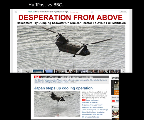
But criticisms have emerged of media — particularly much of the non-Japanese media — coverage of the problems at the nuclear reactor, suggesting the reporting was often inaccurate or that the severity of the situation and potential dangers were exaggerated, and as a result drew attention away from the destruction and suffering caused by the earthquake and tsunami. The blog Japan Probe posted screen captures illustrating the different tone of coverage of the attempt to dump water from military helicopters onto Reactor 3 as part of the efforts to keep the fuel rods cool. The first, from the Huffington Post, implies more of a sense of panic and looming disaster than does the title to a BBC article using the same photo:
Japan Probe also links to a New York Times map, titled “Forecast for Plume’s Path Is a Function of Wind and Weather,” that shows when various detecting stations could potentially be able to pick up what the NYT takes pains to say would be “extremely low levels” of radiation that would have “extremely minor health consequences” (that last phrase bolded). Here’s the scenario that was forecast for March 18:

Scary, right? But then take a look at the color legend for the map:

The radiation levels indicated by different colors are reported in “arbitrary units.” So the different colors reflect differences in the potential level of radiation as it might hypothetically spread. But it’s based on a scale where the reader has no way to know whether the difference between purple, yellow, and red are actually meaningful and whether everything from 0.001 to 100 units, or a hundred billion gazillion units, all still count as “extremely low levels”of radiation, or if the red would indicate we’re all going to die.
I’m sure that the scientists who developed the model explained what the arbitrary unit was, but as provided in the NYT map, despite the text saying there is little to fear in terms of health, the map with the color coding seems likely to generate concern without providing much useful information.
UPDATE: Dmitriy T.M. just emailed me a link to a post about this topic at TechCrunch, which includes a clip from CNN in which Nancy Grace “schools” a meteorologist about how he’s totally wrong about radiation:
And the San Francisco Chronicle has a post up on SFGate summarizing some of the problems with coverage (via Talking Points Memo).
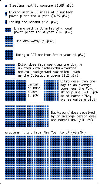
On the topic of concerns about radiation levels, my friend Kelly V. sent me a graphic put together by xkcd to put the level of radiation exposure from various sources into some context. The image is too large to fit in the space available here, but it’s worth clicking over to take a look. Here are two segments of it, but really, go look at the full image:

I’m certainly not in a position to adequately sort through the actual dangers posed by what’s going on at the Fukushima reactors, but it’s certainly worth questioning media coverage, especially insofar as that coverage drew attention away from the horrendous aftereffects of the earthquake and tsunami.
On a related note, and as a contrasting example, Dmitriy T.M. sent in a cartoon based on an idea by artist Kazuko Hachiya that explains the problem at the Fukushima Daiichi facility to kids through metaphors about constipation, pooping, and farting. So…there’s that. It’s unclear whether the video has really been shown on Japanese TV to actual children or not.
UPDATE: Reader Rei Tokyo, who lives in Tokyo, says the video has never been shown on local TV to their knowledge. I have a feeling this is more of an internet sensation outside Japan than within it.

Via Bruce Jacobs, Lesley Hazleton describes her experience of reading the Koran, for real, for the first time:
Lisa Wade, PhD is an Associate Professor at Tulane University. She is the author of American Hookup, a book about college sexual culture; a textbook about gender; and a forthcoming introductory text: Terrible Magnificent Sociology. You can follow her on Twitter and Instagram.
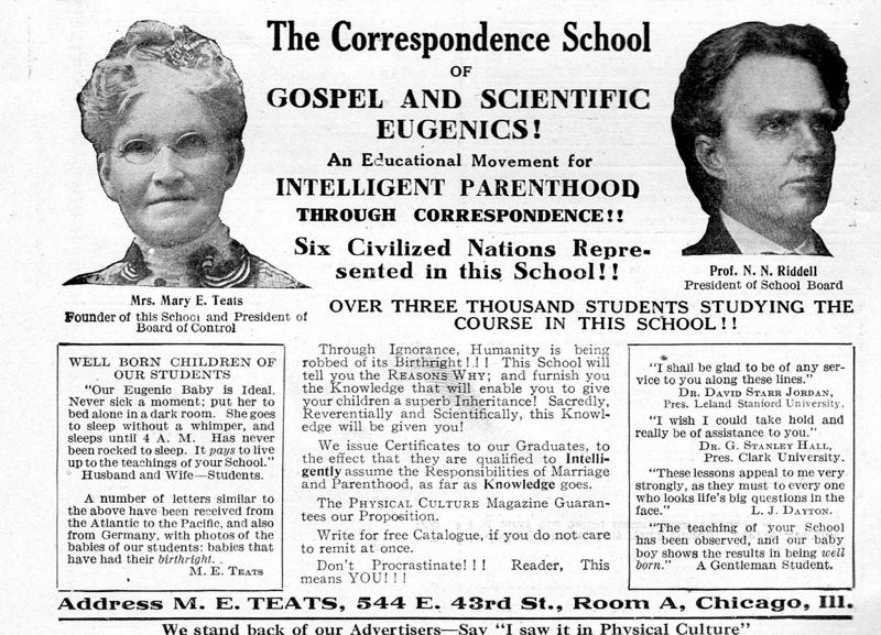
In early 20th century America, eugenics was promoted as a new way to scientifically shape the human race. The idea was to change the human population for the better through selective breeding and sterilization. As you can imagine, this led to serious abuses. People of color, the poor, and those deemed otherwise unfit for reproduction were disproportionately targeted, and usually the sterilization was accomplished by targeting women’s bodies in particular.
One interesting facet of the effort to promote eugenics is the language used, or the framing of the issue. Indeed, just last week I introduced my students to the notion of “Birthright.” The term birthright suggested that all children have the right to be born into a sound mind and body. Why was it important to sterilize individuals deemed morally, culturally, or biologically inferior? Why, we must do it for the children, of course!
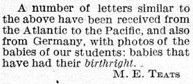
I was reminded of the idea of children having such a birthright by a vintage ad (posted at, predictably, Vintage Ads). The ad is for a school designed to improve the future of the human race by improving parenting. The school would, therefore, teach parents how to engage in civilized “intelligent” “parenthood.” The idea that such parenting can be taught points to the way that eugenics evolved from a biological to a cultural basis. And in several places you see the term “birthright” (excerpted below).
Excerpts:

For a time, pro-sterilization laws were very popular. The U.S. map below, for example, shows which states had pro-sterilization laws in 1935 (striped) and states with laws pending (black). As you can see, most of the United States was on board at this time. Later, condemnation of the practices in Nazi Germany would take the blush off of the eugenics rose.
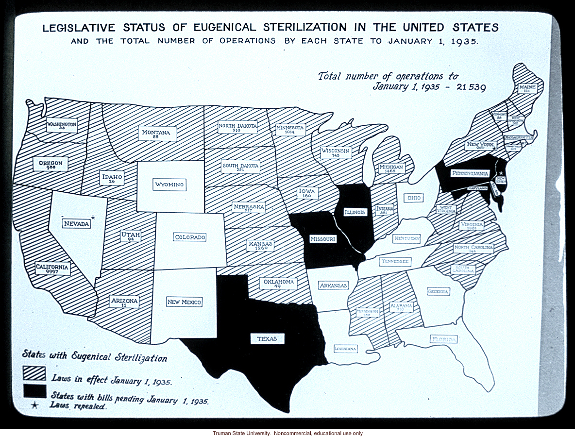 (source)
For a wonderful book on the history of eugenics, read Wendy Kline’s Building a Better Race: Gender, Sexuality, and Eugenics from the Turn of the Century to the Baby Boom.
For more on eugenics and sterilization, see our post with additional pro-eugenics propaganda and two contemporary examples of coercive sterilization campaigns by your health insurance carrier and politician who’ll pay the “unfit” to get tied.
Lisa Wade, PhD is an Associate Professor at Tulane University. She is the author of American Hookup, a book about college sexual culture; a textbook about gender; and a forthcoming introductory text: Terrible Magnificent Sociology. You can follow her on Twitter and Instagram.
Amy H. sent in a Dove ad from O magazine. The ad clearly means to say that women get “visibly more beautiful skin” because their body wash moisturizes dry skin. However, the placement of the women in front of the “before” and “after” text may unfortunately, based on a quick glance, inadvertently convey a different message:
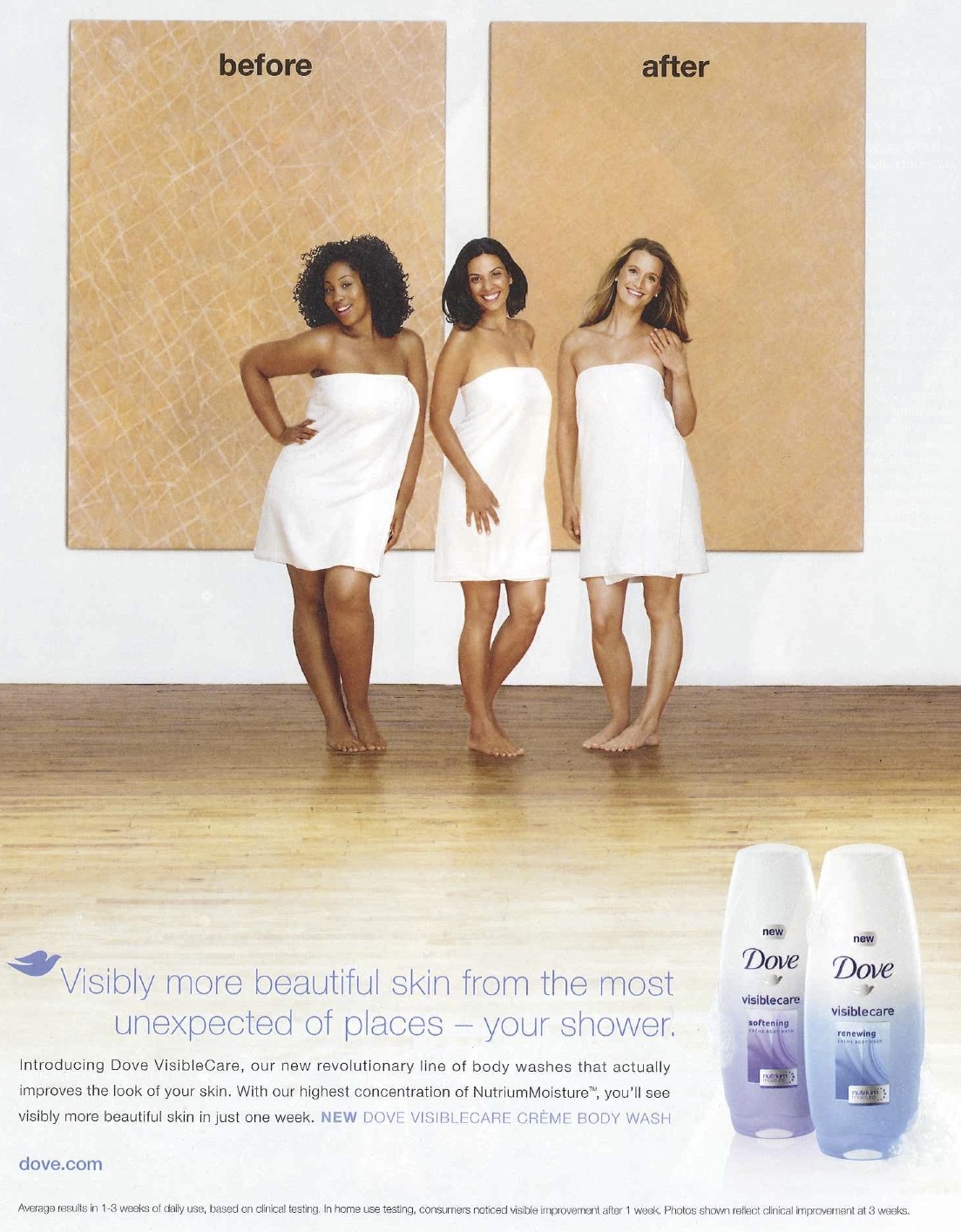
I continue to be puzzled that multinational corporations with resources for large-scale marketing campaigns so often stumble in awkward ways when trying to include a range of racial/ethnic groups in their materials. This seems to occur by not sufficiently taking into account existing or historical cultural representations that may provide a background for the interpretation of images or phrases in the advertising. In this case, the arrangement of the models combined with the text above and below them unfortunately intersects with a cultural history in which White skin was seen as inherently “more beautiful” than non-White skin (not to mention thinner bodies as more beautiful than larger ones).
It would be possible to make this same ad, using these same models and basic idea, in a way that avoided any potential misinterpretation — all it would take, I think, would be to take the before-and-after pics and make them small off-set images on the side, so “before” and “after” couldn’t be read as referring to the women’s bodies. Given that advertising materials are often highly scrutinized, Photoshopped, market tested, and focus grouped, I can’t quite figure out how potentially problematic racial/ethnic connotations aren’t caught before such ads are released.
UPDATE: In my analysis, I gave Dove the benefit of the doubt in assuming this was a non-intentional aspect of the ad, largely because even in the “best case scenario” where this is entirely unintended, it is problematic. However, several readers suggest that we shouldn’t too quickly assume that instances such as these are accidental.
Gwen Sharp is an associate professor of sociology at Nevada State College. You can follow her on Twitter at @gwensharpnv.
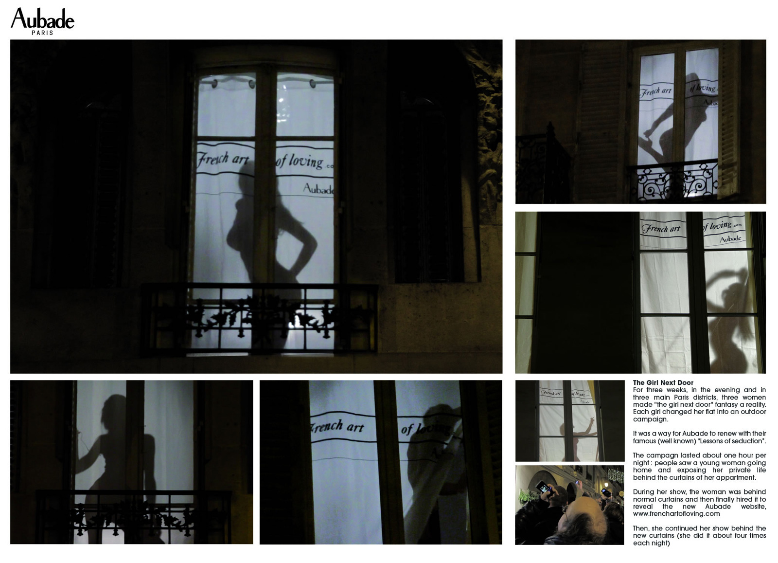
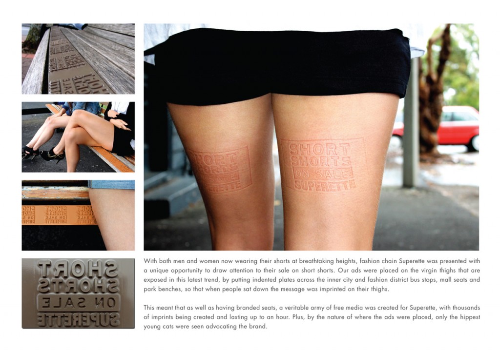
One form of advertising I am excited and interested in “reading” is the emerging practice of ambient advertising. Where traditional outdoor advertising may be placed on a billboard with a particular message and/or images, ambient advertising may have that same message and/or images but it seeks to have interaction with its environment or given location.
Given ambient advertising’s special characteristics, it provides a great opportunity to “read” what is said on those advertisements culturally when the male and female body is the focal point of the ad. Consistent with non-ambient advertising, we tend to see representations that ‘naturally’ give the male body strength and power and one which gives the female body as much strength and power as only in relation to how much the male body allows.
When looking at this dynamic realized in ambient advertising we see the female body as one that is to be gazed upon and scrutinized. Furthermore, the female body is not only just scrutinized and gazed upon in these advertisements but also provides its spectators (male or female) authority over that female body; that authority is usually sexually charged. The following are some examples:

This is not to say that the male body is also not put on display in ambient advertisements. However, those bodies are generally treated with sexual ambiguity and where they are displayed sexually the themes are generally different than where they are when a female body is displayed. The following are some examples:


Understanding that advertising, as an institution, has a function of reflecting our societal norms and considering the body as cultural text (a la Susan Bordo) what we can then “read” in ambient advertising is that culturally the male body has a certain power that the female body does not. This then materializes into a reality where the female body is seen as compliant which continues to enforce an environment where a woman’s body is not hers.
—————————–-
Steve Grimes has his Master of Arts degree in sociology from St. John’s University in New York, is currently seeking a Master of Science degree in media studies from CUNY Brooklyn College, and plans to be enrolled in a Ph.D. program within the next two years. He is, at the moment, engrossed in all things cultural studies and his blog, TimelyDonut, is an avenue to express that.
If you would like to write a post for Sociological Images, please see our Guidelines for Guest Bloggers.


