Search results for The

Time‘s cover story this week is adapted from The Richer Sex, a forthcoming book by Liza Mundy. I provided a few numbers for the story (see below). The content is behind a pay wall here, but the cover gives a taste:

My only beef with the story is that it misidentifies the richer sex, which I’ll return to below. Otherwise, it’s an interesting piece on the (very partial) convergence in roles among married couples. Despite the current stall in progress toward equality, I’m glad to see an article with a positive take on the idea of equality (for middle class straight couples, at least) without focusing on the demise of men.

They only used two of the numbers I sent, so consider the other 9 numbers here a Family Inequality blog exclusive!

First, I showed them the trend in the gender composition of managers from 1980 to 2010. I used the 1990 occupational categories for this (from IPUMS), in the vain hope of maintaining consistency over time*:

My emphasis was on the stall in progress since 1990, so I ended up in the “on the other hand” paragraph of the story.

The other piece of “other hand” I pitched to them was the segregation among managers — with women concentrated in some corners of the managerial world — which I mentioned here, and which Matt Huffman and I studied here. For 2010, that segregation, in broad strokes, looks like this:

This didn’t make it into the story. There was to be only one “on the other hand” paragraph. It’s all about how women are pulling ahead of men and becoming the primary breadwinners, and what that means for gender and relationships.

Of course, women are not yet the richer sex, so the evidence in the article is about trends in that direction. The text says, for example:

Assuming present trends continue, by the next generation, more families will be supported by women than by men.

By the time the graphics department got to it, the “assuming…” part was gone, and this was the header:

The numbers that support this are the trend from 24% of wives out-earning their husbands in 1987 to 38% in 2009 (helped considerably by the mancession’s crimp on men’s jobs in 2008 and 2009). Here’s their graph:

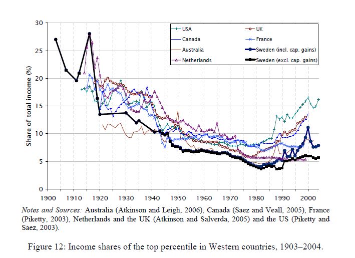
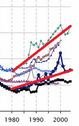
Going from 24% to 38% in 22 years doesn’t mean we’ll pass 50% in another generation. It might be OK for rhetorical purposes to say something like, “at this rate it’ll take 300 years for the U.S. to catch Sweden’s welfare state” — but not OK to say it will happen in that time. If that were true, I could show you this graph and say, “the Earth will be a ball of human flesh expanding at the speed of light in less than 1,000 years!”

Besides projecting from the trend, the other reasonable way to make guesses about the future is to look at young people. For that Liza Mundy reuses a statistic that Time first used in 2010, showing that among those who are single, child free, under 30 and living in metro areas, women have higher earnings than men.

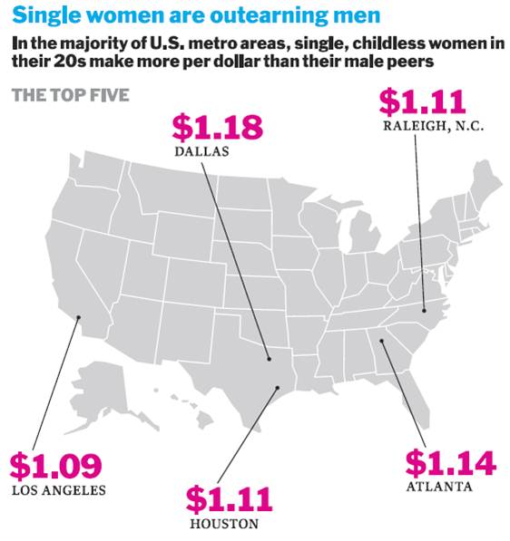
Great, you’re thinking, stay young and single, and don’t have children, and equality is yours!

I do believe our children are the future, but predicting the future from this subset is not a safe bet. The original Time piece is critiqued here and here, although the New York Times hit on this formula for gender equality in 2007 (critiqued here). The basic manipulation here is limiting the comparison to men versus women within a group where women are more likely to have completed college but not yet experienced the wage-diminishing events that now largely begin in the late 20s (marriage, children, and slower earnings growth). It’s an interesting comparison, but shouldn’t be used for projecting the future — or even characterizing the whole present.

Anyway, interesting story.

*There can be no perfectly matching set of occupational categories over long periods of time, because the type of work being done has changed. For example, there were no computer programmers or “customer service representatives” to speak of in 1980, and there are millions now.

Autism appears to be on the rise. The U.S. Centers for Disease Control and Prevention reports that there are 20 times more cases of autism today than there were in the 1980s.  This figure, from the Los Angeles Times, shows a 200% increase in California:

The rise in cases of autism led scientists to ask whether there was an actual increase in incidence or if we were just getting better at identifying it.  The evidence seems to suggest that it’s (at least mostly) the latter.  Said anthropologist Roy Richard Grinker: “Once we are primed to see something, we see it and wonder how we could have never seen it before.”

But how to explain disparities like this?

Often regional differences in health and mental health can be traced to heavier environmental toxin loads.   In most of those cases, though, clusters of illness occur in poor and often disproportionately non-white neighborhoods.  Autism clusters were happening in class-privileged places.

Sociologist Peter Bearman discovered that these clusters were the result of conversation.  Class-privileged parents had the resources to get their child diagnosed, then they talked to other parents.  Some of these parents would recognize the symptoms and take their child to the doctor and… voila… a cluster.  “Living within 250 meters [of a child diagnosed with autism], reports the Los Angeles Times, boosted the chances by 42%, compared to living between 500 and 1,000 meters away.”

Lisa Wade, PhD is an Associate Professor at Tulane University. She is the author of American Hookup, a book about college sexual culture; a textbook about gender; and a forthcoming introductory text: Terrible Magnificent Sociology. You can follow her on Twitter and Instagram.

How does a scientist measure your unconscious mind?  It turns out, it can be done.  With a technique called the Implicit Association Test, psychologists can measure your unconscious beliefs about anything: whether, deep down, you associate Black men with weapons, Asians with foreigners, fat people with laziness, men with science, and more.  You can test yourself on all manner of implicit beliefs here.

It works by putting a pair of words on each side of a computer screen. Sometimes the pair matches your unconscious mind; like (for most of us, unfortunately) young and good.  Sometimes the pair challenges your unconscious mind; like (for most of us, unfortunately) old and good.  You’re asked to do a timed test focusing on just one of the pair; we’re all quicker when the terms match than when they don’t.  For more, read up about it here.

In any case, it turns out the phenomenon has a name — the Stroop effect — and the best illustration of it I’ve ever seen was featured on BoingBoing.  It involves colors and color names. For a lifetime, we’ve been taught to associate certain colors with certain names. Accordingly, our brain fires faster and more confidently when we see the name in the color, compared to when we see the name in an opposing color.  See for yourself: can you read both lists of colors equally comfortably, un-self-consciously, and quickly?Probably not.  So, for better or worse, scientists see this same effect when they try to get our brains to process paired words like Asian/American and men/science.  The results of these experiments are depressing (both abstractly and often personally when we take the tests ourselves), but it’s pretty amazing that we’re able to delve that deeply into the mind with such a simple task.

Lisa Wade, PhD is an Associate Professor at Tulane University. She is the author of American Hookup, a book about college sexual culture; a textbook about gender; and a forthcoming introductory text: Terrible Magnificent Sociology. You can follow her on Twitter and Instagram.

A couple of years ago I posted a segment from the PBS series Faces of America focusing on the legal efforts by Syrian immigrants in the late 1800s and early 1900s to be officially recognized as White (and thus eligible for naturalized citizenship). It nicely illustrates the social construction of race and ethnicity, and the way  power struggles are embedded in the categories we recognize and who is assigned to each one.

In Not Quite White: Arabs, Slavs, and the Contours of Contested Whiteness, directors Jamil Khoury and Stephen Combs integrated scenes from Khoury’s play WASP: White Arab Slovak Pole and interviews with scholars from the Arab American and Polish American communities to “reflect upon contested and probationary categories of whiteness and the use of anti-Black racism as a ‘whitening’ dye.”

Thanks to Katrin for the link!

Cross-posted at Montclair SocioBlog.

This graph tracks the share of income going to the top 1% in seven countries.  It’s from a paper by two Swedish economists, Jesper Roine and Daniel Waldenström (pdf).”’

The trend was towards greater equality up to 1980 — the share of the 1% was shrinking.    Since then, the 1% have increased their share of the income pie in all seven countries.  But the graph seems to show important differences, especially in recent decades.  Here is a  cropped version of the graph showing the 1980-2004 years.  I have added straight lines connecting those two points for Sweden and for the U.S.
Both changes are increases, but are they the same or are they different?  The answer is crucial.  The U.S. and Sweden have different economic policies.  If the changes are no different between countries, then inequality is just one of those inevitable things that’s happening no matter what governments do.  But if the growth of inequality in the US is much greater than in Sweden, maybe government policy can in fact mitigate the trend towards inequality.
The Swedish 1% share went from a little under 5% to about 7.5%.  In the U.S., the 1% share increased from about 7% to 16%.* You might see those increases as very similar.
In fact, Allan Meltzer in the Wall Street Journal takes precisely that view.  He stretches out the graph to de-emphasize the vertical differences, and adds a title implying that all countries are “together” in this shift of income to the top 1%.
He adds this explanation:
As the . . . chart . . . shows, the share of income for the top 1% in these seven countries generally follows the same trend line. That means domestic policy can’t be the principal reason for the current spread between high earners and others. Since the 1980s, that spread has increased in nearly all seven countries. The U.S. and Sweden, countries with very different systems of redistribution, along with the U.K. and Canada show the largest increase in the share of income for the top 1%. [emphasis added]
If your pay went from $5 an hour to $7.50 an hour while your co-worker’s went from $7 to $16, you might think that your co-worker had gotten a substantially heftier raise.  But if so, that’s because you’re not the Wall Street Journal.
Meltzer’s main point in the article is that we should not raise taxes on the very wealthy.  However, as Bruce Barlett points out (here), if the rich are getting just as rich in high-tax countries like Sweden and the Netherlands as they are in low-tax countries like the U.S., we may as well raise taxes on them. They’ll be doing just as well, like their Swedish and Dutch counterparts, and the nation will have more revenue to put towards Medicare, education, deficit-reduction, etc.But Meltzer is wrong.  Sweden and the Netherlands are very different from the U.S.  As the graph shows, the income share of the 1% in the U.S. is twice that of the 1% in Sweden and 3 times that of the 1% in the Netherlands.  And it has risen more rapidly.  Yet Meltzer claims that inequality trends are similar everywhere.

So who are you going to believe – the Wall Street Journal or your lying eyes?

Many people look at Asian-Americans’ relatively high incomes, compared to other racial/ethnic groups, and assume this minority group has achieved the American Dream.  In fact, Census data reveal Asians have higher average incomes and are less likely to live in poverty than whites (DeNavas, Proctor, & Smith, 2011).  Numbers like this lead many to conclude Asians are free from discrimination and are a “model minority” for others to emulate.

However, these numbers regarding Asian-American economic success are misleading.  For example, after controlling for factors such as education, number of workers in a household, and regional costs of living,, Asian-Americans’ economic advantages disappear (Kim & Mar, 2007).  Like other racial minorities, because of racial discrimination Asians must work harder to get the same economic returns as whites.

But the model minority stereotype is so distracting that many completely overlook overtly racist statements about Asians.  A Saturday Night Live clip about the “Linsanity” surrounding NBA player Jeremy Lin illustrates how the racial discourse is regulated quite differently for Asian Americans in comparison to African Americans, drawing on several actual incidents and comments that appeared in coverage of Lin. In this clip, the sportscasters celebrate a headline describing Jeremy Lin as “Amasian,” laugh at signs depicting him inside a fortune cookie, and make statements such as he’s “sweet not sour” and “turned Kobe [Bryant] into Kobe beef.”   They also talk about “loving [Lin] long time,” “wax on, wax off Mr. Miyagi,” and “domo arigato, Mr. Lin-boto” as they bow while grinning widely, bang gongs, and mimic martial arts moves.  The double standard is revealed as the sportscasters criticize and then fire their peer for saying similar things about Black basketball players, including  “Kobe ordered fried chicken,”  “Amar’e Stoudemire was dancing like Maury Povich just told him he’s not the father,” and “my homey Carmelo [Anthony] rolls in late”.

In fact, Chou and Feagin argue the “model minority” stereotype makes Asians more vulnerable to racism than other racial groups because over-exaggerated notions of success lead many to dismiss prejudice against this group as innocent or harmless.  They write, “This distinctive, supposedly positive stereotyping distracts people from seeing the discrimination Asian Americans face every day” (Chou & Feagin, 2008, p. 30). The SNL clip drives home the way this played out with the Jeremy Lin case.

Relevant Reading:

Chou, R. S., & Feagin, J. R. (2008). The Myth of the Model Minority: Asian Americans Facing Racism. Boulder: Paradigm Publishers.

DeNavas, C., Proctor, B. D., & Smith, J. C. (2011). Income, Poverty, and Health Insurance Coverage in the United States: 2010. U.S. Census Bureau.

Kim, M., & Mar, D. (2007). The Economic Status of Asian Americans. In M. Kim (Ed.), Race and Economic Opportunity in the Twenty-First Century (pp. 148-279). New York, SC: Routledge.

Potter, J., & Wetherell, M. (1987). Discourse and Social Psychology. Sage.

—————

Jason Eastman is an Assistant Professor of Sociology at Coastal Carolina University who researches how culture and identity influence social inequalities.

Hennessy Youngman is one of things-on-the-internetz that validates the entire enterprise. In the fast and fascinating 10 minute clip here, Youngman traces the history of performance art, linking it to Occupy and our contemporary engagement with the internet. Oh, and totally worth watching to the end.

(Hennessy, if you’re reading, I was the one that tweeted at you to do a video about The Levitated Mass.  Nobody could do it quite like you! PS – whisky is my drink too.)

Also from Hennessy Youngman:

Lisa Wade, PhD is an Associate Professor at Tulane University. She is the author of American Hookup, a book about college sexual culture; a textbook about gender; and a forthcoming introductory text: Terrible Magnificent Sociology. You can follow her on Twitter and Instagram.

Cross-posted at Reports from the Economic Front.

The Great Recession ended in June 2009, which means we have been in economic expansion for almost 3 years.  Lately the news has been filled with reports of positive economic trends, but how seriously should we take these reports?

One indicator worth looking at is median household income (the red line below).  Unfortunately its trend suggests little reason for cheer. In January 2012, median household income was $50,020.  That was 5.4% lower than it was in June 2009.  Even worse, as the chart below reveals, after a brief uptick it headed back down again.

untitled.jpg

It is true that employment is finally growing, a development reflected in the decline in the unemployment rate (the blue line above).  Unfortunately, this has done little to boost wages.  In fact, real wages actually fell in 2011.  The first chart below highlights the downward turn.  The second chart reveals just how far per capita earnings remain below historical trend.

us-real-wages_thumb.gif

real-wage-and-salary-disbursements-per-capita.jpg

This situation helps to explain why growth has been so anemic.  As the Wall Street Journal wrote:

Many economists in the past few weeks have again reduced their estimates of growth.  The economy by many estimates is on track to grow at an annual rate of less than 2% in the first three months of 2012.  The economy expanded just 1.7% last year.  And since the final months of 2009, when unemployment peaked, the economy has expanded at a pretty paltry 2.5% annual rate.

Without a dramatic change in median household income, growth will remain slow and even the limited employment gains we currently celebrate will likely prove impossible to sustain.  Given the current political climate, it is hard to see how this expansion will be either long lasting or bring meaningful improvements in majority living and working conditions.