I have seen lots of graphs showing rates of immigration to the U.S. over time, but I just found this graph showing the rates of emigration from Mexico from 2006 to early summer of 2008 (from the Migration Information Source website; this is all emigrants, regardless of destination, though of course the vast majority will be to the U.S.):

A quick note on the data: Since it required someone from a family to be left in Mexico to be asked about family emigration patters, it doesn’t include those situations where an entire family left all at once; however, my understanding of immigration patterns is that this type of immigration is a minority of all movements, since most families prefer to send one or two family members to get a foothold in the host country.

As we see, there’s a general overall downward trend during that time period, which isn’t surprising given the downturn in the U.S. economy, especially the construction industry. The Mexican government reports that remittances sent back to Mexico are down this year as well.

 There is also a seasonal pattern, with the period from August to February of each year being the lowpoint and then picking up again in the spring. My first thought, since I study agriculture, was that this might have something to do with the growing season and when agricultural workers are needed in the U.S., but of course it’s a stereotype that most Mexican immigrants are field workers, so that’s probably not it.

Any thoughts on what might explain that pattern?

In this series I have offered five explanations of why people of color are included in advertising. Start with the first in the series and follow the links to the remaining four here.

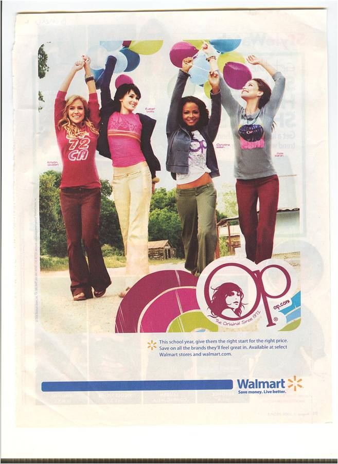
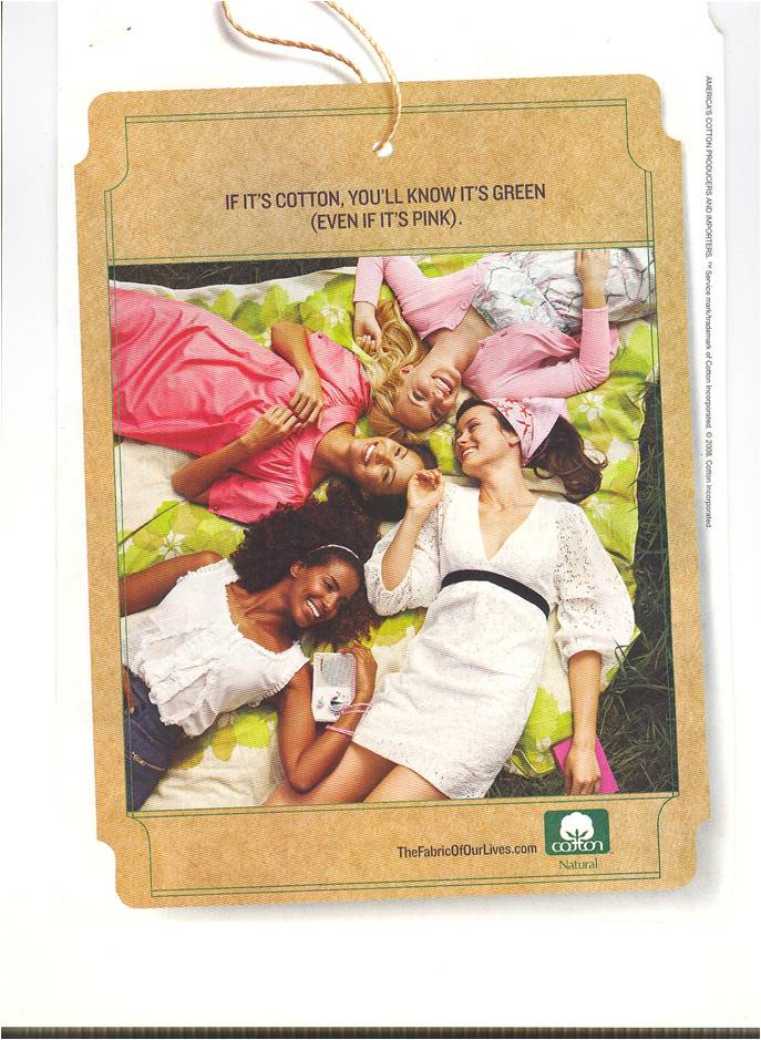
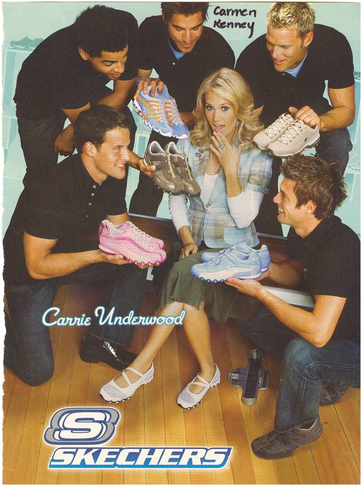
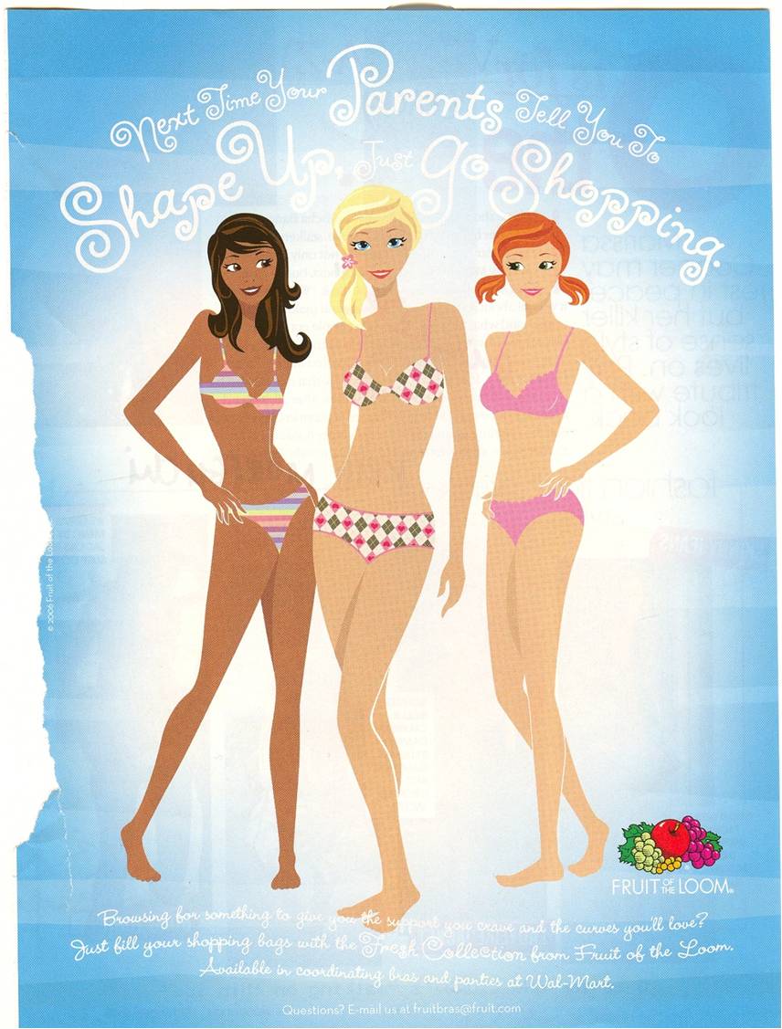
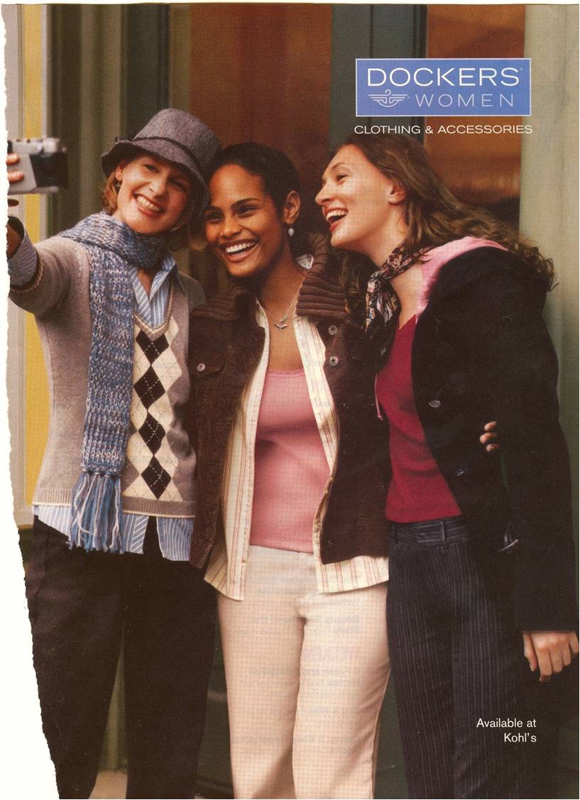
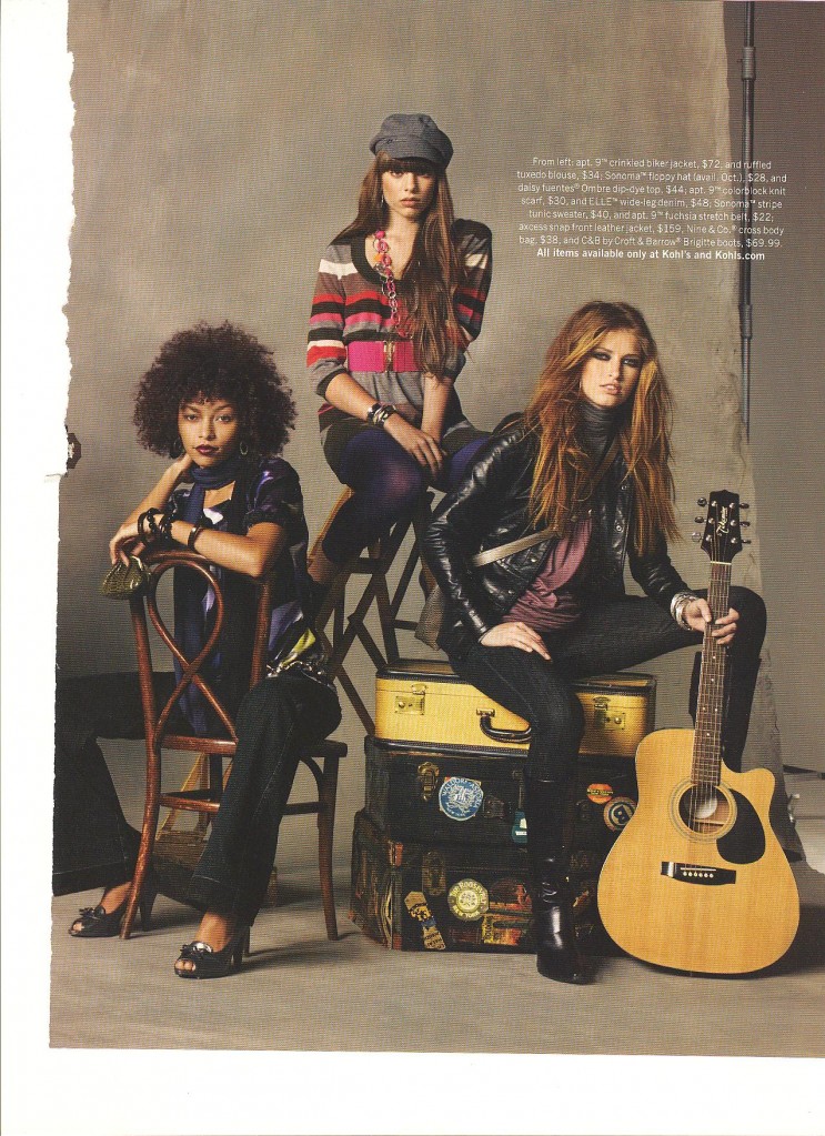
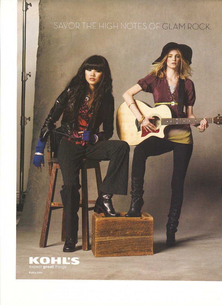
I am now discussing how they are included.  Already I have shown how people of color are whitewashed. Here I show that, when people of color are included, they are often chaperoned. That is, people of color are usually outnumbered by white people. Here are some examples:


NEW!  This is a two-page ad for Kohls:

03-02103-022

I speculate that, if there are more white people than people of color in an advertisement, the inclusion of a non-white person does not threaten the status quo (that whiteness is mainstream and normative) and the product is still clearly marked as mainstream and normative (i.e, white).

Next up: Subordination.

Also in this series:
(1) Including people of color so as to associate the product with the racial stereotype.
(2) Including people of color to invoke (literally) the idea of “color” or “flavor.”
(3) To suggest ideas like “hipness,” “modernity,” and “progress.”
(4) To trigger the idea of human diversity.
(5) To suggest that the company cares about diversity.

How are they included?
(6) They are “white-washed.”

Lisa Wade, PhD is an Associate Professor at Tulane University. She is the author of American Hookup, a book about college sexual culture; a textbook about gender; and a forthcoming introductory text: Terrible Magnificent Sociology. You can follow her on Twitter and Instagram.

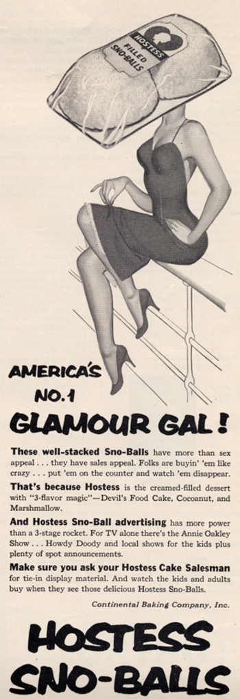
Select text: “These well-stacked Sno-Balls have more than sex appeal… they have sales appeal!”

The 1960s via Found in Mom’s Basement.

More sexualization of food here, herehere, herehere, here, and especially here.

Tessa G.S. sent in a link to the online game Miss Bimbo. Here are some images from the game:

Tessa says,

In this case, you build a “bimbo” by placing your character on diets, getting plastic surgery, shopping for clothes, attending a-list parties, dating handsome men— all with the aim of becoming the most popular bimbo in the game…[According to the website] MissBimbo is an educational tool, a social meeting place and a hot pot of bimboism. It is free to enjoy bimboland.

An educational tool? Really?

According to CNN, parents have expressed concern that pre-teen girls are playing a game that encourages them to have their characters get breast implants and facelifts, as well as go on diets.

The game also reinforces the idea that girls are always rivals, whether competing for popularity or men (or the perfect wedding, as the movie “Bride Wars” shows).

While we’re on the topic of video games (sort of), Burk M. told me about Sexy Beach 3. In the game, you get to pick a female character, what she’s wearing, which of several beach-related activities she’s involved in (playing tag, “playful floating,” limbo, etc.), the location (beach, reef, waterfall, and so on) and the time of day. And then you can take the role of a disembodied hand that rubs various parts of her body while her nipples get hard and she moans in delight and eventually appears to orgasm. Here’s an example (Not Safe for Work):

more...

Jo B. sent us a link to Icebreaker, a New Zealand clothing company. One of their products is wool underwear. As she pointed out, there are some distinct differences in how the men’s and women’s underwear lines are depicted.

The men’s line is called beast. When you go to the site, there’s a little intro part. The following phrase shows up on the banner at the top:

As Jo says,

The overall idea seems to be that men have some kind of innate, primordial aggression (thought I’m not sure how this is supposed to relate to woollen underwear).

Indeed, socialization “cages” men’s true nature, but just barely–its hold is “frail and fragile” and, I presume, could burst forth if you aren’t really careful. I don’t quite follow how the city “brings the beast alive,” or how reconnecting with nature “balances” the beast; since the beast is supposedly men’s real nature, I think reconnecting them with nature would bring out the beast, but whatever. I’m clearly applying too stringent a level of logic. Also, for the record, if all it takes to reconnect with nature is a natural material (made from a domesticated source), then cotton, angora, and mohair would work just as well.


The women’s line is called Nature. When you go to its site there’s also an intro, but without any useful summary of what women are like to compare to the Beast.

Again from Jo:

The female models are slim, delicate, and tend to pose in a way that suggests passivity (static poses, arms held behind body…) and instability (balancing on her toes).  The images in the female range focus more on being attractive, while the men’s range is about being active and aggressive.

The marketing campaign also reinforces the difference in the way we talk about men and women and their association with nature. When we connect men to nature, it’s in an aggressive, predatory sense (the beast). When women are associated with nature, it’s often in a way that implies harmony, an appreciation for the natural world, perhaps some intuitive sense that women have (or, you know, their connection to the moon and stuff because of menstrual cycles). The background is part of this; the grey background of the men’s line doesn’t look nearly as peaceful as the serene white background for the female models.

Thanks, Jo!

FYI:  Jo sent an email to the company complaining and this was their response:

Hi Josephine,

Apologies for the delayed reply. I am writing on behalf of Jeremy Moon to thank you for taking the time to give us your views about Icebreaker’s marketing of its underwear lines for men (Beast) and women (Nature). We understand your concerns, and we really appreciate the level of thought you have put into sharing them with us.

Gender representations are a sensitive issue in marketing, and Icebreaker certainly had no intention of promoting negative or damaging images of men or women in our Winter 08 campaign.

In most of our collections, our marketing approaches to men and women are almost identical. We aim to make Icebreaker garments as stylish as possible, but our clothes are based on performance above all – regardless of the gender of the wearer.

In our Bodyfit, Icebreaker_GT and Superfine collections, for example, women are photographed in exactly the same way as men – pushing their physical boundaries in the outdoors. Our marketing for the garments in these core collections centre on photographs of athletic-looking women skiing, hiking and climbing mountains. None of the images are of women in a passive or decorative role: they’re of women who are confident, independent, adventurous and strong.

We chose a different approach for our underwear ranges. For obvious reasons, we couldn’t adopt our usual approach of showing women taking part in outdoor sports – clearly they wouldn’t play sport in their underwear alone. The other factor we took into consideration is that Nature and Beast, although both underwear collections, are very different ranges.

Men tend to buy underwear for its practical benefits. Our aim was to position Beast as a premium range that has the same performance factors (such as breathability, a critical benefit for underwear) as Icebreaker’s outdoor clothing and yet is sufficiently stylish to be worn at work. Our marketing approach refers not to aggression, but to energy – the same energy (or performance benefits) that works equally well in both outdoor and urban environments. You’ll notice our marketing refers to “creative energy” and also the “harmoniousness” of nature.

The Nature range is our most feminine range by far, and much of our marketing focuses on the way it looks – its styles and its nature-inspired designs. Nature is made from the lightest, most luxurious grade of 100% pure merino, as we understand customers’ concerns against wearing traditional wool (rather than merino) against their skin, so our marketing talks about concepts like “100% pure”. While the photography for the rest of our collections is based around the outdoors, Nature images are designed to show off the styling and softness of the garments.

Our campaigns are designed to be edgy, and we’re very sorry if in this instance you feel our approach conveyed the wrong messages. Please be assured this was not our intention. Thank you for writing, and be assured we will bear your concerns in mind when planning future campaigns. I hope this email helps lesson your disappointment with our brand,

Regards
Alice

Gwen Sharp is an associate professor of sociology at Nevada State College. You can follow her on Twitter at @gwensharpnv.

Michael Kimmel argues that, for contemporary Americans, science is a superstition.  Scientific explanations are comforting and often accepted without critical thought.  The word “natural” rolls off our tongue and frequently gets conflated with “good.”  We are obsessed with finding the biological origins of sexual orientation, gender difference, political proclivities, happiness… everything.  Once a biological basis is found, it is considered the whole explanation.  It is as if biology is more fundamental and more true than things like culture or society. 

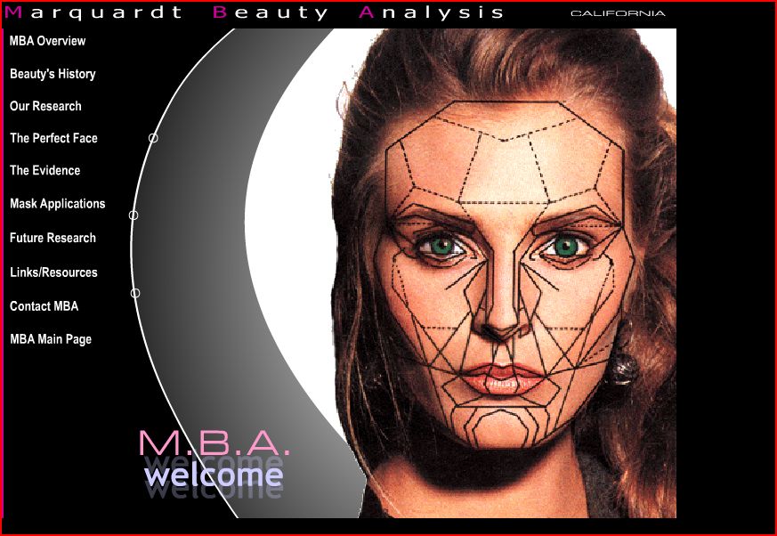
Our “faith” in science, then, is useful to marketers insofar as they can claim that their product is objectively tested, engineered, or otherwise scientifically sound.  This brings me to this Marquardt Beauty Analysis website, sent in by Kiran D.  The website explains the science behind beauty.  The main page includes a woman’s face overlaid with complex geometric shapes:


Here is part of the mission statement (emphasis mine):

MBA is dedicated to proactively researching human visual aesthetics, including its biological and mathematical bases, and to utilizing the results of that research to develop and provide information and technology with which to analyze and positively modify (i.e. improve) human visual attractiveness.

MBA further is dedicated to tailoring and formatting this technology to specific uses for direct applications in the fields where human attractivenss is a factor or parameter (i.e. those fields interested in human visual attractiveness) including medicine, dentistry, psychology, anthropology, biology, anthropometry, the arts, cosmetic makeup, and fashion, as well as for direct use by the individual consumer.

Notice how they use scientific buzzwords like “bases,” “formatting,” “applications,” and “parameter.”

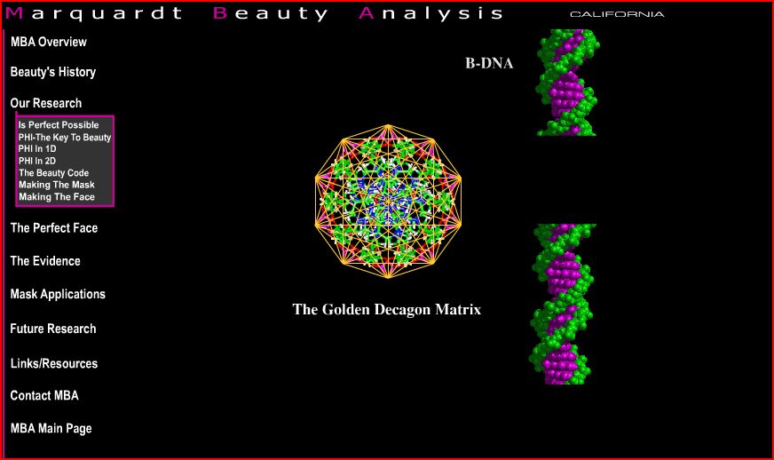
Here is a screenshot showing how they have tried to “scientize” beauty and make their endeavor look like legitimate science:


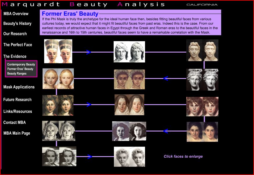
On the page below they claim that their formula works across history (elsewhere they also claim it works across race), so they argue that their science is objective and not culturally or historically contingent:

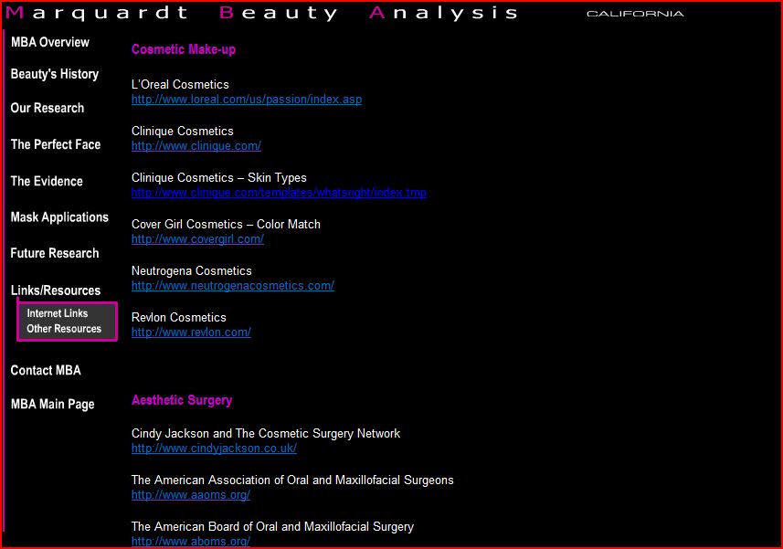
The website, of course, is not really about research on beauty; it’s a mechanism with which to sell make-up, cosmetic surgery, and other products.  Here is a screenshot of the first part of the links page:

The page includes links to L’Oreal, Clinique, Cover Girl, Neutrogena, and Revlon; five “aesthetic surgery” links; three “aesthetic dentistry” links; and a handful of academic-y sounding links.

Thanks Kiran!

From AdGoodness come these three print ads for a new digital camera, the Nikon S60, which apparently has a feature that allows it to auto-detect and focus on faces. The three examples include a bunch of people rubber-necking at two young “porn lesbians” [the top one of which has a horribly Photoshopped head!], a bunch of people of color sneaking up on a white safari dude, and a bunch of ghosts looking at a woman in a hotel room.  Of all the possible examples that could be used to highlight this face-finding feature, who thought it was a good idea to use some hackneyed stereotypes about sexual orientation and race?