Search results for survey

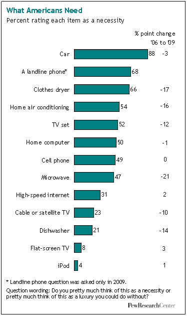
Dmitriy T.M. sent along a Slate slideshow chock full of interesting information on cigarettes and health warnings internationally. I found this particular tidbit most compelling:

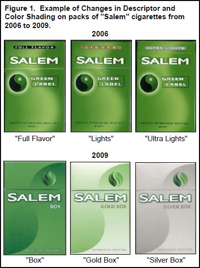
As of June 22, 2010, U.S. cigarette manufacturers are no longer allowed to use the words “light,” “low,” and “mild” to describe their product because it gives the false impression that these cigarettes are better for you than others (source). In place of the words, however, manufacturers are using light and dark colors.  Between 2006 and 2009, for example, Salem cigarettes phased out their packages labeled with words (top) and moved to color based differentiation (bottom):

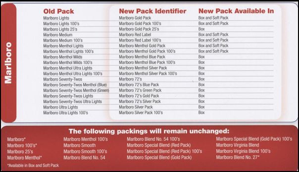
Marlboro has issued a “cheat sheet,” showing the move from descriptors to colors:

This is a very strategic move on the part of cigarette manufacturers, who know that the colors give consumers the same impression as the words.  At least one study has shown as much:

Scientists at Roswell Park Cancer Institute in Buffalo, N.Y., studied 197 smokers and 200 nonsmokers who were shown two mock cigarette packs, one light blue and one dark blue.

They were then asked, “Which one would you buy if you were trying to reduce the risks to your health?” Eighty-seven percent of those surveyed selected the lighter-shaded pack, while just 8 percent chose the darker-shaded pack.

The New York City Health Department is trying to combat this new strategy with commercials aimed at exposing it:

Lisa Wade, PhD is an Associate Professor at Tulane University. She is the author of American Hookup, a book about college sexual culture; a textbook about gender; and a forthcoming introductory text: Terrible Magnificent Sociology. You can follow her on Twitter and Instagram.

Teresa L.-M. sent us a link to an article at Color Lines about a survey of 3,413 people conducted by several groups, including Time magazine and the Center for American Progress, about attitudes toward a variety of issues including changes in women’s work and family roles. Overall, we see that every group said that women’s increased participation in the paid workforce has been good for the U.S., but not surprisingly, some groups were more enthusiastic than others:

This includes those who said it has been “somewhat” or “very” positive.  The % for Latinas was highlighted in the original because the memo focused on the fact that Latinos and Latinas, despite stereotypes that they hold more “traditional” gender attitudes, reported more positive feelings about increased workforce participation than did men and women as a whole. Hispanics were somewhat oversampled — that is, more were included than you would expect relative to their proportion in the U.S. population — because the organizations conducting the survey wanted to get more detailed information about Latino/a attitudes. The results indicated that “Latino attitudes were basically in line with those of other groups on nearly every indicator in the survey. Some minor differences did emerge in terms of the intensity of these beliefs and the degree of consensus about an issue.”

Also, obviously the categories above are not mutually exclusive, they just illustrate some interesting differences when you sort on various characteristics.

One area where Latinos/as differed was that they were more likely to report having an “interesting career” as the most important thing for their daughters to have, and less likely to say marriage and family is the most important, compared to all men and women, which is the opposite of what stereotypes of Latinos and Latinas would predict:

But I can’t help but note the wording there: “Everyone naturally wants the best of all things for their children…” That’s sloppy survey writing there, because it’s leading — it implies that a certain attitude or desire is universal and normative, and implies that everyone would agree that the three items they include in the question are examples of “the best.” It’s not that I’m saying most parents want their daughters to have miserable marriages or shitty jobs they hate. But you always want to be careful about wording questions in ways that take beliefs or values for granted, and thus set up a situation where contradicting them puts the respondent in the position of feeling deviant or fearing disapproval from the interviewer. I don’t know that in this particular example, that wording would have a huge impact on responses, since participants had to rank 3 specific items relative to one another. But I’d be very concerned if they had then been asked how important each item was (rather than asked to rank them), since the wording might lead people to rate items more highly than they would otherwise, because that’s what parents “naturally” want for their kids.

Anyway, moving on. Latinos/as were less concerned about children growing up without a full-time stay-at-home parent than were men  and women overall, with Latinas expressing significantly less negative attitudes than women overall and Latino men (this includes those who answered “very” or “somewhat” negative):

Back to methodological quibbling, this next graph is a great example of slippage between what the graph shows and what the heading claims it shows. As we see, the title says it indicates that Latinos are “more likely to turn to one another for decision making and financial support”:

But that’s not what the data are about at all. The question wording makes it clear this is both hypothetical (including people who don’t have a romantic partner and thus may be answering based on what they suppose would be true if they did) and is about how they value these things (“how important you feel it is for you personally…”), which is very different than if they regularly do them. The fact that you feel that it’s very important to have a romantic partner who provides financial support does not mean you are, in fact, turning to another person for financial support.

Of course, the heading for the table was written after the data were gathered and analyzed, and it doesn’t necessarily indicate that the data themselves are problematic. And yet, along with the wording issue above — and these are just two things I noticed in the memo that summarizes a few of the findings — it makes me a bit hesitant. The topic is interesting, and the results, which seem to undermine stereotypes about Latinos/as, would be great to use…except the methodological issues are overshadowing what might be perfectly valid, useful, and insightful findings. So ultimately, I present the images here less as information on attitudes about women’s roles and more as a cautionary tale.

And, you know, feel free to let me know if you think I’m over-reacting.

While I was at my grandma’s house this week I read Buying In: What We Buy and Who We Are, a fascinating book by Rob Walker. There will be more posts to come in the next few weeks, but for starters, I was struck by the results of a 2006 survey Walker mentions by the Pew Research Center. The survey asked people if various items were luxuries or necessities. Here are the results from 2006 and 1996:

Clearly, over time we’re defining more and more items as necessities rather than luxuries:

A breakdown of some results by age:

If I had to guess, I’d think the fact that younger people are less likely to say a TV is a necessity than older people is due not to less concern about TV but more willingness to watch content online. Does that seem reasonable? Other explanations?

The survey found that the higher a person’s income, the more items they define as a necessity:

The biggest differences by income were for dishwashers, cell phones, computers, and high-speed internet, which are more likely to be defined as a necessity as income increases.

The Pew Center’s website has links to more detailed breakdowns, as well as full info on the question wording, methodology, etc. And as the authors say in the summary, the results show only a one-way change: in no case did they find that the overall percent defining something as a necessity decreased between 1996 and 2006. As they put it,

The old adage proclaims that “necessity is the mother of invention.” These findings serve as a reminder that the opposite is also true: invention is the mother of necessity. Throughout human history, from the wheel to the computer, previously unimaginable inventions have created their own demand, and eventually their own need.

The income data would seem to back this up: what we have, we often come to define as necessities.

I would love to see an international comparison of some sort. I’ll see what I can find.

UPDATE: I haven’t found an international comparison yet, but I discovered that the Pew Research Center conducted the survey again in 2009 to see if attitudes had changed during the recession. Quite a striking change for several items:

d

Keeping a trend in perspective.

The sociologist down the hall pointed out that yesterday’s chart gave the impression of a whopping increase in TANF (Temporary Assistance to Needy Families) support for poor families. But I have been complaining since December 2008 that the welfare system is not responding adequately to the recession’s effects on poor single mothers and their children. I wrote then:

We now appear headed back toward a national increase in TANF cases. But the restrictive rules on work requirements and time limits are keeping many families that need assistance out of the program…. If the government can extend unemployment benefits during the crisis, why not impose a moratorium on booting people from TANF?

So it does seem contradictory that I would post a chart yesterday showing a huge increase in TANF family recipients, and continue the same complaint. So let me put it in better perspective. It’s a good lesson for me on the principles of graphing data, which I have made a point of picking on others for.

Height and width

There were two problems with yesterday’s chart. First, the vertical scale only ran from 1.6 million to 1.9 million families. Second, the horizontal scale only ran for 26 months. I’ll correct each aspect in turn to show their effects. Here’s yesterday’s chart:

It sure looks like a dramatic turnaround. And any turnaround is a big deal. I wrote last year:

What should be striking in this is that the rolls are increasing even as the punitive program rules continue to pull aid from families according to the draconian term limits dreamed up by Gingrich, ratified by Clinton and endorsed by Obama — 2 years continuous, 5 years lifetime in the program. The current stimulus package includes more money for TANF, to help cover an expected growth in families applying — but no rule change to permit families to keep their support in the absence of available jobs.

But, run the vertical axis down to zero, and the same trend is not so dramatic:

Now the big bounce since July 2008 is put in perspective. We’ve seen a 16% increase since that bottom point, but the response seems much more modest in light of the size and impact of the Great Recession we’ve come to know.

In fact, though, the longer-term view underscores how paltry that response has really been. Back the chart up to 1996, and you can see how small the increase has been compared with the pre-draconian reform period:

All three images are correct, but their emphasis is different. To me, the important take-home message from this trend is, “That’s it? The greatest economic recession since the Great Depression, and our welfare response was that measly uptick? Our system really is a shambles.”

One important issue remains, however, and that is some measure of the need for welfare. So consider the number of single-parent families below the poverty line, compared with the number of families receiving TANF (formerly AFDC):

Now the story is much more clear.

After welfare reform in 1996, the number of families receiving welfare was cut by half in just a few years. At the same time, however, the number in poverty dropped. Since then, as the number in poverty has increased, the number on welfare has not. The two trends appeared to be uncoupled through most of the 2000s. In the last year we’ve seen the first increase in TANF numbers since 1996, but nowhere near enough to meet the increase in poor single-parent families.*

It is still the case that, although the stimulus bill allocated more money to TANF, the punitive rules and term limits have not been changed. So the system does not address longer-term poverty — something we should expect to see much more of in the next few years.

*We don’t have the official 2009 poverty rates yet, since they are compiled from a survey done in March 2010, to be released this fall.

Philip Cohen, PhD, is a professor of sociology at the University of North Carolina at Chapel Hill, where he teaches classes in demography, social stratification, and the family.  You can visit him at his blog, Family Inequality, and see his previous posts on SocImages here, here, and here.

Lisa Wade, PhD is an Associate Professor at Tulane University. She is the author of American Hookup, a book about college sexual culture; a textbook about gender; and a forthcoming introductory text: Terrible Magnificent Sociology. You can follow her on Twitter and Instagram.

Oh my. Inés V. just let us know about a contest on WTVN, a conservative talk radio station in Ohio (reader Scapino clarifies that the conservative tone is mostly due to syndication of Glenn Beck and Rush Limbaugh, not really the local DJs). Just…see for yourself:

Inés says,

This campaign is a response to Columbus mayor Michael Coleman who boycotted AZ by banning all city-funded travel after SB1070, and the mayor is depicted as a holder of a green card [that’s him shown on the ID card].

It’s an astounding example of dehumanizing undocumented immigrants — being a proud American is linked to “illegals” (a term that somehow seems more stigmatizing than terms like “illegal immigrants” or “illegal aliens,” even — a linguistic erasure of personhood altogether) being scared, presumably of all the proud Americans they encounter, and the lucky winner gets to go “spend a weekend chasing aliens”. It’s like you’re getting to go on a safari.

Groups in Columbus have organized a response and will be delivering letters to the station this afternoon, before the contest ends, in protest.

I’d add more commentary, but what can you really say?

Sixty-two percent of Americans think that the country should reduce spending in order to cut the deficit.  What do they think we should cut?  Nothing really.

Well, nothing except foreign aid.

Kevin Drum at Mother Jones reminds us that foreign aid is about one percent of the U.S. budget.

…there were only four [other] areas that even a quarter of the population was willing to cut: mass transit, agriculture, housing, and the environment. At a rough guess, these areas account for about 3% of the federal budget. You could slash their budgets by a third and still barely make a dent in federal spending.

The Economist, via BoingBoing.

Lisa Wade, PhD is an Associate Professor at Tulane University. She is the author of American Hookup, a book about college sexual culture; a textbook about gender; and a forthcoming introductory text: Terrible Magnificent Sociology. You can follow her on Twitter and Instagram.

PART ONE:

Drinking lowers your GPA. So do smoking, spending time on the computer, and probably other forms of moral dissolution. That’s the conclusion of a survey of 10,000 students in Minnesota.

Inside Higher Ed reported it, as did the Minnesota press with titles like “Bad Habits = Bad Grades.” Chris Uggen reprints graphs of some of the “more dramatic results” (that’s the report’s phrase, not Chris’s). Here’s a graph of the effects of the demon rum.

Pretty impressive . . . if you don’t look too closely. But note: the range of the y-axis is from 3.0 to 3.5.

I’ve blogged before about “gee whiz” graphs , and I guess I’ll keep doing so as long as people keep using them. Here are the same numbers, but the graph below scales them on the traditional GPA scale of 0 to 4.0.

The difference is real – the teetotalers have a B+ average, heaviest drinkers a B. But is it dramatic?

I also would like finer distinctions in the independent variable, but maybe that’s because my glass of wine with dinner each night, six or seven a week, puts me in the top category with the big boozers. I suspect that the big differences are not between the one-drink-a-day students and the teetotalers but between the really heavy drinkers – the ones who have six drinks or more in a sitting, not in a week– and everyone else.

—————————-

PART TWO:

Some time ago, the comments on a post here brought up the topic of the “gee whiz graph.” Recently, thanks to a lead from Andrew Gelman, I’ve found another good example in a recent paper.

The authors, Leif Nelson and Joseph Simmons, have been looking at the influence of initials. Their ideas seem silly at first glance (batters whose names begin with K are more likely to strike out), like those other name studies that claim people named Dennis are more likely to become dentists while those named Lawrence or Laura are more likely to become lawyers

But Nelson and Simmons have the data. Here’s their graph showing that students whose last names begin with C and D get lower grades than do students whose names begin with A and B.

The graph shows an impressive difference, certainly one that warrants Nelson and Simmon’s explanation:

Despite the pervasive desire to achieve high grades, students with the initial C or D, presumably because of a fondness for these letters, were slightly less successful at achieving their conscious academic goals than were students with other initials.

Notice that “slightly.” To find out how slight, you have to take a second look at the numbers on the axis of that gee-whiz graph. The Nelson-Simmons paper doesn’t give the actual means, but from the graph it looks as though he A students’ mean is not quite 3.37. The D students average between 3.34 and 3.35, closer to the latter. But even if the means were, respectively, 3.37 and 3.34, that’s a difference of a whopping 0.03 GPA points.

When you put the numbers on a GPA axis that goes from 0 to 4.0, the differences look like this.

According to Nelson and Simmons, the AB / CD difference was significant (F = 4.55, p < .001). But as I remind students, in the language of statistics, a significant difference is not the same as a meaningful difference.

Caesarean sections — or C-sections, a surgery that involves making incisions through a woman’s abdomen and uterus to deliver her baby — have been on the rise since the mid-1990s.  Last month a New York Times story reported that 2007 saw the highest rate of Caesarean sections ever, 32 percent:

It is primarily non-medical issues that are driving the increase.  Many C-sections are performed because physicians fear lawsuits.  In a survey of obstetricians, 29 percent admitted to performing C-sections for this reason.

In other cases, mothers request that their labor be induced.  She may have a grandmother in town or a military husband about to be deployed and she wants to have the child while her family can be present.  Induced labor often fails and, so, C-sections are required.  More insidiously (and not mentioned in the story), epidurals also tend to slow down labor and require induction.  So the high rate of epidural use may also be contributing to the rise in C-sections.

And, C-sections beget C-sections.  Fewer and fewer women who have had a previous C-section are being allowed to attempt a vaginal birth.  “Fewer than 10 percent of women who had Caesareans now have vaginal births, compared with 28.3 percent in 1996.”

Rates of C-section in the U.S. are higher than in most industrialized countries but lower than in some developing countries.  “…rates have soared to 40 percent in some developing countries in Latin America, and the rates in Puerto Rico and China are approaching 50 percent.”

And rates in the U.S. states vary by 16 percentage points.  “The highest rates of Caesarean births were in New Jersey (38.3 percent) and Florida (37.2 percent), and the lowest were in Utah (22.2 percent) and Alaska (22.6 percent).”

There was no discussion about why the rates among states in the U.S. would be so variable.  Thoughts?

Lisa Wade, PhD is an Associate Professor at Tulane University. She is the author of American Hookup, a book about college sexual culture; a textbook about gender; and a forthcoming introductory text: Terrible Magnificent Sociology. You can follow her on Twitter and Instagram.