Search results for survey

Rob D. sent along a commercial, made by the non-profit organization Iranians Be Counted, aimed at encouraging Iranian Americans filling out the U.S. Census to check “Other” and write in “Iranian.” It features a famous Iranian commedian doing a bunch of outrageous personalities, but in between the schtick is an argument that there is power in numbers and, therefore, a benefit to being identified as specifically Iranian:

This type of effort is really interesting and taps into a larger debate about Census categories.  How do we divide up the categories that we count?  Iranians are a much smaller group than, say, Arab American Persian (which is currently not an option on the U.S. Census).  If there is power in numbers, then wouldn’t it be better to write in “Arab American” “Persian”?  But, if you write in Arab Persian instead of Iranian, the resources to be gained from being counted may not benefit your community specifically. [As two commenters have pointed out, Iranian Americans are not Arab, except for a small minority. Iranians are Persian and most speak Farsi, not Arabic.  My mistake.]

The Asian American community in the U.S. is a good example of this conundrum.  “Asian” is a social construction; it is an umbrella label that includes very, very different groups.  There is great power in the social construction because it gives “Asians” a presence in American politics that, for example, the Hmong or the Vietnamese alone could never have.  But counting Asians as a group also means obscuring some very important differences among them.

For example, Asians outearn Whites in income surveys, suggesting that Asians should be excluded from programs trying to help groups escape poverty.  But, in reality, the groups we categorize as Asian vary tremendously in their average socioeconomic status.  Some Asian groups (e.g., the Japanese) outearn Whites; other Asian groups (e.g., the Hmong) have very high poverty rates.  When we look at the data broken out by smaller groups, we see more need, but the group itself is small enough that it can be ignored by politicians.

UPDATE: Roshan, in the comments, corrects me further:

Not all Iranians are Persians… Persians compose only 51 percent of the population. Other groups include the Azeris (24 percent), Gilaki and Mazandaranis (eight percent), Kurds (seven percent), Arabs (three percent), Lurs (two percent), Baluchs (two percent), and Turkmens (two percent) (Hakimzadeh, 2006).

Lisa Wade, PhD is an Associate Professor at Tulane University. She is the author of American Hookup, a book about college sexual culture; a textbook about gender; and a forthcoming introductory text: Terrible Magnificent Sociology. You can follow her on Twitter and Instagram.

Dmitriy T.M. sent us a report from the Nielsen company of time spent watching TV and using the internet.

We do, of course, want to take into account possible sample bias–the data are based on answers from Nielsen TV and internet panel participants and a survey of cell phone users, and there’s likely some self-selection bias there, with some groups being more likely to participate than others. I know I’ve read about concerns with Nielsen’s data within the entertainment industry.

That said, while I would be cautious about reporting the data as representative of the U.S. overall, the general trends are interesting. People 65+ watched over 47 hours of traditional (non-recorded) TV per week? Can that be possible? The only 65+-year-old whose TV-watching habits I know is my grandma, and she does tend to have the TV on at all times, even when she’s in the kitchen and is just listening, not watching.

According to these data, among those of retirement age, TV watching is basically more than a full-time job. Kids aged 2-11, on the other hand, only have a part-time job watching TV, at about 25 hours per week.

I, of course, had to sit down and calculate my own TV watching, which came out at a little over 6 hours per week when my friends and I have our Friday night TV watching get-together, 3 hours when we don’t. Less than I thought, overall. I am, however, that advertising nightmare, the person who watches 100% of TV online or DVRd, thus reducing the number of commercials I’m exposed to. You can blame me and others like me for the increasing number of product placements you see in TV shows, a way to try to incorporate sponsorship directly into the content rather than in separate commercials that people are finding more ways to skip.

Gwen Sharp is an associate professor of sociology at Nevada State College. You can follow her on Twitter at @gwensharpnv.

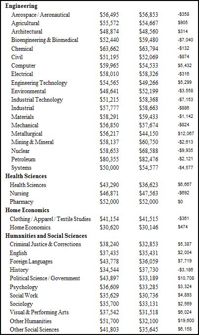
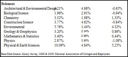
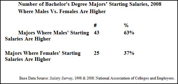
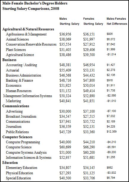
Stan S. sent us a recent research report by Economist Kent Gilbreath.  He presents data illustrating gender differences in the starting salaries of college graduates with different majors, as well as data on the way in which gender differences have changed between 1998 and 2008.  The findings are in the direction you might expect, but with quite a bit of variation!

First, Gilbreath summarizes the data.  Of all of the majors he surveyed, males have higher starting salaries 63% of the time; women have higher starting salaries in the remaining 37%:

Here are the details by major; net differences (far right column), when positive, reflect how much more money men are making than woman and, when negative, reflect how much more money women are making than men (the variation is quite amazing!):

And here’s the data for the sciences, though the format is off:

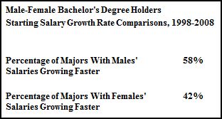
Gilbreath then looks at change in the gender difference between 1998 and 2008.  Again, a summary shows that, in 58% of the cases, men’s advantage over women is growing and, in the remaining 42%, women’s advantage is growing:

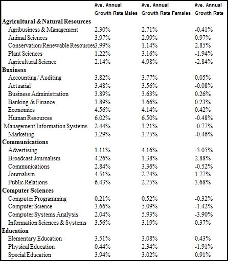
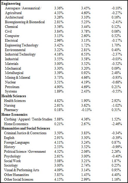
The details show which majors have shown a better growth rate for men or women.  A positive average annual growth rate (far right column) is a gain for men over women and a negative one is a gain for women over men.

This is great data because it shows that, overall, men receive higher starting salaries than women, and their advantage is growing, but the advantage that accrues to men is not even.  It depends, very much, on what their major is.

Anyone see any interesting trends or have any stories from the field?

Lisa Wade, PhD is an Associate Professor at Tulane University. She is the author of American Hookup, a book about college sexual culture; a textbook about gender; and a forthcoming introductory text: Terrible Magnificent Sociology. You can follow her on Twitter and Instagram.
Tara C. sent in this video about why big blockbuster video games haven’t tended to appeal to women, and what might need to change to make the (non-casual?) gaming world more interesting to women in general:

Apparently the creators of this trailer for Record of Agarest War, sent in by Goku S., hadn’t seen the video (NSFW):

Nor, presumably, did the creator of the Pocket Girlfriend iPhone app, sent in by Suzanne B.:

You’ll be excited to know that she’s real!

Pocket Girlfriend moves, she’s interactive, and most importantly she’s real. YES SHE’S REAL!!!! She’s not some 3D rendered mannequin. Seriously, why would you want to buy an application of a dancing mannequin?

Looks like Yahoo didn’t get the message either when it hired lap dancers to attend an event to recruit developers to build things for Yahoo.com, and then posted images of the dancers on the Yahoo Developer Network blog:

Yahoo later apologized.

[And for the record, yes, I realize these are just some examples and don’t represent the entire gaming community, especially the Yahoo thing. That’s true of anything we post–they’re specific examples that we try to fit into a larger context.]

On a related tech-and-gender note, Brigid told us that Wired magazine recently described a study that suggested the stereotype of computer scientists as “unwashed nerds” may be off-putting to women and discourage them from going into computer programming:

Cheryan and colleagues tested this idea by alternately decorating a computer science classroom with objects that earlier surveys pegged as stereotypically geeky—Star Trek posters, videogames and comic books — or with objects that the surveys found to be neutral— coffee mugs, plants and art posters. Thirty-nine college students spent a few minutes in the room, then filled out a questionnaire on their attitudes toward computer science.

Women who spent time in the geeky room reported less interest in computer science than women who saw the neutral room. For male students, however, the room’s décor made no difference.

UPDATE: Comments closed. Sorry, but it was turning into a big fight that wasn’t constructive.

UPDATE 2: Upon request that I rethink closing comments, I’ve cleaned out some problematic ones and am reopening the comment thread. Please remember–no personal attacks or insult wars. Play relatively nice.

Please welcome Guest Blogger Philip Cohen.  Cohen is a sociology professor at the University of North Carolina at Chapel Hill where he specializes in studying the family.  We are pleased to reproduce a post from his own blog, Family Inequality, about (how statistics lie and) the recent media hype about the decrease in the divorce rate.

—————————————-

Delivering some “good news for Christmas,” The National Marriage Project, under the editorship of the sociologist W. Bradford Wilcox, has released a report titled The State of Our Unions, 2009: Money and Marriage. It has a lot of useful information on marriage and families, with some editorial bending in the pro-marriage-and-family direction.

My beef here is with the chapter titled “The Great Recession’s Silver Lining?” In it, Wilcox writes:

judging by divorce trends, many couples appear to be developing a new appreciation for the economic and social support that marriage can provide in tough times. Thus, one piece of good news emerging from the last two years is that marital stability is up.

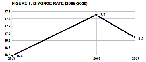
That line was quoted by Ross Douthat at the New York Times, which is a shame, because there is no evidence about anyone’s appreciation for marriage in the chapter. Instead, the evidence for this assertion is presented in a graph that shows three data points in the divorce-rate trend:

The figure shows a decline in the divorce rate from 2007 to 2008. In the press release he calls that drop “the first annual dip since 2005.” (The rate shown here is divorces in a given year per 1,000 married women in the population that year.) Couple things:

1. There is no data point for 2006, so for all we know the divorce rate actually rose higher than it was in 2007, and started falling before the recession, which officially began in December 2007.

2. Despite the dramatic turnaround apparent in this graph, it’s really not enough to go on to draw the kind of conclusion he draws.

The second point is more important, because there really is a lot of research that shows job loss increases the odds of divorce. So why should this recession be different? It’s possible it is, but there’s no evidence – in this report or elsewhere that I’ve seen – of such a change.

In fairness, Wilcox wrote a column in the Wall Street Journal that musters some anecdotal evidence for his theory. But nothing to get him this far: “For most married Americans, the Great Recession seems to be solidifying, not eroding, the marital bond.” Even if the divorce did drop a little in one year – that doesn’t say anything about “most married Americans.”

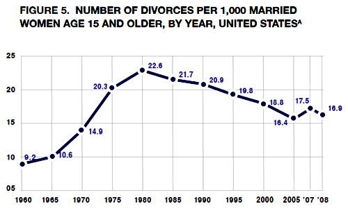
That three-point graph is especially unfortunate because it leads to interpretations like this: “The divorce rate … had previously been on an upward path, rising from 16.4 divorces per 1,000 married women in 2005 to 17.5 in 2007.” That seriously misstates the real trend in divorce rates, which have actually been falling since 1981. And there is nothing in the trend to suggest that recessions teach couples a “new appreciation for the economic and social support that marriage can provide in tough times.” In the appendix, Wilcox presents that longer trend, which makes his previous figure seem much less dramatic.

(The graph seems a little off to me – notice how 10.6 is closer to the line for 10 than 14.9 is to the line for 15 – but I’ll work from his numbers below anyway.)

I think the story of a turnaround in divorce rates has traction because, like crime, divorce is one of those things many people assume is always getting worse (I see this in student papers frequently). So any decline in divorce rates looks like an important change.

What is recession’s effect?

I previously speculated that, because this recession was costing so many men their jobs, more men were likely to be become primary caregivers, and do more housework. The downside – I speculated – was that “maybe men getting ’stuck’ with childcare doesn’t bode well for marriages.” To support that speculation, I showed a graph of divorce rates that had little upward spikes during some recent recessions. The graph was not the real evidence for the argument – which was here:

We already know that economic hard times contribute to marital instability and divorce. Studyafter study after study have found that losing a job increases the likelihood of divorce, with some evidence that husbands’ losses matter more.

Here is a new graph I made, with the “crude divorce rate” (divorces per 1,000 people in the population) in blue, superimposed over Wilcox’s calculations in red. (His takes more work, which is probably why he doesn’t have it for every year. But they track quite well, with some pulling apart some after 1980, which has to do with changes in the population composition that probably aren’t important.) I also put the recessions on there, roughly, by hand with purple bars.

Source: Divorce rates from 2010 Statistical Abstract and various prior years; business cycles from 2010 Statistical Abstract.

Two things here:

1. Over the longer run, there is no obvious relationship between recessions and the divorce rate. There are big social forces at work here (like the rise of the legal practice of no-fault divorce, the increase in women’s education and employment, the growing tendency of men and women of similar education levels to marry, later age at marriage, more cohabitation and unmarried childbearing, etc.). But on the surface – which is where the Wilcox conclusion is drawn – there is not much to go on.

2. The crude divorce rate I got from the Statistical Abstracts shows a little peak in 2006 – not 2007 – followed by two consecutive years of decline, beginning before the recession. So rather than talk about the reason for the decline in the last year – which really just fits in with the falling divorce rates since 1981 – the anomaly is 2006. I have no explanation for that, but in the long run it probably doesn’t matter much.

On the other hand, the American Academy of Matrimonial Lawyers has surveyed its members twice since the recession started. In the first release last fall, they said 37% expected a drop in divorce filings, compared with 19% who usually see an increase during recessions. This fall they report that 57% of their members experienced a drop in filings, with just 14% seeing an increase. There are no details or methods reported in these releases, so it’s hard to evaluate. But if it’s true – along with the previous evidence that unemployment increases divorce – then it maybe that recessions delay the timing of divorce filings while increasing the divorce rate for those affected in the long run.

On the third hand, Jay Livingston at Montclair State points out that the NY Times reports that, in New York’s recession-year court backlog,  ”Cases involving charges like assault by family members were up 18 percent statewide.”

Whether delayed divorce filings contribute to family violence is a question someone might be able to answer when they put all this together. But I doubt the final word will end up as simple as, “Couples too broke to bicker,” as heartwarming as that is. There may be something to the speculation that falling home prices are stalling some divorce plans, but that is not quite the same as developing a newfound appreciation for the benefits of marriage.

I’m sticking with this: in hard times, families are a big part of how people make it through, but hard times are also hard for a lot of marriages. If it’s true that the husband’s job loss especially increases stress on a marriage – as previous research suggests – we may yet see that emerge for the current crisis. If not, maybe something has changed.

Lisa Wade, PhD is an Associate Professor at Tulane University. She is the author of American Hookup, a book about college sexual culture; a textbook about gender; and a forthcoming introductory text: Terrible Magnificent Sociology. You can follow her on Twitter and Instagram.
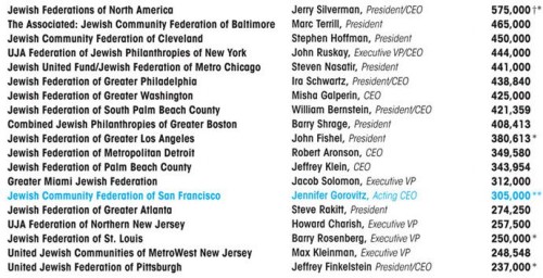
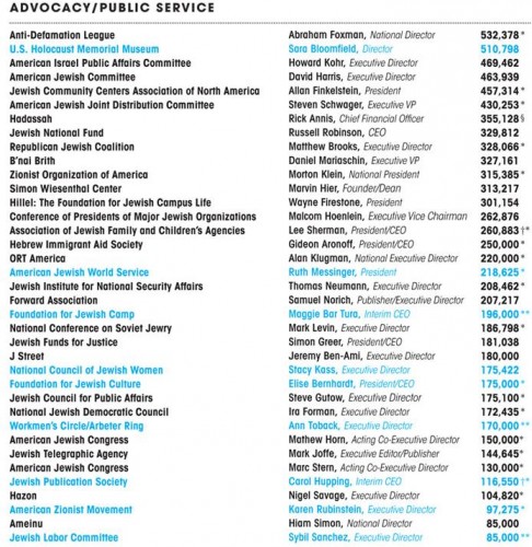
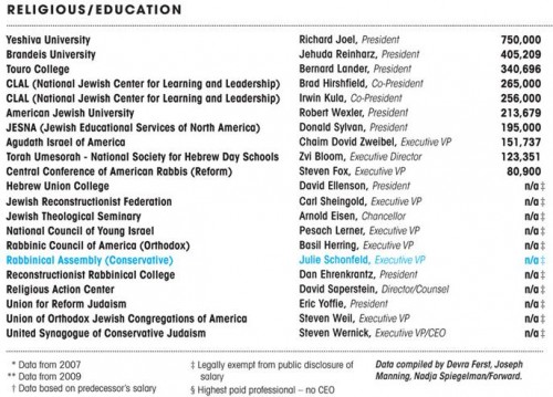
Farrah F. sent us a link to an article on the website for Forward, a newspaper aimed at the American Jewish community. The article looks at the gender gap in pay at Jewish community organizations. According to the article,

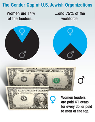
…a Forward survey of 75 major American Jewish communal organizations found that fewer than one in six are run by women, and those women are paid 61 cents to every dollar earned by male leaders.

Incomes of leaders of the organizations they surveyed (data is from 2008 unless otherwise specified, and women are highlighted in blue):

1

2

3

The Forward’s survey was drawn from the most recent public records or, if that information wasn’t available, from the organization itself. The median salary for men was $287,702, while the median for women was $175,211, amounting to a ratio of 61 cents to one dollar.

More from the article:

Women comprise about 75% of those employed by federations, advocacy and social service organizations, and religious and educational institutions, but occupy only 14.3% of the top positions. Of the 11 female leaders identified in this survey, three are in interim roles.

gendergap-110409

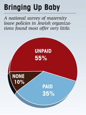
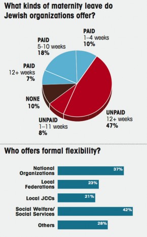
In another article, Forward discusses family leave policies at Jewish organizations, finding that relatively few offer paid leave:

forwardchart-091009

chart2-091009

UPDATE: A few people have asked why I chose to post about these particular organizations. The short answer is: because that’s what I had. My interest here wasn’t in the religious aspect, but in the gender disparities in volunteer/community organizations; I suspect these same trends occur in a lot of similar organizations, not just Jewish ones. I wish I had info on a more general set, but I so far haven’t been able to find a study like this one, but for a wider array of organizations. If anyone knows of one, I’d love to post it.

Triathlon is the new Golf: As a young lawyer making a name for himself in the mid-seventies, my father’s superiors told him to “pick up golf” as a way to rise quickly within the firm, and to land lucrative clients. It’s still all about who you know, but if you want to get ahead in business today, don’t hit the putting green, sign up for an Ironman. Why?

Like Golf, Triathlon is cost prohibitive: The average annual income of an Ironman participant is nearly $160,000, while the average golfer makes a measly $100,980 a year, according to Golf.com’s 2009 Survey.

With Ironman entry fees upwards of $500 each (plus the flight and lodging expenses associated with destination racing), a decent bike starting around $3,000 (plus $400 for the shoes, helmet, peddles and accessories), $200 for swim, bike and run gear, and $300/month in coaching and facilities fees; you start to understand the need for that extra $60,000/year.

Triathletes make better business connections: Like Golf, Triathlon entrances “Type A” personalities, obsessed with winning, even if victory requires continuous practice and focus. Unlike golf, Triathlon also demands incredible pain tolerance and phenomenal endurance. Consequently, “the sport attracts high-income, driven, focused individuals who are able and willing to pay the price in time and money,” says David Samson, Florida Marlins president, and Hawaii Ironman 2006 finisher.

Not only are triathletes more driven, they’re also younger. On average, Ironman triathletes are 35-44, while avid golfers are generally in their early 50’s. Consequently, triathletes are at the peak of their professional careers, while many golfers are contemplating retirement, and thereby less effective in helping you infiltrate the network or company of your choosing.

Triathlon is a better way to schmooze (on a Micro Level): Now that you’ve drawn all of the rich, hard working, high powered individuals into one sport, it is time to make connections. Typically, only four players participate in a round of golf, which takes around 4.5 hours. You likely know at least one or two of the other competitors if you’ve been invited to play in the first place, so you’re left with at best two networking opportunities, which isn’t an efficient way to find the right contact for you.

Most of the Multi-Sport fitness groups in my home town (Marin County, CA), host weekly group rides, averaging thirty to fifty participants. The group usually covers seventy miles in a given ride, thereby providing five hours (plus a group brunch) to make friends, and connections. The group usually breaks into smaller packs of evenly matched athletes after a ten mile warm-up. As competitive, Type A folks, multiple members in a given group will eventually ask you how old you are, what team you belong to, and what you do (probably to ascertain how much time you have to train, how long you’ve been serious about the sport, who coaches you, and what if any advantage your bike may provide you).

It is during this hierarchical ranking process that you establish dominance over the somewhat older, not-as-fast man on the really expensive bike. He may be the CEO of a major tech company in Silicon Valley, but that is the professional “Pond” (Frank, 1987) or “Sphere” (Putnam, 1995). Right now, you’re both in the triathlon sphere, where you’re fitter, faster and had a better time at Ironman Canada last year. As Frank noted, it is relative status that creates happiness and satisfaction, and in this pond, your status is higher than his.

So, for the remainder of the ride (and during brunch afterward), he picks your brain about triathlon, and you arrange to have lunch with him at his office next week, a networking win you’d never enjoy if you’d attempted to engage said CEO in the professional Sphere.

Triathlon as a character reference: Not only have you now procured a meeting, you’ve already passed the first round of the interview process. The ability to withstand (and even enjoy) suffering is a form of ‘bonding social capital’ (Putnam, 2001) that forges a strong sense of collective identity. It implies a preference for achieving work-like goals in the leisure sphere, which translates seamlessly into a strong, professional recommendation from your new friend, the high powered CEO.

Triathlon is a better way to schmooze (on a Macro Level): There is no other sport in which every race includes Professional, Amateur and “Age Group” triathletes from under ten to over eighty, separated only by “wave” times, which are determined by age and gender. As Bob Babbitt, publisher of Competitor Magazine put it: “I can’t pitch to Barry Bonds or tee off with Tiger Woods, but I can be on the starting line with the top people in triathlon.” Consequently, you can train, compete and network with individuals of all ages and abilities, from around the world.

While the world of triathlon is growing rapidly (223,594 US adults participated in a triathlon in 2007, up from just 83,612 just ten years ago), Triathlon is still a small community, even at the Macro level. With a limited number of Ironman (2.4mi Swim, 112mi Bike, 26.2mi Run), Half Ironman (1.2mi Swim, 56mi Bike, 13.1mi Run), Olympic (.9mi Swim, 26mi Bike, 6.1mi Run) and Sprint (.5mi Swim, 16mi Bike, 2mi Run) distance races, you are assured to become familiar (and even friendly) with similarly matched athletes from across the country, and the world.

Triathlon is a reciprocal Panopticon: Your athletic club affiliations are declared on your uniform, and your age is written on your calf prior to each race (so you can check the legs of everyone you pass and everyone who passes you, to estimate ranking in on your age group during the actual race).

Your relative time and ranking is posted within minutes of completing the race, so all can see where you fall amongst the 2,000 or so athletes who participated that day. Award ceremonies are performed immediately, and results are posted online within 24 hours. You can even look up their participant’s photos!

Basically, Triathlon is a Panopticon (Bentham 1995 [1785]; Foucault 1995 [1977]), in which everyone is given the role of prison guard and prisoner. You can’t hide anything about yourself, but in turn, you know everything about everyone else.

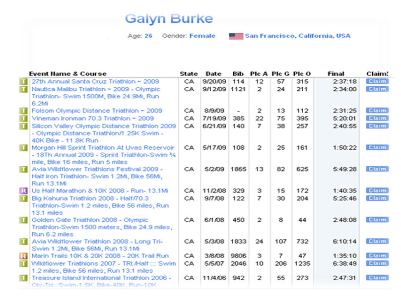
Athlink.com results display an athlete’s age, gender, city, and results for every event completed:

Athlink_Results_Image_4

Bentham’s Panopticon: A theoretical prison that allows guards to observe (-opticon) all (pan-) prisoners, who can’t reciprocally tell whether they are being watched:

Panopticon_Image_5

Conclusion: Triathletes are a self selecting group of affluent, highly motivated individuals, who spend countless hours forging bonds through the competitive, grueling, and socially cohesive ritual of endurance athletics. The greater community convenes several times a year to establish relative rank by sex, age, casual, amateur and pro standards. With access to the region, age, gender and past performances of every athlete in this group, Triathletes are “tee’d up” to make local, national and international connections that turn into husbands, wives (38% of Triathletes are now women), employees, employers and friends. In a world where it’s all about whom you know, it doesn’t hurt to know the rich, successful, driven group that is Triathlon.

References:

Bentham, Jeremy. 1995 [1785]. Panopticon Letters. Miran Bozovic (Ed.). London: Verso.

Foucault, Michel. 1995 [1977]. Discipline and Punish: The Birth of the Prison. New York: Vintage.

Frank, Robert. 1987. Choosing the Right Pond: Human Behavior and the Quest for Status. New York: Oxford University Press.

Putnam, Robert. 2001. Bowling Alone: The Collapse and Revival of American Community. New York: Simon and Schuster.

Galyn Burke–Brown, formerly a competitive equestrienne, is now an enthusiastic triathlete.   She blogs at Economic Sociology.

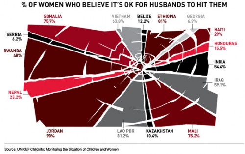
Teresa C. sent in this image created using UNICEF data to show what percent of women surveyed in various countries said it was acceptable for their husbands to hit them:

international-womens-attitudes-towards-domestic-v-28079-1250786064-13

(Found at BuzzFeed.)

You can find the data and a breakdown of UNICEF data collection methods here. The data for many more countries are available there too. I can’t quite figure out why these particular countries were used in the image; they aren’t all of the countries with the highest percentages. As far as I can tell, the UNICEF data table only includes numbers for the “developing” nations and some countries from eastern Europe, which is UNICEF’s focus. But I do wonder what the numbers would be if you asked women in the U.S. a question along the lines of “is it ever acceptable for a man to hit a woman?” or “can you think of any situation where it might be understandable that a man would hit his wife or girlfriend?” You might get higher “support” for violence against women than you’d think. The UNICEF page doesn’t provide the wording of this question, which would be interesting to know.

That’s not to downplay the issue of women justifying or accepting violence against women, just that those of us in the “developed” nations need to be sure not to pat ourselves on the back too much about how enlightened we are about domestic violence.

And I can’t help but dislike the image, in that at first glance it would appear to be a pie chart in which all of the sections add up to 100%; really a bar graph would be a better way to illustrate this. But then, I had a dissertation advisor with a 5-page single-spaced document outlining his standards for data presentation.

UPDATE: Reader P. makes the point I was getting at above (that the wording might greatly impact how much “support” you find for violence against women) much better than I did:

What they were actually asked, in the MICS and the DHS (the two primary sources for the data), was this question:

“Sometimes a husband is annoyed or angered by things that his wife does.  In your opinion, is a husband justified in hitting or beating his wife in the following situations:

– If she goes out with out telling him?
– If she neglects the children?
– If she argues with him?
– If she refuses sex with him?
– If she burns the food?”

I bet you get very different rates for different “justifications,” which is important both for data-gathering/presentation and for anti-domestic violence campaigns. And, again, I bet if you broke down various “reasons” for hitting a woman, I bet you’d get higher-than-expected acceptance of them in countries in the “developed” countries that weren’t presented in the table.