Search results for survey

The short answer is, pretty well. But that’s not really the point.

In a previous post I complained about various ways of collapsing data before plotting it. Although this is useful at times, and inevitable to varying degrees, the main danger is the risk of inflating how strong an effect seems. So that’s the point about teen test scores and adult income.

If someone told you that the test scores people get in their late teens were highly correlated with their incomes later in life, you probably wouldn’t be surprised. If I said the correlation was .35, on a scale of 0 to 1, that would seem like a strong relationship. And it is. That’s what I got using the National Longitudinal Survey of Youth. I compared the Armed Forces Qualifying Test scores, taken in 1999, when the respondents were ages 15-19 with their household income in 2011, when they were 27-31.

Here is the linear fit between between these two measures, with the 95% confidence interval shaded, showing just how confident we can be in this incredibly strong relationship:

1 (2) - Copy

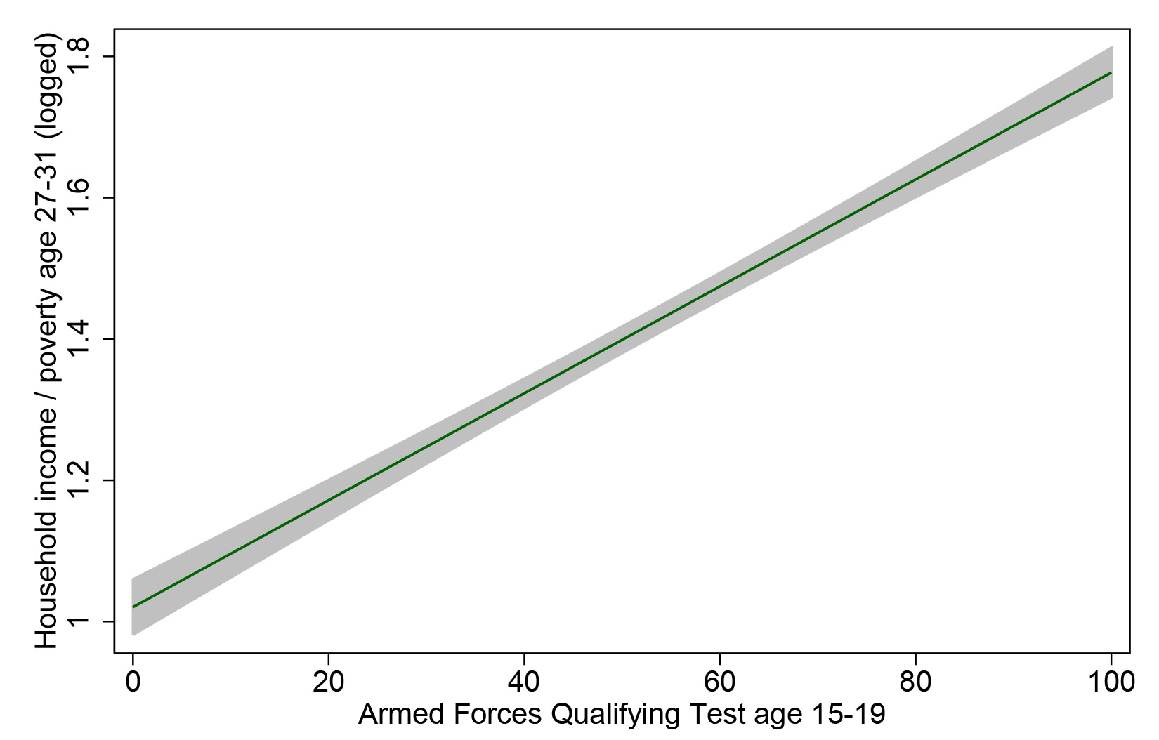
That’s definitely enough for a screaming headline, “How your kids’ test scores tell you whether they will be rich or poor.” And it is a very strong relationship – that correlation of .35 means AFQT explains 12% of the variation in household income.

But take heart, ye parents in the age of uncertainty: 12% of the variation leaves a lot left over. This variable can’t account for how creative your children are, how sociable, how attractive, how driven, how entitled, how connected, or how White they may be. To get a sense of all the other things that matter, here is the same data, with the same regression line, but now with all 5,248 individual points plotted as well (which means we have to rescale the y-axis):

1 (2)

Each dot is a person’s life — or two aspects of it, anyway — with the virtually infinite sources of variability that make up the wonder of social existence. All of a sudden that strong relationship doesn’t feel like something you can bank on with any given individual. Yes, there are very few people from the bottom of the test-score distribution who are now in the richest households (those clipped by the survey’s topcode and pegged at 3 on my scale), and hardly anyone from the top of the test-score distribution who is now completely broke.

But I would guess that for most kids a better predictor of future income would be spending an hour interviewing their parents and high school teachers, or spending a day getting to know them as a teenager. But that’s just a guess (and that’s an inefficient way to capture large-scale patterns).

I’m not here to argue about how much various measures matter for future income, or whether there is such a thing as general intelligence, or how heritable it is (my opinion is that a test such as this, at this age, measures what people have learned much more than a disposition toward learning inherent at birth). I just want to give a visual example of how even a very strong relationship in social science usually represents a very messy reality.

Cross-posted at Family Inequality and Pacific Standard.

Philip N. Cohen is a professor of sociology at the University of Maryland, College Park, and writes the blog Family Inequality. You can follow him on Twitter or Facebook.

Like a lot of moms, I faced the Barbie dilemma when my daughter was younger. Ultimately I  figured a little bit of Barbie would sate her appetite (and stop the nagging) without doing too much harm. Like a vaccination, or homeopathic inoculation against the Big Bad. I told myself my daughter didn’t use her dolls for fashion play anyway: her Barbie “funeral,” for instance, was a tour de force of childhood imagination. I told myself I only got her “good” Barbies: ethnic Barbies, Wonder Woman Barbie, Cleopatra Barbie. Now that she’s 10 and long ago gave the dolls away (or “mummified” them and buried them in the back yard in a “time capsule”), I can’t say whether they’ll have any latent impact on her body image or self-perception. It would seem ludicrous, at any rate, to try to pinpoint the impact of one toy.

But now, according to a study published this week,  it turns out that playing with Barbie, even career Barbie, may indeed limit girls’ perception of their own future choices. Psychologists randomly assigned girls ages 4-7 to play with one of three dolls. Two were Barbies: a fashion Barbie (in a dress and high heels); and a “career” Barbie with a doctor’s coat and stethoscope. (NOTE: I just pulled these images from the web: I don’t know which actual Barbies they used.)

5

The third, “control” doll was a Mrs. Potato Head, who,  although she comes with fashion accessories such as a purse and shoes, doesn’t have Barbie’s sexualized (and totally unrealistic) curves.

So, after just a few minutes of play, the girls were asked if they could do any of 10 occupations when they grew up. They were also asked if boys could do those jobs. Half of the careers, according to the authors, were male-dominated and half were female dominated. The results:

Girls who played with Barbie thought they could do fewer jobs than boys could do. But girls who played with Mrs. Potato Head reported nearly the same number of possible careers for themselves and for boys.

More to the point:

There was no difference in results between girls who played with a Barbie wearing a dress and the career-focused, doctor version of the doll.

Obviously, the study is not definitive. Obviously, one doll isn’t going to make the critical difference in a young woman’s life blah blah blah. Still, it’s interesting that it doesn’t matter whether the girls played with fashion Barbie or doctor Barbie, the doll had the same effect and in only a few minutes.

That reminded me of a study in which college women enrolled in an advanced calculus class were asked to watch a series of four, 30-second TV commercials. The first group watched four netural ads. The second group watched two neutral ads and two depicting stereotypes about women  (a girl enraptured by acne medicine; a woman drooling over a brownie mix). Afterward they completed a survey and—bing!—the group who’d seen the stereo- typed ads expressed less interest in math- and science-related careers than classmates who had watched only the neutral ones. Let me repeat: the effect was demonstrable after watching two ads.

And guess who performed better on a math test, coeds who took it after being asked to try on a bathing suit or those who had been asked to try on a sweater? (Hint: the latter group; interestingly, male students showed no such disparity.)

Now think about the culture girls are exposed to over and over and over and over and over, whether in toys or movies or tv or music videos, in which regardless of what else you are—smart, athletic, kind, even feminist, even old—you must be “hot.” Perhaps, then, the issue is not “well, one doll can’t have that much of an impact,” so much as “if playing with one doll for a few minutes has that much impact what is the effect of the tsunami of sexualization that girls confront every day, year after year?”

Peggy Orenstein is the author of four books, including The New York Times best-seller Cinderella Ate My Daughter: Dispatches from the Front Lines of the New Girlie-Girl Culture.  You can follow her at her blog, where this post originally appeared, on facebook, and on twitter.

A popular quote urges us to shoot for the moon: even if we miss, it tells us, we’ll land among the stars. According to new research, there’s more to it than cheesy inspiration. Using data from two waves of the National Longitudinal Survey of Youth, sociologist John Reynolds and Chardie Baird test the common notion that failing to attain as much education as expected is associated with symptoms of depression in early/middle adulthood.

First, their results show that individuals with lower levels of education are more likely to exhibit signs of depression.

Screenshot (36)

But, further statistical wrangling shows that their depression doesn’t come from the gap between plans and achievement. It comes from the low level of educational attainment in itself.

Reynolds and Baird conclude that there are no long-term emotional costs to aiming high and falling short when it comes to educational aspirations. This contradicts decades of research that holds that unmet educational expectations lead to psychological distress. In fact, not trying is the only way to ensure lower levels of education and increased chances of poor mental health. So, go ahead and shoot for that moon.

Hollie Nyseth Brehm is a Ph.D. Candidate at the University of Minnesota.  She is the graduate editor of The Society Pages.  This post originally appeared at Contexts Discoveries.

A survey question is only as good as its choices. Sometimes an important choice has been left off the menu.  I was Gallup polled once, long ago. I’ve always felt that they didn’t get my real opinion.

“What’d they ask?” said my brother when I mentioned it to him.

“You know, they asked whether I approved of the way the President was doing his job.”  Nixon – this was in 1969.
“What’d you say?”

“I said I disapproved of his entire existential being.”

I was exaggerating my opinion, and I didn’t actually say that to the pollster.  But even if I had, my opinion would have been coded as “disapprove.”

For many years the American National Election Study has asked:

How much of the time do you think you can trust the government in Washington to do what is right – just about always, most of the time or only some of the time?

The trouble with these choices at that they exclude the truly disaffected. The worst you can say about the federal government is that it can be trusted “only some of the time.”  A few ornery souls say they don’t trust the federal at all. But because that view is a write-in candidate, it usually gets only one or two percent of the vote.

This year the study included “never” in the options read to respondents.  Putting “no-way, no-how” right there on the ballot makes a big difference. And as you’d expect, there were party differences:

1 (2)

Over half of Republicans say that the federal government can NEVER be trusted.

The graph appears in this Monkey Cage post by Marc Hetherington and Thomas Rudolph. Of course, some of those “never” Republicans don’t really mean “never ever.”  If a Republican becomes president, they’ll become more trusting, and the “never-trust” Democrat tide will rise.  Here’s the Hetherington-Rudolph graph tracking changes in the percent of people who do trust Washington during different administrations.

1 (3)

This one seems to show three things:

  1. Trust took a dive in the 1960s and 70s and never really recovered.
  2. Republican trust is much more volatile, with greater fluctuations depending on which party is in the White House.
  3. Republicans really, really hate President Obama.

Cross-posted at Montclair SocioBlog.

Jay Livingston is the chair of the Sociology Department at Montclair State University. You can follow him at Montclair SocioBlog or on Twitter.

A majority of both Democrats and Republicans believe that economic inequality in the U.S. has grown, but they disagree as to its causes and the best solutions, according to a new survey from the Pew Research Center.  While 61% of Republicans and 68% of Democrats say inequality has widened, only 45% of Republicans say that the government should do something about it, compared to 90% of Democrats.  A study using the General Social Survey has confirmed the findings.

Screenshot (24)

Republicans and Democrats also disagree about what the best interventions would be.  At least three-quarters of Democrats favor taxes on the wealthy and programs for the poor, but 65% of Republicans think that helping the poor does more harm than good.Screenshot (25)

The differences may be related to beliefs about the cause of poverty.  Republicans are much more likely to endorse an individualist explanation (e.g., people are poor because they are lazy), whereas Democrats are more likely to offer a structural explanation (e.g., it matters where in the class structure you begin and how we design the economic system).

Screenshot (27)

Interestingly, answers to these questions vary much more by political affiliation than social class.  Using data from the survey, I put together this table comparing the number of percentage points that separated the average answers to various questions.  On the left is the difference by political party and, on the right, income (click to enlarge).

1

Clearly political affiliation drives opinions on the explanation for and right solutions to income inequality more so than income itself.

This is a great example of hegemony.  A hegemonic ideology is one that is widely supported, even by people who are clearly disadvantaged by it.  In this case, whatever you think of our economic system, it is pretty stunning that only there is only a six point gap between the percent of high income people saying it’s fair and the percent of low income people saying so.  That’s the power of ideology — in this case, political affiliation — to shape our view of the world, even going so far as to influence people to believe in and perhaps vote for policies that are not in their best interest.

Cross-posted at Pacific Standard.

Lisa Wade, PhD is an Associate Professor at Tulane University. She is the author of American Hookup, a book about college sexual culture; a textbook about gender; and a forthcoming introductory text: Terrible Magnificent Sociology. You can follow her on Twitter and Instagram.

The Pew Research Center has released the data from new survey of religious and non-religious Jews.  They find that almost a quarter of Jews (22%) describe themselves as being “atheist,” “agnostic,” or “nothing in particular.”  The percentage of Jews of no religion correlates with age, such that younger generations are much more likely to be unaffiliated.  Nearly a third of Millennials with Jewish ancestry say they have no religion (32%), compared to 19% of Boomers and 7% of the Greatest Generation.

Screenshot (34)

A majority of Jews with no religion marry non-Jews (79%); 67% have decided against raising their children with the religion.
Screenshot (33)As a result of intermarriage, the percent of all Jews who have only one Jewish parent is rising.  While 92% of people born between 1914 and 1927 had two Jewish parents, Millennials are as likely as not to have just had one.

Cross-posted at Pacific Standard.

Lisa Wade, PhD is an Associate Professor at Tulane University. She is the author of American Hookup, a book about college sexual culture; a textbook about gender; and a forthcoming introductory text: Terrible Magnificent Sociology. You can follow her on Twitter and Instagram.

New survey data shows that the average person overestimates the diversity of the American population, both now and in the future.  Today, for example, racial minorities make up 37% of the population, but the average guess was 49%.

projections

Many Americans fear rising diversity.  Over half worry that more minorities means fewer jobs, nearly half think that it means more crime, and almost two-thirds think these groups strain social services.  If people think that minorities are bad for America and overestimate their prevalence, they may be more likely to support draconian and punishing policy designed to minimize their numbers or mitigate the consequences they are believed to bring.

Not all Americans, of course, fear diversity equally.  Below are the scores of various groups on an “openness to diversity” measure with a range of 0-160.

Screen Shot 2013-10-22 at 1.34.24 PM

For the future, Americans are still strongly divided as to what to do about diversity and the racialized inequality we currently see.

last chart

Via The Atlantic; thanks to @_ettey for the link.  Cross-posted at Pacific Standard.

Lisa Wade, PhD is an Associate Professor at Tulane University. She is the author of American Hookup, a book about college sexual culture; a textbook about gender; and a forthcoming introductory text: Terrible Magnificent Sociology. You can follow her on Twitter and Instagram.

I can’t offer much in the crowded field of Disney gender criticism. But I do want to update my running series on the company’s animated gender dimorphism. The latest installment is Frozen.

Just when I was wondering what the body dimensions of the supposedly-human characters were, the script conveniently supplied the dimorphism money-shot: hand-in-hand romantic leads, with perfect composition for both eye-size and hand-size comparisons:

1

With the gloves you can’t compare the hands exactly, but you get the idea. And the eyes? Yes, her eyeball actually has a wider diameter than her wrist:

2

Giant eyes and tiny hands symbolize femininity in Disneyland.

While I’m at at, I may as well include Brave in the series. Unless I have repressed it, there is no romance story for the female lead in that movie, but there are some nice comparison shots of her parents:

3Go ahead, give me some explanation about the different gene pools of the rival clans from which Merida’s parents came.

Since I first complained about this regarding Tangled, I have updated the story to include Gnomeo and Juliet. You can check those posts for more links to research (and see also this essay on human versus animal dimorphism by Lisa Wade). To just refresh the image file, though, here are the key images. From Tangled:

3.5

From Gnomeo:

4

At this point I think the evidence suggests that Disney favors compositions in which women’s hands are tiny compared to men’s, especially when they are in romantic relationships.

REAL WRIST-SIZE ADDENDUM

How do real men’s and women’s wrist sizes differ? I looked at 7 studies on topics ranging from carpal tunnel syndrome to judo mastery, and found a range of averages for women of 15.4 cm to 16.3 cm, and for men of 17.5 to 18.1 cm (in both cases the judo team had the thickest wrists).

‘Then I found this awesome anthropometric survey of U.S. Army personnel from 1988. In that sample (almost 4,000, chosen to match the age, gender, and race/ethnic composition of the Army), the averages were 15.1 for women and 17.4 for men. Based on the detailed percentiles listed, I made this chart of the distributions:

5

The average difference between men’s and women’s wrists in this Army sample is 2.3 cm, or a ratio of 1.15-to-1. However, if you took the smallest-wristed woman (12.9 cm) and the largest-wristed man (20.4), you could get a difference of 7.5 cm, or a ratio of 1.6-to-1. Without being able to hack into the Disney animation servers with a tape measure I can’t compare them directly, but from the pictures it looks like these couples have differences greater than the most extreme differences found in the U.S. Army.

Cross-posted at Family Inequality and the Huffington Post.

Philip N. Cohen is a professor of sociology at the University of Maryland, College Park, and writes the blog Family Inequality. You can follow him on Twitter or Facebook.