
Stacey Burns wrote in to tell us about her successful effort to fight an ad campaign that objectified women and trivialized sex work. She explains:
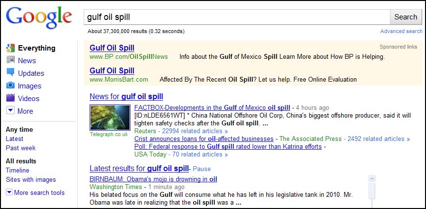
USI Wireless, an Internet provider that has a ten-year contract to provide wireless to the city of Minneapolis, recently launched a new ad campaign promoting its service. The ad features the image of a young woman who we are clearly meant to read as a sex worker, accompanied by the text “FAST, CHEAP, and SATISFACTION GUARANTEED.”
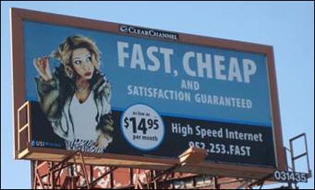
A photo of the billboard was placed on Facebook, which she saw on a friend’s page, and then re-posted with a critique. She contacted the company, whose representatives were “polite but dismissive, telling [her] that they test-marketed the ad and it did well in focus groups.” The photo of the billboard went viral and she took it to the City Council, who “responded to public outcry and succeeded in getting the ad pulled from the 12 locations it was posted” (story here).
Burns’ story is a nice example of how collective action, facilitated by the internet, can make a difference.
For more examples of this kind of resistance, read about fights against the Obama sock monkey, a Target ad, Mr. Wasabi, Frito Bandito, Motrin’s idea of motherhood, and the rebellyon.
—————————
Lisa Wade is a professor of sociology at Occidental College. You can follow her on Twitter and Facebook.


