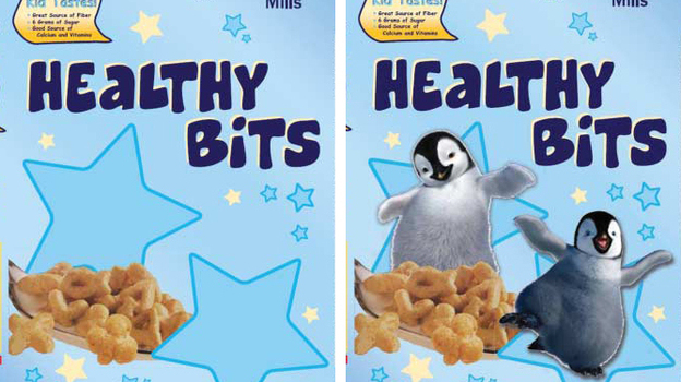
I’ve argued that the visual aids used in computer programs designed to help us learn new languages are ethnocentric, generic, and uninformative.  Since then, I have been working on an alternative to these images, compiling a database of culturally organized images called the Culturally Authentic Pictorial Lexicon (CAPL).

What strikes me as both a student and a professor of language and culture is that the visual world differs so greatly across cultures and even minor differences are telling in how we organize and perceive our world. Color is one of the easiest ways to find differences in cultures. I have previously discussed the linguistic and cognitive differences of color, but now I want to show some simple examples of color in culture through analysis of various postal systems.

In China, the postal system uses a deep hunter green:

(source)

 In Japan, it is a bright red, much like England.

England:

(source)

Japan:

(source)

 In Germany, it is a bright yellow (think DHL):

(source)

In Russia, it is a lighter but similar shade of the deep postal blue in the U.S.

Russia:

(source)

 The U.S.:

(source)

This example of postal systems is an easy way to illustrate how color becomes one of the central ways to communicate and, although the same message is shared across cultures, the path to that message varies through color.

Michael Shaughnessy is an Associate Professor of German and Chair of Modern Languages at Washington & Jefferson College.  In addition to German language, literature, and culture, he has a professional interest in educational technology, especially the authenticity of multimedia imagery.  His book German Pittsburgh (Arcadia Publishing) highlights the contributions of German speaking immigrants to our area.

I suspect most Soc Images readers will, by now, be familiar with the Bechdel Test — the set of criteria for evaluating whether female characters are included in movies in even minimally non-male-centered ways, made popular by Alison Bechdel of Dykes to Watch Out For. To pass, a movie has to have at least two female characters who have at least one conversation with one another about something other than a man. For a quick overview, see our repost of Anita Sarkeesian discussing the Bechdel Test.

Leah B. let us know that there’s a website, Bechdel Test Movie List, entirely devoted to rating movies based on the criteria (with the stipulation that female characters have to actually be named to count). It consists of a list of movies that have been added and rated by readers; there are currently over 2,000 movies produced between 1900 and 2011 rated on the website. This is, obviously, nowhere near a random sample; as you’d expect, it’s highly weighted toward more recent movies, and of course not everyone agrees on the ratings (you can add a symbol to show you disagree and leave a comment on a movie’s rating page).

That said, the site includes a stats page that is interesting to look through just for a snapshot of the inclusion of women in these movies. Here’s a breakdown of the entire list; green indicates movies that passed all three tests, yellow passed 2, orange passed 1, and red didn’t pass any of the three:

It’s fun to browse through, for entertainment value and a starting place for thinking about the Bechdel Test and pop culture.

Feminist Frequency’s Anita Sarkeesian is back with another trope. In this one she covers the “evil demon seductress.” Sarkeesian argues that the trope reproduces the stereotype that women use their sexuality to manipulate men. This encourages us to always view their sexual expression with suspicion such that we deny women authentic sexualities.

Thanks to Anita for linking to our post about the femme fatal praying mantis.

Lisa Wade, PhD is an Associate Professor at Tulane University. She is the author of American Hookup, a book about college sexual culture; a textbook about gender; and a forthcoming introductory text: Terrible Magnificent Sociology. You can follow her on Twitter and Instagram.

We have posted in the past about the controversy surrounding the casting of the movie The Last Airbender. Many fans of the original series were upset that Asian characters were recast as White, with the main cast initially containing no non-White characters at all. This fits in with a more general lack of Asian main characters in Hollywood.

More recently, a different controversy about race and casting emerged when African American British actor Idris Elba was cast as the Norse god Heimdall in Thor, though this character was always White in the comic book series.

Anthony N. sent in a video by MovieBob at The Escapist that discusses concerns over race in casting Thor and why recasting a White character with a non-White actor doesn’t have the same implications as recasting a non-White character with a White actor does:

,/p>


Discussing media attention to Donald Trump, Jay Smooth (Ill Doctrine) describes what sociologists call agenda setting.  The phrase refers to the media’s ability to shape what we think about (and what we don’t think about), if not what to think about it.  That is, the media can’t necessarily tell us what to think, but it can certainly keep some issues on-the-agenda while leaving others invisible to us.

In this case, Smooth points out, the media’s coverage of Trump led to public interest in him; that public interest waned as soon as Trump was out of the news.

See also Agenda Setting and Obama’s Socialist Leanings and Media Reaction to Janet Jackson’s “Wardrobe Malfunction.”

Lisa Wade, PhD is an Associate Professor at Tulane University. She is the author of American Hookup, a book about college sexual culture; a textbook about gender; and a forthcoming introductory text: Terrible Magnificent Sociology. You can follow her on Twitter and Instagram.

We’re trying to get our inbox under control, so I decided it was time for another of my occasional round-ups of gendered kids’ items, so here you go. My favorite example was an ad from a flyer for Save On Foods in Victoria, Canada, sent in by Joanna M. The advertised products are boysz and girlsz inhalers, for all your gendered breathing needs. The boyz’ version is in green and gray with a graphic of a skateboarder, while the girlz’ inhaler is, of course pink, with a flower:

Amanda K.H. took this photo of 3 kid-sized Civil War hats for sale at the Abraham Lincoln Presidential Museum in Springfield, IL. In addition to the Union blue and the Confederate gray, there was a pink version:

The Pragmatist let us know about onesies for sale at Mommy and Kids Allure Boutique. The onesies include lists of “ingredients” for boys and girls. What are boys made of? Love, energy, and dirt:

For girls, it’s love, beauty, and kindness:

Elliott M. noticed that the Garanimals website doesn’t just just divide the clothing into boys’ and girls’ sections, but uses gendered language to describe them. The boys’ clothing is described with active language (“ready, set, go!”), and they’ll look “cool”. Girls, on the other hand, are “sugar and spice, everything nice” and a “princess,” and they’ll be “looking great and feeling better,” “cute,” “eye catching,” and “adorable”:

An anonymous reader saw these sets of stickers, divided into themes for boys and girls:

What are boy themes? Space, travel/transportation, dinosaurs, sports, and pirates, among others. Girls, on the other hand, are associated with stars, flowers, butterflies, clothes, makeup, personal hygiene, cheerleading, and shopping. Since the reader was buying them to give out to a Girl Guide group (equivalent to Girl Scouts in the U.S.) for badges about science, being active, and personal hygiene, she had to buy both sets.

Finally, Sarah M. sent in a photo she took at Target of two toys that define boys by what they do and girls by what they are. The toys are those types of little sit-and-scoot toy cars kids push around with their feet. The boys’ version is red and is, appropriately, called a Lil’ Fire Truck Ride-On. The pink version, on the other hand, is the Lil’ Princess Ride-On — because apparently there’s no appropriate vehicle to define as “girly,” so the easiest way to gender the toy was just to call it a thing for princesses and be done with it:

UPDATE: Philip Cohen pointed out another example on his blog, Family Inequality. Baby blankets at Amazon were available in blue for the “little man” and pink for the “little cupcake,” in case your baked goods are cold:

Dmitriy T.M. sent in a link to the website If It Were My Home. The site allows you to select two nations and then explains how your life would compare if you lived in each one in terms of rates of HIV/AIDS, employment, energy consumption, infant mortality, class inequality, and other factors (based on CIA data). As an example, Dmitriy chose to compare the U.S. and Ukraine, “the 2 greatest countries in the world, as determined by the poll conducted in my head”:

You can then choose one of the items for more details; I selected life expectancy:

The site is set up with the U.S. as one of the default comparisons, but at the top there’s a button that lets you select a non-U.S. comparison. (Note: Reader Parodie says it appears to detect whatever country you’re accessing the site from and set that as one of the default comparisons.) It’s a fun site that you can spend quite a bit of time playing around with.

UPDATE: Just a caution–a couple of readers seem to have found situations where the math doesn’t add up in the comparisons of some countries. And other readers noted that this does an enormous amount of averaging, which definitely hides the differences in quality of life in various countries, which are so extreme in some nations that “averages” might be nearly meaningless.

I bumped up against two pieces of information today regarding caloric intake. I can’t confirm either, but I found both quite interesting. First, State Info features a map showing the average number of calories consumed each day in different countries across the globe. In the U.S., for example, the average is 3,754, in Argentina it is 2,959, in China it is 2,940, and in Congo it is 1,606.  Citizens of some countries, then, eat more than twice as many calories as citizens of others.

The fact that the average in almost every country exceeds the 2,000 calorie goal suggested by the U.S. Food and Drug Administration is fascinating in itself.

I was surprised at the average number of calories consumed in the U.S., where I live.  But then I came across the second graphic at GOOD which purports to reveal the number of calories and distribution of food types in the average school lunch and prison meal.  The comparison between the two is interesting enough, but I was struck by just how high the numbers were.  An average of 1,400 calories in your typical school lunch may very well indeed translate into over 3,000 calories a day.

Lisa Wade, PhD is an Associate Professor at Tulane University. She is the author of American Hookup, a book about college sexual culture; a textbook about gender; and a forthcoming introductory text: Terrible Magnificent Sociology. You can follow her on Twitter and Instagram.