
I’ve argued that the visual aids used in computer programs designed to help us learn new languages are ethnocentric, generic, and uninformative. Since then, I have been working on an alternative to these images, compiling a database of culturally organized images called the Culturally Authentic Pictorial Lexicon (CAPL).
What strikes me as both a student and a professor of language and culture is that the visual world differs so greatly across cultures and even minor differences are telling in how we organize and perceive our world. Color is one of the easiest ways to find differences in cultures. I have previously discussed the linguistic and cognitive differences of color, but now I want to show some simple examples of color in culture through analysis of various postal systems.
In China, the postal system uses a deep hunter green:
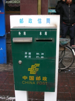 (source)
In Japan, it is a bright red, much like England.
England:
 (source)
Japan:
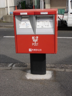 (source)
In Germany, it is a bright yellow (think DHL):
 (source)
In Russia, it is a lighter but similar shade of the deep postal blue in the U.S.
Russia:
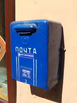 (source)
The U.S.:
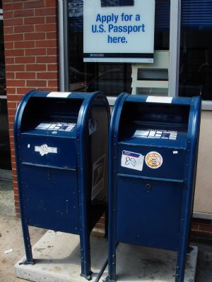 (source)
This example of postal systems is an easy way to illustrate how color becomes one of the central ways to communicate and, although the same message is shared across cultures, the path to that message varies through color.
Michael Shaughnessy is an Associate Professor of German and Chair of Modern Languages at Washington & Jefferson College. In addition to German language, literature, and culture, he has a professional interest in educational technology, especially the authenticity of multimedia imagery. His book German Pittsburgh (Arcadia Publishing) highlights the contributions of German speaking immigrants to our area.
Comments 103
Bill Angel — May 21, 2011
Mailboxes on the United States were not always solid blue. Interestingly enough one group of people who concern themselves with this are model railroad hobbyists.
See http://www.nscalelimited.com/2009/03/21/mailbox-color-for-your-era/
Nentuaby — May 21, 2011
Mmm... It's not as if these colors are exactly *synonymous* with mail even in their respective countries. An American, e.g., might as easily drop an overnight envelope into a brown box or a white one with purple trim, if they're sending it by one of the USPS's fully private competitors.
Culture & Symbols | Crimiology — May 21, 2011
[...] Blog post about how colors carry different meanings in different cultures — in this example to indicate mail delivery. Also, see here for color wheel of what colors mean across different cultures. Could also discuss different colors traditionally worn at funerals in different cultures. This entry was posted in Culture, Introduction and tagged Symbols. Bookmark the permalink. ← Skin Bleaching LikeBe the first to like this post. [...]
Helen — May 21, 2011
Just thought I'd suggest a correction - when you say 'England' you are making the (often made) mistake of making England stand for the whole of the UK (England, Scotland, Wales and Northern Ireland). The post boxes are the same colour and form throughout.
It's a pet peeve of those from the other three nations, as it feels a little marginalising.
m — May 21, 2011
It's interesting to see how some countries seems to have both post boxes in the same color. Here in Sweden, they are color coded as light yellow and light blue respectively (a little nationalism), with the addition of a red postbox for christmas cards.
Zara — May 21, 2011
I'm astonished by how much the US mailboxes look like rubbish bins to me. Colour influence at work.
Berengar Lehr — May 21, 2011
It's quite a simple but very astonishing fact, indeed, thank you for that cause for thought!
My two cents to that topic is my thought about new police uniforms in Germany. Dark blue or even black uniforms are not only in the US but in the EU widely used. After WW2 Germany police uniforms were given uncommon yellow an green colors (you'll find images on the German wikipedia entry: http://de.wikipedia.org/wiki/Polizeiuniform_(Deutschland) at the bottom).
But in the European process of standardization the uniforms are changed to (dark) blue as well. I for my self must say it is quite hard to accept such an drastic change and get used call beloved "team green" "team blue" in the future.
Another such change people have to adjust to will be the replacement of the pharmacy symbol (old: Red "A" in Grotesk font; new: green cross; see germany wikipedia: "Apotheke")
azizi — May 21, 2011
Here's an excerpt from http://en.wikipedia.org/wiki/Post_box
"A post box (British English and others, also written postbox, known in the United States and Canada as collection box, mailbox, post box, or drop box) is a physical box into which members of the public can deposit outgoing mail intended for collection by the agents of a country's postal service. The term post box can also refer to a private letter box for incoming mail.
.."The United States Post Office Department began installing public mail collection boxes in the 1850s outside post offices and on street corners in large cities. Collection boxes were initially mounted on lamp-posts.[4] As mail volume grew, the Post Office Department gradually replaced these small boxes with larger models. The four-footed, free-standing U.S. Mail collection box was first suggested in 1894, following the successful use of such designs in Canada, and quickly became a fixture on U.S. city street corners.[4][5] Unlike Canadian mailboxes, which were painted red,[6] U.S. mail collection boxes were originally painted a dark green to avoid confusion with emergency and fire equipment, then to red and blue in the 1950s, and finally, all-blue with contrasting lettering.[5][7] The coming of the automobile also influenced U.S. mailbox design, and in the late 1930s, an extension chute or 'snorkel' to drive-up curbside collection boxes was adopted.[4]"
[Italics added for emphasis]
-snip-
That Wikipedia page has photos of the public mail boxes in certain nations. Australia's mail box is also red. Is this the case with most other former British colonies?
As a personal aside, when I visited Alberta, Canada a few years ago, besides the money and the Canadian flag displayed outdoors, what made me realize I was no longer in the USA was the color of the public mailboxes. Silly me, I had assumed that all public mailboxes were the blue used in the United States.
Ana — May 21, 2011
Here in Japan, the boxes are actually orange, not red. The delivery vans and mopeds are red, but the standalone boxes and Japan Post signs are orange.
jane — May 22, 2011
I heard that in the Republic of Ireland, as soon as independence was gained the first thing they did was paint all the postboxes green!
Estella — May 22, 2011
Here in France they're yellow like in Germany. Interestingly, here at least, and probably elsewhere as well, the old ones that are no longer in use aren't any distinctive color; they're just whatever color the materials (stone, metal, etc.) used to construct them are naturally.
It would also be interesting to do this kind of comparison with trash receptacles. Here they're mostly green, which leads a lot of people from the US, including myself at first, to associate at least subconsciously with recycling.
Elena — May 22, 2011
In Spain they're yellow, like this. Correos' logo is a stylized post horn with a crown on top, like in many other European countries.
Madeline — May 22, 2011
That's just branding baby.
Emma — May 22, 2011
I'm sorry, am I being dense? I don't get it.
You say in your post you want to analyse the use of color on post boxes - yet, you only post pictures? I don't see any contextual explanation of the cultural significance, and frankly, I don't know what I am to make of this?
It's like, yeah, the post boxes have different colors - and?
Rayna — May 25, 2011
Just wanted to share an anecdote re ethnocentric perspectives in second language teaching - when I was teaching ESL in a Japanese junior high school, I was making picture cards to teach verbs and related vocab, and one was of an apple. I prefer granny smith apples, so I made it green, without thinking about it any further. I forgot, or hadn't explicitly thought about, the fact that you don't have multiple varieties of apples in Japanese supermarkets - only one. They don't have green apples! So when I held up this card, they all thought it was a melon. I was like, noooo it's an apple.... My kids were - noooo, that's a melon. Apples ain't green.
It was a really good OH! moment - of course it's a melon, they don't have green apples.
Norms are always about what we DON'T think about, more than what we do. I like the examples above, of the post-boxes - really clear illustration of the 'defaults' we take for granted. Especially from a teaching perspective - as we do teach kids of all different backgrounds, and recognising our 'taken for granteds' is a key part of this.
Also, as an Australian, which is a marginalised market/culture within a dominant English-language group (as in English-language is a massive market/population globally speaking, but we are culturally marginal within it and the US dominates) - a lot of very US-specific defaults (blue postbox) are very recognisable here, even though they're not our own, due to the broad (and unidirectional) access to US culture that we have. That affects the little things and schema we might not explicitly think about - clipart for instance. Didn't really think about it myself until comparing all the postboxes above.
Lite blue Login — September 11, 2018
Now USPS services are available in LiteBlue.
mikes — September 11, 2018
Now you can use USPS services on LiteBlue. Just LiteBlue Login and enjoy all USPS services.
Nicolash Marting — January 24, 2019
the eligibility specifications discussed over. The USPS Part-time usps liteblue any kind of placement description, so you are not disqualified.
Greg Freund — April 18, 2019
Liteblue is the official employee login portal of the United States Postal Service.
liteblue
Wendy J Erler — June 4, 2020
I heard that in the Republic of Ireland, as soon as independence was gained the first thing they did was paint all the postboxes green! Black Seed
kik login — July 25, 2020
kik login
ishani kappor — July 25, 2020
OmeTV Denmark
ishani kappor — July 25, 2020
walmart one
ishani kappor — July 25, 2020
tchatsites.com/
hack for kahoot — July 26, 2020
Thank you for your nice comment on my blog!
hack for kahoot
janicesharp — July 26, 2020
you may login here
teatv for pc
janicesharp — July 26, 2020
Thank you for sharing the post!
Livetheorangelife login
janicesharp — July 26, 2020
hotmail
DigitalM45 — August 10, 2020
shirt
Emma Lucey — August 22, 2020
plumviolet
Jessica — September 21, 2020
How about changing the colors to yellow? I mean they look attractive don't they? hotmail.com
wireone.me — February 25, 2021
wireone.me
mythdhr login — February 25, 2021
mythdhr login
Bazoocam — March 28, 2021
Bazoocam
Mizuki Taro — April 19, 2021
I think changing the colors might be a great idea because it'll become more attractive right? hotmail
hotmail — May 2, 2021
hotmail
facebook login — May 4, 2021
new one
hotmail — May 4, 2021
facebook login
hotmail — May 4, 2021
hotmail
hotmail login — May 30, 2021
www.hotmail.com
hotmail — June 14, 2021
hotmail
https://login-db.info/sfax — June 14, 2021
GOOD ARTICLE AND IMPORTANT
Lucifer — June 22, 2021
it could be more attractive but it fine in its own way
https://mailsbug.com/hotmail-login/
Lucifer — June 22, 2021
https://mailsbug.com/hotmail login/
it would be more colourful
Gmail — July 5, 2021
It's not as if these colors are exactly *synonymous* with mail even in their respective countries. I think that Gmail is working everyday on the issue.
https://login-db.info/ — July 6, 2021
Thanks for sharing!
Gmail login — July 23, 2021
It's interesting to see how some countries seems to have both post boxes in the same color.
gmail — July 23, 2021
I heard that in the Republic of Ireland, as soon as independence was gained the first thing they did was paint all the postboxes green! i got this on my Gmail Login
Sarah Well — July 29, 2021
Thanks will check it out. hotmail
Mizuki Taro — July 29, 2021
Please share more details. kisscartoon
Gmail — August 1, 2021
I subscribed this blog on my Gmail
Matthew Davis — August 3, 2021
Thank you for sharing the post! Michael Ruge Duncan BC
Michael Ruge — August 11, 2021
Great Article. Thanks for sharing valuable information. Keep Posting Michael Ruge
Nicholas Perry — August 23, 2021
Thank you for sharing the post! Graphic Design Resources
hkpools — August 26, 2021
the information is very good. thank you for sharing the information.
data hongkong
Dawn Steward — September 22, 2021
Liteblue is the official employee login portal of the United States Postal Service. Free Video & Music Downloader
Mark — October 22, 2021
i think this creates a variation in the process.
hotmail sign up
icloud — October 22, 2021
it effects how the people can easily identify
rediffmail — October 22, 2021
these images are very clear
Scott Rick — November 2, 2021
Examples are really amazing. You're absolutely right. thankyou so much for sharing this here. gmail login
Miss Edward — November 2, 2021
Color is one of the easiest ways to find differences in cultures. There's a whole science in the meanings of different colors. wells fargo login
Ronnie — November 14, 2021
I personally like the way you have portrayed the topic with images from different countries mail boxes.
hotmail
delete snapchat — December 9, 2021
these images are very clear
Ormus — January 27, 2022
ORMUS Monoatomic Gold - Liquid Chi ORMUS is a powerful liquid tonic containing monoatomic gold, also known as ORMEs.
Dev493 — March 23, 2022
these images are very clear Visit!
Sasha Kim — June 3, 2022
You've done a really good job, keep it up. Colors are indeed a part of ones culture. facebook login
mark mark — November 14, 2022
We see an opportunity to feed more into that segment and be the de-facto norm for how people care for their dogs,” Easterly added.
There is also opportunity to go beyond dogs. Rover already has seen everything from pigs to shrimp on its platform, but “we haven’t made that experience easy for people,” Easterly said.
Companies like Rover, which also has investment from Petco, and DogVacay often draw laughs from critics who believe they aren’t legitimate tech businesses, harkening back to the dot-com boom days of Pets.com. But just as Uber and Lyft are now upending the traditional taxi cab market by allowing just about anybody to become a cab driver, so too are the online pet sitting marketplaces, transforming how Americans find overnight care for their beloved pets.
“Every once in a while, you have the opportunity to back a category-defining company,” Menlo Ventures Managing Director Venky Ganesan said in a statement. “At Menlo we have been fortunate to back companies like Uber, Siri, hotmail signup and Gilead Sciences. Rover is on that trajectory and that’s why we decided to double down and go all in on this investment.”
balen — February 11, 2023
gmail.com features include: custom email (@yourcompany.com), unlimited group email addresses, 99.9% guaranteed uptime, twice the storage of personal Gmail
ellen — February 11, 2023
The Ministry of Labor and Employment has launched the e-Shram Portal at Register. eshram.gov.in
boby — February 11, 2023
rediffmail.com is a popular email service commonly used for personal account creation
Hotmail — February 26, 2023
You've done a really good job, keep it up. Colors are indeed a part of ones culture. outlook login
mark mark — March 24, 2023
Scholarships are given out by the program to students from underprivileged and marginalized backgrounds across the nation. In order to utilize a program effectively, you must be familiar with all of its nuances. Based on this data, you can check the status of your registration and pfms login.
yahoo mail — April 8, 2023
No matter where you click, they will always remain sorted according to their yahoo mail predraft rank.
hotmail.com — April 8, 2023
It has just come to my attention that I continue to use an email address with hotmail.com has my main account and google as my backup account.
gmail.com — April 8, 2023
Where can I keep 40,000 emails from gmail.com as well as 2000 voicemails from Google Voice?
facebook.com — April 11, 2023
Upgrading our technology stack in preparation for the launch of the new facebook.com
office 365 — April 11, 2023
How can I prevent my office 365 login files from being stored on one drive and instead save them locally on my computer? I don't want them to be saved in one disc.
gmail.com — April 11, 2023
Hello to all of you. After receiving an email from gmail.com , I am unable to get away from this page in any manner that I can think of.
rediffmail — April 19, 2023
The following problem notice appears whenever I try to setup my rediffmail account in Outlook; could you possibly assist me in resolving this issue?
www.outlook.com — May 31, 2023
Continued Problems with www.outlook.com for Mac - Deficiency in the Sending of Attachments
www.facebook.com — May 31, 2023
I am certain that if we band together and make ourselves heard loudly enough, we will be able to convince www.facebook.com to take our safety more seriously. So lets become loud.
www.gmail.com — May 31, 2023
I am in possession of the recovery www.gmail.com email address and phone number. Help is required.
Yahoo Mail — September 21, 2023
features include: custom email , unlimited group email addresses, Yahoo Mail
BTC — September 30, 2023
Experience the Future of Email with Gmail/a>
Davit Mata — October 17, 2023
It’s a hot-button issue for Microsoft, which has taken a hard stand on revelations of government surveillance, and lampooned Google for delivering ads based on the contents of customers’ email messages. Frank opens his post by saying, “We believe that and hotmail email are and should be private.”
jannyfer lops — October 26, 2023
Mark Zuckerberg, along with several Harvard University students including Chris Hughes, Andrew McCollum, Dustin Moskovitz, and Eduardo Saverin, founded facebook login in February 2004. Initially established for college students to connect and exchange information, has since grown into a global platform used by people of all ages and backgrounds.
mark john — January 11, 2024
facebook login continues, “Courts do not, however, issue orders authorizing someone to search themselves, since obviously no such order is needed. So even when we believe we have probable cause, there’s not an applicable court process for an investigation such as this one relating to the information stored on servers located on our own premises.”