There is one similarity between the Israel/Gaza crisis and the U.S. unaccompanied child immigrant crisis: National borders enforcing social inequality. When unequal populations are separated, the disparity creates social pressure at the border. The stronger the pressure, the greater the military force needed to maintain the separation.

To get a conservative estimate of the pressure at the Israel/Gaza border, I compared some numbers for Israel versus Gaza and the West Bank combined, from the World Bank (here’s a recent rundown of living conditions in Gaza specifically). I call that conservative because things are worse in Gaza than in the West Bank.

Then, just as demographic wishful thinking, I calculated what the single-state solution would look like on the day you opened the borders between Israel, the West Bank, and Gaza. I added country percentiles showing how each state ranks on the world scale (click to enlarge).

1

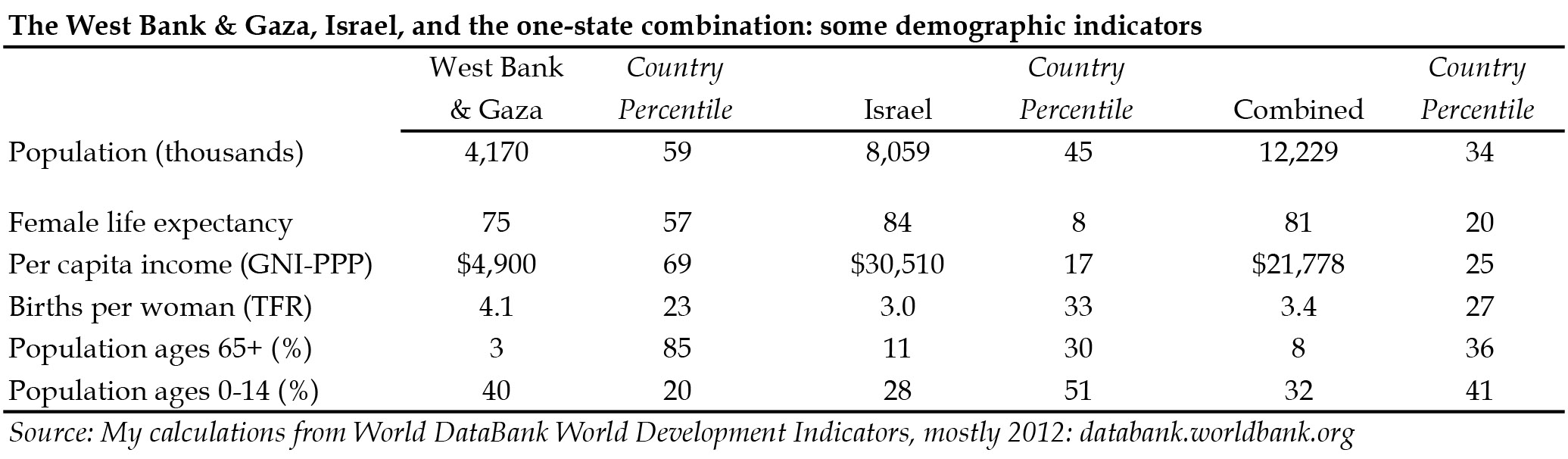
Israel’s per capita income is 6.2-times greater, its life expectancy is 6 years longer, its fertility rate is a quarter lower, and its age structure is reversed. Together, the Palestinian territories have a little more than half the Israeli population (living on less than 30% of the land). That means that combining them all into one country would move both populations’ averages a lot. For example, the new country would be substantially poorer (29% poorer) and younger than Israel, while increasing the national income of Palestinians by 444%. Israelis would fall from the 17th percentile worldwide in income, and the Palestinians would rise from the 69th, to meet at the 25th percentile.

Clearly, the separation keeps poor people away from rich people. Whether it increases or decreases conflict is a matter of debate.

Meanwhile

Meanwhile, the USA has its own enforced exclusion of poor people.

3
Photo of US/Tijuana border by Kordian from Flickr Creative Commons.

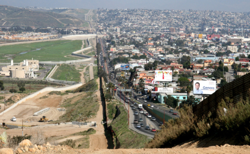
The current crisis at the southern border of the USA mostly involves children from Guatemala, Honduras, and El Salvador. They don’t actually share a border with the USA, of course, but their region does, and crossing into Mexico seems pretty easy, so it’s the same idea.

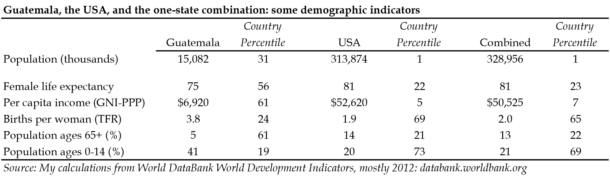
To make a parallel comparison to Israel and the West Bank/Gaza, I just used Guatemala, which is larger by population than Honduras and El Salvador combined, and also closest to the USA. The economic gap between the USA and Guatemala is even larger than the Israeli/Palestinian gap. However, because the USA is 21-times larger than Guatemala by population, we could easily absorb the entire Guatemalan population without much damaging our national averages. Per capita income in the USA, for example, would fall only 4%, while rising more than 7-times for Guatemala (click to enlarge):

4

This simplistic analysis yields a straightforward hypothesis: violence and military force at national borders rises as the income disparity across the border increases. Maybe someone has already tested that.

The demographic solution is obvious: open the borders, release the pressure, and devote resources to improving quality of life and social harmony instead of enforcing inequality. You’re welcome!

Cross-posted at Family Inequality.

Philip N. Cohen is a professor of sociology at the University of Maryland, College Park, and writes the blog Family Inequality. You can follow him on Twitter or Facebook.

At Pew Social Trends, Gretchen Livingston has a new report on fathers staying at home with their kids. They define stay at home fathers as any father ages 18-69 living with his children who did not work for pay in the previous year (regardless of marital status or the employment status of others in the household). That produces this trend:

1 (2) - Copy

At least for the 1990s and early-2000s recessions, the figure very nicely shows spikes upward of stay-at-home dads during recessions, followed by declines that don’t wipe out the whole gain — we don’t know what will happen in the current decline as men’s employment rates rise.

In Pew’s numbers 21% of the stay at home fathers report their reason for being out of the labor force was caring for their home and family; 23% couldn’t find work, 35% couldn’t work because of health problems, and 22% were in school or retired.

It is reasonable to call a father staying at home with his kids a stay at home father, regardless of his reason. We never needed stay at home mothers to pass some motive-based criteria before we defined them as staying at home. And yet there is a tendency (not evidenced in this report) to read into this a bigger change in gender dynamics than there is. The Census Bureau has for years calculated a much more rigid definition that only applied to married parents of kids under 15: those out of the labor force all year, whose spouse was in the labor force all year, and who specified their reason as taking care of home and family. You can think of this as the hardcore stay at home parents, the ones who do it long term, and have a carework motivation for doing it. When you do it that way, stay at home mothers outnumber stay at home fathers 100-to-1.

I updated a figure from an earlier post for Bryce Covert at Think Progress, who wrote a nice piece with a lot of links on the gender division of labor. This shows the percentage of all married-couple families with kids under 15 who have one of the hardcore stay at home parents:

SHP-1. PARENTS AND CHILDREN IN STAY-AT-HOME PARENT FAMILY GROUPS

That is a real upward trend for stay at home fathers, but that pattern remains very rare.

See the Census spreadsheet for yourself here.  Cross-posted at Pacific Standard.

Philip N. Cohen is a professor of sociology at the University of Maryland, College Park, and writes the blog Family Inequality. You can follow him on Twitter or Facebook.

In this post I present the most comprehensive analysis ever reported of the gender of New York Times writers (I think), with a sample of almost 30,000 articles.

This subject has been in the news, with a good piece the other day by Liza Mundy — in the New York Times — who wrote on the media’s Woman Problem, prompted by the latest report from the Women’s Media Center. The WMC checked newspapers’ female byline representation from the last quarter of 2013, and found levels ranging from a low of 31% female at the NYT to a high of 46% at the Chicago Sun-Times. That’s a broad study that covers a lot of other media, and worth reading. But we can go deeper on the NYTimes, thanks to the awesome data collecting powers of my colleague Neal Caren.

Here are the results based on 21,440 articles published online from October 23, 2013 to February 25, 2014.

Women’s authorship

1. Women were the first author on 34% of the articles. This is a little higher than the WMC got with their A-section analysis, which is not surprising given the distribution of writers across sections.

2. Women wrote the majority of stories in five out of 21 major sections, from Fashion (52% women), to Dining, Home, Travel, and Health (76% women). Those five sections account for 11% of the total.

3. Men wrote the majority of stories in the seven largest sections. Two sections were more than three-fourths male (Sports, 89%; and Opinion, 76%). U.S., World, and Business were between 66% and 73% male.

Here is the breakdown by section (click to enlarge):

1 (2)

Gender words

Since we have all this text, we can go a little beyond the section headers served up by the NYTimes‘ API. What are men and women writing about? Using the words in the headlines, I compiled a list of those headline words with the biggest gender difference in rates of appearance.

For example, “Children” occurred 36 times in women’s headlines, and 24 times in men’s headlines. Since men used more than twice as many headline words as women, this produced a very big gender spread in favor of women for the word “Children.”  On the other hand, women’s headlines had 10 instances of “Iran,” versus 85 for men. Repeating this comparison zillions of times, I generated these lists:

NYTimes headline words used disproportionately in stories by

WOMEN MEN
Scene US
Israel Deal
London Business
Hotel Iran
Her Game
Beauty Knicks
Children Court
Home NFL
Women Billion
Holiday Nets
Food Music
Sales Case
Wedding Test
Museum His
Cover Games
Quiz Bitcoin
Work Jets
Christie Chief
German Firm
Menu Nuclear
Commercial Talks
Fall Egypt
Shoe Bowl
Israeli Broadway
Family Oil
Restaurant Shows
Variety Super
Cancer Football
Artists Hits
Shopping UN
Breakfast Face
Loans Russia
Google Ukraine
Living Yankees
Party Milan
Vows Mets
Clothes Kerry
Life Gas
Child Investors
Credit Plans
Health Calls
Chinese Fans
India Model
France Fed
Park Protesters
Doctors Team
Hunting Texas
Christmas Play

Here is the same table arranged as a word cloud, with pink for women and blue for men (sue me), and the more disproportionate words larger (click to enlarge):

1 (3) - Copy

What does it mean?

It’s just one newspaper but it matters a lot. According to Alexa, NYTimes.com is the 34th most popular website in the U.S., and the 119th most popular in the world — and the most popular website of a printed newspaper in the U.S. In the JSTOR database of academic scholarship, “New York Times” appeared almost four-times more frequently than the next most-commonly mentioned newspaper, the Washington Post.

Research shows that when women are charge, they tend to produce better outcomes for women below them in the organizational hierarchy. Jill Abramson, the NYTimes‘ executive editor, is aware of this issue, and proudly told the Women’s Media Center that she had reached the “significant milestone” of having a half-female news masthead (which is significant). So why are women underrepresented in such prominent sections?  I’m really wondering. The NYTimes doesn’t even do as well as the national average: 41% of the 55,000 “News Analysts, Reporters and Correspondents” working full-time, year-round in 2012 were women.

Organizational research finds that large companies are less likely to discriminate against women, and we suspect three main reasons: greater visibility to the public, which may complain about bias; greater visibility to the government, which may enforce anti-discrimination laws; and greater use of formal personnel procedures, which limits managerial discretion and is supposed to weaken old-boy networks. Among writers, however, an informal, back-channel norm still apparently prevails — at least according to a recent essay by Ann Friedman. Maybe NYTimes‘ big-company, formalized practices apply more to departments other than those that select and hire writers.

A more in-depth discussion of these findings, with details on Cohen and Caren’s research methods, can be found at Family Inequality. Cross-posted at Pacific Standard.

Philip N. Cohen is a professor of sociology at the University of Maryland, College Park, and writes the blog Family Inequality. You can follow him on Twitter or Facebook.

The short answer is, pretty well. But that’s not really the point.

In a previous post I complained about various ways of collapsing data before plotting it. Although this is useful at times, and inevitable to varying degrees, the main danger is the risk of inflating how strong an effect seems. So that’s the point about teen test scores and adult income.

If someone told you that the test scores people get in their late teens were highly correlated with their incomes later in life, you probably wouldn’t be surprised. If I said the correlation was .35, on a scale of 0 to 1, that would seem like a strong relationship. And it is. That’s what I got using the National Longitudinal Survey of Youth. I compared the Armed Forces Qualifying Test scores, taken in 1999, when the respondents were ages 15-19 with their household income in 2011, when they were 27-31.

Here is the linear fit between between these two measures, with the 95% confidence interval shaded, showing just how confident we can be in this incredibly strong relationship:

1 (2) - Copy

That’s definitely enough for a screaming headline, “How your kids’ test scores tell you whether they will be rich or poor.” And it is a very strong relationship – that correlation of .35 means AFQT explains 12% of the variation in household income.

But take heart, ye parents in the age of uncertainty: 12% of the variation leaves a lot left over. This variable can’t account for how creative your children are, how sociable, how attractive, how driven, how entitled, how connected, or how White they may be. To get a sense of all the other things that matter, here is the same data, with the same regression line, but now with all 5,248 individual points plotted as well (which means we have to rescale the y-axis):

1 (2)

Each dot is a person’s life — or two aspects of it, anyway — with the virtually infinite sources of variability that make up the wonder of social existence. All of a sudden that strong relationship doesn’t feel like something you can bank on with any given individual. Yes, there are very few people from the bottom of the test-score distribution who are now in the richest households (those clipped by the survey’s topcode and pegged at 3 on my scale), and hardly anyone from the top of the test-score distribution who is now completely broke.

But I would guess that for most kids a better predictor of future income would be spending an hour interviewing their parents and high school teachers, or spending a day getting to know them as a teenager. But that’s just a guess (and that’s an inefficient way to capture large-scale patterns).

I’m not here to argue about how much various measures matter for future income, or whether there is such a thing as general intelligence, or how heritable it is (my opinion is that a test such as this, at this age, measures what people have learned much more than a disposition toward learning inherent at birth). I just want to give a visual example of how even a very strong relationship in social science usually represents a very messy reality.

Cross-posted at Family Inequality and Pacific Standard.

Philip N. Cohen is a professor of sociology at the University of Maryland, College Park, and writes the blog Family Inequality. You can follow him on Twitter or Facebook.

Let’s imagine that a woman — we’ll call her “you,” like they do in relationship advice land — is trying to calculate the odds that a man will call back after sex. Everyone tells you that if you sleep with a guy on the first date he is less likely to call back. The theory is that giving sex away at a such a low “price” lowers the man’s opinion of you, because everyone thinks sluts are disgusting.* Also, shame on you.

So, you ask, does the chance he will call back improve if you wait till more dates before having sex with him? You ask around and find that this is actually true: The times you or your friends waited till the seventh date, two-thirds of the guys called back, but when you slept with him on the first date, only one-in-five called back. From the data, it sure looks like sleeping with a guy on the first date reduces the odds he’ll call back.

1 (2)

So, does this mean that women make men disrespect them by having sex right away? If that’s true, then the historical trend toward sex earlier in relationships could be really bad for women, and maybe feminism really is ruining society.

Like all theories, this one assumes a lot. It assumes you (women) decide when couples will have sex, because it assumes men always want to, and it assumes men’s opinion of you is based on your sexual behavior. With these assumptions in place, the data appear to confirm the theory.

But what if that those assumptions aren’t true? What if couples just have more dates when they enjoy each other’s company, and men actually just call back when they like you? If this is the case, then what really determines whether the guy calls back is how well-matched the couple is, and how the relationship is going, which also determines how many dates you have.

What was missing in the study design was relationship survival odds. Here is a closer look at the same data (not real data), with couple survival added:

5
(Graph corrected from an earlier version.)

.

By this interpretation, the decision about when to have sex is arbitrary and doesn’t affect anything. All that matters is how much the couple like and are attracted to each other, which determines how many dates they have, and whether the guy calls back. Every couple has a first date, but only a few make it to the seventh date. It appears that the first-date-sex couples usually don’t last because people don’t know each other very well on first dates and they have a high rate of failure regardless of sex. The seventh-date-sex couples, on the other hand, usually like each other more and they’re very likely to have more dates. And: there are many more first-date couples than seventh-date couples.

So the original study design was wrong. It should have compared call-back rates after first dates, not after first sex. But when you assume sex runs everything, you don’t design the study that way. And by “design the study” I mean “decide how to judge people.”

I have no idea why men call women back after dates. It is possible that when you have sex affects the curves in the figure, of course. (And I know even talking about relationships this way isn’t helping.) But even if sex doesn’t affect the curves, I would expect higher callback rates after more dates.

Anyway, if you want to go on blaming everything bad on women’s sexual behavior, you have a lot of company. I just thought I’d mention the possibility of a more benign explanation for the observed pattern that men are less likely to call back after sex if the sex takes place on the first date.

* This is not my theory.

Cross-posted at Family Inequality and Pacific Standard.

Philip N. Cohen is a professor of sociology at the University of Maryland, College Park, and writes the blog Family Inequality. You can follow him on Twitter or Facebook.

One criticism of my post on gender dimorphism in Disney movies was that good animation inevitably exaggerates sex differences. There are a lot of these comments here on SocImages and at Slate. Here’s one example:

Cartoons aren’t meant to accurately portray people, EVER. They are meant to exaggerate features, so that they are more prominent and eye catching. So feminine features are made more feminine, and masculine features are made more masculine. … The less realistic the proportions, the more endearing and charming we find the character. The closer to realistic they are, the creepier/blander they can become.

Flipping through IMDB’s list of the top 500 animated movies reveals that Disney is certainly not alone in emphasizing the larger size of males. But there are a few successful counterexamples as well.

Here are some good ones where the male and female characters are similarly proportioned. Note these are not just random male and female characters but couples (more or less).

From Kiki’s Delivery Service by Hayao Miyazaki:

1

From Dreams of Jinsha:

2

Even some old Disney movies have romantic moments between physically-similar males and females. The original Snow White (from the 1937 movie) was paired with a Prince Charming whose wrists were barely bigger than hers:

3

Disney non-human animal pairs were sometimes quite physically matched. Consider Bambi and Faline (Bambi, 1942):

4

Or Dutchess and O’Malley from Aristocats (1970) in which their exaggerated femininity and masculinity are not conveyed through extreme body-size difference:

5

In other realms of animation, Marge and Homer Simpson, the most durable couple in animation history, have very similar features: heads, eyes, noses, ears. His arms are fatter and neither of them really have wrists, but I’d put this in the category of normal sex difference:

6

Of course, Lucy and Charlie Brown were virtually identical if you think about it:

7

I’m open to other suggestions.

Cross-posted at Family Inequality and Pacific Standard.

Philip N. Cohen is a professor of sociology at the University of Maryland, College Park, and writes the blog Family Inequality. You can follow him on Twitter or Facebook.

I can’t offer much in the crowded field of Disney gender criticism. But I do want to update my running series on the company’s animated gender dimorphism. The latest installment is Frozen.

Just when I was wondering what the body dimensions of the supposedly-human characters were, the script conveniently supplied the dimorphism money-shot: hand-in-hand romantic leads, with perfect composition for both eye-size and hand-size comparisons:

1

With the gloves you can’t compare the hands exactly, but you get the idea. And the eyes? Yes, her eyeball actually has a wider diameter than her wrist:

2

Giant eyes and tiny hands symbolize femininity in Disneyland.

While I’m at at, I may as well include Brave in the series. Unless I have repressed it, there is no romance story for the female lead in that movie, but there are some nice comparison shots of her parents:

3Go ahead, give me some explanation about the different gene pools of the rival clans from which Merida’s parents came.

Since I first complained about this regarding Tangled, I have updated the story to include Gnomeo and Juliet. You can check those posts for more links to research (and see also this essay on human versus animal dimorphism by Lisa Wade). To just refresh the image file, though, here are the key images. From Tangled:

3.5

From Gnomeo:

4

At this point I think the evidence suggests that Disney favors compositions in which women’s hands are tiny compared to men’s, especially when they are in romantic relationships.

REAL WRIST-SIZE ADDENDUM

How do real men’s and women’s wrist sizes differ? I looked at 7 studies on topics ranging from carpal tunnel syndrome to judo mastery, and found a range of averages for women of 15.4 cm to 16.3 cm, and for men of 17.5 to 18.1 cm (in both cases the judo team had the thickest wrists).

‘Then I found this awesome anthropometric survey of U.S. Army personnel from 1988. In that sample (almost 4,000, chosen to match the age, gender, and race/ethnic composition of the Army), the averages were 15.1 for women and 17.4 for men. Based on the detailed percentiles listed, I made this chart of the distributions:

5

The average difference between men’s and women’s wrists in this Army sample is 2.3 cm, or a ratio of 1.15-to-1. However, if you took the smallest-wristed woman (12.9 cm) and the largest-wristed man (20.4), you could get a difference of 7.5 cm, or a ratio of 1.6-to-1. Without being able to hack into the Disney animation servers with a tape measure I can’t compare them directly, but from the pictures it looks like these couples have differences greater than the most extreme differences found in the U.S. Army.

Cross-posted at Family Inequality and the Huffington Post.

Philip N. Cohen is a professor of sociology at the University of Maryland, College Park, and writes the blog Family Inequality. You can follow him on Twitter or Facebook.

Sociologists like to say that gender identities are socially constructed. That just means that what it is, and what it means, to be male or female is at least partly the outcome of social interaction between people – visible through the rules, attitudes, media, or ideals in the social world.

And that process sometimes involves constructing people’s bodies physically as well. And in today’s high-intensity parenting, in which gender plays a big part, this includes constructing – or at least tinkering with – the bodies of children.

Today’s example: braces. In my Google image search for “child with braces,” the first 100 images yielded about 75 girls.

Screenshot_1

Why so many girls braced for beauty? More girls than boys want braces, and more parents of girls want their kids to have them, even though girls’ teeth are no more crooked or misplaced than boys’. This is just one manifestation of the greater tendency to value appearance for girls and women more than for boys and men. But because braces are expensive, this is also tied up with social class, so that richer people are more likely to get their kids’ teeth straightened, and as a result richer girls are more likely to meet (and set) beauty standards.

Hard numbers on how many kids get braces are surprisingly hard to come by. However, the government’s medical expenditure survey shows that 17 percent of children ages 11-17 saw an orthodontist in the last year, which means the number getting braces at some point in their lives is higher than that. The numbers are rising, and girls are wearing most of hardware.

study of Michigan public school students showed that although boys and girls had equal treatment needs (orthodontists have developed sophisticated tools for measuring this need, which everyone agrees is usually aesthetic), girls’ attitudes about their own teeth were quite different:

michigan-braces

Clearly, braces are popular among American kids, with about half in this study saying they want them, but that sentiment is more common among girls, who are twice as likely as boys to say they don’t like their teeth.

This lines up with other studies that have shown girls want braces more at a given level of need, and they are more likely than boys to get orthodontic treatment after being referred to a specialist. Among those getting braces, there are more girls whose need is low or borderline. A study of 12-19 year-oldsgetting braces at a university clinic found 56 percent of the girls, compared with 47 percent of the boys, had “little need” for them on the aesthetic scale.

The same pattern is found in Germany, where 38 percent of girls versus 30 percent of boys ages 11-14 have braces, and in Britain – both countries where braces are covered by state health insurance if they are needed, but parents can pay for them if they aren’t.

Among American adults, women are also more likely to get braces, leading the way in the adult orthodontic trend. (Google “mother daughter braces” and you get mothers and daughters getting braces together; “father son braces” brings you to orthodontic practices run by father-son teams.)

Teeth and consequences

anchors-braces
Caption: The teeth of TV anchors Anderson Cooper, Soledad O’Brien, Robin Roberts, Suzanne Malveaux, Don Lemon, George Stephanopolous, David Gregory, Ashley Banfield, and Diane Sawyer.

.

Today’s rich and famous people – at least the one whose faces we see a lot – usually have straight white teeth, and most people don’t get that way without some intervention. And lots of people get that.

Girls are held to a higher beauty standard and feel the pressure – from media, peers or parents – to get their teeth straightened. They want braces, and for good reason. Unfortunately, this subjects them to needless medical procedures and reinforces the over-valuing of appearance. However, it also shows one way that parents invest more in their girls, perhaps thinking they need to prepare them for successful careers and relationships by spending more on their looks.

When they’re grown up, of course, women get a lot more cosmetic surgery than men do – 87 percent of all surgical procedures, and 94% of Botox-type procedures – and that gap is growing over time.

As is the case with lots of cosmetic procedures, people from wealthier families generally are less likely to need braces but more likely to get them. But add this to the gender pattern, and what emerges is a system in which richer girls (voluntarily or not) and their parents set the standard for beauty – and then reap the rewards (as well as harms) of reaching it.

Cross-posted at Family Inequality, Adios Barbie, and Jezebel.

Philip N. Cohen is a professor of sociology at the University of Maryland, College Park, and writes the blog Family Inequality. You can follow him on Twitter or Facebook.