For the last week of December, we’re re-posting some of our favorite posts from 2012. Originally cross-posted at Family Inequality.

The other day the New York Times had a Gray Matter science piece by the authors of a study in PLoS One that showed some people could identify gays and lesbians based only on quick flashes of their unadorned faces. They wrote:

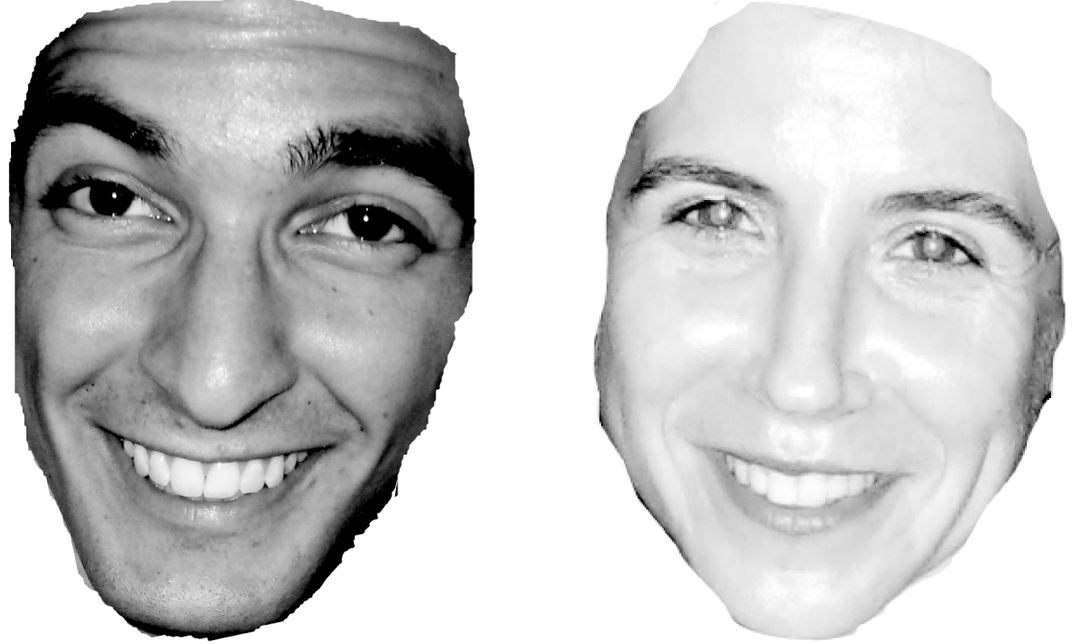
We conducted experiments in which participants viewed facial photographs of men and women and then categorized each face as gay or straight. The photographs were seen very briefly, for 50 milliseconds, which was long enough for participants to know they’d seen a face, but probably not long enough to feel they knew much more. In addition, the photos were mostly devoid of cultural cues: hairstyles were digitally removed, and no faces had makeup, piercings, eyeglasses or tattoos.

…participants demonstrated an ability to identify sexual orientation: overall, gaydar judgments were about 60 percent accurate.

Since chance guessing would yield 50 percent accuracy, 60 percent might not seem impressive. But the effect is statistically significant — several times above the margin of error. Furthermore, the effect has been highly replicable: we ourselves have consistently discovered such effects in more than a dozen experiments.

This may be seen as confirmation of the inborn nature of sexual orientation, if it can be detected by a quick glance at facial features.

Sample images flashed during the “gaydar” experiment:

There is a statistical issue here that I leave to others to consider: the sample of Facebook pictures the researchers used was 48% gay/lesbian (111/233 men, 87/180 women). So if, as they say, it is 64% accurate at detecting lesbians, and 57% accurate at detecting gay men, how useful is gaydar in real life (when about 3.5% of people are gay or lesbian, when people aren’t reduced to just their naked, hairless facial features, and you know a lot of people’s sexual orientations from other sources)? I don’t know, but I’m guessing not much.

Anyway, I have a serious basic reservation about studies like this — like those that look for finger-lengthhair-whorltwin patterns, and other biological signs of sexual orientation. To do it, the researchers have to decide who has what sexual orientation in the first place — and that’s half the puzzle. This is unremarked on in the gaydar study or the op-ed, and appears to cause no angst among the researchers. They got their pictures from Facebook profiles of people who self-identified as gay/lesbian or straight (I don’t know if that was from the “interested in” Facebook option, or something else on their profiles).

Sexual orientation is multidimensional and determined by many different things — some combination of (presumably many) genes, hormonal exposures, lived experiences. And for some people at least, it changes over the course of their lives. That’s why it’s hard to measure.

Consider, for example, a scenario in which someone who felt gay at a young age married heterogamously anyway — not too uncommon. Would such a person self-identify as gay on Facebook? Probably not. But if someone in that same situation got divorced and then came out of the closet they probably would self-identify as gay then.

Consider another new study, in the Archives of Sexual Behavior, which used a large sample of people interviewed 10 years apart. They found changes in sexual orientation were not that rare. Here is my table based on their results:
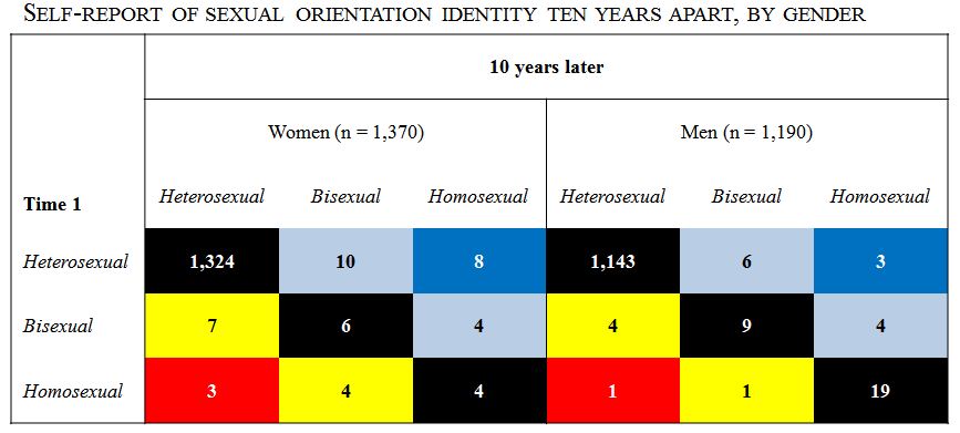
Overall, 2% of people changed their response to the sexual orientation identity question. That’s not that many — but then only 2.5% reported homosexual or bisexual identities in the first place.

In short, self identification may be the best standard we have for sexual orientation identity (which isn’t the same as sexual behavior), but it’s not a good fit for studies trying to get at deep-down gay/straight-ness, like the gaydar study or the biological studies.

And we need to keep in mind that this is all complicated by social stigma around sexual orientation. So who identifies as what, and to whom, is never free from political or power issues.

Philip N. Cohen is a professor of sociology at the University of Maryland, College Park, and writes the blog Family Inequality. You can follow him on Twitter or Facebook.

Over at the University of North Carolina at Chapel Hill, sociologist Neal Caren and a team of graduate students have worked up on image showing the locations of people signing secession petitions on the White House website in the wake of Obama’s reelection.

For context, here’s the text of one such petition, from Alaska:

ALLOW ALASKA TO SECEDE FROM A DYSFUNCTIONAL UNION.

As an American Veteran on behalf of the U.S. Constitution, the Republic, the Rule of Law, and equal justice for all freedom loving citizens of the United States of America hereby declare that the Federal Government allow Alaska to peacefully secede from a dysfunctional Union that is run by corrupt politicians who buy the votes of individuals who can no longer be seen as American citizens but rather, slaves to a tyrant. We who took the oath to protect and defend the Constitution of the United States of America against all enemies, foreign and domestic, now declare Washington D.C. to be the domestic enemy to the freedom and liberty of all Alaskans and indeed, 50% of the free citizens of the USA. Therefore, we declare our secession in support of the U.S. Constitution. LET MY PEOPLE GO!

Almost all states have an active petition now. Here’s the map of signers from around the country, shaded according to the proportion of each county’s residents who signed a secession petition. If you click on the image you go to the site, which allows you to hover over each county and see the counts:Neal Caren writes:

In total, we collected data on 702,092 signatures. Of these, we identified 248,936 unique combinations of names and places, suggesting that a large number of people were signing more than one petition. Approximately 90%, or 223,907, of these individuals provided valid city locations that we could locate with a U.S. county.

Using a first-name algorithm, they estimate that 62% of those signing are men.

Philip N. Cohen is a professor of sociology at the University of Maryland, College Park, and writes the blog Family Inequality. You can follow him on Twitter or Facebook.

For whatever reason, there has been a real slump in the number of people typing “obama gun” (will he take our guns away?), “obama muslim” (the idea used to run at about 20%), “obama socialist” (the republic “hangs in the balance“), and “obama citizen” (thank you, Snopes) into the Google search box since the 2008 election.

Here’s the Google trend (and the search link):

We don’t know how much these fears, versus other concerns, will affect votes against him this year, although there have been some good efforts to track the effects of anti-Black racism on his vote tally.

Naturally, not everyone who Googles these things believes the underlying stories or myths. But it seems likely they either believe them, are considering them, heard someone repeat them, or are arguing with someone who believes them, etc. So I’m guessing – just guessing – that these trends track those beliefs.

But maybe four years of Obama as an actual president has softened up the hard-line hatred in some quarters. What do you think?

Philip N. Cohen is a professor of sociology at the University of Maryland, College Park, and writes the blog Family Inequality. You can follow him on Twitter or Facebook.

Cross-posted at Family Inequality.

People don’t know how much they’re eating.

A recent experiment found that people eat more when the container is larger, even when the portion size is not. They gave Belgian college students a container of M&Ms and parked them in front of a TV, with some cover story. The students were randomly assigned to three groups, medium-portion/small-container, medium-portion/large-container, and large-portion/large-container. These were the results: The ones who got the large container ate more, whether it was full or not (the difference between the two wasn’t significant).

These kinds of experiments continuously suggest that distractions, distortions and other apparently irrelevant information and events routinely have large effects on people’s eating practices (here’s an extensive review). One infamous study showed that even people served 14-day-stale popcorn at the movies ate 34% more when it was served in a large container. In an earlier popcorn study, researchers found that people given large containers not only ate more, but were less able to report how much they ate. They concluded:

When a food is eaten from a large container, it appears easy to lose track of how much one eats. Even if the food were to taste relatively unfavorable, eating it from a large container may cause one to overeat because they lose track of how much they have consumed.

About that Yogurt Tub…

All this occurred to me when I visited one of our many local Frozenyo franchise outlets. It’s a self-serve frozen yogurt place where you pay one price by weight no matter what you put in your bucket. The trick that impressed me is the bucket — there is only one size, and it’s very large. But you can’t judge how big it is because there’s nothing to compare it with — no sizes or prices on the wall, no mini cup for kids — just one stack of identical buckets. So the person who posted this picture on Yelp probably thought she had a reasonable size serving, since the thing is barely half full:

There are three possible ways to judge your self-served serving size. You can go by the tub (“I filled it half way”), you can go by the person next to you (“sheesh!”), or you can look at the cartoon penguins on the wall:

How much is the penguin eating? I took home one of the buckets, and measured the volume of water it holds: 18 ounces. In comparison, a standard kid-sized serving bowl, the kind some people use to give their kids ice cream at home, holds 12 ounces:

An innocent child used to half a bowl of ice cream — in the bowl on the left — might be pretty steamed if you served her this:

According to the serving size information on the back wall of Frozenyo, I think that’s about 1.5 servings, or 150 calories of the nonfat variety, before toppings. The penguin’s overflowing bowl is 5.0 servings. With no toppings that’s 500 calories. If you pile it with M&Ms, sprinkles, hot fudge, Captain Crunch, coconut topping and fresh kiwis, who knows. It’s not really that many calories to consume — the same number as a single slice of banana bread at Starbucks.

But the point is you don’t know how much you’re eating. One Yelp reviewer cautioned that you can get a stomach ache after eating at Frozenyo, because “your eyes are bigger than your stomach.” I think it’s because the dump-truck sized delivery vehicle you eat it out of is bigger than your stomach.

But most reviewers love it for the individual control over serving size and toppings, and the reasonable price ($.39 per ounce by weight, or $5-$6 for a typical load).* I think it’s a winning business model, with low labor costs, because all you need is one person to pour the mix into the machines and another to weigh the tubs and swipe credit cards. According to the company’s ambitious map, there are still 46 states with “territory available.”

If I were them, I would increase the bucket size by 5% per year. I doubt anyone would notice.

* Paging George Ritzer: it’s the irrationality of rationality.

Cross-posted at Family Inequality.

You can’t get 18 pages into Hanna Rosin’s blockbuster myth-making machine The End of Men, before you get to this (on page 19):

One of the great crime stories of the last twenty years is the dramatic decline of sexual assault. Rates are so low in parts of the country — for white women especially — that criminologists can’t plot the numbers on a chart. “Women in much of America might as well be living in Sweden,* they’re so safe,” says criminologist Mike Males.

That’s ridiculous, as I’ll show. Rape is difficult to measure, partly because of limiting state definitions, but the numbers are consistent enough from different sources to support the conclusion that reported rape in the United States has become less common in the last several decades — along with violent crime in general. This is good news. Here is the rate of reported “forcible rape” (of women) as defined by the FBI’s crime reporting system, the Uniform Crime Reports.**  See the big drop — and also that the rate of decline slowed in the 2000s compared with the 1990s:

(Source: Uniform Crime Reports, 2010)

The claim in Rosin’s book — which, like much of the book, is not sourced in the footnotes — is almost too vague to fact-check. What is “much of the country,” and what is a number “so low” that a criminologist “can’t plot” it on a chart? (I’m no criminologist, but I have even plotted negative numbers on a chart.)

Even though she makes things up and her publisher apparently doesn’t care, we must resist the urge to just ignore it. The book is getting a lot of attention, and it’s climbing bestseller lists. Just staying with the FBI database of reported rates, they do report them by state, so we can look for that “much of the country” she’s talking about. I made a map using this handy free tool.

(Source: FBI Uniform Crime Reports, 2010, Table 47)

The lowest state rate is 11.2 per 100,000 (New Jersey), the highest is 75 (Alaska). You can also get the numbers for 360 metropolitan areas. For these, the average rate of forcible rape reported was 31.5 per 100,000 population. One place, Carson City, Nevada, had a very low rate (just one reported in 2010), but no place else had a rate lower than 5.1. (you can see the full list here). I have no trouble plotting numbers that low. I could even plot numbers as low as those reported by police in Europe, where, according to the European Sourcebook of Crime and Criminal Justice Statistics, for 32 countries in 2007, the median rate was just 5 per 100,000 — which is lower than every U.S. metropolitan area for 2010 (except Carson City, Nevada).

These police reports are under-counts compared with population surveys that ask people whether they have been the victim of a crime, regardless of whether it was reported to police. According to the government’s Crime Victimization Survey (CVS), 65% of rape/sexual assault is not reported. The CVS rate of rape and sexual assault (combined) was 70 per 100,000 in 2010. That does reflect a substantial drop since 2001 (although there was also a significant increase from 2009 to 2010).

And what about the “for white women especially” part of Rosin’s claim? According to the Crime Victimization Survey (Table 9), the white victimization rate is the same as the national average: 70 per 100,000.

I hope it’s true, as Rosin says, that “what makes [this era] stand out is the new power women have to ward off men if they want to.” But it’s hard to see how that cause is served by inventing an end of rape.

—————————

*That is an unintentionally ironic reference, because Sweden actually has very high (for Europe) rate reported rape, which has been attributed to its broad definition and aggressive attempts at prosecution and data collection.

** Believe it or not, this was their definition: “the carnal knowledge of a female forcibly and against her will. Attempts or assaults to commit rape by force or threat of force are also included; however, statutory rape (without force) and other sex offenses are excluded.” That is being changed to include oral and anal penetration, as well as male victims, but data based on those changes aren’t reported yet.

Check the Hanna Rosin tag for other posts in this series.

Cross-posted at Family Inequality.

In 2010, 28% of wives were earning more than their husbands. And wives were 8-times as likely as their husbands to have no earnings.

I still don’t have my copies of The End of Men, by Hanna Rosin, or The Richer Sex, by Liza Mundy. But I’ve read enough of their excerpts to plan out some quick data checks.

Both Rosin and Mundy say women are rapidly becoming primary earners, breadwinners, pants-wearers, etc., in their families. It is absolutely true that the trend is in that direction. Similarly, the Earth is heading toward being devoured by the Sun, but the details are still to be worked out. As Rosin wrote in her Atlantic article:

In feminist circles, these social, political, and economic changes are always cast as a slow, arduous form of catch-up in a continuing struggle for female equality.

Which is right. So, where are we now, really, and what is the pace of change?

For the question of relative income within married-couple families, which is only one part of this picture — and an increasingly selective one — I got some Census data for 1970 to 2010 from IPUMS.

I selected married couples (called “heterogamous” throughout this post) in which the wife was in the age range 25-54, with couple income greater than $0. I added husbands’ and wives’ incomes, and calculated the percentage of the total coming from the wife. The results show and increase from 7% to 28% of couples in which the wife earns more than the husband (defined as 51% or more of the total income):

(Thanks to the NYTimes Magazine for the triumphant wife image)

Please note this is not the percentage of working wives who earn more. That would be higher — Mundy calls it 38% in 2009 — but it wouldn’t describe the state of all women, which is what you need for a global gender trend claim. This is the percentage of all wives who earn more, which is what you need to describe the state of married couples.

But this 51% cutoff is frustratingly arbitrary. No serious study of power and inequality would rest everything on one such point. Earning 51% of the couple’s earnings doesn’t make one “the breadwinner,” and doesn’t determine who “wears the pants.”

Looking at the whole distribution gives much more information. Here it is, at 10-year intervals:

These are the points that jump out at me from this graph:

  • Couples in which the wife earns 0% of the income have fallen from 46% to 19%, but they are still 8-times as common as the reverse — couples where the wife earns 100%.
  • There have been very big proportionate increases in the frequency of wives earning more — such as a tripling among those who earn 50-59% of the total, and a quadrupling among those in which the wife earns it all.
  • But the most common wife-earning-more scenario is the one in which she earns just over half the total. Looking more closely (details in a later post) shows that these are mostly in the middle-income ranges. The poorest and the richest families are most often the ones in which the wife earns 0%.

Maybe it’s just the feminist in me that brings out the stickler in these posts, but I don’t think this shows us to be very far along on the road to female-dominance.

Previous posts in this series…

  • #1 Discussed The Richer Sex excerpt in Time (finding that, in fact, the richer sex is still men).
  • #2 Discussed that statistical meme about young women earning more than young men (finding it a misleading data manipulation), and showed that the pattern is stable and 20 years old.
  • #3 Debunked the common claim that “40% of American women” are “the breadwinners” in their families.
  • #4 Debunked the description of stay-at-home dads as the “new normal,” including correcting a few errors from Rosin’s TED Talk.
  • #5 Showed how rare the families are that Rosin profiled in her excerpt from The End of Men

Cross-posted at Family Inequality.

It is great to acknowledge and celebrate the increase in father involvement in parenting. But it is not helpful to exaggerate the trend and link it to the myth-making about looming female dominance. Yesterday’s feature in the Sunday New York Times does just that, and reminds me that I meant to offer a quick debunking of Hanna Rosin’s TED talk.

The story is headlined “Just Wait Till Your Mother Gets Home.” The picture shows a group of dads with their kids, as if representing what one calls “the new normal.” Careful inspection of the caption reveals it is a “daddy and me” music class, so we should not be surprised to see a lot of dads with their kids.

The article also makes use of a New Yorker cover, which captures a certain gestalt — it’s a funny exaggeration — but should not be confused with an empirical description of the gender distribution of parents and playgrounds:

Naturally, the story is in the Style section, so close reading of the empirical support is perhaps a fool’s errand. However, I could not help noticing that the only two statistics in the story were either misleading or simply inaccurate. In the category of misleading, was this:

In the last decade, though, the number of men who have left the work force entirely to raise children has more than doubled, to 176,000, according to recent United States census data. Expanding that to include men who maintain freelance or part-time jobs but serve as the primary caretaker of children under 15 while their wife works, the number is around 626,000, according to calculations the census bureau compiled for this article.

The Census Bureau has for years employed a very rigid definition of stay-at-home dads, which only counts those who are out of the labor force for an entire year for reasons of “taking care of home and family.” This may seem an overly strict definition and an undercount, but if you simply counted any man with no job but with children as a stay-at-home dad, you risk counting any father who lost a job as stay-at-home. (A former student of mine, Beth Latshaw, now at Appalachian State University, has explored this issue and published her results here in the journal Fathering.)

In any event, those look like big numbers, but one should always be wary of raw numbers in the news. In fact, when you look at the trend as published by the Census Bureau, you see that the proportion of married couple families in which the father meets the stay-at-home criteria has doubled: from 0.4% in 2000 to 0.8% today. The larger estimate which includes fathers working part-time comes out to 2.8% of married couple families with children under 15. The father who used the phrase “the new normal” in the story was presumably not speaking statistically.

(Source: My calculations from Census Bureau numbers [.xls file]. Includes only married-couple families with children under age 15.)


That’s the misleading number. The inaccurate number is here:

About 40 percent of women now make more than their husbands, the bureau’s statistics show, and that may be only the beginning of a seismic power shift, if new books like “The Richer Sex: How the New Majority of Female Breadwinners Is Transforming Sex, Love, And Family,” by Liza Mundy, and “The End of Men: And the Rise of Women,” by Hanna Rosin, are to be believed.

I guess in these troubled times for the newspaper business it might be acceptable to report X and Y statistic “if so-and-so is to be believed.” But it is a shame to do so when the public is paying the salary of people who have already debunked the numbers in question. Just the other day, I wrote about that very statistic: “Really? No. I don’t know why this keeps going around.” Using freely available tables (see the post), I calculated that a reasonable estimate of the higher-earning-wife share is 21%. In fact, on this point Liza Mundy and Hanna Rosin and are not to be believed.

(Source: My graph from Census Bureau numbers.)


TED: Misinformation Frequently Spread

There is a TED talk featuring Hanna Rosin from the end of 2010, and I finally got around to watching it. Without doing a formal calculation, I would say that “most” of the statistics she uses in this talk are either wrong or misinterpreted to exaggerate the looming approach of female dominance. For example, she says that the majority of “managers” are now women, but the image on the slide which flashes by briefly refers to “managers and professionals.” Professionals includes nurses and elementary school teachers. Among managers themselves, women do represent a growing share (although not a majority, and the growth has slowed considerably), but they remain heavily segregated as I have shown here.

Rosin further reports that “young women” are earning more than “young men.” This statistic, which has been going around for a few years now, in fact refers to single, child-free women under age 30 and living in metropolitan areas. That is an interesting statistic, but used in this way is simply a distortion. (See this post for a more thorough discussion, with links.)

Rosin also claims that “70% of fertility clinic patients” prefer to have a female birth. In her own article in the Atlantic, Rosin reports a similar number for one (expensive, rare) method of sex selection only (with no source offered) — but of course the vast majority of fertility clinic patients are not using sex selection techniques. In fact, in her own article she writes, “Polling data on American sex preference is sparse, and does not show a clear preference for girls.”

Finally, I don’t think I need to offer statistics to address such claims as women are “taking control of everything”and “starting to dominate” among “doctors, lawyers, bankers, accountants.” These are just made up. Congress is 17% female.

Philip N. Cohen is a professor of sociology at the University of Maryland, College Park, and writes the blog Family Inequality. You can follow him on Twitter or Facebook.

Cross-posted at Family Inequality.

Fat people shown with no heads, starving children shown with dull stares? The short explanation may be the difference between a shaming frame and a pity frame. Fat people are blamed for their obesity, so to show their faces stimulates shame and stigma. Starving children are helpless, homogeneous victims, so to stare into their eyes stimulates feelings of pity in the viewer.

The news media’s practice of showing what Charlotte Cooper has called “headless fatties” is ubiquitous. Writing about this phenomenon on a news blog, Nate Jones says,

Picturing the obese without heads is a handy solution for an age-old problem: How do you illustrate a story on obesity without shining a spotlight on any individuals? Cropping out faces is more polite — and more legal — than leaving them in, the thinking goes. It’s journalism at its most paternalistic.

And then he asks,

Assuming we don’t stop covering obesity stories entirely, is there a way to illustrate them without saying, “Hello, you are fat. May I take your picture?”

But wait a minute. Why not ask that?

It seems to me that, in sparing a few news photographers some embarrassment — as they approach strangers and ask them this question — the media instead perpetuates the shame, embarrassment and stigma of millions of other people. (And if a few people get over it, ask, and show the full picture, it might just be less difficult to have the conversation the next time.)

Here’s a suggestion: instead of approaching people while they are eating alone on the boardwalk or at a fast food restaurant, how about finding people at work or school or playing with their children, and showing them living real, complicated, human lives with a potentially risky health condition?

An unscientific sample: Here are the 17 pictures on the first page of my Google images search for “obesity men.” The pictures include 15 individuals, 9 of whom have no faces. (The equivalent search for women yielded 30 obese people, 17 of whom were faceless.)

On the other hand

So why is it so different for starving children? Here are the Google images of “starving child.”

They all have faces. Also, none of them are White Americans (which makes sense, since hardly anyone starves in America, though many are food insecure). Also, maybe no one asked their permission to use their likenesses.

For obese people in a rich country, the shame and stigma is a big part of the problem itself — as the anguish it causes undermines healthy behavior. Shame and stigma does not promote healthy weight loss.

For starving children in a poor country, the pity of rich-country viewers is also part of the problem, because it becomes the story, detracting from systematic impoverishment and exploitation. For them, pity also seems ineffective at generating solutions.

Showing pictures of obese people and starving children in the news is important. Both of these practices set up dehumanizing scenarios, however, because they do not create images of complete people in the social contexts of their lives.

Philip N. Cohen is a professor of sociology at the University of Maryland, College Park, and writes the blog Family Inequality. You can follow him on Twitter or Facebook.