In light of the mean-spirited Obama-wants-everyone-on-food-stamps meme, and the Heritage Foundation’s mocking attack on poor people as air-conditioned, Xbox-loving couch potatoes, let’s consider something else about poor single parents — especially poor mothers: their Google searches.

That’s right, in addition to refrigerators, apparently almost everyone in America today has Internet access — often at their local public libraries.

And yet they still complain about their little problems. They type searches into Google like, “help paying electric bill,” “hair falling out,” and even — presumably so they can laugh at the poor suckers who actually work for a living — “walmart jobs.”

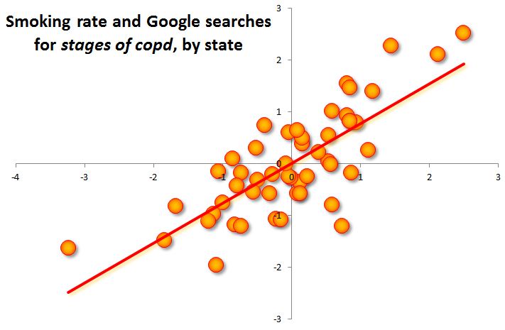
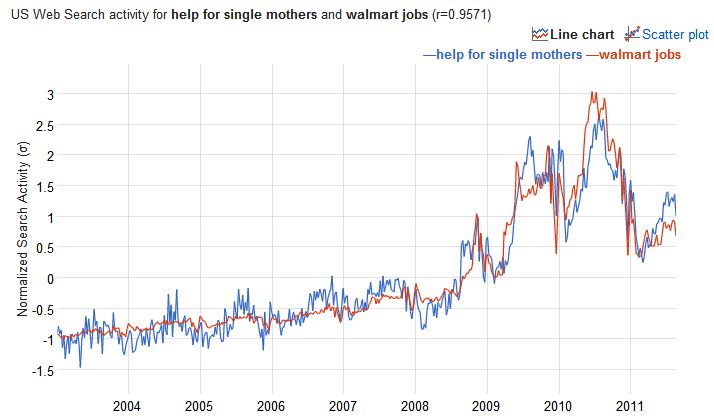
The old “misery index” was just unemployment plus inflation. Maybe the new index to watch is Google searches for “help for single mothers.” Here is the trend for that search, along with one of the searches that most closely follows its trend, “walmart jobs.” The temporal correlation between these two — the amount they rise and fall together over time — is .96 on a scale of 0 to 1.

You can see the full list of 100 searches most correlated with “help for single mothers” by following this link.

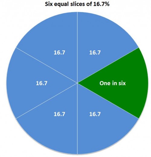
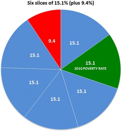
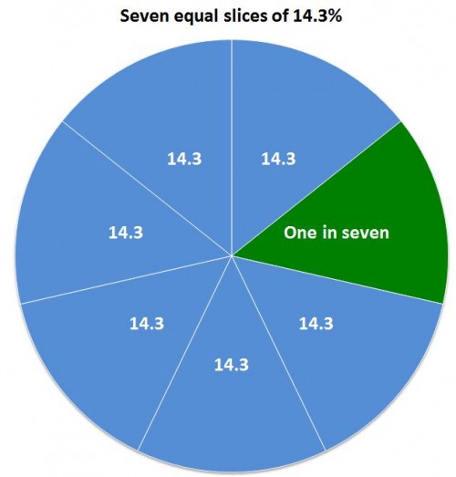
After the poverty report came out last month, comedian Andy Borowitz tweeted, “One in six Americans is living in poverty, but the other five are more concerned about the changes to Facebook.” Whether you’re in the first group or the latter one — or neither — it’s worth pausing for a minute to think about the lives of people Googling things like, “help with rent,” “iud side effects,” “cheap dinner ideas” and “get a credit card with bad credit.” (The searches all correlate with “help for single mothers” at .94 or higher.)

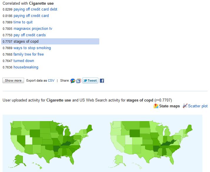
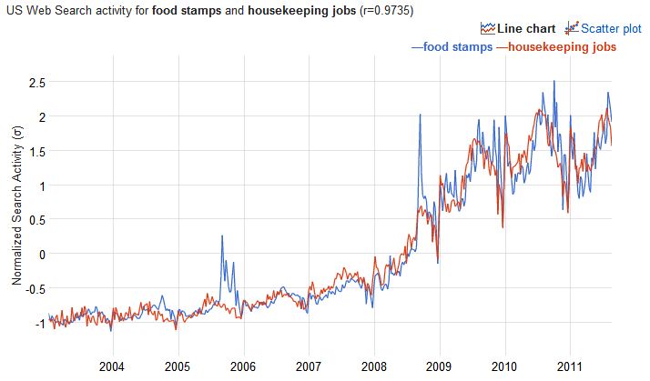
A similar list comes up in the correlations with searches for “food stamps.” Here it is graphed with “housekeeping jobs,” correlated at .97:

The list of correlated searches is similar, including a preponderance of women’s health terms (“clots during period”) economic crises (“light bill”), and ideas for climbing out of an economic hole (“medical assistant jobs,” “dispatcher jobs”).

On the plus side, both of these trends peaked in mid-2010, for now. So maybe things have stopped getting worse quite so fast. Or maybe they just lost their Internet access at the library due to budget cuts.

Am I being selective, not reporting the searches like “loving this cool TV,” and “food stamps rule”? Not intentionally, but you never know. The links to the searches are above, and the data is free.

The U.S. Census Bureau reported last week that there were 46.2 million people in poverty in 2010, out of a population of 305.7 million. That is 15.1%, or if you prefer whole numbers, call it 151 out of every 1,000.

Most news reports seem to prefer reducing the rate to a numerator of one — which makes sense since it uses the smallest whole number possible, for your mental image. In that case, you could accurately call it one out of every 6.6, but no one did. Like the Washington Post and NPR, most called it some version of “nearly one in six.” That’s OK, if you’re willing to call 15.1 “nearly 16.7.”

Using percentages, here’s the difference:

A substantial minority of reports on the poverty report took the low road of rounding the fraction in the direction of their slant on the story. Some reports just went with “one in six,” including people on the political left who may be inclined to enlarge the problem, such as Democracy Now and the labor site American Rights at Work.

On the right, the Heritage Foundation’s Robert Rector and Rachel Sheffield called it “one in seven” in a column carried by the Boston Herald and others. (Their point, repeated here when the new numbers came out, is that the poor aren’t really poor anymore since they have many more amenities than they used to.) That’s cutting 15.1% down to 14.3%, which is actually closer to the truth than 16.7%:

It’s not that far off, but if your story is about the increase in poverty rates, it’s unfortunate to round down exactly to last year’s rate: 14.3%.

Then there are the people who may have just gotten stuck on the math and couldn’t decide which way to go, like the columnist who called it “essentially one in six” (which was ironic, because the point of his post was, “That’s the nice thing about most statistics, handled deftly, they can say just about anything you want them to.”) In some cases headline writers seem to have been the culprits, shortening the writer’s “almost one in six” to just “one in six.”

The worst exaggeration was from Guardian correspondent Paul Harris, who wrote, “the US Census Bureau has released a survey showing that one in six Americans now live in poverty: the highest number ever reported by the organisation.” The number — 46.2 million — is the highest ever reported, but the percentage was higher as recently as 1993.

If the point is to conjure an image that helps make the number seem real to people, it probably doesn’t matter — you may as well just go for accuracy and say “fifteen percent.” (You definitely shouldn’t use pie charts, which are hard for viewers to judge.) That’s because most people can’t immediately make an accurate mental image of either six or seven — after four they count. But I could be wrong about that. Consider these images — would the choice of one over the other change your opinion about the poverty problem?

They both create a reasonable image. But the choices people made are revealing about their biases  — and the unfortunate state of numeracy in America. Because it does matter that the number of people in poverty rose by 2,611,000.

Maybe more important is who and where these poor people are. Here’s two other ways of representing it, with very different implications.

Fifteen percent over there:

Fifteen percent spread according to a random number generator:

Note that those are just abstractions for visualizing the overall percentage of poverty. But there is a real geographic distribution of rich and poor, described in recent research by Sean Reardon and Kendra Bischoff (free version here). They found that, not surprisingly, as income inequality has grown, so has income segregation — the tendency of rich and poor to live in different parts of town. And that probably makes reality even more abstract — and more subject to media construction — for people who aren’t poor.

Cross-posted at Family Inequality.

The grandparent spike spikes on.

Last fall I learned that the number of children who live with at least one grandparent had spiked upward over the last half decade or so. The one-year update of that trend was dramatic enough to justify a yikes-edition update.

Again, the non-poor and near-poor lead the upward trend, while the highest rates are among near-poor. Although there were upward movements in the years before 2008, for the present I think we should file this under recession studies.

(For more on grandparents providing care for children, see this Pew report from last fall.)

According to the flyer in yesterday’s mail, “Life’s too short to clean your own home.”

Naturally, for the people who work for The Cleaning Authority, life is not to short to clean someone else’s home — and love it, as this woman on the inside flap apparently does:

Maybe she’s happy because she has a job she likes — even though she would be miserable cleaning her own home.

The sociological truth is that it is different to clean someone else’s home. Today’s corporate cleaners are different from an informal cleaning relationship.  Corporatizing housework changes its social nature.  That doesn’t mean it’s not unpleasant work. But cleaning the toilet of an anonymous person may be less degrading than cleaning the toilet of someone you have a personal (subordinate) relationship with. On the other hand, maybe people love cleaning toilets for people they really love.

The rationality of market dynamics ideally also makes gender irrelevant.  In that ideal, not real, marketized world, then, maybe there is no such thing as housework — just work and workers. Would that be better?

If I ran the Federal scary anti-smoking image warning program, I might show smokers the list of health-related terms that show up most in the states with the highest cigarette smoking rates.

If you take the smoking rates by state, and throw them into the Google Correlate hopper, you can see the 100 search terms that are most highly correlated with that reported smoking behavior. That is, the terms that are most likely to be used in high-smoking states and least likely to be used in the low-smoking states.

Is the result just a lot of noise? Maybe, but I don’t think so. Here are the smoking-related terms in the top 100:

  • camel no 9
  • cigarette coupon
  • cigarette coupons
  • marlboro coupons
  • my time to quit
  • safe cigarettes
  • stopping smoking
  • time to quit
  • fire safe cigarettes
  • ways to stop smoking

So that’s good for face validity — a list of random search terms isn’t likely to have all those smoking terms on it.

But after the smoking terms, the thing that jumps out is the health-related terms. We know from the Google flu tracker that people search for their symptoms. So these caught my eye.

Here is a screen shot of the first page of results:

I selected “stages of copd” as the term to map. The map on the left is the smoking rates; the one on the right is the relative frequency of searches for “stages of copd.” That is, chronic obstructive pulmonary disease, a nasty disease the most common cause of which is smoking.

Here is the complete list of health-related terms among the top-100 correlates with smoking rates:

Lymph node swelling, which is implicated in the jaw and neck searches, most often reflects infection — which smoking causes.

How strong are the connections? They’re not the strongest I’ve seen on Google Correlate. The “stages of copd” search is correlated with smoking rates at .77 on a scale of 0 to 1. It’s not uncommon to find correlations of .93 (which is the relationship between “quiche” and “volvo v70 xc”).

But considering the smoking rates come from a sample survey (the National Survey on Drug Use and Health) which includes random error, and states are somewhat arbitrary geographic units, that correlation seems pretty high to me. Here’s the scatterplot:

What is the correlation causality story here? I can’t say. But the simplest explanation is that these are the terms smokers (and maybe those who know or care for them) are most likely to Google relative to non-smokers — not that they are the most common searches smokers do, of course, but the searches that differentiate them from non-smokers. The simplest explanation is the best place to start.

I like this list of conditions because in my experience smokers sometimes have the attitude of “you have to die of something.” But it’s not just the chance of dying that smoking increases — it’s a lot of possible forms of suffering along the way.

——————————

The Google Correlate tool is showing the great potential for using Internet search activity to investigate layers of behavior and meaning behind other observable social phenomena, such as race/ethnic compositionhealth behavior, and family patterns.

Cross-posted at Family Inequality.

Buy a McDonald’s Happy Meal and get a toy: OK, I didn’t expect it to be enlightening.

But to hear Kevin Newell, the company’s executive vice president and global chief brand officer, tell it, that’s exactly what it should be:

McDonald’s is committed to playing a positive role in children’s well-being. The Smurfs Happy Meal program delivers great quality food choices, fun toys and engaging digital content that reinforces important environmental messages.

Awesome. Granted, the last time I saw a Smurf, it was about 1978, and he looked like this:

And I don’t recall being overly concerned with gendered toy representations at the time. Anyway, now I’m told by the Happy Meal box that, “Smurfs are named after their individual talents: there’s Farmer, Painter and Baker… Know your talent and find your Smurf name!”

The girls both got male Smurf characters, which struck me as interesting, because the counter person had asked us if the Meals were for boys or girls. Then I looked at the characters on the box. Then I looked at the complete list of them on the website (see the poster version here):

Then I wondered what Smurfette’s “individual talent” was that got her — the only female Smurf – named “Smurfette.” And at that point, if it hadn’t been for all the fat and salt and sugar in my meal, I might have stopped enjoying it.

In context

I’ve commented before on the gender segregation in film making. The gist of it is apparent in this graph from the Celluloid Ceiling report by the Center for the Study of Women in Television and Film. Not many women in charge:

But isn’t it improbable that a blockbuster kids’ movie, which grossed more than $75 million in its first two weeks, could be so blatantly sexist? There are a few women in the cast of the movie version of The Smurfs, but all the Smurfs are still male except Smurfette. Next thing you know they’re going to turn the only female character in this promotion — which, remember, plays a “positive role in children’s well-being” — into an adult sex symbol played by Katy Perry. You’re kidding.

Is sexist even a word anymore?

In fact, sexism used to be a very common word. According to the Google Ngrams database of millions of terms from their vast collection of digitized books in American English, “sexism” was even more common than “bacon” during the 1990s (you can play with this yourself here):

Unfortunately, in my opinion, sexism has retreated from the language, and kids’ stuff seems to be more shamelessly gendered than ever. I think this sad state of affairs is at least partly the result of what you see in that green line above — the backlash against feminism (and anti-racism) that made it seem more unpleasant or unwarranted to make a “big deal” out of sexism than to treat girls like this.

P.S. I haven’t seen the movie. Please tell me it has a hidden feminist message I haven’t heard about.

Cross-posted at Family Inequality.

The news each month is usually on unemployment rates, weekly filings of new claims, layoffs and new hiring. And the Pew report on widening race/ethnic wealth gaps was eye-opening. But you can take the measure of the recession overall maybe best with the employment rates — how many people have jobs? By that measure, the news is flat-to-down without letup. The Black-White discrepancy in the trends is increasing.

Here is the employment trend for White and Black women, showing that Black women had higher employment rates before the recession, but they’ve fallen more than twice as much as White women’s (a drop of 5.7% versus 2.4% as of June):

Source: Bureau of Labor Statistics data.

For men, the gap is bigger and the lines further apart, so I added a ratio line to help show the gap. Black men’s rate has fallen 5.6%, compared with 3.8% for White men:

The Christian Science Monitor has an article reviewing some of the factors that contribute to the unemployment gap for men, including education, incarceration and discrimination. And the Center for American Progress has more detail in this report, which argues that declines in manufacturing and public employment are increasing the Black-White gaps especially in this recession.

What the broader statistics don’t show as well is the tenuousness of the jobs Black workers have compared to Whites generally — working for weaker firms, in more segregated jobs, as a result of a racialized sorting process, which put them at higher risk of job loss in a recession (even without discrimination in firing decisions, which there is, too).

Cross-posted from Family Inequality.

The Supreme Court’s decision in the Dukes v. Wal-Mart case, Justice Scalia acknowledged that Wal-Mart’s many local managers had a lot of discretion in their personnel decisions, even though the company had a written policy against gender discrimination (who doesn’t?). But he gave the company credit for a vague policy and let it off the hook for a systematic pattern of disparity between men and women. So, when does a toothless, vague policy with wide discretion lead to a bad outcome, and is failing to prevent it the same as causing it?

A path-breaking sociological analysis of organizational affirmative action outcomes has shown that the companies that successfully diversify their management are most likely to have policies with teeth – where accountability is built into the diversity goal. In light of the Wal-Mart case, this led to a rollicking debate about how to think about “corporate culture” versus policies, and when to blame whom, legally or otherwise – which even divided sociologists.

Smoking in the movies

Here’s an interesting, at-least-vaguely related case. Positive depictions of smoking in the movies are widely understood to be harmful. Yet, smoking is also glamorous, artistic, and popular – representing both anti-adult rebellion and maturity. So, what to do? The Centers for Disease Control, in the always-riveting Morbidity and Mortality Weekly Report, has published a fascinating report on this topic. They report the number of tobacco incidents* in top-grossing, youth-rated (G, PG, PG-13) movies, and divide them between those that implemented an anti-tobacco policy and those that didn’t — helpfully cutting the movie industry roughly in half — and provide a simple before-and-after tabulation:

From 2005 to 2010, among the three major motion picture companies (half of the six members of the Motion Picture Association of America [MPAA]) with policies aimed at reducing tobacco use in their movies, the number of tobacco incidents per youth-rated movie decreased 95.8%, from an average of 23.1 incidents per movie to an average of 1.0 incident. For independent companies (which are not MPAA members) and the three MPAA members with no antitobacco policies, tobacco incidents decreased 41.7%, from an average of 17.9 incidents per youth-rated movie in 2005 to 10.4 in 2010, a 10-fold higher rate than the rate for the companies with policies. Among the three companies with antitobacco policies, 88.2% of their top-grossing movies had no tobacco incidents, compared with 57.4% of movies among companies without policies.

The difference is dramatic, as indicated by this image about the images. (Because I turned the columns into cigarettes, this is not just a graph, but an infographic):


The policies provide what may be an ideal mix of accountability and responsibility, short of a simplistic ban.

[The policies] provide for review of scripts, story boards, daily footage, rough cuts, and the final edited film by managers in each studio with the authority to implement the policies. However, although the three companies have eliminated depictions of tobacco use almost entirely from their G, PG, and PG-13 movies, as of June 2011 none of the three policies completely banned smoking or other tobacco imagery in the youth-rated films that they produced or distributed.

Maybe this formula is effective because there already has been a strong cultural shift against smoking — as strong, even, as the shift against excluding women from management positions?

Graphic addendum (disturbing image below)

Whether smoking in movies actually encourages young people to take up smoking is of course a not a settled issue — especially on websites sponsored by tobacco sellers, as seen in this ironic screen-shot from Smokers News:


One reason to have an explicit policy is that it’s easy to assume viewers will see through the glamour to the negative outcomes. “Surely no one will want to be like that character…” But people – maybe especially young people? – have an amazing capacity to celebrate selectively from the characters they see. I have learned from experience that, in children’s stories, even those who get their comeuppance in the end still manage to emerge as role models for their bad behavior. So maybe some people want to relive this from Pulp Fiction…

…and aren’t put off by this:

—————————–

* “A new incident occurred each time 1) a tobacco product went off screen and then back on screen, 2) a different actor was shown with a tobacco product, or 3) a scene changed, and the new scene contained the use or implied off-screen use of a tobacco product.”