Cross-posted at Family Inequality.

Lots of buzz over a New York Times article about men moving into female-dominated occupations, which reported that “more and more men are starting to see the many benefits of jobs long-dominated by women.”

The Times produced this table, which shows the fastest growing occupations for (for some reason) college-educated White men, ages 25-39:

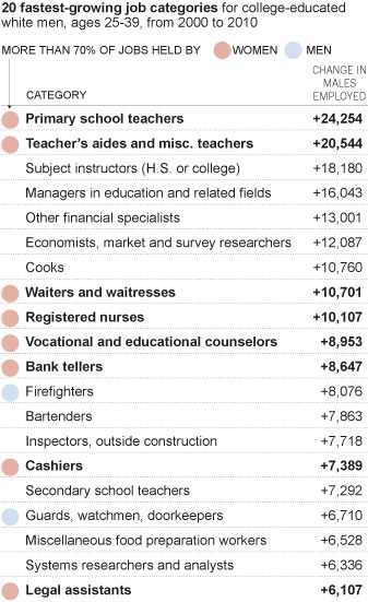
The ones with the pink dots are 70% female or more. The increase of young college educated White men in these occupations over 10 years appears striking, but the numbers are small. For example, compare that increase of (round numbers) 10,000 young White male registered nurses to the 1,900,000 full-time year-round nurses there were in 2010.

Moreover, consider that increase of 10,000 nurses in light of the overall growth of registered nurses from 2000 to 2010: about 500,000. Overall, the representation of men among full-time year-round registered nurses increased from 9.4% to 10.3% during the decade.

The Times article attempts to describe a broad trend of men moving into “pink-collar” jobs:

The trend began well before the crash, and appears to be driven by a variety of factors, including financial concerns, quality-of-life issues and a gradual erosion of gender stereotypes. An analysis of census data by The New York Times shows that from 2000 to 2010, occupations that are more than 70 percent female accounted for almost a third of all job growth for men, double the share of the previous decade.

Bold claims. But check the next sentence: “That does not mean that men are displacing women — those same occupations accounted for almost two-thirds of women’s job growth.” So, lots more men are in these jobs, but even more women are? How does that reflect an “erosion of gender stereotypes”? It seems like it reflects an increase in the size of female-dominated occupations.

In fact, as I reported briefly before, occupational gender segregation dropped barely a hair in the 2000s, from 51 to 50 on a scale of 0 to 100, compared with drops of 5 or 6 points in the decades before 1990. That is a lost decade for integration.

And if you look specifically at the category the Times chose — occupations that are 70% female or more — the percentage of men in those occupations increased, but only from 5.0% to 6.1%. And nurses? In 2010, 0.4% of all full-time year-round working men were nurses, up from 0.3% in 2000. Women are still 11-times more likely to be nurses than men.

Now that’s what you call a “gradual erosion of gender stereotypes.”

Sources: U.S. Census tables for 2000 and 2010 (table B24121).

Sitting through Disney’s Tangled again, I saw new layers of gender in there. They’ve moved beyond the old-fashioned problem of passive princesses and active princes, so Rapunzel has plenty of action sequences. And it’s not all about falling in love (at least at first). Fine.

But how about sexual dimorphism? In bathroom icons the tendency to differentiate male and female bodies is obvious. In anthropomorphized animal stories its a convenient fiction. But in social science it’s a hazardous concept that reduces social processes to an imagined biological essence.

In Tangled, the hero and heroine are apparently the more human characters, whose love story unfolds amidst a cast of exaggerated cartoons, including many giant ghoulish men (the billed cast includes the voices of 12 men and three women).

Making the main characters more normally-human looking (normal in the statistical sense) is a nice way of encouraging children to imagine themselves surrounded by a magical wonderland, which has a long tradition in children’s literature: from Alice in Wonderland to Where the Wild Things Are.

That’s what I was thinking. But then they went in for the lovey-dovey closeup toward the end, and I had to pause the video:

Their total relative size is pretty normal, with him a few inches taller. But look at their eyes: Hers are at least twice as big. And look at their hands and arms: his are more than twice as wide. Look closer at their hands:

Now she is a tiny child and he is a gentle giant. In fact, his wrist appears to be almost as wide as her waist (although it is a little closer to the viewer).

In short, what looks like normal humanity – anchoring fantasy in a cocoon of reality – contains its own fantastical exaggeration.

The patriarchal norm of bigger, stronger men paired up with smaller, weaker women, is a staple of royalty myth-making – which is its own modern fantasy-within-reality creation. (Diana was actually taller than Charles, at least when she wore heels .)

In this, Tangled is subtler than the old Disney, but it seems no less powerful.

Philip N. Cohen is a professor of sociology at the University of Maryland, College Park, and writes the blog Family Inequality. You can follow him on Twitter or Facebook.

There is no one answer to the question, “How many people are lesbian, gay, bisexual or transgender?” But demographer Gary Gates, who works for the Williams Institute at UCLA’s School of Law, has compiled the results from nine surveys that attempt to measure sexual orientation — five of them from the U.S. He estimates that 3.5% of the U.S. population identify as lesbian, gay or bisexual, while 0.3% are transgender. Here is the breakdown for the different surveys:

He also points out that bisexual identification is generally more common among women than among men. Among women, more than half of the lesbian/bisexual population identifies as bisexual; among men more than half identify as gay.

As is the case with race, we may rely on self-identification when it comes to sexual orientation. But criteria external to individuals’ identities may matter as well. These include the perceptions or actions of others (such as cross-burning or job discrimination), as well as qualities measurable by impersonal means (such as phenotypical traits or genes). In the case of sexual orientation more than race, these externally-measurable qualities include behavior (such as the gender of those one has sex with). The interpretation of these qualities, and their measurement, necessarily are highly contingent on social constructions.

In the case of sexual orientation, the questions are not usually asked, so the answers are not bureaucratically normalized. If the government and other data collectors were to start asking the question regularly, the results would probably settle down, as they have with race. In Michel Foucault’s terms, you might say the population is not disciplined with regard to sexual orientation as well as it is with race. (Of course, the public is unruly when it comes to measuring race as well, especially outside those outside the Black/White dichotomy, as “Asians” and “Hispanics” often offer national-origin identities when asked to describe their race.) Settling down doesn’t mean there would be no more changes, just that variability between surveys would probably decline.

Because of this complexity, it is interesting to compare results when people are asked about their sexual behavior, and their sexual attraction. Here surveys find much higher rates of gayness. As Gates shows, for example, 11% of Americans ages 18-44 report any same-sex sexual attraction, while 8.8% report any same-sex sexual behavior.

Whether demographers, or the public, or anyone else, considers these experiences and feelings to define people as gay/lesbian or bisexual is not resolved. For example, as Gates notes in a much longer law review article that describes the methods behind his report – and the reactions to it – some media simply ignored the self-identified bisexual population, and those with same-sex attraction or behavior, declaring that the gay and lesbian population was less than 2% of Americans. Others concluded that the commonness of bisexuality implies most gays and lesbians in fact have a “choice” about their sexual orientation.

I recommend the law review article for Gates’s in-depth discussion of “the closet” issue with regard to surveys, and the problem of measuring concealed identities — which vary according to social context and sometimes change over the course of people’s lives.

I’m grateful that Gates has pursued these questions, and taken a lot of grief in the process. He concludes:

These are challenging questions with no explicitly correct answers. The good news is that strong evidence suggests that, politically at least, the stakes in this discussion are no longer rooted in an urgent need to prove the very existence of LGBT people. This progress hopefully provides the space to more critically and thoughtfully assess these issues in an environment where a sense of urgency is not paramount. Today, the size of the LGBT community is less important than understanding the daily lives and struggles of this still-stigmatized population and informing crucial policy debates with facts rather than stereotype and anecdote.

As with race, measurement of sexual orientation may be essential to legal and political responses to inequality and discrimination — even as the process helps solidify fixed identity categories we might rather do without.

Philip N. Cohen is a professor of sociology at the University of Maryland, College Park, and writes the blog Family Inequality. You can follow him on Twitter or Facebook.

Time‘s cover story this week is adapted from The Richer Sex, a forthcoming book by Liza Mundy. I provided a few numbers for the story (see below). The content is behind a pay wall here, but the cover gives a taste:

My only beef with the story is that it misidentifies the richer sex, which I’ll return to below. Otherwise, it’s an interesting piece on the (very partial) convergence in roles among married couples. Despite the current stall in progress toward equality, I’m glad to see an article with a positive take on the idea of equality (for middle class straight couples, at least) without focusing on the demise of men.

They only used two of the numbers I sent, so consider the other 9 numbers here a Family Inequality blog exclusive!

First, I showed them the trend in the gender composition of managers from 1980 to 2010. I used the 1990 occupational categories for this (from IPUMS), in the vain hope of maintaining consistency over time*:

My emphasis was on the stall in progress since 1990, so I ended up in the “on the other hand” paragraph of the story.

The other piece of “other hand” I pitched to them was the segregation among managers — with women concentrated in some corners of the managerial world — which I mentioned here, and which Matt Huffman and I studied here. For 2010, that segregation, in broad strokes, looks like this:

This didn’t make it into the story. There was to be only one “on the other hand” paragraph. It’s all about how women are pulling ahead of men and becoming the primary breadwinners, and what that means for gender and relationships.

Of course, women are not yet the richer sex, so the evidence in the article is about trends in that direction. The text says, for example:

Assuming present trends continue, by the next generation, more families will be supported by women than by men.

By the time the graphics department got to it, the “assuming…” part was gone, and this was the header:

The numbers that support this are the trend from 24% of wives out-earning their husbands in 1987 to 38% in 2009 (helped considerably by the mancession’s crimp on men’s jobs in 2008 and 2009). Here’s their graph:

Going from 24% to 38% in 22 years doesn’t mean we’ll pass 50% in another generation. It might be OK for rhetorical purposes to say something like, “at this rate it’ll take 300 years for the U.S. to catch Sweden’s welfare state” — but not OK to say it will happen in that time. If that were true, I could show you this graph and say, “the Earth will be a ball of human flesh expanding at the speed of light in less than 1,000 years!”

Besides projecting from the trend, the other reasonable way to make guesses about the future is to look at young people. For that Liza Mundy reuses a statistic that Time first used in 2010, showing that among those who are single, child free, under 30 and living in metro areas, women have higher earnings than men.

Great, you’re thinking, stay young and single, and don’t have children, and equality is yours!

I do believe our children are the future, but predicting the future from this subset is not a safe bet. The original Time piece is critiqued here and here, although the New York Times hit on this formula for gender equality in 2007 (critiqued here). The basic manipulation here is limiting the comparison to men versus women within a group where women are more likely to have completed college but not yet experienced the wage-diminishing events that now largely begin in the late 20s (marriage, children, and slower earnings growth). It’s an interesting comparison, but shouldn’t be used for projecting the future — or even characterizing the whole present.

Anyway, interesting story.

*There can be no perfectly matching set of occupational categories over long periods of time, because the type of work being done has changed. For example, there were no computer programmers or “customer service representatives” to speak of in 1980, and there are millions now.

Cross-posted at Family Inequality.

The Carsey Institute’s Kristin Smith has written a brief on the plight of home care workers — the home health aides and personal care aides that play a growing role in our patchwork network of care work.

The news now is that these workers are not covered by the Fair Labor Standards Act — which offers the protection of minimum wage and overtime pay — but the U.S. Labor Department has proposed to bring them under its aegis.

According to the Department of Labor:

Many of these workers are the primary breadwinners for their families. Of the roughly 2 million workers who will be affected by this rule, more than 92 percent are women, nearly 50 percent are minorities, and nearly 40 percent rely on public benefits such as Medicaid and food stamps. According to the Bureau of Labor Statistics, home health care aides earn about $21,000 a year and many lack health insurance.

Smith’s analysis uses 2011 federal data. She shows that home care workers are more likely to work overtime, and more likely to work part time, than direct care workers in hospitals and nursing homes:

And they are more likely to be working part time for involuntary reasons:

Finally, their median wages — and the wages of those in the bottom quartile of the occupation — are lower than those of hospital and nursing home workers:

As Nancy Folbre as explained, the economics are bad here. Besides the bad hours, bad pay, bad working conditions, lack of unions and lack of state protections, there are some structural problems. Paid home health care is competing with unpaid family care. That means the decision about whether to pay for professional care weighs against the value of a (usually female) family member’s unpaid work. That drives down the cost of home health care — which means more than a million women get lower wages, and women’s work is devalued. And so on. Breaking that cycle requires either a wage increase (sadly, that includes bringing them under the minimum wage law) or government subsidies.*

——————————

*One attempt to beat these economic odds and support long-term care, the Community Living Assistance Services and Supports Act (CLASS Act), was supposed to be a premium-based long-term care support program, and it was passed as part of Obamacare. However, with the rule that it be self-funding, and solvent, while paying a cash benefit for life to eligible beneficiaries, theadministration said it couldn’t be done after all. Actually paying for care isn’t cheap.

Philip N. Cohen is a professor of sociology at the University of Maryland, College Park, and writes the blog Family Inequality. You can follow him on Twitter or Facebook.

Cross-posted at Family Inequality.

In 1994, Sara McLanahan and Gary Sandefur published, Growing Up With A Single Parent: What Hurts, What Helps. The growth of children living with only their mothers was — then as now — a matter of concern not only for children’s well-being, but for intergenerational mobility. One of their empirical conclusions was this:

For children living with a single parent and no stepparent, income is the single most important factor in accounting for their lower well-being as compared with children living with both parents. It accounts for as much as half of their disadvantage. Low parental involvement, supervision, and aspirations and greater residential mobility account for the rest.

The biggest problem, in other words, is economic. The other factors —  involvement, supervision, aspirations, mobility — are related to social class and the time poverty that economically-poor parents experience.

Examples

Here are some bivariate illustrations — that is, head-to-head comparisons of the difference between children of poor and non-poor versus single and married parents.

These are the “skill group” rankings by teachers of children by socioeconomic status (or SES, a composite of parents’ education, occupational prestige and income) versus race/ethnicity, gender and family structure. SES shows the widest spread in reading teachers’ group placement of first graders.

Source: Condron (2007)

Similarly, the poor/nonpoor difference is greater than the two-parent/single-parent difference in kindergarten entry scores:

Source: Early Childhood Longitudinal Study (2009)

Those are just two examples from early-childhood assessments. More importantly, here is the breakdown seen in a longitudinal study of children growing up. When women grow up to be mothers, their poverty level in childhood is more important than their family structure for predicting whether they will be in poverty themselves. The poverty difference is large, the family structure difference is not:

Source: Musik & Mare (2006)

This study included a more sophisticated set of multivariate analyses than this simple graph, but the author’s conclusion fits it:

Net of the correlation between poverty and family structure within a generation, the intergenerational transmission of poverty is significantly stronger than the intergenerational transmission of family structure, and neither childhood poverty nor family structure affects the other in adulthood.

That is, childhood poverty matters more.

Fewer single parents, or less poverty?

But if single parenthood and poverty are so closely related, some people say, we should spend hundreds of millions of dollars promoting marriage to help children avoid poverty (and other problems). That’s what the government has done, with money from the welfare budget. Even if it worked, which it apparently doesn’t, it’s only one approach. What about reducing poverty? And, more specifically, reducing the relative likelihood of poverty in single-parent families versus those with married parents. That is, address the poverty gap between the two groups, rather than the size of the two groups. This has the added advantage of not singling out one group — single mothers — for social stigmatization (of the kind I mentioned here). And, because it defines the problem as economic rather than moral, may make it easier to build public support for helping the poor.

Consider a recent paper by David Brady and Rebekah Burroway, which will be published in Demography. They analyzed the relative poverty of single mothers versus the total population — that is, what percentage had incomes below half the median (per person, after accounting for taxes and government transfers). Such a relative poverty measure is really a measure of inequality, but specifically inequality at the low end. (Regardless of how rich the rich are, it’s theoretically possible to have no one below half the median income). Here is my graph showing that result, with only the countries that have reliable sample sizes in the survey:

The Nordic countries have the lowest overall poverty rates. But in absolute terms their advantage is much bigger for single mothers. (The red line shows equal poverty rates for single mothers and the total population.) The US and UK have the largest difference in poverty rates between single mothers and overall poverty. That is, we have the largest poverty penalty for single motherhood. If the relative poverty rates for single mothers were lower in the US, we might spend more time and money addressing poverty and less trying to change family structures.

In my opinion, there is no way to administer a math test that will identify inborn ability. So people who think the greater presence of men in high-end math and science positions is a result of the distribution of inborn abilities generally rely on the observation of (a) big gender gaps, (b) long-standing gender gaps, or (c) widespread gender gaps, to make their case.

Big gaps (a) are only useful for creating a big impression. Long-standing gaps (b) are undermined by the scale of change in recent decades. And a new study does a very nice job weakening type-C support.

In “Debunking Myths about Gender and Mathematics Performance,” in the Notices of the American Mathematical Society, Jonathan Kane and Janet Mert study variation both between and within countries to test a variety of hypotheses about the sources male math advantage. They look at the distribution and variance in scores, the association with single-gender schooling, religious context and, most importantly, broader patterns of gender inequality. The main message I get is that gender ability in math differs so much across social contexts that any conclusion about “natural” ability is untenable. Also, gender equality is good.

Here’s my favorite figure from the paper, showing the distribution of eighth-grade scores for boys and girls in three countries:

In the Czech Republic there is no difference in either the means or the distributions for boys versus girls, and the average ability is high. Bahrain shows a much greater variance for boys versus girls — which is sometimes used to explain why to many top achievers are men — but women’s average is higher. Finally, in Tunisia the girls have a higher variance but a lower mean. Where’s the natural ability story?

An important consideration in all of these patterns is the role of selective dropouts. That is a potential problem with any school-based test, but also shows the problem with using any test of school-based knowledge to understand underlying “natural” ability (including SATs). Unless you can test populations with no schooling, or identical schooling experiences, you can’t resolve this.

In the meantime, the great social variability shows us that context matters, and since that’s something we can definitely address, there is no reason to get hung up on the biological stuff — at least as far as policy and practice are concerned.

Here’s a previous post from me on how teacher interactions affect gender patterns of learning, and another writeup on the new study from ScienceBlogs.

I can’t teach my course on family sociology without these graphs, which show the rise of the unfree population, and the incredible race/ethnic and gender disparities behind them.

The Bureau of Justice Statistics has released Correctional Population in the United States, 2010, which updates my standard figures. First, the total trend toward unfreedom in the population — from less than 2 million in 1980 to more than 7 million 30 years later:

And second, to understand the disparate impact of this change on Black men in young adulthood primarily — and secondarily, Latino men — here are the rates of incarceration for men by age and race/ethnicity (Blacks here exclude Latinos; Asians and American Indians are not included in the statistics):

Just to make sure you read the scale right, that incarceration rate for Black men in their early 30s is 9,892 per 100,000, or 9.9%, or one-in-ten — more than five-times the rate for White men.

I come at this largely from its effects on families. In a nutshell: The overall trend is largely a consequence of how the U.S. has waged its drug war over this period; these policies fit into a web of practices that deny families to millions of people in the U.S. (only a minority of whom have been convicted of crimes), including by simply removing men from communities and increasing the number of single-parent families.

All that said, you may notice the little decline at the end of that long upward trend in the first figure. In fact, for the first time since 1980, there has been a decline in the incarcerated population for two years running. There has been a long-term decline in crime, but I don’t know whether that is more important than the budget crises facing so many states, or the diminished lust for locking people up. In New York, for example, seven incarceration facilities were closed in the last year, after the number of prisoners dropped about one-fifth in the past decade:

The inmate decline followed a 25 percent statewide drop in crime over the past decade and revisions in sentencing laws that allowed earlier releases and alternative programs for nonviolent drug offenders. The number of prisoners in medium-security prisons declined almost 20 percent from 2001 to 2010 while those in minimum-security facilities dropped 57 percent.

The numbers on the charts are still off the charts, meanwhile — and remember these are just those in the system now. Many more people (and their families) live lives permanently hampered by criminal records and the experience of imprisonment.