Cross-posted at Family Inequality.

There’s an interesting example of how to interpret scientific results — and draw policy implications from them — from the world of birth practices and safety.

The subject of the debate is a major new study from the British Medical Journal. The study followed more than 60,000 women in England with uncomplicated pregnancies, excluding those who had planned caesarean sections and caesarean sections before the start of labor. They compared the number of bad outcomes — from death to broken clavicles – for women depending on where they had their births.

One comparison stands out in the results. From the abstract: “For nulliparous women [those having their first birth], the odds of the primary outcome [that is, any of the negative events] were higher for planned home births” than among those planned for delivery in obstetric units. That is, the home births had higher rates of negative events. The difference is large. Here’s a figure to illustrate:

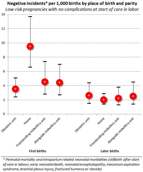
The error bars show 95% confidence intervals, so you can see the difference between home births and obstetric-unit births is statistically significant at that level. These are the raw comparisons, but the home-versus-obstetric comparison was unchanged when the analysts controlled for age, ethnicity, understanding of English, marital or partner status, body mass index, “deprivation score,” previous pregnancies, and weeks of gestation. Further, by restricting the comparison to uncomplicated pregnancies and excluded all but last-minute c-sections, it seems to be a very strong result.

But what to make of it?

In their conclusion, the authors write:

Our results support a policy of offering healthy nulliparous and multiparous women with low risk pregnancies a choice of birth setting. Adverse perinatal outcomes are uncommon in all settings, while interventions during labour and birth are much less common for births planned in non-obstetric unit settings. For nulliparous women, there is some evidence that planning birth at home is associated with a higher risk of an adverse perinatal outcome.

But in what way do the results “support a policy”? The “higher risks” they found for planned home births are still “uncommon,” by comparison, with those in poor countries, for example. But the home birth risk is 2.7-times greater.

The Skeptical OB, who is a reliable proponent of modern medical births, titled her post, “It’s official: homebirth increases the risk of death.” She added some tables from the supplemental material, showing the type of negative events and conditions that occurred. Her conclusion:

“In other words, any way you choose to look at it, no matter how carefully you slice and dice the data, there is simply no getting around the fact that homebirth increases the risk of perinatal death and brain damage.”

I guess the policy options might include include whether home births should be encouraged, more regulated, covered by public and/or private health insurance, banned, penalized or (further) stigmatized.

Home birth seems safer than letting children ride around unrestrained in the back of pickup trucks, which is legal in North Carolina – as long as they’re engaged in agricultural labor. On the other hand, we have helmet laws for kids on bicycles in many places. And if a child is injured in either situation, hopefully an ambulance would take them to the hospital even if the accident were preventable.

In other words, I don’t think policy questions can be resolved by a comparison of risks, however rigorous.

Cross-posted at Family Inequality.

Let’s just stipulate that using a personal electronic device while driving increases the risk of an accident and should be avoided.

Let me just make sure I have the rest of the facts straight.

1.  The total number of traffic deaths is at its lowest level since 1949, even as the population, number of vehicles, and number of miles driven have all increased radically.

2.  The number of mobile phone subscribers has increased more than 1,000% since the early 1990s.

3.  “Distraction-affected” crashes accounted for less than 10% of traffic fatalities in 2010.

4.  Deaths attributed to drivers age 17 and younger have fallen by about half since 1990.

5.  The National Transportation Safety Board “is recommending that states prohibit all drivers from using cellphones, for talking or texting.”

Here’s a visual on some of the trends, in one figure:

Pay no attention to the man behind the curtain. Here are my previous posts on this.

————————

Sources: National Highway Traffic Safety Administration: 2009-2010 deathsdeaths trends;  Federal Communications Commission: phone trends; CTIA: 2009 phone subscriptions.


Cross-posted at Family Inequality.

Poverty is usually described as a status, as there are people below and above the poverty line. We need to do more to capture and represent the experience of poverty.

There are ways this can be done even in a single survey question, such as this one: ”During the past 12 months, was there any time when you needed prescription medicine but didn’t get it because you couldn’t afford it?” Below are the percentages answering affirmatively, by official poverty-line status.

Percentage of Adults Aged 18-64 Who Did Not Get Needed Prescription Drugs Because of Cost, by Poverty Status (National Health Interview Survey, 1999-2010)

This is not the same as not having any of the prescription drugs you need. What it indicates is economic insecurity rather than deprivation per se, a more nuanced measure than simply being above or below (some percentage of) the poverty line.

Cross-posted at Family Inequality.

Things that make you say… “peer review”?

This is the time of year when I expect to read inflated or distorted claims about the benefits of marriage and religion from the National Marriage Project. So I was happy to see the new State of Our Unions report put out by W. Bradford Wilcox’s outfit. My first reading led to a few questions.

First: When they do the “Survey of Marital Generosity” — the privately funded, self-described nationally-representative sample of 18-46-year old Americans, which is the source of this and several other reports, none of them published in any peer-reviewed source I can find — do they introduce themselves to the respondents by saying, “Hello, I’m calling from the Survey of Marital Generosity, and I’d like to ask you a few questions about…” If this were the kind of thing subject to peer review, and I were a reviewer, I would wonder if the respondents were told the name of the survey.

Second: When you see oddly repetitive numbers in a figure showing regression results, don’t you just wonder what’s going on?

Here’s what jumped out at me:

If a student came to my office with these results and said, “Wow, look at the big effect of joint religious practice on marital success,” I’d say, “Those numbers are probably wrong.” I can’t swear they didn’t get exactly the same values for everyone except those couples who both attend religious services regularly — 50 50 50, 13 13 13 , 50 50 50, 21 21 21 — in a regression that adjusts for age, education, income, and race/ethnicity, but that’s only because I don’t swear.*

Of course, the results are beside the point in this report, since the conclusions are so far from the data anyway. From this figure, for example, they conclude:

In all likelihood,  the experience of sharing regular religious attendance — that  is, of enjoying shared rituals that endow one’s marriage with transcendent significance and the support of a community  of family and friends who take one’s marriage seriously— is a solidifying force for marriage in a world in which family life is  increasingly fragile.

OK.

Anyway, whatever presumed error led to that figure seems to reoccur in the next one, at least for happiness:

Just to be clear with the grad student example, I wouldn’t assume the grad student was deliberately cooking the data to get a favorable result, because I like to assume the best about people. Also, people who cook data tend to produce a little more random-looking variation. Also, I would expect the student not to just publish the result online before anyone with a little more expertise had a look at it.

Evidence of a pattern of error is also found in this figure, which also shows predicted percentages that are “very happy,” when age, education, income and race/ethnicity are controlled.

Their point here is that people with lots of kids are happy (which they reasonably suggest may result from a selection effect). But my concern is that the predicted percentages are all between 13% and 26%, while the figures above show percentages that are all between 50% and 76%.

So, in addition to the previous figures probably being wrong, I don’t think this one can be right unless they are wrong. (And I would include “mislabeled” under the heading “wrong,” since the thing is already published and trumpeted to the credulous media.)

Publishing apparently-shoddy work like this without peer review is worse when it happens to support your obvious political agenda. One is tempted to believe that if the error-prone research assistant had produced figures that didn’t conform to the script, someone higher up might have sent the tables back for some error checking. I don’t want to believe that, though, because I like to assume the best about people.

* Just kidding. I do swear.

Cross-posted at Family Inequality.

In some societies it is expected that newly married couples will move into the husband’s family home.  This is called a “patrilocal system” or a “custom of marriage by which the married couple settles in the husband’s home or community” (OED).  Patrilocality is bad for women’s status: as outsiders in their new homes, they are alone and disconnected from their own families.

Patrilocal China

The patrilocal system in China is one of the foundations of its unique form of patriarchy, embedded in the religious tradition of family ancestor worship — and in the language.

This came up because I was learning the Chinese word for grandmother, which, like other family relationship words, differs according to the lineage in question (maternal grandmother, paternal grandmother, etc.). A common traditional term for maternal grandmother is wài pó, 外婆:

Those two characters separately mean outsider and woman. (If you put a space between them in Google translate, the English translation is “foreign woman.”) For comparison, the common term for paternal grandmother is nǎinai (奶奶), which is the word for “milk” twice.

Words as Gendered Images

I had been working on Chinese Characters for Beginners, and with my recent focus on language for union or marriage types (homogamy and heterogamy for same sex and other sex marriage, respectively), on the one hand, and sexual dimorphismgender, on the other, I was sensitive to my first lesson, in which I learned that the word for good is woman+son (好):

And the word for man is field+strength (田+力=男):

Someone who knows more about languages can say whether or how Chinese reveals more about the cultural contexts of its word origins than English does.

In the one-child-policy era the patrilocal tradition has become especially harmful to women. That’s because the lack of an adequate state pension system has increased the need for poor families to produce a son — a son whose (patrilocal) marriage will bring a caretaking daughter-in-law into the family — and decreased the return on investment for raising a daughter, who probably will leave to care for her husband’s parents. One consequence, amply documented in Mara Hvistendahl’s book Unnatural Selection, has been tens of millions of sex-selective abortions.

So, the next time someone sees a common pattern of gendered behavior, and attributes it to genetics or evolution, I’m going to ask them to first demonstrate that the pattern holds among people who aren’t exposed to any language at all (and raised by parents who haven’t been exposed to language either). Otherwise, the influence of ancient cultures is impossible to scrub from the data.

Cross-posted at Family Inequality.

Americans about my age and older all seem to have stories about how we survived our school playgrounds without today’s cushy soft surfaces, safety-oriented climbing structures, and running water.

Here is a picture of the playground at my elementary school. I myself survived a fall off one of those seesaws onto the broken-glass-strewn asphalt, with nothing but a scrape to show for it (attended to by the school secretary — there was no “school nurse” back then either).

In the safety craze in recent decades, sadly, real seesaws were one of the first things to go.

Go back another few generations, and you’ll find stories like this — about 200 children killed in the streets of New York in 1910 (from the NYT Jan. 1, 1911):

Most of those kids weren’t in cars or wagons; they were playing in the streets, doing work for their families, or just wandering around unattended — there were no public playgrounds. In contrast, in 2009 there were about 10 pedestrian or cycling children killed by vehicles in New York City. Ah, the good old days.*

Nowadays

As things have gotten safer for America’s children, of course, parents have become ever more concerned with their safety, as well as with their learning and development. Somewhere in America on a Sunday a few weeks ago, in an affluent community, a public playground was bubbling with activity. Every child seemed to be enjoying a rollicking good time on the latest safety-designed play equipment, cushioned by a luxuriously deep bed of mulch.

Also, each child seemed to be within a few feet of a parent or other adult caretaker — coaching, encouraging, spotting, supervising.

In recent years, concern about the physical fitness of children has increased, especially among poor children. Some researchers have asked whether the proximity of safe neighborhood playgrounds is one cause of the social class disparity in obesity rates. That would make sense because obesity rates are lower among children who play outdoors. But the relationship between social class and playing outdoors is not clear at all. Rich children have more access to some kinds of facilities, but poor children have more free time — and, where there is public housing, it usually includes playgrounds, like this one photographed in the 1960s:

In Annette Lareau’s analysis of family life and social class, Unequal Childhoods, children of middle class and richer parents spend more time in organized activities, and poorer kids spend more time in unstructured time (including play and TV). But as these pictures show, there’s play and there’s play. Are middle class parents hovering more than poorer parents do, and with what effect?

Consider a recent article by Myron Floyd and colleagues (covered here), which attempted to assess the level of physical activity among children in public parks by observing 2,700 children in 20 public parks in Durham, NC:

[The] presence of parental supervision was the strongest negative correlate of children’s activity… the presence of adults appears to inadvertently suppress park-based physical activity in the current study, particularly among younger children… This result should be used to encourage park designers to create play environments conducive to feelings of safety and security that would encourage rather than discourage active park use among children. For example, blending natural landscapes, manufactured play structures, and fencing in close intimate settings can be used to create comfortable environments for children and families. Such design strategies could encourage parents to allow their children to freely explore their surroundings, providing more opportunities for physical activity.

Interestingly, park in the pictured above has a fence around it so that parents can hang around at a distance with little fear for their children.

Under social pressure

In Under Pressure, one of many books bemoaning the excesses of over-parenting, Carl Honoré wrote:

Even when we poke fun at overzealous parenting… part of us wonders, What if they’re right? What if I’m letting my children down by not parenting harder? Racked by guilt and terrified of doing the wrong thing, we end up copying the alpha parent in the playground.

The point is not just that some parents have overzealous supervisory ambitions, driven by unequal investments in children and a threateningly competitive future. I think there is a supervision ratchet that feeds on the interaction between parents. In an article called “Playground Panopticism,” Holly Blackford summarized her observations:

The mothers in the ring of park benches symbolize the suggestion of surveillance, which Foucault describes as the technology of disciplinary power under liberal ideals of governance. However, the panoptic force of the mothers around the suburban playground becomes a community that gazes at the children only to ultimately gaze at one another, seeing reflected in the children the parenting abilities of one another.

This plays out in everyday interaction, whether one wants to engage it or not. If everyone else’s kid is closely supervised while yours is running around bonkers on her own, what is a parent to do? If the other parents insist that their kids not go “up the slide” and yours just scrambles past them, you feel the pressure. (You also put the other parent in the position of violating another taboo — supervising someone else’s child.) So it’s not just fear of underparenting that drives parents to hover — it’s also the cross-parent interactions. These are the moments when contagious parenting behavior spreads.

—————————

*I started looking at this after reading about it in Viviana Zelizer’s Pricing the Priceless Child, in which she writes, “The case of children’s accidental death provides empirical evidence of the new meanings of child life in twentieth-century America.”

Reminder: This blog post does not constitute research, but rather commentary, observation and recommendations for reading and discussion. The description of my childhood playground, and of one recent afternoon at one park, are anecdotes, something that stimulates reflection on wider issues, not empirical evidence or data.

Cross-posted from Family Inequality.

The Congressional Budget Office has a new report on trends in the income distribution. The big news is the 1%’s blitzkrieg assault on equality.*

The headline image will be this one, which shows the changing share of after-tax-and-transfer household income. Every group except the top 1% had a smaller share of income in 2007 than they did in 1979, or just an equal share in the case of the 81st-99th percentile group. That means the gains in the top quintile are all concentrated in the top 1%.

That is very important and a source of outrage for the hundreds of thousands of Facebook users posting, commenting, or “liking” Occupy Wall St. and its related pages.

But it would be misleading to view the chart as showing that incomes fell for the other groups, since it shows shares of the total income. Income growth has been very skewed toward the top, but it is by no means confined to the top 1%. Here is my graph showing the income cutoffs for each quintile, and for the top slices separately. These are the cutoffs in 1979 and 2007 (in inflation-adjusted dollars), with the percentage change in the backgrounded bars.

(Note there is no lower cutoff for the bottom quintile — the price of entry for that group is always $0).

Two thoughts about this.

  • Even if there were no 1%, if the graph only included the green bars, there would be plenty of increasing inequality for what might then be called “the 80%” to protest. The 81st-99th folks may be lucky to have the popular anger directed at the grotesque opulence of the sliver above them. (I’m not diminishing the extremity of the gains for the top 1%, but, as Matt Taibbi describes, the object of opposition is not just their income, but their influence.
  • If you look at the families and networks of the top 1%, how many of them have relatives, friends, and even co-“workers” who are only in the top 10%? Would a self-respecting 1% family be appalled if their son married someone from a stable 5%-er family?

What I’m wondering is whether the 1% folks are merely a statistical convenience rather than a socially cohesive group (dare I say, class?). That’s an empirical question that national income distributions can’t necessarily answer.

*I should mention that the report is not just another rehash of Census numbers, though. Two adjustments they made seem especially good. First, they used a tricky matching method to combine Current Population Survey numbers (which do better at benefits and low-income households) combined with Internal Revenue Service data (which is better for high-end data). Second, they adjusted for household size and composition, and calculated distributions before and after taxes and transfers, and among different kinds of income. The report is here, a summary is here, and the blog post version is here.


A group of conservative research institutes led by W. Bradford Wilcox’s National Marriage Project, with support from the Bradley Foundation, have produced a website called The Sustainable Demographic Dividend. They argue:

…the long-term fortunes of the modern economy rise and fall with the family. The report focuses on the key roles marriage and fertility play in sustaining long-term economic growth, the viability of the welfare state, the size and quality of the workforce, and the profitability of large sectors of the modern economy.

The analysis is not important, mostly focusing on promoting religion and marriage (I wrote more about one of the articles here). But they do make a unique appeal to corporate America:

Companies whose fortunes are linked to the health of the family, such as Procter & Gamble, spend billions of dollars each year on advertising. … Executives with oversight across brands should ask themselves a simple question: Do the messages used in our advertising make family life look attractive? Or do they exalt single living? Obviously, it’s in their long-term interest to do more of the former.

And they offer as a positive example this video from Proctor & Gamble, celebrating the company’s 75th anniversary in the Philippines.

One of the essays in the report says,

A turning point has occurred in the life of the human race. The sustainability of humankind’s oldest institution, the family—the fount of fertility, nurturance, and human capital—is now an open question.

Would more of this kind of advertising help to bring back the traditional family?