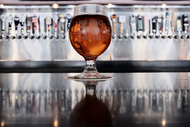
The first nice weekend after a long, cold winter in the Twin Cities is serious business. A few years ago some local diners joined the celebration with a serious indulgence: the boozy milkshake.

When talking with a friend of mine from the Deep South about these milkshakes, she replied, “oh, a bushwhacker! We had those all the time in college.” This wasn’t the first time she had dropped southern slang that was new to me, so off to Google I went.

According to Merriam-Webster, “to bushwhack” means to attack suddenly and unexpectedly, as one would expect the alcohol in a milkshake to sneak up on you. The cocktail is a Nashville staple, but the origins trace back to the Virgin Islands in the 1970s.

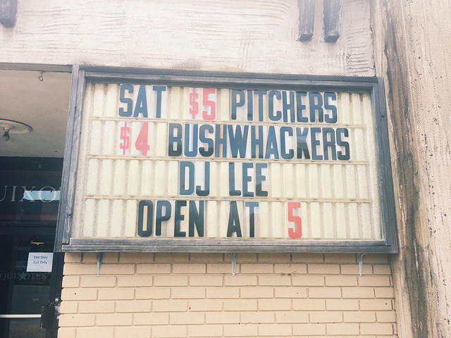
Photo Credit: Beebe Bourque, Flickr CC
Photo Credit: Like_the_Grand_Canyon, Flickr CC

Here’s the part where the history takes a sordid turn: “Bushwhacker” was apparently also the nickname for guerrilla fighters in the Confederacy during the Civil War who would carry out attacks in rural areas (see, for example, the Lawrence Massacre). To be clear, I don’t know and don’t mean to suggest this had a direct influence in the naming of the cocktail. Still, the coincidence reminded me of the famous, and famously offensive, drinking reference to conflict in Northern Ireland.

Battle of Lawrence, Wikimedia Commons

When sociologists talk about concepts like “cultural appropriation,” we often jump to clear examples with a direct connection to inequality and oppression like racist halloween costumes or ripoff products—cases where it is pretty easy to look at the object in question and ask, “didn’t they think about this for more than thirty seconds?”

Cases like the bushwhacker raise different, more complicated questions about how societies remember history. Even if the cocktail today had nothing to do with the Confederacy, the weight of that history starts to haunt the name once you know it. I think many people would be put off by such playful references to modern insurgent groups like ISIS. Then again, as Joseph Gusfield shows, drinking is a morally charged activity in American society. It is interesting to see how the deviance of drinking dovetails with bawdy, irreverent, or offensive references to other historical and social events. Can you think of other drinks with similar sordid references? It’s not all sex on the beach!

Evan Stewart is an assistant professor of sociology at University of Massachusetts Boston. You can follow his work at his website, or on BlueSky.
More social scientists are pointing out that the computer algorithms that run so much of our lives have our human, social biases baked in. This has serious consequences for determining who gets credit, who gets parole, and all kinds of other important life opportunities.

It also has some sillier consequences.

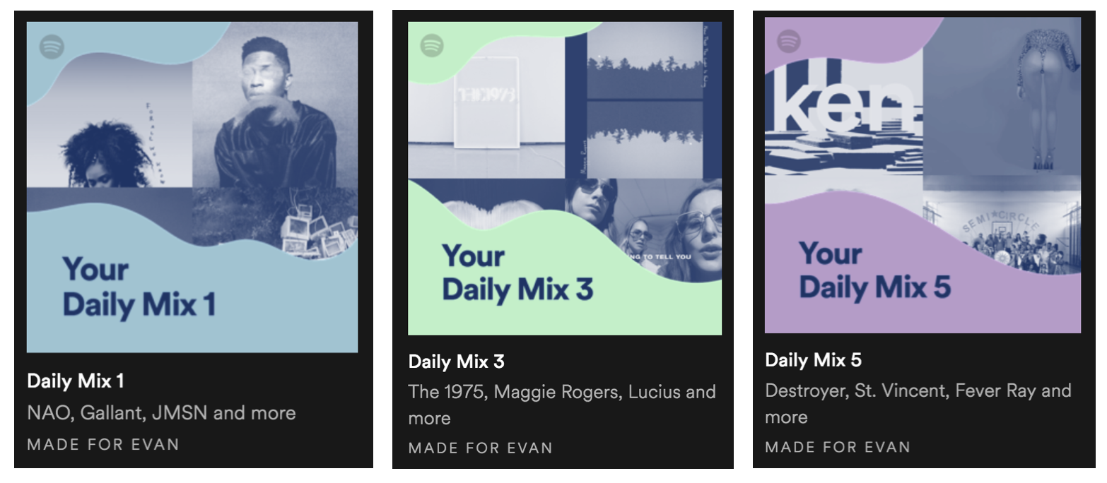
Last week NPR host Sam Sanders tweeted about his Spotify recommendations:

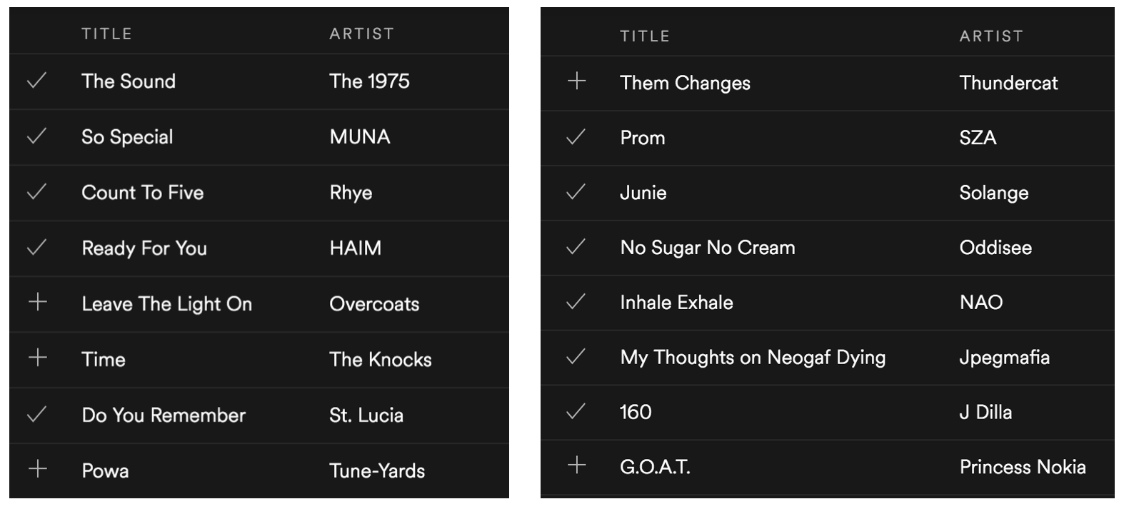
Others quickly chimed in with screenshots of their own. Here are some of my mixes:

The program has clearly learned to suggest music based on established listening patterns and norms from music genres. Sociologists know that music tastes are a way we build communities and signal our identities to others, and the music industry reinforces these boundaries in their marketing, especially along racial lines.

These patterns highlight a core sociological point that social boundaries large and small emerge from our behavior even when nobody is trying to exclude anyone. Algorithms accelerate this process by the sheer number of interactions they can watch at any given time. It is important to remembers the stakes of these design quirks when talking about new technology. After all, if biased results come out, the program probably learned it from watching us!

Evan Stewart is an assistant professor of sociology at University of Massachusetts Boston. You can follow his work at his website, or on BlueSky.
Source Photo: Ted Eytan, Flickr CC

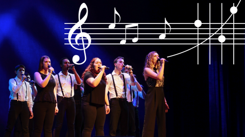
It’s that time of year again! Fans across the nation are coming together to cheer on their colleges and universities in cutthroat competition. The drama is high and full of surprises as underdogs take on the established greats—some could even call it madness.

I’m talking, of course, about The International Championship of Collegiate A Cappella.

In case you missed the Pitch Perfect phenomenon, college a cappella has come a long way from the dulcet tones of Whiffenpoofs in the West Wing. Today, bands of eager singers are turning pop hits on their heads. Here’s a sampler, best enjoyed with headphones:

And competitive a cappella has gotten serious. Since its founding in 1996, the ICCA has turned into a massive national competition spawning a separate high school league and an open-entry, international competition for any signing group.

As a sociologist, watching niche hobbies turn into subcultures and subcultures turn into established institutions is fascinating. We even have data! Varsity Vocals publishes the results of each ICCA competition, including the scores and university affiliations of each group placing in the top-three of every quarterfinal, regional semifinal, and national final going back to 2006. I scraped the results from over 1300 placements to see what we can learn when a cappella meets analytics.

Watching a Conference Emerge

Organizational sociologists study how groups develop into functioning formal organizations by turning habits into routines and copying other established institutions. Over time, they watch how behaviors  become more bureaucratic and standardized.

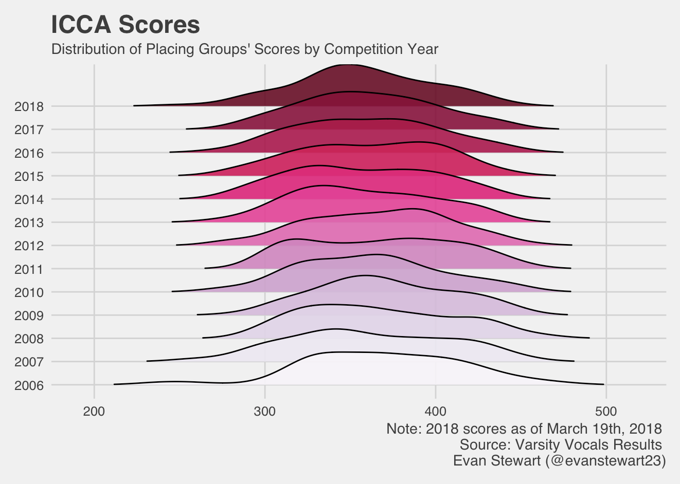
We can watch this happen with the ICCAs. Over the years, Varsity Vocals has established formal scoring guidelines, judging sheets, and practices for standardizing extreme scores. By graphing out the distribution of groups’ scores over the years, you can see the competition get more consistent in its scoring over time. The distributions narrow in range, and they take a more normal shape around about 350 points rather than skewing high or low.

(Click to Enlarge)

Gender in the A Cappella World

Gender is a big deal in a cappella, because many groups define their membership by gender as a proxy for vocal range. Coed groups get a wider variety of voice parts, making their sound more versatile, but gender-exclusive groups can have an easier time getting a blended, uniform sound. This raises questions about gender and inequality, and there is a pretty big gender gap in who places at competition.

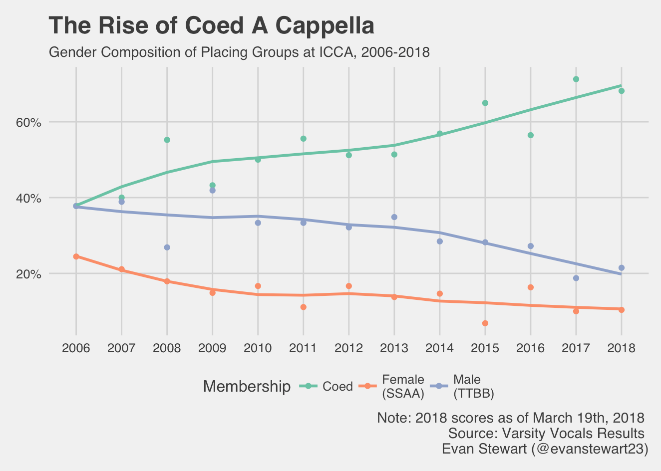
In light of this gap, one interesting trend is the explosion of coed a cappella groups over the past twelve years. These groups now make up a much larger proportion of placements, while all male and all female groups have been on the decline.

(Click to Enlarge)

Who Are the Powerhouse Schools?

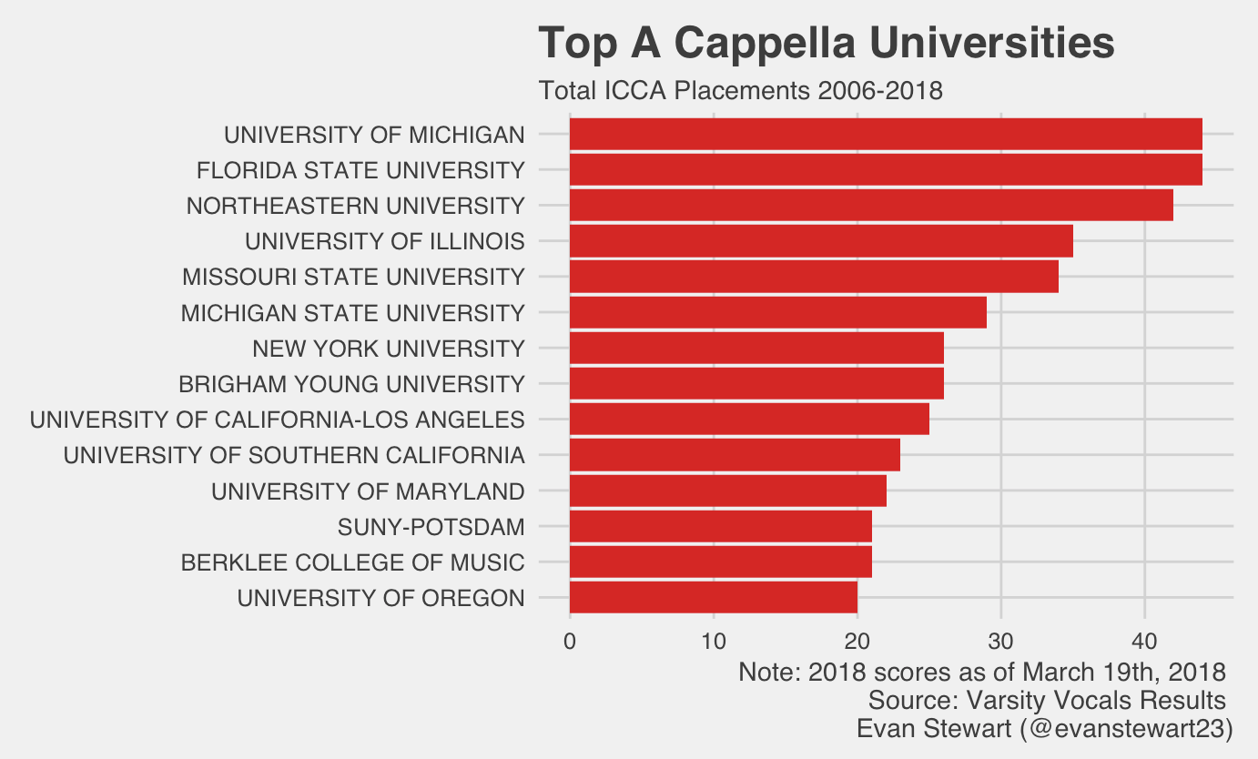
Just like March Madness, one of my favorite parts about the ICCA is the way it brings together all kinds of students and schools. You’d be surprised by some of the schools that lead on the national scene. Check out some of the top performances on YouTube, and stay tuned to see who takes the championship next month!

(Click to Enlarge)


Evan Stewart is an assistant professor of sociology at University of Massachusetts Boston. You can follow his work at his website, or on BlueSky.
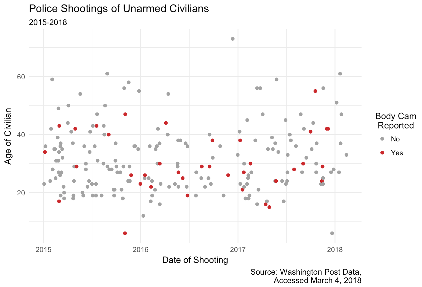
The Washington Post has been collecting data on documented fatal police shootings of civilians since 2015, and they recently released an update to the data set with incidents through the beginning of 2018. Over at Sociology Toolbox, Todd Beer has a great summary of the data set and a number of charts on how these shootings break down by race.

One of the main policy reforms suggested to address this problem is body cameras—the idea being that video evidence will reduce the number of killings by monitoring police behavior. Of course, not all police departments implement these cameras and their impact may be quite small. One small way to address these problems is public visibility and pressure.

So, how often are body cameras incorporated into incident reporting? Not that often, it turns out. I looked at all the shootings of unarmed civilians in The Washington Post’s dataset, flagging the ones where news reports indicated a body camera was in use. The measure isn’t perfect, but it lends some important context.

(Click to Enlarge)

Body cameras were only logged in 37 of 219 cases—about 17% of the time—and a log doesn’t necessarily mean the camera present was even recording. Sociologists know that organizations are often slow to implement new policies, and they don’t often just bend to public pressure. But there also hasn’t been a change in the reporting of body cameras, and this highlights another potential stumbling block as we track efforts for police reform.

Evan Stewart is an assistant professor of sociology at University of Massachusetts Boston. You can follow his work at his website, or on BlueSky.
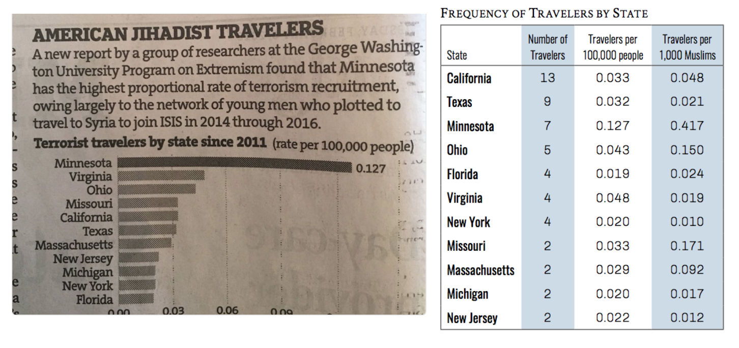
The Star Tribune recently ran an article about a new study from George Washington University tracking cases of Americans who traveled to join jihadist groups in Syria and Iraq since 2011. The print version of the article was accompanied by a graph showing that Minnesota has the highest rate of cases in the study. TSP editor Chris Uggen tweeted the graph, noting that this rate represented a whopping seven cases in the last six years.

Here is the original data from the study next to the graph that the paper published:

(Click to Enlarge)

Social scientists often focus on rates when reporting events, because it make cases easier to compare. If one county has 300 cases of the flu, and another has 30,000, you wouldn’t panic about an epidemic in the second county if it had a city with many more people. But relying on rates to describe extremely rare cases can be misleading. 

For example, the data show this graph misses some key information. California and Texas had more individual cases than Minnesota, but their large populations hide this difference in the rates. Sorting by rates here makes Minnesota look a lot worse than other states, while the number of cases is not dramatically different. 

As far as I can tell, this chart only appeared in the print newspaper photographed above and not on the online story. If so, this chart only went to print audiences. Today we hear a lot of concern about the impact of “filter bubbles,” especially online, and the spread of misleading information. What concerns me most about this graph is how it shows the potential impact of offline filter bubbles in local communities, too.

Evan Stewart is an assistant professor of sociology at University of Massachusetts Boston. You can follow his work at his website, or on BlueSky.
That large (and largely trademarked) sporting event is this weekend. In honor of its reputation for massive advertising, Lisa Wade tipped me off about this interesting content analysis of last year’s event by the Media Education Foundation.

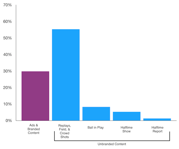
MEF watched last year’s big game and tallied just how much time was devoted to playing and how much was devoted to ads and other branded content during the game. According to their data, the ball was only in play “for a mere 18 minutes and 43 seconds, or roughly 8% of the entire broadcast.”

MEF used a pie chart to illustrate their findings, but readers can get better information from comparing different heights instead of different angles. Using their data, I quickly made this chart to more easily compare branded and non-branded content.

Data Source: Media Education Foundation, 2018

One surprising thing that jumps out of this data is that, for all the hubbub about commercials, far and away the most time is devoted to replays, shots of the crowd, and shots of the field without the ball in play. We know “the big game” is a big sell, but it is interesting to see how the thing it sells the most is the spectacle of the event itself.

Evan Stewart is an assistant professor of sociology at University of Massachusetts Boston. You can follow his work at his website, or on BlueSky.
My gut reaction was that nobody is actually eating the freaking Tide Pods.

Despite the explosion of jokes—yes, mostly just jokes—about eating detergent packets, sociologists have long known about media-fueled cultural panics about problems that aren’t actually problems. Joel Best’s groundbreaking research on these cases is a classic example. Check out these short video interviews with Best on kids not really being poisoned by Halloween candy and the panic over “sex bracelets.”

[youtube]https://www.youtube.com/watch?v=Bav01pAZrNw[/youtube]

In a tainted Halloween candy study, Best and Horiuchi followed up on media accounts to confirm cases of actual poisoning or serious injury, and they found many cases couldn’t be confirmed or were greatly exaggerated. So, I followed the data on detergent digestion.

It turns out, there is a small trend. According to a report from the American Association of Poison Control Centers,

…in 2016 and 2017, poison control centers handled thirty-nine and fifty-three cases of intentional exposures, respectively, among thirteen to nineteen year olds. In the first fifteen days of 2018 alone, centers have already handled thirty-nine such intentional cases among the same age demographic.

That said, this trend is only relative to previous years and cannot predict future incidents. The life cycle of internet jokes is fairly short, rotating quickly with an eye toward the attention economy. It wouldn’t be too surprising if people moved on from the pods long before the panic dies out.

Evan Stewart is an assistant professor of sociology at University of Massachusetts Boston. You can follow his work at his website, or on BlueSky.
The rise of craft beer in the United States gives us more options than ever at happy hour. Choices in beer are closely tied to social class, and the market often veers into the world of pointlessly gendered products. Classic work in sociology has long studied how people use different cultural tastes to signal social status, but where once very particular tastes showed membership in the upper class—like a preference for fine wine and classical music—a world with more options offers status to people who consume a little bit of everything.

Photo Credit: Brian Gonzalez (Flickr CC)

But who gets to be an omnivore in the beer world? New research published in Social Currents by Helana Darwin shows how the new culture of craft beer still leans on old assumptions about gender and social status. In 2014, Darwin collected posts using gendered language from fifty beer blogs. She then visited four craft beer bars around New York City, surveying 93 patrons about the kinds of beer they would expect men and women to consume. Together, the results confirmed that customers tend to define “feminine” beer as light and fruity and “masculine” beer as strong, heavy, and darker.

Two interesting findings about what people do with these assumptions stand out. First, patrons admired women who drank masculine beer, but looked down on those who stuck to the feminine choices. Men, however, could have it both ways. Patrons described their choice to drink feminine beer as open-mindedness—the mark of a beer geek who could enjoy everything. Gender determined who got “credit” for having a broad range of taste.

Second, just like other exclusive markers of social status, the India Pale Ale held a hallowed place in craft brew culture to signify a select group of drinkers. Just like fancy wine, Darwin writes,

IPA constitutes an elite preference precisely because it is an acquired taste…inaccessible to those who lack the time, money, and desire to cultivate an appreciation for the taste.

Sociology can get a bad rap for being a buzzkill, and, if you’re going to partake, you should drink whatever you like. But this research provides an important look at how we build big assumptions about people into judgments about the smallest choices.

Evan Stewart is an assistant professor of sociology at University of Massachusetts Boston. You can follow his work at his website, or on BlueSky.