Every year I see the Fourth of July spark a social media fight. First, the flag swag comes out for the ritual parties and barbecues:

Then, somebody posts the U.S. flag code, especially this part:
(d) The flag should never be used as wearing apparel, bedding, or drapery.
It is interesting that flag apparel has become a quintessential dudebro look for the Fourth. Activist Abbie Hoffman was arrested for wearing a flag shirt in protest in 1968, and we still argue about whether flag burning in protest should be legal.
Are the dudebros disrespectful? Are the flag purists raining on the parade? Sociology shows us how this debate runs into deep assumptions about how we show respect for sacred things.
In 1966, the late sociologist Robert Bellah presented a now-classic essay, “Civil Religion in America.” The essay is about religion in public life, and how American politicians created a sense of shared national identity around general religious claims. Since then, sociologists and political theorists have argued about how inclusive civil religion really is (Does it include atheists or other minority groups who aren’t Christian? Lots of Americans don’t seem to think so.), but the theory is useful for highlighting how much of American political life takes on a religious tone.
While Bellah focused on religious references in speeches and texts, there is a more general point that stands out for the flag debate:
What we have, then, from the earliest years of the republic is a collection of beliefs, symbols, and rituals with respect to sacred things and institutionalized in a collectivity…
The American civil religion…borrowed selectively from the religious tradition in such a way that the average American saw no conflict between the two. In this way, the civil religion was able to build up without any bitter struggle with the church powerful symbols of national solidarity and to mobilize deep levels of personal motivation for the attainment of national goals.
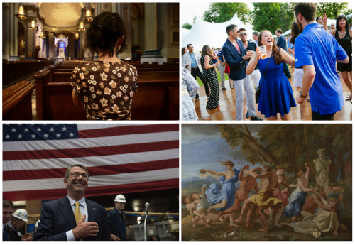
It is pretty easy to see the flag as a sacred symbol—one that represents a long history of solidarity and commitment in the United States. The trick is that civil religion focuses on the content of political beliefs more than the conduct of honoring those beliefs. The rich variety of human religious experience shows us that just because people share a sacred symbol doesn’t mean they agree about how best to celebrate it. Sure, the styles of American Christianity might appreciate quiet reverence and contemplation, but other societies partied to show their piety (Bacchanalia, anyone?).
Once you consider the range in how people express their deeply-held political and cultural beliefs, it gets easier to understand where they are coming from, even if you completely disagree with them. What starts as an argument about disrespect hides a deeper argument about different kinds of celebration (and, of course, whether it is appropriate to celebrate at all). Political tensions are high these days, but cases like this show how we can have more productive arguments by getting to the core of our cultural disagreements.
Evan Stewart is an assistant professor of sociology at University of Massachusetts Boston. You can follow his work at his website, or on BlueSky.