A couple of days ago, Lisa posted about the sexualization of young girls, specifically in a fashion spread in French Vogue. Erica B. found another striking example on the reality show Toddlers & Tiaras, a show about young girls entered in beauty pageants. In this case, 2-year-old Mia’s mother has her perform wearing a tiny version of Madonna’s famous cone-bra bustier from her Blond Ambition tour:

The whole performance (and note the video is titled “Mia Living Doll”):

M/p>

For another video of her doing the routine, watch the 2nd video at this Jezebel post.

As most of you probably know, yesterday Representative Gabrielle Giffords, of Arizona, was one of 18 people shot at a public event yesterday. Elliott J. went online to find more information and came across this piece from Fox News:

The piece has now been expanded somewhat, with a photo of Giffords added, the photo of her husband pushed to the bottom of the page, and the title changed.

When I was googling looking for the Fox story, I came upon this from the website of the Orlando Sentinel:

I get that the point of a title is to draw people in and give them information that might make the topic seem interesting or relevant to them. And I guess NASA has a center in Florida, so maybe being married to an astronaut has special resonance there.

But really: a woman had a person walk up to her in a crowd and shoot her in the head, also shooting other people and killing some of them. I would hope that, even if she weren’t a member of Congress, that in and of itself would be sufficient material for a headline, regardless of who the victim’s husband was.

UPDATE: Kat P. sent in another example from the Galveston County Daily News. The headline reads: “Wife of shuttle commander shot during rampage.”

In the article “In Pursuit of the Perfect Penis: The Medicalization of Male Sexuality” (available for free if you search for the title and Tiefer’s name), Leonore Tiefer discusses the way that the increasing attention paid by the medical community to conditions defined as “impotence,” and the way it has become medicalized, requiring any number of surgical, psychological, and/or pharmacological interventions. While some men have undoubtedly benefited, the largest beneficiary is the medical community itself. The broadened definition of what counts as “erectile dysfunction,” for instance, has created a larger market for drugs such as Viagra and Cialis.

Dmitriy T.M. sent in a trailer for the documentary Orgasm Inc., which documents efforts to medicalize “sexual dysfunction” among women. In the 3-minute trailer, we see cultural commentators and doctors discussing the shocking prevalence of sexual problems among women (43%! 83%! It’s an epidemic!) and some potential medical solutions. It’s a fantastic example of the medicalization of sexuality (and pretty safe for work). Enjoy!

Emory University has a very detailed database about the Atlantic slave trade, titled Voyages: The Trans-Atlantic Slave Trade Database, which I don’t believe we’ve posted before (my apologies if we have). It includes nine maps providing information on major points of departure and destination ports for the trans-Atlantic trade; here’s a general overview:

Initially the vast majority of slave voyages were organized by firms or individuals in Spain and Portugal; however, over time the slave trade was dominated by groups from northern Europe. Great Britain eventually played a major role, and over 1/3 of documented slave voyages were organized there.The description of Map 6 explains, “vessels from the largest seven ports, Rio de Janeiro, Bahia, Liverpool, London, Nantes, Bristol, and Pernambuco carried off almost three-quarters of all captives removed from Africa via the Atlantic Ocean.”

This map shows where voyages were organized, and the % of all documented African slaves that voyages from that country/area transported:

In the U.S., students generally learn about slavery in relation to cotton plantations and, to a lesser extent, tobacco. However, overall those two crops played a relatively minor role in the growth of the global slave trade. It was the growing taste for sugar, and the creation of sugar plantations, particularly in the Caribbean and South American coastal areas, that produced such an enormous demand for African slaves in the Americas. According to the Voyages website, less than 4% of all Africans captured were sold in North America.

The website also has a database of thousands of documented trips in the trans-Atlantic slave trade, including everything from point of origin, destination, number of slaves, % who died during voyage, length of trip, and so on. Some include many more details than others, as you’d expect. You can also create tables to display the variables you’re interested in. Here’s the table showing the slave trade, broken into 25-year intervals and by destination. We can clearly see that the slave trade made one big jump in the late 1500s (going from 4,287 in the 1551-1575 interval to 73,865 between 1576 and the end of the century) and another huge jump in the late 1600s, with the height of the slave trade occuring in the 1700s through the mid-1800s:

You can also create various graphs and charts. Here is a graph of the % of slaves who died during the trip, by year:

I presume the extremely high numbers in the 1550s must be skewed by some ships that sank or met some other disaster that led to the death of everyone aboard.

Over time, ships carried larger numbers of individuals per trip:

The individuals taken as part of the slave trade were predominantly male:

Documented types of resistance from captives or from Africans trying to free them:

You can spend quite a bit of time on this, I warn you — creating timelines, graphs, and so on. It’s taken me an hour to write this post because I keep getting distracted creating charts and tables. Overall, the site is a fantastic resource for both specific information and for helping illuminate the enormity of the Atlantic slave trade. Thanks to Shamus Khan for the tip.

Mab R. sent in a nice example of how children are socialized into gendered expectations. Chunky Monkey Mind has a post about the cut-out trading cards that appeared on the back of Cap’n Crunch cereal boxes a while back. Each card features a Cap’n Crunch character. Here’s the card for Smedley:

Ok, so for the male character we get basic stats, and he’s clearly an active guy who has thrilling adventures.

On the same box that featured the Smedley card was a card for Magnolia Bulkhead, who is shown with hearts hovering around her face as she clasps her hands together in rapture:

But of course, being female, she isn’t going to give us all of her vital statistics — in particular, age and weight are secrets women should guard carefully. Also notice the reinforcement of the idea that women are obsessed with romance. While Smedley’s hobbies involve action, Magnolia’s only listed hobby is daydreaming about a man (and his cereal). And her greatest adventure? Why, almost getting married, of course. Yes, the most amazing adventure of her life is something she failed at, but since it held out at least the possibility of romance, and she’s female, it was still the highlight of her life.

Ah, gender stereotypes! Fun for kids of all ages!

Michaela sent in two Australian ads for Selleys sealants. Both target men and caution them about the consequences of neglecting home maintenance projects:

So men who fail to do the type of housework that is consistent with ideals of masculinity — fixing things — face threats to other areas of masculinity as well, since, of course, women (who cannot, themselves, caulk a shower, obviously) will be unable to resist a hot dude who can (and will) fix stuff, thus proving himself to be the ideal man. Who doesn’t love emasculation as a marketing tool?

A polished version of this post was published in Contexts. You can download it here.

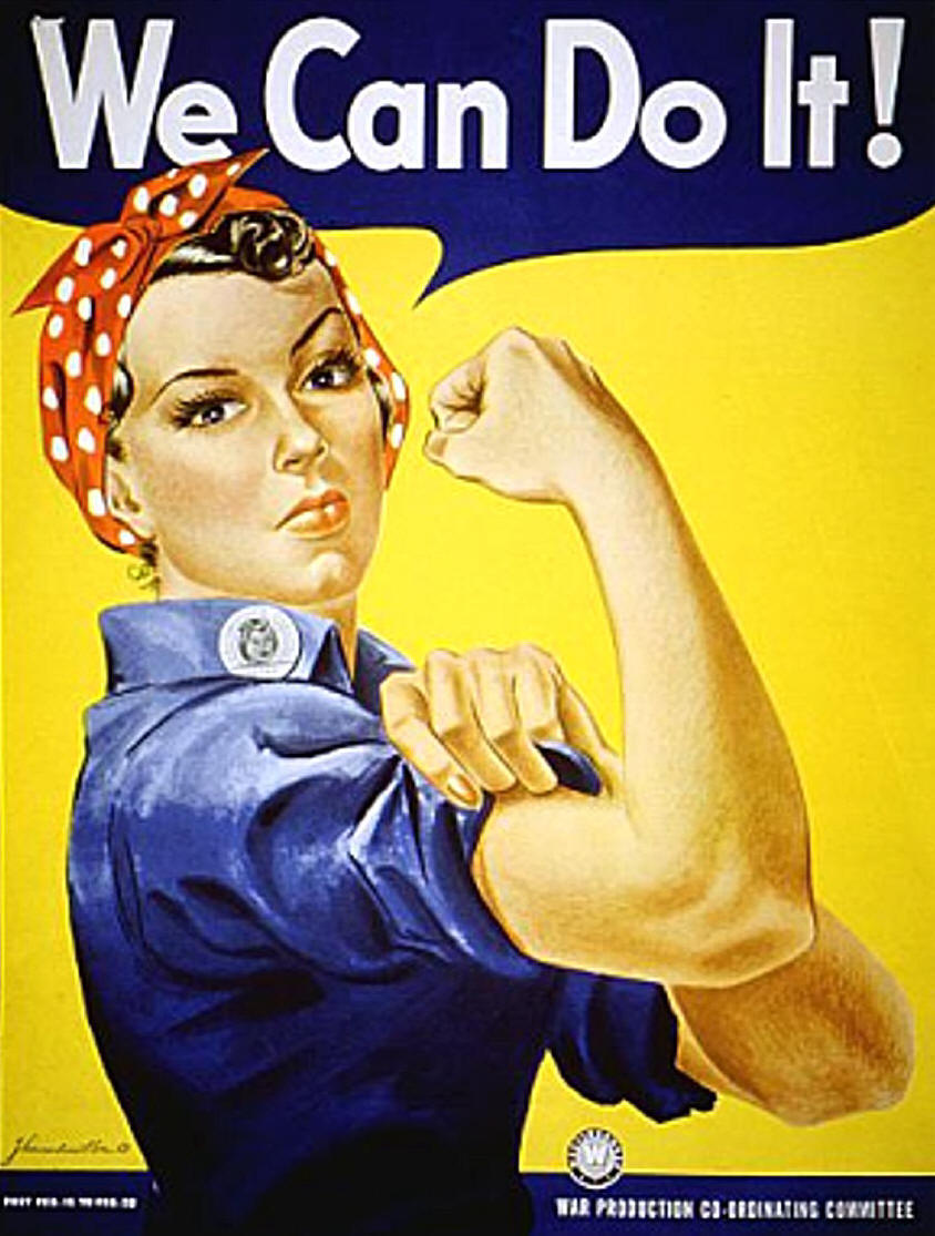
Most of our readers are probably familiar  with the now-iconic “We Can Do It!” poster associated with Rosie the Riveter and the movement of women into the paid industrial workforce during World War II:

It is, by this point, so recognizable that it is often parodied or appropriated for a variety of uses (including selling household cleaners). The image is widely seen as a symbol of women’s empowerment and a sign of major gender transformations that occurred during the 1940s.

In their article, “Visual Rhetoric Representing Rosie the Riveter: Myth and Misconception in J. Howard Miller’s ‘We Can Do It!’ Poster,” James Kimble and Lester Olson argue that our current interpretations of the poster don’t necessarily align with how it was seen at the time.

While the poster is often described as a government recruiting item (Kimble and Olson give many examples in the article of inaccurate attributions from a variety of sources), it was, in fact, created by J. Howard Miller as part of a series of posters for the Westinghouse Electric and Manufacturing Company — the Westinghouse logo is clearly visible just under the woman’s arm, and the badge on her shirt collar is the badge employees wore on the plant floor, including an employee number. The War Production Co-ordinating Committee was an internal Westinghouse committee, similar to those created by many companies during the war, not a government entity.

The assumption of current viewers of the image is usually that it was meant to recruit women into the workforce, or to rally women in general — an early example of girl power marketing, if you will — and was widely displayed. But the audience was actually only Westinghouse employees. The company commissioned artists to create posters to be hung in Westinghouse plants for specific periods of time; this poster specifically says, “Post Feb. 15 to Feb. 28” [1943] in small font on the lower left. There’s no evidence that it was ever made available to the public more broadly. For that matter, the poster doesn’t identify her as “Rosie,” and it’s not clear that at the time she would have been immediately identifiable to viewers as “Rosie the Riveter”.

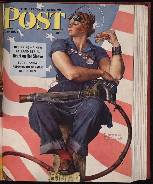
The image that was more widely seen, and is often conflated with the “We Can Do It!” poster, was Norman Rockwell’s May 29, 1943, cover for the Saturday Evening Post:

Here, the woman is clearly linked to the idea of Rosie the Riveter, through both the name on her lunchbox and the  equipment she’s holding. She is more muscular than the woman in Miller’s poster, she’s dirty, and her foot is standing on a copy of Hitler’s Mein Kampf. Rockwell’s image presents the woman as a vital part of the war effort; her work helps defeat the Nazis. The image also includes fewer details to make her look conventionally attractive than Miller’s, where the woman has emphasized eyelashes and visibly painted fingernail.

Most interestingly, Kimble and Olson question the female empowerment message presumed to be the point of the “We Can Do It!” poster. We see the poster on its own, through the lens of a narrative about World War II in which housewives left the kitchen in droves to work in factories. But Westinghouse workers would have seen it in a different context, as one of a series of posters displayed in the plant, with similar imagery and text. When seen as just one in a series, rather than a unique image, Kimble and Olson argue that the collective “we” in “We can do it!” wouldn’t have been women, but Westinghouse employees, who were used to seeing such statements posted in employee-access-only areas of the plant.

Of course, having a woman represent a default factory employee is noteworthy. But our reading of the poster as a feminist emblem partially rests on the idea that this female worker is calling out encouragement to other women. The authors, however, point out a much less empowering interpretation if you think of the poster not in terms of feminism, but in terms of social class and labor relations:

…Westinghouse used “We Can Do It!” and Miller’s other posters to encourage women’s cooperation with the company’s relatively conservative concerns and values at a time when both labor organizing and communism were becoming active controversies for many workers… (p. 537)

…by addressing workers as “we,” the pronoun obfuscated sharp controversies within labor over communism, red-baiting, discrimination, and other heartfelt sources of divisiveness. (p. 550)

One of the major functions of corporate war committees was to manage labor and discourage any type of labor disputes that might disrupt production. From this perspective, images of happy workers expressing support for the war effort and/or workers’ abilities served as propaganda that encouraged workers to identify with one another and management as a team; “patriotism could be invoked to circumvent strikes and characterize workers’ unrest as un-American” (p. 562).

And, as Kimble and Olson illustrate, most of Miller’s posters included no women at all, and when they did, emphasized conventional femininity and the domestic sphere (such as a heavily made-up woman waving to her husband as he left for work).

Of course, today the “We Can Do It!” poster is seen as a feminist icon, adorning coffee cups, t-shirts, calendars, and refrigerator magnets (I have one). Kimble and Olson don’t explain when and how this shift occurred — when the image went from an obscure piece of corporate war-time propaganda, similar to many others, to a widely-recognized pop cultural image of female empowerment. But they make a convincing argument that our current perceptions of the image involve a significant amount of historical myth-making that helps to obscure the discrimination and opposition many women faced in the paid workforce even during the height of the war effort.

[The article appears in Rhetoric & Public Affairs 9(4): 533-570, 2006.]

Gwen Sharp is an associate professor of sociology at Nevada State College. You can follow her on Twitter at @gwensharpnv.

If you are a bit of a linguistics geek, then Jeff H. sent in a treat for you. He found a detailed map of accents/dialects among English speakers in the U.S.:

The creator, Rick Aschmann, is a professional linguist, though the map is described as a hobby not related to his work. It appears to be based primarily on data from the Atlas of North American English (ANAE).

A caution: Aschmann says, “I have not included AAVE [African American Vernacular English] in this study, since its geographical distribution tends to be independent of ‘white’ dialects.” That’s an important omission to keep in mind. I went to the ANAE website and also did a general search for a map of AAVE prevalence, but I haven’t been able to find one

And there is one area in the continental U.S. where the majority of people do not speak English: the parts of Arizona and New Mexico, shaded a sort of coral color, where indigenous languages are still more prevalent than English.

If you go to Aschmann’s page, you can click on sections of the map and go to a list of representative recordings of people who represent the dominant speech patterns there. You can also get a very thorough explanation of all kinds of linguistic differences that are beyond my level of interest/comprehension.