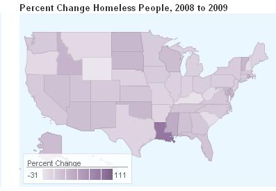
scatx sent in a link to the National Alliance to End Homelessness website, which includes a number of maps illustrating the increase in the homeless population over the past few years. The data come from community counts conducted each January of individuals in shelters as well as counts by outreach workers and volunteers of those sleeping in public places, in cars, abandoned buildings, and so on. Of course, counting the homeless will always be a challenging task, but these community counts provide at least some baseline data for those areas that take part.
If you go to the website, you can hover over an individual state to see the relevant data. The page also has a map of the total number of homeless individuals by state.
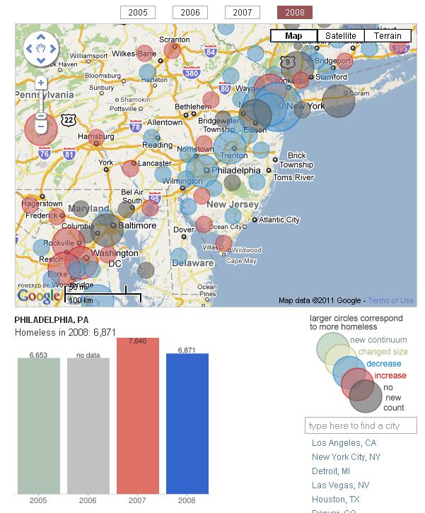
A more detailed interactive map lets you get information for individual communities. When you click on one of the circles on the map, a bar graph pops up underneath showing any data available for that city from 2005-2008. Here I selected Philadelphia:
A breakdown of the data shows that though most of those who are currently homeless are sheltered in some way, a significant number are living on the street, in a car, or in some other situation that wasn’t designed for human habitation:
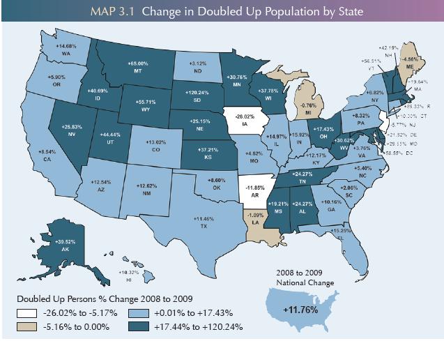
The full report shows a striking increase in the number of people “doubled-up” — that is, staying with other families because of economic hardship (based on U.S. Census Bureau data):
While moving in with others is a common strategy, it is also often temporary; significant proportions of individuals in shelters end up there when they can no longer stay with friends or family.
The website has tons of data on homelessness — risk factors, demographics, changes, and so on — so it’s worth a look.
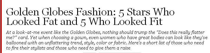
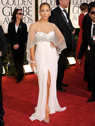
G.M. Cairney pointed out a set of photos at Time that highlights the scrutiny women’s bodies are under, the expectation that we constantly work to make our bodies look smaller, and a general cultural fat phobia, while making me wonder, again, why does this merit a slideshow? The article (which features only women) focuses on celebrities’ outfits at the Golden Globes on Sunday and makes it very clear what the main criterion for success is: could it possibly, in any way, from any angle, make these celebrities, most of whom are tiny, look even slightly larger than they are?
Here’s one of the offending garments, on Jennifer Lopez:
I don’t know that I particularly like the dress, but does it make her look fat? The author assures us, though, that this is a disaster: “White is a fright on an ample derriere, or on anyone who is not a size 0.” That’s right: if you’re over a size 0, the entire color white is off-limits to you.
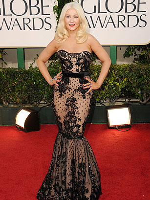
Christina Aguilera’s dress commits the sin of making her look “buxom” and “hippy,” and she is rather oddly compared to Mae West as though that’s a bad thing:
Jennifer Love Hewitt’s dress is described as a “high-calorie confection,” reinforcing the association with fat.
All of these criticisms rest on the central assumption that there is an ideal body type that we should all be aspiring to, and that the role of fashion is to “camouflage” any areas that don’t conform. Any outfit that doesn’t do this has, by definition, failed, no matter how it actually looks on the person. Yes, the specific dress is supposed to be unique, individual, unlike anything else there, but the body inside it isn’t.
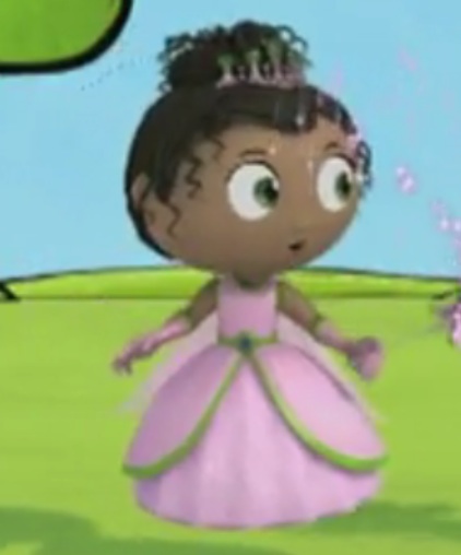
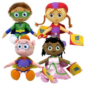
Brandy B. let us know about an interesting article by Isis the Scientist at Science Blogs on the apparent whitening of a children’s cartoon character for the Christmas toy market. PBS’s cartoon, “Super Why!”, includes a female character, Princess Presto, who has the power to spell. Here’s what she looks like:
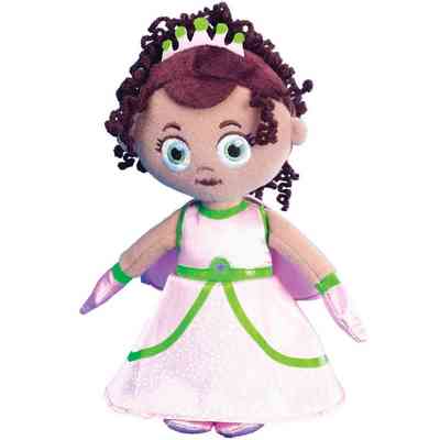
Yet the plush doll version of Princess Presto (who is supposed to have one White and one African American parent) looks significantly different:
I did find one set where she looks more like the original:
Isis the Scientists says that in comments to an article on the topic at the Orlando Sentinel, someone claiming to represent the company says the plush doll looks more like the original in person than the pictures online and says the following:
…The hair on the doll is more purple than black and this was an aesthetic choice…The placement of the facial features was intentionally tweaked to make the embroidered beanies look cute, so there is a slight difference from the onscreen character. The alterations were similarly made across all characters in the line, not just Princess Presto. There are almost always slight differences when translating the onscreen characters to off-air product especially with regard to colors because we have to use PMS or CMYK color choices for products.
Isis says BS — that having seen an actual version of the plush toy, it looks like it does in the photo, with very light skin, and that aside from that, other manufacturers seem to be able to make African American dolls just fine. And saying you changed things for “aesthetic” purposes doesn’t explain why you thought her existing characteristics were insufficiently aesthetically pleasing. Of course, we also don’t know for sure the person writing the comment was from PBS.
I tend to side with Isis here: the idea that technical limitations prevent making a more accurate representation of a dark-skinned doll is…sketchy, to say the least, and makes me think PBS needs to partner with a better toy design firm. And the choices about what the Princess Presto doll should look like in doll form put PBS in the position of appearing to think that a mixed-race character needs to be whitened to sell. PBS’s dolls exist in a marketplace where we’ve seen controversies about African American dolls being literally valued less than White dolls, and whatever their supposed reasons, it’s hard to get around the fact that all of the choices made in the name of aesthetics added up to a doll that looks awfully White.
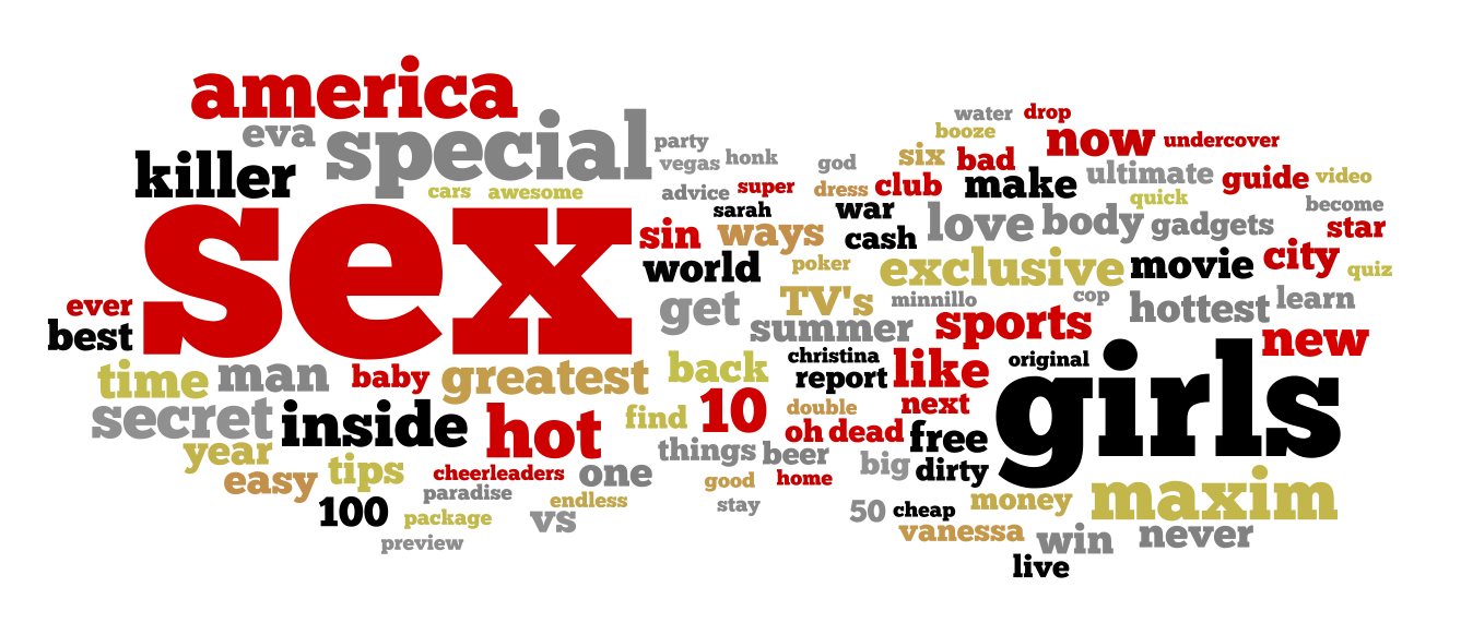
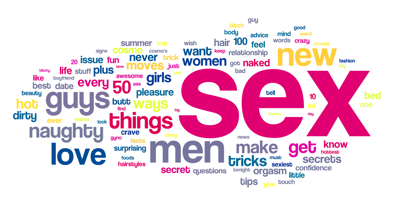
Jacqueline S. told us about a post at DarrenBarefoot comparing the words that appears most frequently on the covers of Cosmo and Maxim. Darren typed a list of every word that appeared on the covers for three years (2007-2010 for Cosmo, 2005-2008 for Maxim; he doesn’t explain why he chose different time periods) and then made word clouds to illustrate frequency. The results for Maxim:
And Cosmo:
So in both cases, sex rules, followed by a reference to the category of people you’re supposedly interested in having sex with (since both magazines pretty much exclusively assume heterosexual relationships). The word “sex” or “sexy” appeared at least once on ever single Cosmo cover in the 3-year span, and most Maxim covers as well.
But notice how much more the language on Cosmo covers focuses on sex and relationships than Maxim‘s does, with more frequent use of words that explicitly refer to men and/or sex. Of course, those familiar with Cosmo, or most other women’s magazines, know that its headlines about sex make it clear what the point is: various ways to please your man, which translates into increasing your own pleasure. Maxim, on the other hand, focuses less attention on relationships (or health/fitness) and more on money, travel, and pop culture (sports, TV, movies).
To highlight how dominant sex is on Cosmo covers, Darren made a 15-second video of them in rapid succession, back and forth:
I doubt any of you are shocked by his findings, but it’s a nice illustration of the way magazines aimed at women reinforce the idea that our primary goal should be finding, pleasing, and keeping a heterosexual partner to a degree not usually found in men’s magazines.
A while back Kale let us know that the New York Public Library had made their images collection available online.The collection has images on a huge array of topics, from fashion to the military to slavery to insects to a whole category for stilts, and including political cartoons, illustrations from publications, photographs, and so on.
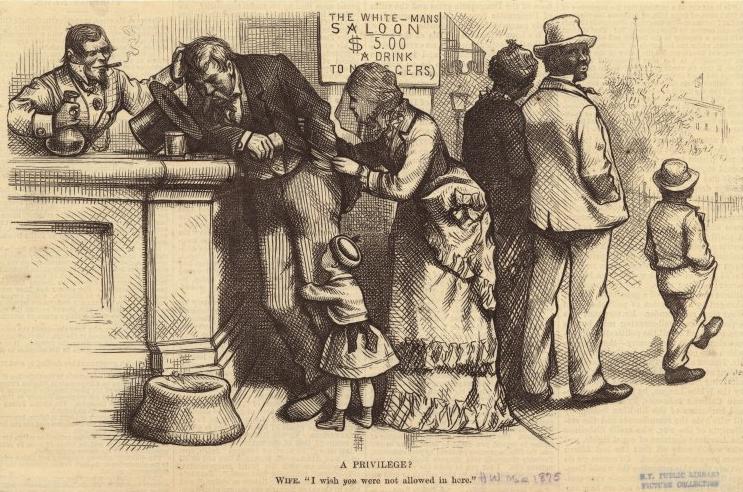
Kale found the collection particularly interesting as a way to look at historical racism and rhetoric about race relations in publications aimed at White readers. This 1875 cartoon, titled “A Privilege?”, presents segregation as actually protecting African Americans from the scourge of alcohol:
Text:
A PRIVILEGE?
Wife, “I wish you were not allowed in here.”
It’s a fascinating example of the use of institutionalized racial inequalities that hurt African Americans to, instead, garner sympathy for White women and children and present African Americans as, really, better off.
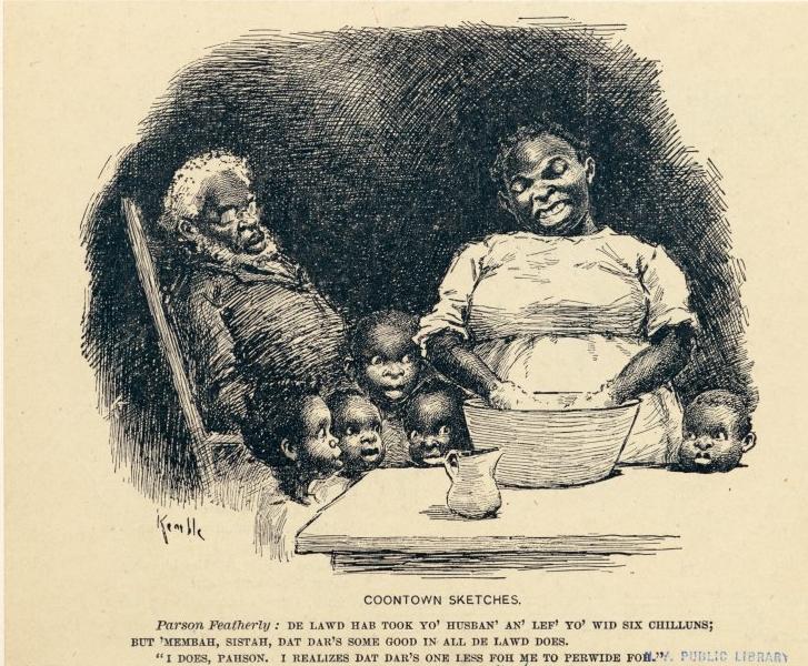
Another, published in Life in 1899, implies African American men are burdens on their families, making their wives take on the role of providing for everyone:
Text:
Parson Featherly: De Lawd hab took yo’ husban’ an’ lef’ yo’ wid six chilluns; but ‘membah, Sistah, dat dar’s some good in all de Lawd does.
“I does, Parson. I realizes dat dar’s one less for me to perwide foh.”
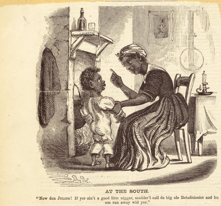
This 1860 cartoon from Harper’s Weekly shows an African American woman (presumably a slave) in the South using the “Bobolitionists” — that is, abolitionists, who wanted to outlaw slavery — as a threat, a type of monster that will come steal him if he’s not good:
Text:
“Now den Julius! If yer ain’t a good litte nigger, mudder’l call de big old Bobolitionist and let um run away wid yer.”
I’m sure it must have been very comforting to some readers to think of slaves viewing abolitionists as threats rather than potential allies.
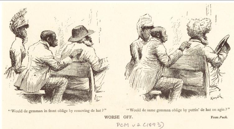
Other cartoons mock African Americans’ physical attributes, marking them as laughable or even grotesque:
Text:
“Would de gemman in front oblige by removing de hat?”
“Would de same gemman oblige by puttin’ de hat on agin?”
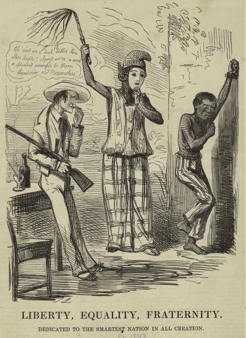
There are also examples that criticized U.S. race relations, such as this 1848 cartoon from Punch [Note: a reader thinks this might be about France, which banned slavery in 1848, but the NYPL has it listed as relevant to U.S. slavery, so there may be so lost context here]:
Enjoy!
[Note: A commenter has expressed concern that I ended this post with “Enjoy!” I apologize for my insensitivity. I meant it in terms of “Enjoy browsing this fascinating archive,” of which racist imagery is only a small part, not, I hope it would be clear, “Enjoy looking at racist cartoons!” I wasn’t thinking about how it might appear immediately after those set of images, and I should have been more careful.]
Sometimes we save up submissions on a particular topic so we can show several examples at once. And today, ladies and gents, I thought I’d present a few items that, to greater or lesser extent, glamorize brutality toward women or use images of dead women as props. Yes, I know — happy day!
On the less graphic end of the scale, way back in June 2010, Rei sent in these two trailers for the A&E show The Glades, where women exist just as props who manage to remain sexy, despite the deadness:
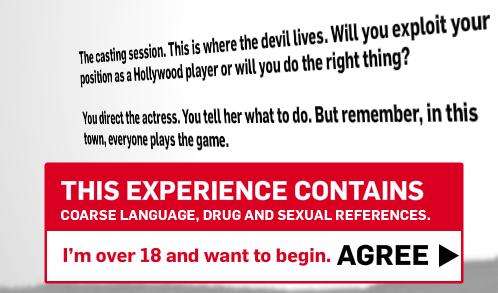
And some time ago Stefan Mesch, who writes for Die Zeit, let us know about the promotional website for Bret Easton Ellis’s new novel, Imperial Bedrooms. The website includes an interactive game where you’re a casting director and interact with a young woman who wants a part. From the homepage:
So theoretically, you have a choice — you can “exploit your position” or “do the right thing,” which presumably means not degrading or using a woman just because you can. But as Stefan explains, the options in the game are actually quite limited:
The game gives you options to talk to (and “encourage”) her, but they all lead to abuse, sexual harassment…The game rewards you for harassing the girl, and you’re supposed to drive up your personal score of “evil” by making her submit as much as possible.
Here are your first set of options:
I selected “encourage her.” The game then plays out a few seconds of dialogue and then leads to a second decision point, where I have these choices:
At least the first time I had one option to be a decent human being, other than not hiring her at all. I suppose that, in theory, giving someone booze might be a nice thing to do, but I think in this situation, probably nothing good can come of it. I selected that option; the director encourages her to drink when she doesn’t want to, and to drink more than she wants to. And then…
The “make her strip” option isn’t quite as bad as it might seem; when I chose it, she takes off her cardigan, but nothing else. At that point I felt like I’d pretty much gotten the point of the game, and wasn’t particularly interested in exploring how much of an asshole I could theoretically be, so I quit.
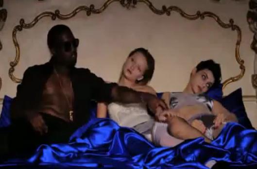
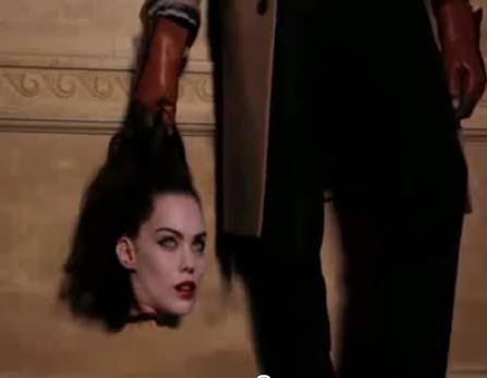
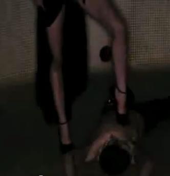
But both of those pale in comparison to our finale, readers. Dmitriy T.M. and Hope H. told us to check out Kanye West’s video for “Monster,” in which, among other things, Kanye casually rearranges the lifeless bodies of two women in bed with him:
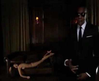
Images of dead-looking women’s bodies appear throughout the video (which also features Jay Z and Nicki Minaj). I’m putting the rest of the images after the jump, as they might be particularly upsetting to some readers:
Presumably this isn’t sexist because the video shows sexualized violence of women against men, as well, which totally makes it all ok:
The full video (the language is NSFW):
And as this post at the Feminist Fatale points out, there was even more graphic imagery that didn’t make it into the final video, such as Rick Ross eating from a plate of meat while a woman’s body in lingerie sprawls on the table in front of him, or lingerie-clad women swing from chains around their necks.
So, um…yeah. There’s that: it could have been even more graphic.
UPDATE: In regards to the Kanye video, reader Bagelsan commented,
I don’t think you can just skip the race aspect in Kanye’s video, though. White women were being targeted for violence, but not black/non-white women. That complicates the analysis; I think particular women were chosen to be dead and others were afforded much more power and a strong voice in the video, so I can’t just write it off as a straightforward example of dead ladies = pure titillation.
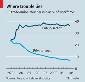
Laura Heron sent in a article from the Economist about changes in union membership. The article, which takes a fairly negative view of the effects of unionization, includes a graph, titled “Where trouble lies,” that illustrates how much union membership has shifted from the private to the public sector in the U.S. Today, 36% of public employees (7.6 million) are members of a union, while only about 7% of employees of private companies (7.1 million) are:
Such a change, from primarily private-sector and often blue-collar workers to government employees, many of whom will be white-collar, middle-class, and relatively highly educated, has significant consequences for employers, governments, employees, and the issues likely to be of primary concern to the labor movement more broadly.
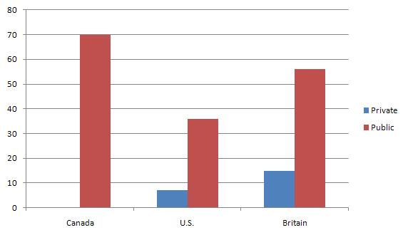
I used the data given in the article to create a chart comparing the percent of private- and public-sector employees in unions in Canada, the U.S., and Britain “today” (by which I assume they mean 2010, though they don’t specify, so be cautious there; also, they didn’t provide the private-sector rate for Canada, so I just used the data I had):
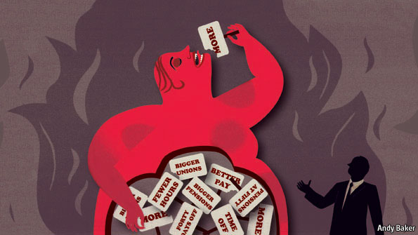
Aside from that, Laura’s attention was drawn to the post partially by the way labor was represented. To make sure we don’t miss the fact that unions are “trouble,” they illustrate the story with this image depicting labor as a fat, ravenous, naked figure devouring resources from the trim man in business attire:
A subsection of the article is also titled “Fattening the Leviathan,” and as the image at the end of the article makes clear, we need to cut this monster down to size:
It’s sort of the mirror image of the “fat cat” rhetoric often used to depict the wealthy as greedy individuals who gorge themselves on profits at the expense of workers. In either case, the central element that makes such rhetoric work is the perception of fat people as lazy, ravenous, greedy individuals who take more than their fair share of available resources.
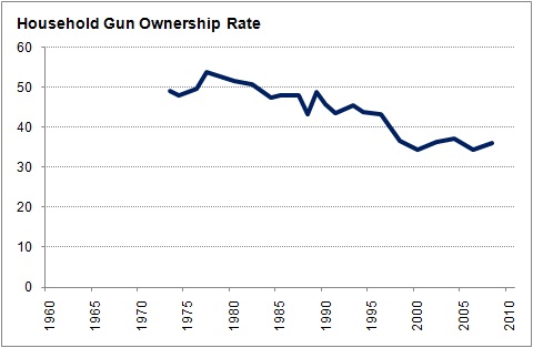
FiveThirtyEight has up a post about attitudes toward gun ownership in the U.S. Drawing on General Social Survey data, they show actual ownership of guns has gone down over time; less than 40% of American households now report having one:
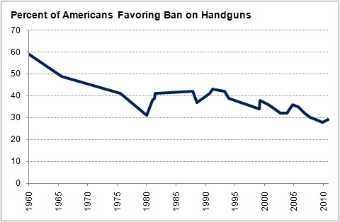
You might expect that, as fewer Americans own guns themselves, support for the right to own personal firearms might decrease, as fewer people might feel a strong personal interest in the issue and restricting or banning access to guns wouldn’t, presumably, affect them directly or bring up an emotional image of agents storming into their homes. Yet we don’t see this at all. In fact, Gallup poll data indicate that support for banning handguns has decreased over time as well, with fewer than one third of Americans supporting such a policy:
Silver suggests that changes in political rhetoric, particularly more vocal and unequivocal support for gun rights by the Republicans and less emphasis on banning guns by Democrats, may explain some of this change. I’m sure that’s part of it; but that leaves unanswered why the political rhetoric changed, particularly after 1992 (when, as Silver demonstrates, the Republican Party platform became more pro-gun/anti-restriction, while the Democrats made sure to start stressing their overall support for some basic right to gun ownership by individuals, though still pushing for some regulations). And aside from that, the biggest drop in support for banning handguns came during the ’60s and ’70s, before the change in party rhetoric, so what do we make of that?
Sociological Images encourages people to exercise and develop their sociological imaginations with discussions of compelling visuals that span the breadth of sociological inquiry. Read more…


