Back in September, I posted about some maps put together by Eric Fischer, using 2000 Census data, showing the racial/ethnic makeup of selected cities. As Jeff H., Eluned J., and Dmitriy T.M. pointed out, the NYT now has up an interactive map where you can see the racial/ethnic composition of any Census tract, using more updated Census Bureau data from 2005 to 2009. For instance, here’s a map of the neighboring cities of Midland and Odessa, Texas, which I picked for no reason other than that I just watched an episode of Friday Night Lights, which is set in a fictionalized version:

Color key:

You can zoom in to get quite detailed information about individual neighborhoods. I zoomed in as far as I could on Miami (each dot now represents 50 people):

There’s also a tab that says “View More Maps.” It allows you to select to see just the distribution of Whites, Blacks, Hispanics, Asians, or the foreign-born population. Here’s the map of the Hispanic population of Las Vegas:

As you can see, if you hover over a Census tract, you can get specific data on its racial/ethnic makeup.

The foreign-born population of Seattle (if you hover over a tract, it will tell you the % foreign-born, as well as the % increase in the foreign-born population since 2000):

A great resource. Although I tried to look up my home town, and even zooming in to the smallest scale, it’s too small to have any data available.

Larry Harnisch, of The Daily Mirror, sent in a link to a story at the NYT regarding study released by the Geena Davis Institute on Gender in Media about the under-representation of women and girls in “family” movies — that is, movies rated G, PG, and PG-13. The authors looked at all English-language fictional G-rated films released in the U.S. or Canada between September 2006 and September 2009 (a total of 22 movies). They also looked at the 50 highest-grossing films for both PG- and PG-13-ratings, meaning a total of 122 movies is included in the analysis. They focused on characters that were either mentioned by name or spoke at least one word in the movie, leading to a sample of 5,554 characters. Of those, 70.8% were male and 29.2% were female.

Consistent with patterns in Hollywood in general, women made up a small proportion of directors, writers, and producers in the movies studied:

The authors found that movies with female directors and/or writers had more female characters than those with male directors/writers, with writers seeming to have a stronger effect than directors:

Of course, this could be because female directors/writers actively try to incorporate female characters into movies or because studios are simply more comfortable hiring female directors/writers to work on movies with female characters than they are other types of films, leading to a concentration of women working on such projects.

Comparing the results of this study to an earlier analysis of films from 1990-2006, we see that the gender imbalance isn’t improving over time (though since the methodologies differed slightly, the data aren’t absolutely comparable and so are more indicative of a general trend; the authors did make statistical adjustments for the methodological differences):

Of course, none of this gets at the content of the films. The study found that female characters were generally younger than male characters, made up only 17% of group or crowd scenes, and often had plotlines that centered entirely around interests in romance.

Dmitriy T.M. sent in a Chilean ad for menstrual relief pills, posted at Copyranter. The ad plays on the old trope that during their periods, women turn into savage beasts, unrecognizable compared to their normal selves. In this case, menstruating women turn into burly, hairy, enormous Vikings:

Going with the same theme, another ads for the same company depicted a woman as a large Black boxer:

And another includes a Mexican wrestler:

What I find fascinating here is the presentation of menstruation as something that masculinizes women. We’re talking about a biological process unique to women, the foundation of women’s ability to reproduce; if you were a biological essentialist, you could argue that it is, in fact, the essence of womanhood. Yet here, the message is that menstruation steals femininity, temporarily turning women into large, intimidating, unattractive, violent non-women who must be managed and tamed by the men in their lives, with the help of the right medication.

Back in October, NPR presented the results of their investigation into the writing of Arizona’s notorious anti-immigrant law, SB 1070. I was listening to NPR when the story first aired, and I was stunned. The discussion of the law, which allows Arizona law enforcement officers to ask people they stop for proof of citizenship/legal immigration (and to arrest them if they don’t have it), has generally left out one important part of the story: the role of the private prison industry (the above link has an audio file of the story; you can get a complete transcript here):

NPR spent the past several months analyzing hundreds of pages of campaign finance reports, lobbying documents and corporate records. What they show is a quiet, behind-the-scenes effort to help draft and pass Arizona Senate Bill 1070 by an industry that stands to benefit from it…

Corrections Corporation of America, a for-profit prison company, used its membership in the American Legislative Exchange Council (ALEC), a group that brings government officials and corporate representatives together, to lobby for and shape the wording of the bill, which they see as being in their direct interest:

According to Corrections Corporation of America reports reviewed by NPR, executives believe immigrant detention is their next big market. Last year, they wrote that they expect to bring in “a significant portion of our revenues” from Immigration and Customs Enforcement, the agency that detains illegal immigrants.

Once the bill was introduced, CCA began lobbying the broader Arizona legislature. This graphic illustrates the interconnections between ALEC, private prison companies, and final sponsorship of the bill. Of the co-sponsors of the bill, only 6 didn’t receive campaign contributions from the private prison industry (represented by the dollar signs), and the vast majority had either been at the ALEC meeting or were at least members:

In a foll0w-up story (transcript here), NPR explains how ALEC’s “conferences” allow legislators to meet with corporations but get around regulations that normally require disclosure of corporate gifts:

Videos and photos from one recent ALEC conference show banquets, open bar parties and baseball games — all hosted by corporations. Tax records show the group spent $138,000 to keep legislators’ children entertained for the week. But the legislators don’t have to declare these as corporate gifts…legislators can just say they went to ALEC’s conference. They don’t have to declare which corporations sponsored these events.

I know that corporations regularly lobby legislators. That in and of itself shouldn’t be surprising — or even inherently problematic if done in a transparent manner. But I have to say, thinking about the fact that private prison industries are actively lobbying to get elected officials to create new categories of crime so they’ll have to lock up more people, and that this connection was ignored for over 6 months after the bill was implemented, struck me as particularly disturbing — as did the fact that once this came out, we haven’t seen any widespread backlash or citizen outcry at the idea that there are companies that directly stand to benefit from putting people in jail helping to write and pass criminal codes.

The NYT has posted an interesting interactive map showing the results of the last slave Census taken in the U.S., in 1860, which I discovered via Jessica Brown and Jim Yocom. The map, which shows county-level data, illustrates how slave ownership varied throughout the South

The shading (a new technique at the time, according to the NYT article) indicates what percent of the entire county’s population was enslaved:

You can see the percentage for each county, which is listed on the map, more easily if you zoom in on the pdf version. The cotton-belt area along the Mississippi River clearly stands out, as does Beaufort County, South Carolina, all with over 80% of the population enslaved. The highest rate I could pick out (the map got a little blurry as I zoomed) is in Issaquena County, Mississippi, where slaves appear to have made up 92.5% of the population.

The map also included information on the overall population and % enslaved at the state level; in South Carolina and Mississippi, over half of the total state population was made up of slaves:

Also check out Lisa’s post on geology, the economy, and the concentration of slavery in the U.S.

As the NYT post points out, the map doesn’t show the dramatic increases in slavery in some areas. For instance, while Texas ranked fairly low in terms of the overall slave population, the number of slaves in the state had tripled between 1850 and 1860. The number had doubled in Mississippi between 1840 and 1860. Those growth rates make it rather hard to swallow the argument sometimes presented by those romanticizing the Confederacy that slavery was actually on the wane and would have soon been ended in the South anyway, without any need for federal interference, and wasn’t why the South seceded at all.

Jon Stewart and Larry Wilmore discussed this effort to frame discourses about the Civil War to erase the issue of slavery on The Daily Show:

As a member of a cattle-raising family, I hear a pretty steady stream of complaints about people eating less beef, which is variously attributed to a conspiracy against the American rancher (possibly by terrorists), the result of stupid city people who get all terrified over every little health concern (Mad Cow Disease is a myth! Unless it’s a terrorist plot to ruin ranching), environmentalists, animal rights activists, and me (I’ve been a vegetarian since 1996 and thus single-handedly nearly destroyed the beef industry).

The National Cattlemen’s Beef Association is similarly concerned about reduced beef consumption. And given that we frequently hear about the connections between red meat consumption and health concerns such as heart disease, and are advised to substitute white meat for red meat (to the point that the pork industry began branding pork as “the other white meat”), you’d probably expect to see a dramatic decline in consumption of beef.

And we do see a decline, but not as much as you might expect, as this graph from the Freakonomics blog, sent in by Dmitriy T.M. and Bryce M. (a student at Rensselaer Polytechnic Institute), illustrates:

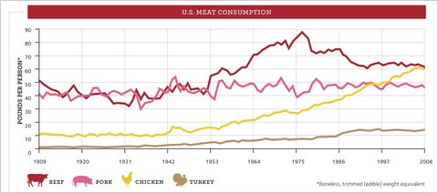
Clearly beef consumption has declined since its peak in the late 1970s, when people in the U.S. ate nearly 90 pounds of beef each per year, to closer to 60 lbs. each today. On the other hand, all those health warnings, disease scares, and environmentalist-vegetarian terrorist plots haven’t yet knocked beef out of its position as the most-eaten meat in the U.S. Clearly, chicken seems poised to take over that position, but beef doesn’t exactly appear to be falling off the charts.

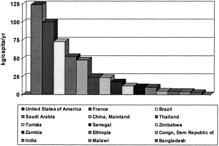
So how do we compare to other countries in terms of overall meat consumption? In a 2003 article in the Journal of Nutrition, Andrew Speedy provided data on global meat consumption (defined as “beef and buffalo, sheep and goat, pig meat and poultry”) — note it’s in kilograms, not pounds, and the legend should be read across, not down (so the first bar is for the U.S., the second is for France, and so on):

So insofar as there has been a decrease in beef consumption in the U.S., and more dramatic increase in chicken consumption: what’s going on? The Freakonomics article presents an explanation:

A study by the agricultural economists James Mintert, Glynn Tonsor, and Ted Schroeder found that for every 1 percent increase in female employment, beef consumption sank by .6 percent while chicken consumption rose by .6 percent. Why? Probably because beef takes longer than chicken to prepare, and because poultry producers did a good job marketing cheap and ready-to-cook chicken products. Furthermore, all those working women meant more household income, which meant more families eating in restaurants — where meals are less likely to contain beef than meals at home.

Health concerns do play a part; the authors found that negative media coverage of beef (either recalls due to contamination or general links to heart disease, etc.) reduced consumption, while positive coverage that linked eating meat to getting iron, zinc, and other minerals increased it. But they found that health effects were small compared to the effects of changing family dynamics — that is, women working outside the home and families eating fewer meals at home.

It’s a nice example of how the factors driving social changes are often much more complex than we’d expect. Common sense explanations of changes in beef consumption would, I think, a) overestimate how much less beef Americans eat than in the past and b) assume the major driving factors to be health-related concerns, whether about chronic disease or recalls. Yet it turns out a major aspect of the story is a structural change that doesn’t seem clearly connected at all.

I guess if I were a health advocate hoping people in the U.S. were starting to listen to messages about healthy eating, that might depress me. But I guess I can tell my grandma that the terrorists’ evil plans to infect U.S. cattle herds with Mad Cow or some other disease might not be as catastrophic as they might imagine.

UPDATE: As a couple of readers point out, the increase in chicken consumption can’t be explained just as a result of people eating chicken when they otherwise would have eaten beef; the drop in beef consumption is way overshadowed by the increase in how much chicken people eat. The total amount of all meat eaten each year has increased dramatically.

I don’t know what is driving all of that change, but I suspect a lot of it is marketing campaigns — not just directly to consumers, but efforts by industry groups and the USDA to get more meat into a wide variety of items at grocery stores and on restaurant menus, as they have done with cheese.

In a fantastic example of the way being single is stigmatized, Rachel K. took a photo of this ad she saw at a bus stop in Toronto:

I’m afraid this is the last post you will get from me. You see, I’m single, and it’s just occurred to me how very much my life sucks, with no one to give me sparkly things. I am going to drop everything and dedicate myself full-time to finding a mate.

I mean, really. It’s an interesting assumption that being unmarried (I presume that’s an engagement ring) means you are “alone.” And I’d say that what sucks isn’t being “alone,” it’s being told constantly that you must be sad and miserable since you aren’t coupled up.


In this video, which I found via my friend Captain Crab, Kate O’Beirne (editor of the National Review) attacked the federal subsidized school breakfast and lunch programs. She did so by stating that parents who would find the program necessary must be “criminally negligent,” since they can’t put food on the table:

Transcript (via):

The federal school lunch program and now breakfast program and I guess in Washington DC, dinner program are pretty close to being sacred cows… broad bipartisan support. And if we’re going to ask more of ourselves, my question is what poor excuse for a parent can’t rustle up a bowl of cereal and a banana? I just don’t get why millions of school children qualify for school breakfasts unless we have a major wide spread problem with child neglect.

You know, I mean if that’s how many parents are incapable of pulling together a bowl of cereal and a banana, then we have problems that are way bigger than… that problem can’t be solved with a school breakfast, because we have parents who are just criminally… ah… criminally negligent with respect to raising children.

It’s an excellent example of the stigmatization of poverty: letting your kids go to class hungry would make you a bad parent, but taking advantage of programs set up to be sure kids don’t go to class hungry (and thus less able to learn) also makes you a bad parent. The problem here isn’t structural, or even about poverty. The problem, from O’Beirne’s manner of framing it, is that individuals who enroll their children in such programs are, by default, negligent “poor excuses” for parents.