NPR’s Planet Money blog posted an interesting image of differences in how we allocate income based on how much we make. The image looks at three income groups and shows what percent of their  household income budget they spend various categories, using Bureau of Labor Statistics Consumer Expenditure Survey data:

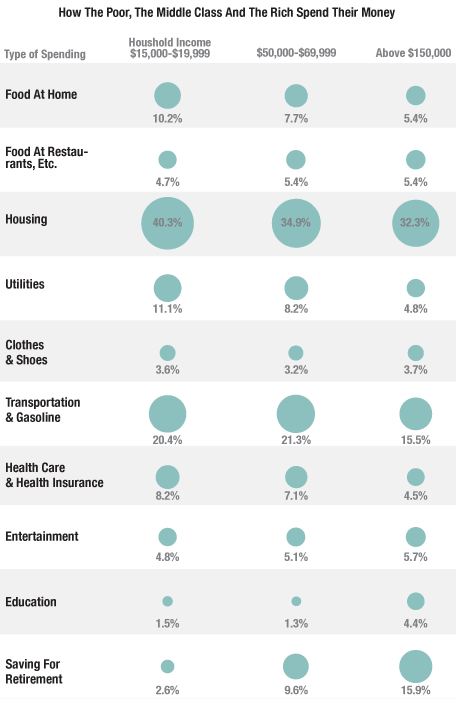
As we see, the largest expense for every group is housing; for the low-income group, 40% of their income goes just to paying for a place to live. They also use more of their income to cover basic necessities — utilities, food eaten at home, transportation.The high-income group, on the other hand,  spends quite a bit more on education.

Look at that last row: saving for retirement (which includes Social Security contributions). This is a particularly striking difference. The affluent are able to put away a significant portion of their income for retirement; for those living just above the poverty line, it’s much, much less than the amount financial planners would recommend (even the middle-income group is saving about the minimum amount generally recommended to prepare for retirement). When so much of your income goes to simply meeting day-to-day needs, saving for the future is a luxury many just cannot afford.

UPDATE: NPR has updated their post, saying the image they had up initially incorrectly. They posted a new image, with notably lower spending on housing:

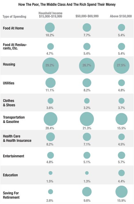
Eagle-eyed reader David C. pointed this out to me. The revised numbers seem surprisingly low to both of us.Looking at the NPR post again, I think I misunderstood what they were representing; I think this isn’t the percent of total income, but rather % of the household budget, which may not be identical. That said, I looked at some Consumer Expenditure Survey data (here and here) and can’t get the numbers to work out to what they’re showing in the updated image. If someone can, please send us a note at socimages(at)thesocietypages.org and we’ll do another update. Thanks!

Adrienne K., who blogs at Native Appropriations, recently put together a post about food products that feature stereotypical images of Native Americans. I’m reposting some of them here, but check out her original post for more.

It started out with Calumet baking powder:

Adrienne explains,

In my head, I thought “I could make some stereotype biscuits for breakfast!” Which got me thinking. How many products with stereotypical imagery could I fit in one imaginary breakfast?

Excluding vintage products and items that weren’t easily available, she still found an awful lot. Indian Head corn meal, anyone?

Land-O-Lakes butter:

The Sue Bee Honey logo:

Umpqua ice cream:

Pemmican beef jerky:

And you can top off your meal with Cherikee Red soda:

Adrienne explains,

In isolation, each of these would seem like no big deal–these are the “good” stereotypical images. The “noble savage.” No wild eyes or big noses, just headdresses and Indian maidens. But when taken as a collective, is it any wonder that most people in the world think of Native peoples as headdress-wearing Plains chiefs or buckskin-clad Indian women? I’m not saying there isn’t stereotypical imagery of other racial/ethnic groups in branding, but the ubiquity of Native imagery is striking.

Check out her blog for her full discussion of the problems with the repetition of these limited, anachronistic images of Native Americans.

Last year Lisa posted about Wonder Woman’s pose on a Justice League cover and the way it revealed performative aspects of gender. DC Comics recently released a new Catwoman series. Majd Al-Shihabi sent in a link to the cover of Catwoman #0. The cover drew a lot of attention for the degree of sexualization of Catwoman, whose unrealistic and painful-looking pose maximizes the prominence of her breasts and butt:

I tried to imagine how you’d have to hold your body to even approximate that pose, but at a certain point it hurt to even think about it.

Gamma Squad posted a number of parodies that highlight the over-the-top sexualization of this female superhero. From Josh Rodgers, of Mushface Comics:

From King of the Siams:

And some time ago Hark! A Vagrant presented Strong Female Characters, which awesomely parodies the “it’s not problematic to sexually objectify all your female characters as long as they’re able to kick ass ‘n stuff!” argument (thanks to Erin R. and Gabrielle M. for sending it in). Here’s just one panel; I recommend following the link to check out the whole thing:


Gamma Squad has several other examples, including one where someone tries to use a graphics design program to reproduce the Catwoman pose without breaking her spine. Results: can’t be done.

The National Employment Law Project (NELP) recently released a report about low-wage workers — those making less than $10 an hour. In 2011, 26% of private-sector jobs in the U.S. were low-wage jobs. These jobs were highly concentrated in a few industries. Just over half (52.1%) of all low-wage workers were employed in five sectors:

Most low-wage workers are employed by large businesses, those with more than 100 employees. NELP looked at the three largest employers of low-wage workers — Wal-Mart, Yum! Brands, and McDonald’s. All three have seen significant profit growth over the last four years:

The heads of these corporations are doing quite well, too:

Care 2 posted about the report and included additional details about low-wage workers. The relative worth of the minimum wage continues to decline, since prices for common consumer goods increase while the minimum wage is stuck at $7.25 an hour:

Finally, over at the Economic Policy Institute blog, David Cooper posted a table that provides an overview of the demographics of those who would be affected if Congress passed Senator Tom Harkin’s proposed bill that would raised the minimum wage to $9.80/hour:

Thanks to Dolores R. for the links!

If you pay much attention to politics in the U.S., especially during this presidential election year, you’ve probably heard someone assert that politics is getting more polarized — that is, that there is less consensus and fewer people in the middle, making it more difficult to agree on policies or get anything done. But is it true?

A recent Pew poll sent to us by Katrin indicates that it is. The Pew Research Center has tracked responses about 48 political values for over 25 years now. Over time, the percentage-point gap between Democrats and Republicans has nearly doubled:

Which issues do Republicans and Democrats most disagree about? Providing a social safety net, environmental protection, the role of labor unions, the role of government in ensuring equal opportunity, and the overall scope of government had particularly large gaps, and all have grown substantially since 1987:

Political scientists Keith Poole and Howard Rosenthal looked at polarization among federal legislators from the late 1800s through 2011. If we look at party means for members of the House, we see that after a decrease in polarization mid-century, the gap has increased again since the 1980s. Though Democrats have become somewhat more liberal, the change is is largely due to Republicans in the House becoming more conservative on average:

The Senate:

David Roberts posted about the trend at Grist. The changes we’re seeing in the Pew data, he argues, are not due to big value changes among the electorate. Instead, we see that people are sorting themselves politically in a more consistent fashion. The parties used to contain coalitions that united liberal and conservative voting blocs, but both parties are becoming more ideologically consistent.

There are Blue Dog Democrats, who are more conservative than the party overall, and some moderate Republicans who are fairly liberal on social issues. However, there is less and less room for these individuals. Those seeking elected office find it difficult to win primaries within their parties. Citizens increasingly associate conservatism with Republicans and liberalism with Democrats, and choose their party affiliation accordingly. Thus, without any great change in the actual values of Americans, we get a more starkly politically divided nation and federal legislature.

The U.S. Census Bureau recently posted some visualizations of data related to urbanization and the distribution of the U.S. population. One shows changes in the regional distribution of the population from 1790 to 2010. I can’t embed it, but I took a couple of screencaps, but it’s much more striking to watch it and see when various trends (say, the surge of population in the Midwest in the late 1800s) first appear, so I’d go check it out at the Census site.

In 1850, the South and Northeast had about equal portions of the population, and the West was just barely in the picture (I presume the 1850 Census data excludes Native Americans living in the West; if anyone is certain, let us know in the comments):

By 2010, we see a smaller percent of the population living in the Northeast, which has been overtaken by the West (though the Northeast is also the smallest of the four geographic areas, so it’s still overall more densely settled than the West):

There’s also an animated graph showing urbanization in the U.S. between 1790 and 1890. Here’s 1840:

And fifty years later:

Finally, there’s a map showing all cities that have ever been in the top 20 largest cities in the U.S. since 1790. If you click on a city name, you can see

Los Angeles:

And for Dmitriy T.C., here’s New Orleans:

The Census site lets you click through for the data each visualization is based on, so there’s lots to dig through if you’re really excited about this type of thing, as I am.

When we categorize people into “races,” we do so using a number of physical characteristics, but especially skin color. Our racial system is based on the idea that skin color is a clearly distinguishing trait, especially when we use terms like “black” and “white,” which we generally conceive of as opposite colors.

Of course, because race is socially constructed, there’s actually enormous diversity within the categories we’ve created, and great overlap between them, as we’ve forced all humans on earth into just a few groupings.  And terms like “black” and “white” don’t really describe the shades of actual human skin.

Artist and photographer Angelica Dass has an art project, Humanae, that illustrates the tremendous diversity in skin color (via co.CREATE, sent in by Dolores R., Mike R., and YetAnotherGirl. She uses an 11×11 pixel of individuals’ faces to match them to a specific color in the Pantone color system, which catalogs thousands of hues and is used in many types of manufacturing to standardize and match colors. She then takes a photo of them in front of a background of their Pantone color.

Currently the project is very heavily focused on people we’d generally categorize as White — there are a few individuals from other groups, but not many, and in no way does it represent “every skin tone,” as I’ve seen it described in some places. So that’s a major caveat.

That said, I do think the project shows how reductive our system of classifying people by skin tone is, when you look at the range of colors even just among Whites — why does it make sense to throw most of these people into one category and say they’re all physically the same in a meaningful way that separates them from everyone else (and then connect those supposedly shared physical traits to non-physical ones)? And which part of the body do we use to do so, since many of us have various shades on our bodies? Or which time of year, since many of us change quite a bit between summer and winter?

Maru sent in a similar example; French artist Pierre David created “The Human Pantone,” using 40 models. We think racial categories make sense because we generally think of the extremes, but by showing individuals arranged according to hue, the project highlights the arbitrariness of racial boundaries. Where, exactly, should the dividing lines be?

Via TAXI.

Gwen Sharp is an associate professor of sociology at Nevada State College. You can follow her on Twitter at @gwensharpnv.

We’ve posted in the past about the ways in which ads often depicted non-White women as wild and exotic (and thus exciting), even conflating them with animals through poses or animal-print clothing. Unstraightened African American hair is also used as an exotic marker, presented as less civilized. Recently readers sent in two separate examples of these tropes.

Michelle H. noticed that Lane Bryant advertised “exotic inspirations” as part of a “tribal trend” “inspired by nature” that allows you to use your “natural instincts”. The model used to personify this exoticism is an African American woman with unstraightened hair:

Similarly, Sonia A., Jen J., and an anonymous reader noticed that data analysis firm ATLAS.ti used an image of an African American woman with several pencils stuck in her natural curls along with text encouraging you to “tame your data” but also “go wild”:

The company removed the banner from its Facebook page after complaints, but it’s still on the company website in an image and accompanying brochure on the product info page and several other places on the site.