
If you’re paying any attention to the U.S. presidential election, you’ve likely heard a lot about campaign spending on ads. So how much is being spent? And where?
Dmitriy T.C. sent in an interactive graphic that the Washington Post created that allows you to look at one particular type of campaign spending: commercials in various television markets. Spending, and thus exposure to presidential campaign commercials, is very unevenly distributed. Many states get almost no attention from the national campaigns and the interest groups and PACS that support them, since their voting outcomes are seen as all but inevitable.
I, on the other hand, live in the largest city in a swing state; $37 million has been spent on over 47,000 commercials here:
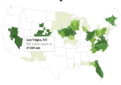
Here’s the key for the map; the darkest green shade indicates more than 20,000 ads, a number roughly equal to how many times I have been called by political pollsters during the past three months:
![]()
You can also limit the map to look just at Democratic or Republican spending.
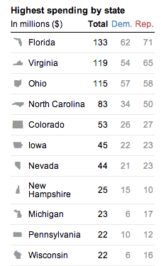
Florida leads the nation in amount spent on TV ads by the two campaigns. The Republicans have outspent the Democrats in all of the top 11 states except New Hampshire:
The site also has a graph that lets you track spending in the most competitive states by week between mid-April and now.
This is just one element of campaign spending. Add in the cost of all the mailers, campaign trips, online ads, the conventions themselves, and Get out the Vote efforts by the presidential campaigns or interest groups and SuperPACs associated with them, and the amount spent to elect our president is truly mind-boggling.
Gwen Sharp is an associate professor of sociology at Nevada State College. You can follow her on Twitter at @gwensharpnv.
Comments 2
Yrro Simyarin — October 25, 2012
This is, unfortunately, the downside of concentrating so much power. The return on investment for rent-seeking is much better than you can get for any other use of that money. :(
On another note, it really saddens me just how polarized the country is culturally, when the election results in over 80% of the country are essentially predetermined.
James Jordan — September 14, 2023
You have shared some data and graphics that show how much TV ad spending is involved in the presidential campaign. I was surprised to see how unevenly distributed the spending is across different states and markets.
Roofing Services in Fort Worth TX