We’ve offered many examples of companies co-opting feminism in order to sell products. In the video below, we see that the co-optation of feminism is nothing new:
(At Vintage Videosift.)
Actually, I shouldn’t be so flippant. Inventions like the washing machine did, indeed, save women a great deal of time and effort. From what I understand, however, as women’s cleaning became more efficient, standards of cleanliness rose. So even as time-saving devices were introduced, the time women spent cleaning did not substantially change. I’d love to hear more from scholars who have a better handle on this history.
Here’s another step in the trajectory, this one from 1971, also about cleaning appliances (found here):
Text:
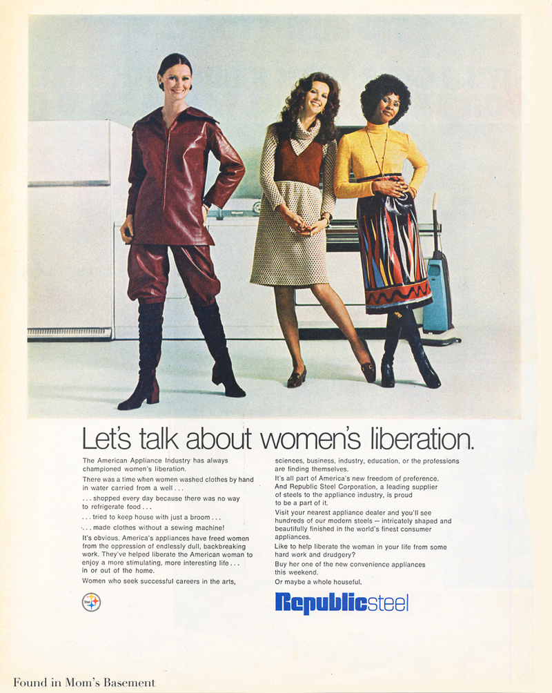
The American Appliance Industry has always championed women’s liberation.
There was a time when women washed clothes by hand in water carried from a well…
…shapped every day because there was no way to refigerate food…
..tried to keep house with just a broom…
…made clothes without a sewing machine!
It’s obvious. America’s appliances have freed women from the oppression of endlessly dull, backbreaking work. They’ve helped liberate the American woman to enjoy a more stimulating, more interesting life…
In or out of the home.
Women who seek successful careers in the arts, sciences, business, industry, education, or the professions are finding themselves.
It’s all part of America’s new freedom of preference. And Republican Steel Corporation, a leading supplier of steels to the appliance industry, is proud to be a part of it.
Visit your nearest appliance dealer and you’ll see hundreds of our modern steels — intricately shaped and beautifully finished in the world’s finest consumer appliances.
Like to help liberate the women in your life from some hard work and drudgery?
Buy her one of the new convenience appliances this weekend.
Or maybe a whole houseful.
Notice that women’s liberation DOES NOT involve men sharing housework responsibilities, but men replacing women’s labor with tools he purchases for her. Ultimately, even if she has a “successful career” in “the professions,” it is her responsibility to make sure that the housework is completed (and apparently still wouldn’t be able to buy herself one of these machines).
For contemporary examples, see these posts on make up (here and here), botox, cigarettes (here and here), right-hand diamond rings, cooking and cleaning products, fashion, and other miscellaneous products (here, here, and here).