culture: color

Flashback Friday.

In August of 2010, NPR reported on a scale developed by a forensic psychologist, Michael Stone, on which murderers could be placed according to how evil they are (from slightly evil to really, really really evil).  To illustrate the scale, NPR developed this graphic:

Let’s say, for the sake of argument, that the artists designing this graphic did not purposefully associate darker skin-like colors with more evil and lighter skin-like colors with less evil.  I think this is a fair assumption, though I don’t know for sure that this is true.  But let’s give them the benefit of the doubt.

If they didn’t do this on purpose, then race never consciously entered their minds.  Once you notice that the colors are skin-like colors, and if you are a member of a society that discriminates against darker-skinned people, you immediately see that this graphic reproduces those stereotypes… AND YOU CHANGE THE COLORS.   Any color, going from light to dark, will illustrate intensity.  How about red?  In Western societies, red is associated with anger.   If you insist on using black because black signifies evil in our culture, how about using a true black (that is very rarely if ever seen on people) and a gray scale?  How about any color other than brown?

I think this is likely a case in which the producers of the image did not think.  And not thinking is one of the most insidious ways that racism and other bigotries get reproduced.  People who don’t think about race are the most likely to endorse racial stereotypes.  When people who think about race are distracted — with another task, or loud music, or some other intervening stimulus — they are more likely to think stereotypically than when they are not distracted.  We can’t be colorblind.  Our unconscious is steeped in racial meanings.  Consciously fighting those associations is the only way to be less racist.

Not thinking about race is a cousin to thinking racist thoughts.  Only thinking hard about race helps alleviate racism.  And this graphic is an excellent example of why.

Originally posted in 2010.

Lisa Wade, PhD is an Associate Professor at Tulane University. She is the author of American Hookup, a book about college sexual culture; a textbook about gender; and a forthcoming introductory text: Terrible Magnificent Sociology. You can follow her on Twitter and Instagram.

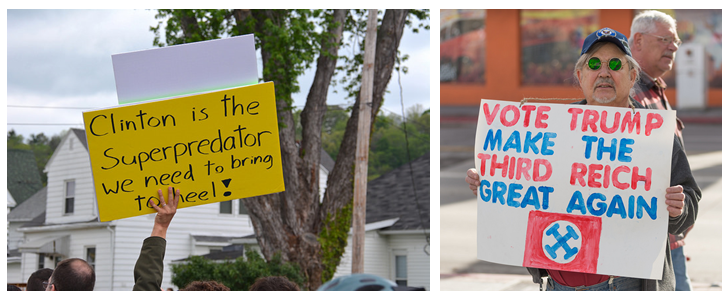
Who among us this election — except perhaps that elusive undecided voter — has not turned to a politically aligned friend and said, from their heart of hearts, “I just can’t understand how anyone could vote for Clinton/Trump”? The sheer mindbogglingness of it, the utter failure of so many Americans to even begin to fathom voting for the other candidate, is one of the most disturbing features of this election. We all seem to be asking: What could the other side be thinking!?

left: flickr photo by Sarah Hina; right: flickr photo by Darron Bergenheier.
left: flickr photo by Sarah Hina; right: flickr photo by Darron Bergenheier

Perhaps what we need is a “sociology of thinking.” And we’ve got one; it’s called cognitive sociology.

One of the foundational texts in the subfield is called Social Mindscapes. In it, the sociologist Eviatar Zerubavel argues that we think as individuals (we are all alone in our brains) and we think as human beings (with the cognitive processes that humans have inherited from evolution), but we also think as members of social groups. Our thinking, then, is not only idiosyncratic (i.e., “individual”), nor universal (i.e., “human”) — though it is both those things — it’s also social. Our thinking is influenced by the groups to which we belong, what Zerubavel called “thought communities.” These are the people with whom we enjoy a meeting of the minds.

By this, Zerubavel doesn’t simply mean that our social groups shape what information we get and what arguments resonate, though that’s true. He and other cognitive sociologists argue that our thought communities shape cognition itself, that the brains of people in strongly divergent thought communities literally work differently. To Zerubavel, the idea that many Democrats can’t begin to understand Republican thinking — and vice versa — isn’t a surprise, it’s a hypothesis.

Research on sensory perception is fun evidence for their claims. Researchers have shown, for example, that our language categories influence not just how we describe the world we see, but how we see it. The Himba in Namibia, for example — who have one word for blue and some greens and another word for other greens, reds, and browns — are better than English speakers at differentiating one shade of green from another, but worse at differentiating green and blue from each other. Likewise, Russian speakers are better than English speakers at differentiating shades of blue because they have more than one word for the color and English speakers, in turn, are better than Japanese speakers at recognizing the gradations between blue and green, because the Japanese have traditionally used only one word to describe them both.

If our membership in thought communities is powerful enough to shift our very perception of color, then it must be able to influence our thinking in many other ways, too. In Social Mindscapes, Zerubavel shows that what we pay attention to, the categories we use, what we remember, and even our perception of time are all shaped by our thought communities.

Accordingly, cognitive sociology would predict that the rising polarization in politics and the fragmentation of media will make it harder and harder to understand each other, not because we don’t agree on the facts or because we have different political interests, but because our brains are actually working in divergent ways. That is, what we’re experiencing with this election is not just political disagreement, it’s a total breakdown in functional communication, which sounds about right.

Lisa Wade, PhD is an Associate Professor at Tulane University. She is the author of American Hookup, a book about college sexual culture; a textbook about gender; and a forthcoming introductory text: Terrible Magnificent Sociology. You can follow her on Twitter and Instagram.

Flashback Friday.

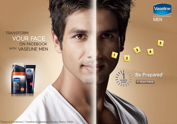
Previously marketed to women, skin lightening, bleaching, and “fairness” creams are being newly marketed to men.  The introduction of a Facebook application has triggered a wave of commentary among American journalists and bloggers.  The application, launched by Vaseline and aimed at men in India, smoothes out blotches and lightens the overall skin color of your profile photo, allowing men to present a more “radiant” face to their friends.

The U.S. commentary involves a great deal of hand-wringing over Indian preference for light skin and the lengths to which even men will go to get a few shades lighter.  Indians, it is claimed, have a preference for light skin because skin color and caste are connected in the Indian imagination.  Dating and career success, they say further, are linked to skin color.  Perhaps, these sources admit, colorism in India is related to British colonialism and the importation of a color-based hierarchy; but that was then and, today, India embraces prejudice against dark-skinned people, thereby creating a market for these unsavory products.

The obsession with light skin, however, cannot be solely blamed on insecure individuals or a now internalized colorism imported from elsewhere a long time ago.  Instead, a preference for white skin is being cultivated, today, by corporations seeking profit.  Sociologist Evelyn Nakano Glenn documents the global business of skin lightening in her article, Yearning for Lightness.  She argues that interest in the products is rising, especially in places where “…the influence of Western capitalism and culture are most prominent.”  The success of these products, then, “cannot be seen as simply a legacy of colonialism.”  Instead, it is being actively produced by giant multinational companies today.

The Facebook application is one example of this phenomenon.  It does not simply reflect an interest in lighter skin; it very deliberately tells users that they need to “be prepared” to make a first impression and makes it very clear that skin blotches and overall darkness is undesirable and smooth, light-colored skin is ideal.  Marketing for skin lightening products not only suggests that light skin is more attractive, it also links light skin to career success, overall upward mobility, and Westernization.  Some advertising, for example, overtly links dark skin with saris and unemployment for women, while linking light skin with Western clothes and a career.

The desire for light skin, then, isn’t an “Indian problem” for which they should be entirely blamed. It is being encouraged by corporations who stand to profit from color-based anxieties that are overtly tied to the supposed superiority of Western culture.  These corporations, it stands to be noted, are not Indian.  They are largely Western: L’Oreal and Unilever are two of the biggest companies.  The supposedly Indian preference for light skin, then, is being stoked and manufactured by companies based in countries populated primarily by light-skinned people.  As Glenn explains, “Such advertisements can be seen as not simply responding to a preexisting need but actually creating a need by depicting having dark skin as a painful and depressing experience.”

Before pitying Indian seekers of light-skin, condemning the nation for colorism, or gently shaking our heads over the legacies of colonialism, we should consider how ongoing Western cultural dominance (that is, racism and colorism in the West today) and capitalist economic penetration (that is, profit through the cultivation of insecurities around the world) contributes to the global market in skin lightening products.

Originally posted in 2010; crossposted at BlogHer.

Lisa Wade, PhD is an Associate Professor at Tulane University. She is the author of American Hookup, a book about college sexual culture; a textbook about gender; and a forthcoming introductory text: Terrible Magnificent Sociology. You can follow her on Twitter and Instagram.
In 1985, Zeneca Pharmaceuticals (now AstraZeneca) declared October “National Breast Cancer Awareness Month.” Their original campaign promoted mammography screenings and self-breast exams, as well as aided fundraising efforts for breast cancer related research.  The month continues with the same goals, and is still supported by AstraZeneca, in addition to many other organizations, most notably the American Cancer Society.

The now ubiquitous pink ribbons were pinned onto the cause, when the Susan G. Komen Breast Cancer Foundation distributed them at a New York City fundraising event in 1991. The following year, 1.5 million Estée Lauder  cosmetic customers received the promotional reminder, along with an informational card about breast self-exams. Although now a well-known symbol, the ribbons elide a less well-known history of Breast Cancer Awareness co-opting grassroots’ organizing and activism targeting women’s health and breast cancer prevention.

The “awareness” campaign also opened the floodgates for other companies to capitalize on the disease. For example, Avon, New Balance, and Yoplait have sold jewelry, athletic shoes, and yogurt, respectively, using the pink ribbon as a logo, while KitchenAid still markets a product line called “Cook for the Cure” that includes pink stand mixers, food processors, and cooking accessories, items which the company first started selling in 2001.  Not to be left out, Smith and Wesson, Taurus, Federal, and Bersa, among other companies, have sold firearms with pink grips and/or finishing, pink gun-cases, and even pink ammo with the pink ribbon symbol emblazoned on the packaging. Because breast cancer can be promoted in corporate-friendly ways and lacks the stigma associated with other diseases, like HIV/AIDS, these companies and others, have been willing to endorse Breast Cancer Awareness Month and, in some cases, donate proceeds from their merchandise to support research affiliated with the disease.

2 (1)

Yet companies’ willingness to profit from the cause has also served to commodify breast cancer, and to support what sociologist Gayle Sulik calls “pink ribbon culture.” As Sulik notes, marking breast cancer with the color pink not only feminizes the disease, but also reinforces gendered expectations about how women are “supposed” to react to and cope with the illness, claims also corroborated by my own research on breast cancer support groups.

Based on participant observation of four support groups and in-depth interviews with participants, I have documented how breast cancer patients are expected to present a feminine self, and to also be positive and upbeat, despite the pain and suffering they endure as a result of being ill. The women in the study, for example, spent considerable time and attention on their physical appearance, working to present a traditionally feminine self, even while recovering from surgical procedures and debilitating therapies, such as chemotherapy and radiation. Similarly, members of the groups frequently joked about their bodies, especially in sexualized ways, making light of the physical disfigurement resulting from their disease. Like the compensatory femininity in which they engaged, laughing about their plight seemed to assuage some of the emotional pain that they experienced.  However, the coping strategies reinforced traditional standards of beauty and also prevented members of the groups from expressing anger or bitterness, feelings that would have been justifiable, but seen as (largely) culturally inappropriate because they were women.

Even when they recovered physically from the disease, the women were not immune to the effects of the “pink ribbon culture,” as other work from the study demonstrates. Many group participants, for instance, reported that friends and family were often less than sympathetic when they expressed uncertainty about the future and/or discontent about what they had been through.  As “survivors,” they were expected to be strong, positive, and upbeat, not fearful or anxious, or too willing to complain about the aftermath of their disease. The women thus learned to cover their uncomfortable emotions with a veneer of strength and courage. This too helps to illustrate how the “pink ribbon culture,” which celebrates survivors and survivorhood, limits the range of emotions that women who have had breast cancer are able to express. It also demonstrates how the myopic focus on survivors detracts attention from the over 40,000 women who die from breast cancer each year in the United States, as well as from the environmental causes of the disease.

Such findings should give pause. If October is truly a time to bring awareness to breast cancer and the women affected by it, we need to acknowledge the pain and suffering associated with the disease and resist the “pink ribbon culture” that contributes to it.

Jacqueline Clark, PhD is an Associate Professor of Sociology and Chair of the Sociology and Anthropology Department at Ripon College. Her research focuses on inequalities, the sociology of health and illness, and the sociology of jobs, work, and organizations.

Flashback Friday.

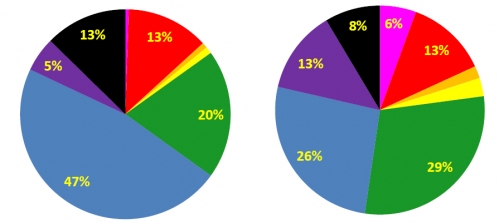
A study published in 2001, to which I was alerted by Family Inequality, asked undergraduate college students their favorite color and presented the results by sex.  Men’s favorites are on the left, women’s on the right:

The article is a great example of the difference between research findings and the interpretation of those findings.  For example, this is how I would interpret it:

Today in the US, but not elsewhere and not always, blue is gendered male and pink gendered female.  We might expect, then, that men would internalize a preference for blue and women a preference for pink.  We live, however, in an androcentric society that values masculinity over femininity.  This rewards the embracing of masculinity by both men and women (making it essentially compulsory for men) and stigmatizes the embracing of femininity (especially for men).

We might expect, then, that men would comfortably embrace a love of blue (blue = masculinity = good), while many women will have a troubled relationship to pink (pink = femininity = devalued, but encouraged for women) and gravitate to blue and all of the good, masculine meaning it offers.

That’s how I’d interpret it.

Here’s how the authors of the study interpreted it:

…we are inclined to suspect the involvement of neurohormonal factors. Studies of rats have found average sex differences in the number of neurons comprising various parts of the visual cortex. Also, gender differences have been found in rat preferences for the amount of sweetness in drinking water. One experiment demonstrated that the sex differences in rat preferences for sweetness was eliminated by depriving males of male-typical testosterone levels in utero. Perhaps, prenatal exposure to testosterone and other sex hormones operates in a similar way to “bias” preferences for certain colors in humans.

Go figure.

Important lesson here: data never stands alone. It must always be interpreted.

Originally posted in 2010.

Lisa Wade, PhD is an Associate Professor at Tulane University. She is the author of American Hookup, a book about college sexual culture; a textbook about gender; and a forthcoming introductory text: Terrible Magnificent Sociology. You can follow her on Twitter and Instagram.
Flashback Friday.41EXTGX1VRL__AA400_

A reader named Judith B. wrote in confounded by the copy describing the watch pictured above. It began:

Don’t be fooled by the girly blue and white face on this multifunction Pro Spirit® digital sports watch. It’s more than a match for any tough guy’s watch…

“Girly blue and white?” she asked. “Huh?”

I think I’ve got an answer for you, Judith. And it has to do with fractals. Trees are good examples of fractals: branches can split into two branches, and each of those branches can split into two branches, etc.

Flickr creative commons by Richard Thomas.

The gender binary — that is, the rule that everything (oh animalsjobs, food, kleenex, housework, sound, games, deordorant, love and sex, candy, vitaminsetc) gets split into male and female — is fractal. That means that, for every male or female version of something (say sports versus dance), there is a further gendered split that can be made. If we take sports, we might divide it into the masculine football and the feminine swimming. If we take swimming, we could probably divide it down further. Take education (which is, arguably, feminized): we can split it into physical sciences (masculine) and social sciences (feminine). And we can split the physical sciences into biology (dominated these days by women) and physics (dominated by men). So the gender binary has a fractal character.

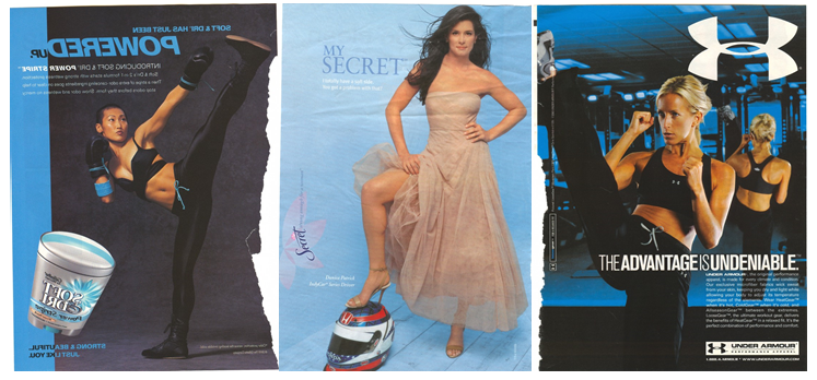
What does that mean for blue? Well, it means that, even though “blue” is socially constructed to be masculine, blue can be broken down into more and less masculine types of blue. Turquoise and light blue, for example, are often seen as more feminine that the primary color blue or royal/dark blue. The text, then, is referring to, literally, “girly blue.” Lots of ads aimed at women employ the feminine blues. These ads sent in by some of my former students are good examples:

Usually the use of a “girly blue” serves to balance masculinity and femininity.  It’s no accident that these ads are sports-related, or use copy such as “strong & beautiful” and “I totally have a soft side. You comfortable with that?”

So, that’s my explanation for “girly blue”: fractal gender binaries.

Originally posted in 2010.

Lisa Wade, PhD is an Associate Professor at Tulane University. She is the author of American Hookup, a book about college sexual culture; a textbook about gender; and a forthcoming introductory text: Terrible Magnificent Sociology. You can follow her on Twitter and Instagram.

In this Farm Bureau Insurance ad, a father and son paint a room pink and commiserate about how their lives will be ruined by the arrival of a baby girl.

1. Essentialize gender. A girl is coming? That means playing with dolls and having tea parties. Girls are girls. Us, we’re boys, so automatically we…

2. …belittle femininity. The stuff girls do is boring and trivial. Only girls would want to do those things. Girls are such a drag!

In short, all girls are girly and girly stuff is dumb.

I didn’t find it, but I’ll give them the benefit of the doubt; maybe they made the opposite commercial, too. One in which a mom and her daughter cringe over the idea of having to put up with booger-flinging and farting at the table.

But that would be equally bad. We don’t know a child’s personality just by anticipating the stuff between their legs. And it’s not true that male and female humans are so different as to enjoy entirely non-overlapping sets of things.

In daily life, we recognize each other for the complex and varied people that we are. Think about it. Practically the only place we see stereotypes this retrograde are on TV and in the movies. We’re not “opposite sexes,” but we’re surrounded by the idea that we are.

Thanks to @DustinStoltz anyway!

Lisa Wade, PhD is an Associate Professor at Tulane University. She is the author of American Hookup, a book about college sexual culture; a textbook about gender; and a forthcoming introductory text: Terrible Magnificent Sociology. You can follow her on Twitter and Instagram.
Flashback Friday.

In her article “Unpacking the Invisible Knapsack,” Peggy McIntosh talks about a number of types of white privilege, including using the phrases “flesh tone” or “nude” to describe light skin and featuring mostly white people in tv, movies, and advertising.

When I’ve had students read this article, they often argue that it just makes sense to do that, since the majority of people in the U.S. are white. They also question what other color could be used as a “neutral” or “normal” one.  In fact, this is exactly what was argued in the comments to this post about the “white” Facebook avatar.

But English Russia points out that in Russia, it’s not uncommon for people in cartoons to be black; not Black racially, but literally black. Below are examples of these cartoons, introduced with English Russia‘s translations.

“My pussy could have Whiskas instead of whiskey.”

11

“Sir, don’t throw away the empty bottle, I would take it to the recycle point for spare money.”

21

“Tourist: ‘Is it true that the Earth is round?’ Men: ‘We don’t know son, we’re not locals.'”

31

Despite the fact that many people in Russia would be classified in the U.S. as white, these cartoons obviously use the color black as a neutral color — the people in the cartoons aren’t Black in any racial sense, it’s just the standard color the artist has used for everyone. You might contrast these with things in the U.S. that are labeled “flesh” or “nude” to counter the idea that there are no other options but a sort of light peach color to be the fallback color when you aren’t specifically representing a racial minority.

Thanks to Miguel at El Forastero for the link! Originally posted in 2009.

Gwen Sharp is an associate professor of sociology at Nevada State College. You can follow her on Twitter at @gwensharpnv.