discourse/language

I thought Samatha Critchell’s description of Michelle Obama’s light tan or “champagne” dress as “flesh colored” might get her fired.  If nothing else, I figured it’d be warning to all other journalists out there to, for gawd’s sake!, watch your racist language.

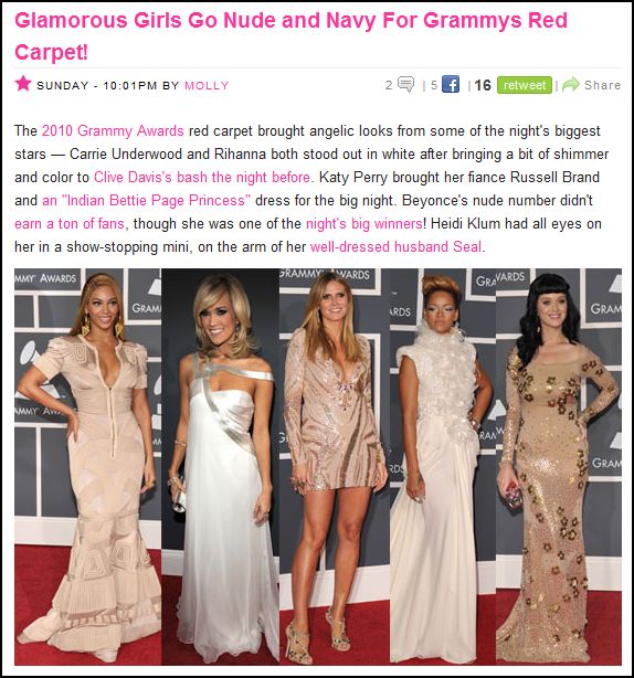
But, alas, the parade of “champagne”-colored gowns at this year’s Grammy’s had led a flood of fashion writers talking about the color “nude.”  Here are just a handful of examples from the first three pages of my google search

Los Angeles Times:

Katy Perry and her dress:

Elsewhere in the Los Angeles Times:

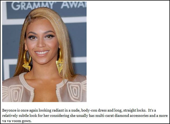
Beyonce and her dress:

VH1:

Keri Hilson and her dress:

Associated Content:

msnbc:

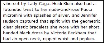
Heidi Klum and her dress:

Popsugar:

Of course (almost) no one is actually “nude”-colored, but the term still manages to naturalize whiteness insofar as white people’s skin color tends to match colors described as “nude” moreso than the skin color of non-white people (though there are always exceptions).  I’m really surprised that journalists are still managing to get this language past their editors.

Lisa Wade, PhD is an Associate Professor at Tulane University. She is the author of American Hookup, a book about college sexual culture; a textbook about gender; and a forthcoming introductory text: Terrible Magnificent Sociology. You can follow her on Twitter and Instagram.

Jersey Shore has come to end, we’re (genuinely) sad to say. We know we had fun. But is it possible we also saw something, dare I say it, subversive about beauty, gender and sexuality? I think so.

A panel discussion on the show and “Guido culture” at Queens College yesterday (you read that right), included New York State Senator and Jezebel heroine Diane Savino, who knows from stinging cultural analysis.

[Savino] explained, “‘guido’ was never a pejorative.” It grew out of the greaser look and became a way for Italian-Americans who did not fit the standard of beauty to take pride in their own heritage and define cool for themselves.

When she was growing up, everybody listened to rock; girls were supposed to be skinny with straight blonde hair (like Marcia Brady on “The Brady Bunch”); guys wore ripped jeans, sneakers and straggly hair.

The 1977 film “Saturday Night Fever” marked a turning point. “It changed the image for all of us,” Ms. Savino said. As Tony Manero, John Travolta wore a white suit, had slicked short hair, liked disco music and was hot. “It was a way we could develop our own standard of beauty,” she added.

In the same way, Virginia Heffernan writes in this weekend’s New York Times Magazine, Italian-Americans in the Northeast originally disdained their own accents until movies like “Mean Streets, Saturday Night Fever, Working Girl and, of course, Taxi Driver.” Those representations, she says, led to a “hammy” reclamation of an identity that had been mirrored back to them through Hollywood. These were second and third generation immigrants, who had mostly reached the middle class but maybe didn’t feel wholly a part of the mainstream, who telegraphed their identity through stylized symbols like Italian flags and red sauce that felt potent but no longer limited their social mobility.

That goes for the ladies too. Female beauty that took on a showily “ethnic cast” was distinct from what was already being sold. As Regina Nigro recently put it on The Awl:

We (I) laugh at bon mots like “You don’t even look Italian!” (the insult that Sammi “Sweetheart” flings at the blonde blue-eyed “grenade” …) but, ridiculous as it is, that assessment betrays a value system: Skinny blonde pale WASP princesses are deemed not attractive when measured by the JS aesthetic. And this seems curious and laughable to us.

“You don’t even look Italian!” is crazy funny but is the underlying judgment (dark hair/olive skin/Italian-looking = pretty; the inverse = not pretty) any worse than any other standard of beauty? It’s an alternative perspective, one that I suspect is so funny partly because it is so unfamiliar.

Of course, there is plenty about the Jersey Shore sexual aesthetic that is broadly familiar. The worst insult is to call a woman fat (or a “hippo”); big, exposed boobs are a baseline requirement, and the men are judged by the attractiveness of the women they acquire. (The other guys repeatedly mock The Situation about the looks of the women he brings home; Ronnie taunts him that he hasn’t brought home a girl anywhere near as pretty as Sammi).

And yet it’s oddly refreshing how much artifice itself is celebrated, with everyone participating mightily, and openly, in becoming the ideal Guido. No one is just born one, or supposed to make it look effortless. There are communal visits to tanning salons and unblinking references to fake breasts, and everyone takes hours to get ready. Vinny describes a girl admiringly: “Fake boobs, nice butt, said she was a model.”

Heffernan, writing about regional accents being reinforced by the show, uses Sammi as an example: “Every part of Sweetheart’s identity – including her skin color, which on the show is not an inborn marker of ethnicity but a badge of achievement (in the tanning bed) – is the product of intense calculation.” And Heffernan didn’t even get to Sammi’s hair extensions, which are brandished for emphasis.

No character more desperately self-produces than The Situation and his third-person pronouncements. Men are not inscluded [sic] from all this ritual artifice. In the last episode, J-Woww practically goes into heat when she sees some “juicehead gorillas” on the beach, and she lists “Human Growth Hormone” among the attractions. This, by the way, leads The Situation to mumble defensively, “Big is out and lean is in.”

That’s because on The Jersey Shore, men’s bodies are just as scrutinized as women’s, and their beauty rituals are as elaborate, expensive, and time-consuming as those of the women. Maybe even more so — in addition to blowouts, tanning sessions, and agonizing over which appliqued shirt will set them apart from the gelled masses, they spend hours at the gym, something we never see the girls do.

As much as the cast performed all this around the clock during the show’s taping, the audition tapes seen here and in the video below are even more extreme, mixing ethnic calculation with the general famewhoring savviness reality producers have become accustomed to.

Looking at this through what we know now: Sammi calls herself a “hookup slut” but aside from a few flirtations, turned out to be conventionally monogamous on the show. Vinny, in straight-up costume, claims he has to take off his pants “to really show you the magic,” but turned out to be the mildest-mannered cast member, one who unashamedly adores his doting mother. Underneath playing to the producers, though, is a more personal kind of construction, and a more particular one. And ironically, although the cast members’ self-creation was one of the most entertaining parts of the show, some underlying sense of unembarrassed authenticity, even wholesomeness, made it most worth watching.

——————————

Irin Carmon is a reporter at Jezebel.com, from where we’re super pleased to have borrowed the post below. Her work has also appeared in the New York Times, Boston Globe, The Village Voice, and others; more information is at www.irincarmon.com.

If you would like to write a post for Sociological Images, please see our Guidelines for Guest Bloggers.

I was stuck by this image, which is being used by Environmental Defense as part of a “how you can stop global warming”-type promotion:

slimEarth

We see a cartoon anthropomorphized earth flexing its muscles happily while a tape measure is cinched around its quite unnaturally narrow waist. It’s an interesting collision between the longstanding metaphor of environmentalism as seeking the “health” of the environment, with the modern idea of obesity as iconic of poor health.

Unpacking the idea of ecological “health” as the goal of environmentalism is something I’ll mostly set aside here, except to note that it is a non-inevitable conceptualization (contrast the alternate framing of conservation/sustainability). The important thing to keep in mind is that the idea of ecological health involves conceptualizing the ecosystem, or even the entire planet, as a mega-organism — and in particular, a mega-human-body — for which health consists of an approximation to a particular ideal state. For a human body, health by this conception involves having all the normal parts (2 legs, both eyes, smooth skin, etc) functioning in the normal way.

What caught my eye about the ED ad was the change in the representation of what constitutes “health.” A quick Google image search on “sick earth” brings up lots of examples of the old way of representing health. We get lots of earths suffering from common cold and flu type symptoms — flushed, sweating, excreting mucus, and making use of thermometers and hot water pads.

The archetype of ill health here is infectious disease, an invasion by microbes that upsets the system’s functioning. The metaphorical parallels between viruses and pollution (including, in some cases, human beings) have been powerful for environmentalism.

But over the past few decades, we’ve acquired a new archetype for poor health: obesity. Being fat has become synonymous with being sick, and vice-versa. What I’m interested in here is not the scientific/medical question of how bad for you being fat really is (though I’ll admit to skepticism of the obesity panic on these grounds), but rather the sociological question of how obesity became the key trope in our discourse about health. Thus, a healthy earth can be easily represented as one that has slimmed down, because we all know that getting skinnier equals getting healthier. The metaphor is extended in the “Low Carbon Diet Guide” that the ad encourages you to download, which talks about how “counting carbs” should apply to carbon dioxide as well as carbohydrates. Interestingly, the guide sticks to energy conservation tips, thus both continuing environmentalists’ reluctance to address food habits as a contributor to climate change while mercifully avoiding blaming fat people for causing global warming by stuffing their faces.

An important element to the conceptualization of obestity as the archetype of ill health is the way it’s tied to ideas of personal responsibility. While genetics and social conditions play a huge role in determining who gets fat, our discourse about obesity promotes the idea that on the one hand you can control your own weight, and on the other fat people can be blamed for their condition. This is reflected in the content of ED’s Low Carbon Diet brochure, which is is a fairly standard compendium of personal behavioral changes that will make you a better, less-carbon-emitting, metaphorically slimmer person. Obviously this sort of thinking long predates the ecological-health-as-thinness metaphor, but there’s a synergy between them in terms of the emphasis on the small scope of personal control within a larger issue.

This is not the first, or most extreme, time environmentalists have tried to link up with the concern over obesity. But it was striking to me that the thin = healthy idea is so engrained that it can be used as a metaphor by causes outside of the public health field.

Stentor Danielson is a professor of Geography at Slippery Rock University in Pennsylvania. His research focuses on the relationship between humans and their environment. Specifically, he’s interested in how people understand the risk of wildfires. You can read more from Stentor at his blog, Debitage.

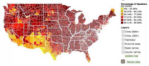
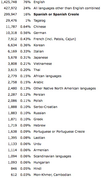
The Modern Language Association has all kinds of awesome language-related data available that you can customize depending on your interests. Most basically, you can get an interactive map showing the percent or number of speakers of various languages spoken at home by county (or number by zip code). Here is English:

English

Spanish:

Spanish

Navajo:

Navajo

Notice that the scale of the maps changes, so the same color doesn’t indicate the same percent of speakers for each language. For some languages the darkest red only indicates 1 or 2 percent.

There was one odd category I noticed. This is the map for “African languages”:

African languages

I can understand why you might lump some languages from an area together if they are so rare in the U.S. that they’d barely show up. But what, exactly, is an “African” language? It doesn’t appear to include Arabic, though it is spoken in much of northern Africa. Many people in Africa speak European languages (particularly French and English) due to colonialism. Presumably this category includes “native,” non-Arabic languages. It’s a strange category.

For those of you wondering about the little pockets of African language speakers in, say, Iowa and Nebraska, I could be wrong, but I would suspect in some of those counties it might have something to do with slaughterhouses. In the last decade or so some packing houses have recruited African immigrants, particularly Somalis, to move to rural areas and work in the plants. Again, that’s just a guess, but some of the locations fit.

UPDATE: Commenter mordant.espier says,

I think you’re wrong about African languages and meatpacking in the midwest. I know that Omaha has a significant Sudanese community, about 7,000, many of whom are refugees and asylum seekers.  In Minneapolis, there are a number of Somali. They are there because of the US government, and even more because religious and charitable organizations, especially the Episcopal Church and Catholic Charities, have provided support through all stages of the immigration process.  The existance of a group of refugees who are able to enlist the support of locals has created such pockets.

Anyway, moving on.You can also get side-by-side comparisons of two states. This shows the percentage of the population speaking Arabic in California and Michigan:

Arabic comparison

Number and percent of speakers of various languages:

Picture 1

You can compare the number of speakers in 2000 and 2005:

Picture 3

If you go to “Language by State” in that last link and select a language, you can then look at “ability to speak English”. Annoyingly, it only shows raw numbers, not percentages, so you have to do the calculations yourself. But here’s the breakdown for German in Michigan; clearly the vast majority of people who speak German also say they speak English “very well”:

Picture 4

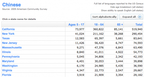
You can also get an age breakdown (again, just raw numbers) for each language, by state. Here’s a partial list for Chinese:

Picture 1

I’m warning you now, the site can turn into an enormous time-suck. You think you’ll just look up the state you live in, say, and then you get started comparing things, and the next thing you know, it’s a half hour later.

UPDATE 2: Commenters have also pointed out that a) “Chinese” is as much of a thrown-together category as “African” (does it mean Cantonese? Mandarin?) and b) the site doesn’t have any information about use of American Sign Language, both great points.

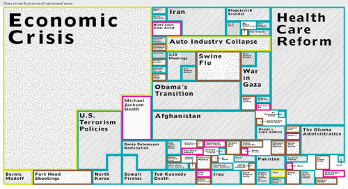
Hank M. sent us a link to this image that shows the proportion of news coverage in 55 outlets for various items throughout the year (click here for a larger image; to read more about the methodology and the news outlets, see Journalism.org):

Picture 4

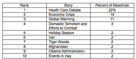
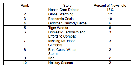
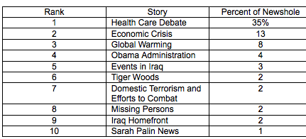
Journalism.org puts out a weekly index as well, broken down by type of source (network TV, newspaper, etc.). Some of the results for Dec. 14-20 show some interesting differences. Here are the top-10 lists for newspaper and network TV, respectively:

Picture 5

Picture 6

The top three stories are the same, and clearly dominate both types of media outlets. TV sources seem to do more “human interest” or “entertainment” coverage of things like Tiger Woods’s scandal, the Goldman custody battle, and the missing climbers. (My mom and grandma were both distressed that I wasn’t aware of the missing woman in Utah or the Goldman custody case and said that I need to keep myself more informed of the world around me by taking the time to watch the news on TV so I’d know what’s going on in the world.)

Cable TV outlets had the same top 3 stories, but actually emphasized them even more than newspapers and network TV did, with health care getting nearly twice as much coverage as it did on the networks (radio had the same pattern):

Picture 4

Their database is archived and searchable, and it provides a rather fascinating view of what is considered newsworthy each week and how that depends on the type of outlet.

Also check out our posts on google searches for information about Afghanistan and Tiger Woods, the “dithering” meme,

This vintage ad reminds us of a time when “gay” meant “happy” and fruit cake wasn’t a joke:

483083461_e39b58b4ef_o

See more gay ads here!

From Vintage Ads.

Lisa Wade, PhD is an Associate Professor at Tulane University. She is the author of American Hookup, a book about college sexual culture; a textbook about gender; and a forthcoming introductory text: Terrible Magnificent Sociology. You can follow her on Twitter and Instagram.
Chris Uggen, fellow sociologist and editor of Contexts magazine, put together a graphic for Public Criminology comparing the current age of death row inmates in the US with their age at arrest (in the title, I assumed they were mostly men, but I don’t know):

deathrow3

So the median age at arrest is 27 and the median current age is 43.  This illustrates the lag time between arrest, conviction, sentencing, and  execution.  It also creates the conditions for what Uggen calls the “graying of prison populations.”   We are executing mostly middle-aged men and older, even as the young are disproportionately convicted for committing violent crimes.

I suppose whether or not we support executing a 50-year-old man for a crime he committed half a lifetime ago depends on what you think the death penalty is for.   Is it to satisfy the family of the victims?  Is it for revenge?  Is it for deterrence?  Is it to make the world outside the prison a safer place?

Executing people in their 40s, 50s, and beyond makes more sense if your goal is something like revenge, less sense if your goal is a safer world with less violent crime.  So, how we frame the death penalty (that is, how we answer the questions “what is it?” and “what is it for?”) shapes whether the graph above looks like social justice or social tragedy.

Lisa Wade, PhD is an Associate Professor at Tulane University. She is the author of American Hookup, a book about college sexual culture; a textbook about gender; and a forthcoming introductory text: Terrible Magnificent Sociology. You can follow her on Twitter and Instagram.

When thinking about how media coverage affects public perceptions, many people think of it in terms of an “injection model”–that is, media outlets “inject” ideas into a passive public, directly affecting what they think (or, anyway, what everyone else thinks, since most people are convinced that they personally aren’t affected). Many researchers have argued this model depicts media audiences as having little agency when it comes to interpreting things they read or hear. People do ultimately decide what they think of issues, though the media play a large role in defining what issues are worth thinking about.

I have spent the last several days being mystified and annoyed by the number of news stories I’ve heard about Tiger Woods and his wreck and apparent affairs. I do not understand why this is national (and even international) news, and why news outlets from Fox to NPR found it worthwhile to have on commentators to talk about the fact that an athlete cheated on his wife.

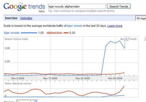
Upon hearing my grumbling, my friend Larry (of The Daily Mirror) sent in this Google trends graph showing searches for “Tiger Woods” and “Afghanistan” during the last month:

news

The top graph shows searches for those terms; the bottom graph shows the frequency of them in news stories distributed by Google News. What was interesting to me is that news coverage has actually been higher for Afghanistan, with the gap growing during the days following the Tiger Woods story, but searches have followed the opposite pattern, with the enormous spike in searches for Tiger Woods in the last few days. It’s possible that TV media outlets have covered the Tiger Woods issue more than print media, so that could show a different trend.

But from what we see here, it appears that public interest isn’t being driven solely by media coverage, and any increases in news stories about Tiger Woods may be a response to an appetite for more information. That doesn’t mean media coverage doesn’t play a large part in framing public discourse–after all, we wouldn’t even know about the Tiger Woods story if it didn’t get some initial media coverage–but media outlets don’t decide what to cover in a complete vacuum, with the ability to get the public interested in any story they report on.

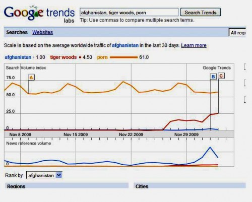
UPDATE: Larry sent in this image that contrasts searches for those terms with searches for “porn”:

porn

Sigh.

Also see our posts on CNN questioning whether Jon and Kate’s divorce was getting too much coverage, which missing children get media coverage, the media shape reality, and coverage of Obama and Clinton.