discourse/language

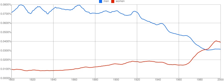
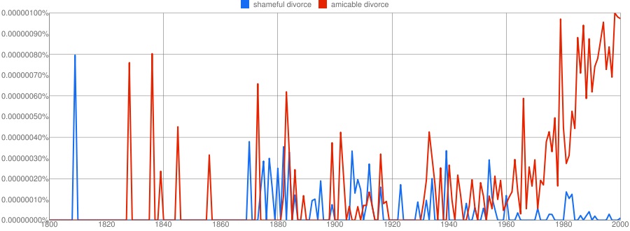
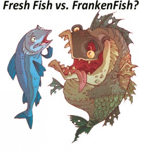
All social movements try to frame issues in ways that benefit their cause. Controlling the discourse is an important step towards getting the outcome they want.  Previously, we’ve posted about the way that activists against the genetic modification of food have nicknamed these foods, “frankenfoods.” Recently, Steven Foster, a student at Rensselaer Polytechnic Institute, sent us a pair of images questioning this rhetoric by comparing the imagery with the animals in question.

Frankenfish cartoon:

Images of genetically- and non-genetically-modified salmon:

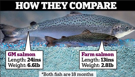
While we don’t know whether anti-“frankenfood” activists are right about their concerns and it’s certainly true that these animals are genetically modified; it’s also clear that the visuals distort the facts (that is, the modified animals are not nearly as distorted as the cartoon implies).  Thinking through how the tactics by which social movement actors try to influence discourse is a fun and useful application of the sociological imagination.

Lisa Wade, PhD is an Associate Professor at Tulane University. She is the author of American Hookup, a book about college sexual culture; a textbook about gender; and a forthcoming introductory text: Terrible Magnificent Sociology. You can follow her on Twitter and Instagram.

Cosmo's Fake Cover Hides Orgasms From Advertisers

The cover of January Cosmo is as sexed-up as ever — on newsstands at least. But we got a copy of the version the mag sends to advertisers, and it’s significantly more chaste. What’s going on here?

Note the miraculous disappearance of “60 Sex Tips” and “Orgasm Virgins” — suddenly, Cosmo‘s appropriate for your grandma! Or your grandma’s favorite retailer — a tipster suggests that the cleaned-up cover is meant to be “more appropriate for conservative [advertising] clients, which the ad sales team is hoping to fool.” If so, they’re not doing a very good job — the table of contents in the ad-friendly version still lists both the sex tips and the orgasm piece as cover stories.

Cosmo's Fake Cover Hides Orgasms From Advertisers

A spokesperson for Cosmo offered this terse comment in response to our queries: “It is common for magazines to have different versions of the cover.”  We decided to see if this was indeed common at other publications. Caroline Nuckolls at Teen Vogue told us the magazine usually has just one version of the cover — but of course, Teen Vogue has a cleaner image to start out with, and less to hide. So we called Maxim, known for its lad-mag raunch — a source there told us they too produce just one cover, which goes out to newsstands, subscribers, and advertisers alike. This isn’t to say that no magazine does what Cosmo‘s done, but it’s not an industry-wide standard.

Of course, it’s not a surprise that a publication feels it needs to put its best foot forward to attract ad dollars — still, creating whole new cover lines is a pretty big step. Which coveted advertising account merited such a drastic cleanup? Some high-fashion brand? (Current Cosmo advertisers include Dior and Chanel.) Mainstream car or consumer products companies? (January’s issue includes an ad for Chevrolet.) Maybe they’re gunning for that Candie’s account? Whatever the brand, Cosmo assumes the ad buyers don’t read very carefully, and don’t know that the mag’s been providing sex advice and orgasm pointers to eager middle-schoolers for decades.

Send an email to Anna North at annanorth@jezebel.com.

George Wiman, in searching for news about the shooting of Gabrielle Giffords’ and others, typed into Google the phrase “congresswoman assassinated.”  Google, it turns out, isn’t sure that “congresswoman” is a word.  I tried it again at midnight last night with the same result.

UPDATE: Readers discovered that Google doesn’t say “Did you mean congressman?” if you type only “congresswoman.”   The algorithm is based on language that already exists on the net and apparently “congresswoman assassinated” is not a phrase we find out there.  It’s so interesting how neutral tools — like algorithms — can nevertheless reproduce existing biases.  Because there have been so few congresswomen (too bad), and so few targeted with violence (thank goodness), typing in “congresswoman assassinated” makes it seem as if women are strangers to congress.  To sum, I’m not saying that this is some evil plan or oversight by Google, it’s an interaction between our real, unequal social world and a neutral algorithm.

Lisa Wade, PhD is an Associate Professor at Tulane University. She is the author of American Hookup, a book about college sexual culture; a textbook about gender; and a forthcoming introductory text: Terrible Magnificent Sociology. You can follow her on Twitter and Instagram.

A polished version of this post was published in Contexts. You can download it here.

Most of our readers are probably familiar  with the now-iconic “We Can Do It!” poster associated with Rosie the Riveter and the movement of women into the paid industrial workforce during World War II:

It is, by this point, so recognizable that it is often parodied or appropriated for a variety of uses (including selling household cleaners). The image is widely seen as a symbol of women’s empowerment and a sign of major gender transformations that occurred during the 1940s.

In their article, “Visual Rhetoric Representing Rosie the Riveter: Myth and Misconception in J. Howard Miller’s ‘We Can Do It!’ Poster,” James Kimble and Lester Olson argue that our current interpretations of the poster don’t necessarily align with how it was seen at the time.

While the poster is often described as a government recruiting item (Kimble and Olson give many examples in the article of inaccurate attributions from a variety of sources), it was, in fact, created by J. Howard Miller as part of a series of posters for the Westinghouse Electric and Manufacturing Company — the Westinghouse logo is clearly visible just under the woman’s arm, and the badge on her shirt collar is the badge employees wore on the plant floor, including an employee number. The War Production Co-ordinating Committee was an internal Westinghouse committee, similar to those created by many companies during the war, not a government entity.

The assumption of current viewers of the image is usually that it was meant to recruit women into the workforce, or to rally women in general — an early example of girl power marketing, if you will — and was widely displayed. But the audience was actually only Westinghouse employees. The company commissioned artists to create posters to be hung in Westinghouse plants for specific periods of time; this poster specifically says, “Post Feb. 15 to Feb. 28” [1943] in small font on the lower left. There’s no evidence that it was ever made available to the public more broadly. For that matter, the poster doesn’t identify her as “Rosie,” and it’s not clear that at the time she would have been immediately identifiable to viewers as “Rosie the Riveter”.

The image that was more widely seen, and is often conflated with the “We Can Do It!” poster, was Norman Rockwell’s May 29, 1943, cover for the Saturday Evening Post:

Here, the woman is clearly linked to the idea of Rosie the Riveter, through both the name on her lunchbox and the  equipment she’s holding. She is more muscular than the woman in Miller’s poster, she’s dirty, and her foot is standing on a copy of Hitler’s Mein Kampf. Rockwell’s image presents the woman as a vital part of the war effort; her work helps defeat the Nazis. The image also includes fewer details to make her look conventionally attractive than Miller’s, where the woman has emphasized eyelashes and visibly painted fingernail.

Most interestingly, Kimble and Olson question the female empowerment message presumed to be the point of the “We Can Do It!” poster. We see the poster on its own, through the lens of a narrative about World War II in which housewives left the kitchen in droves to work in factories. But Westinghouse workers would have seen it in a different context, as one of a series of posters displayed in the plant, with similar imagery and text. When seen as just one in a series, rather than a unique image, Kimble and Olson argue that the collective “we” in “We can do it!” wouldn’t have been women, but Westinghouse employees, who were used to seeing such statements posted in employee-access-only areas of the plant.

Of course, having a woman represent a default factory employee is noteworthy. But our reading of the poster as a feminist emblem partially rests on the idea that this female worker is calling out encouragement to other women. The authors, however, point out a much less empowering interpretation if you think of the poster not in terms of feminism, but in terms of social class and labor relations:

…Westinghouse used “We Can Do It!” and Miller’s other posters to encourage women’s cooperation with the company’s relatively conservative concerns and values at a time when both labor organizing and communism were becoming active controversies for many workers… (p. 537)

…by addressing workers as “we,” the pronoun obfuscated sharp controversies within labor over communism, red-baiting, discrimination, and other heartfelt sources of divisiveness. (p. 550)

One of the major functions of corporate war committees was to manage labor and discourage any type of labor disputes that might disrupt production. From this perspective, images of happy workers expressing support for the war effort and/or workers’ abilities served as propaganda that encouraged workers to identify with one another and management as a team; “patriotism could be invoked to circumvent strikes and characterize workers’ unrest as un-American” (p. 562).

And, as Kimble and Olson illustrate, most of Miller’s posters included no women at all, and when they did, emphasized conventional femininity and the domestic sphere (such as a heavily made-up woman waving to her husband as he left for work).

Of course, today the “We Can Do It!” poster is seen as a feminist icon, adorning coffee cups, t-shirts, calendars, and refrigerator magnets (I have one). Kimble and Olson don’t explain when and how this shift occurred — when the image went from an obscure piece of corporate war-time propaganda, similar to many others, to a widely-recognized pop cultural image of female empowerment. But they make a convincing argument that our current perceptions of the image involve a significant amount of historical myth-making that helps to obscure the discrimination and opposition many women faced in the paid workforce even during the height of the war effort.

[The article appears in Rhetoric & Public Affairs 9(4): 533-570, 2006.]

Gwen Sharp is an associate professor of sociology at Nevada State College. You can follow her on Twitter at @gwensharpnv.

If you are a bit of a linguistics geek, then Jeff H. sent in a treat for you. He found a detailed map of accents/dialects among English speakers in the U.S.:

The creator, Rick Aschmann, is a professional linguist, though the map is described as a hobby not related to his work. It appears to be based primarily on data from the Atlas of North American English (ANAE).

A caution: Aschmann says, “I have not included AAVE [African American Vernacular English] in this study, since its geographical distribution tends to be independent of ‘white’ dialects.” That’s an important omission to keep in mind. I went to the ANAE website and also did a general search for a map of AAVE prevalence, but I haven’t been able to find one

And there is one area in the continental U.S. where the majority of people do not speak English: the parts of Arizona and New Mexico, shaded a sort of coral color, where indigenous languages are still more prevalent than English.

If you go to Aschmann’s page, you can click on sections of the map and go to a list of representative recordings of people who represent the dominant speech patterns there. You can also get a very thorough explanation of all kinds of linguistic differences that are beyond my level of interest/comprehension.

Time magazine has an end-of-the-decade issue with a cover, sent in by Dmitriy T.M., that summarizes what they consider major events between 2000 and 2010:

The stories illustrate the way that, as ESPN puts it, “only bad news counts as news.” Of the 118 items chosen by the editors as “what really happened” over the last ten years, a few are what most people would probably see as relatively positive or benign (such as achievements in sports and the rescue of the Chilean miners) and others would probably fall into the “neutral” category (“U.S. Election” doesn’t say anything about the election — or, for that matter, even indicate which of the various elections that occurred during that time frame it refers to). And a few are just…odd. “AOL-Time Warner Merger” is one of the most important events of the decade? And “The Dark Knight Release” was selected as the most significant pop-culture-related event? Um…okay.

But the majority of items are clearly negative/scary, or at least I think the editors assume they’d be seen that way: BP oil spill, a space shuttle disaster, various diseases, several bombings, “Disaster in Darfur,” the Haiti earthquake, a tire recall, and various topics related to economic problems. According to the ESPN post,

The Time selection says nothing about major positive trends such as declining international military spending (rising U.S. spending is the exception to the rule), declining teen pregnancy rates, declining crime, declining accidental deaths. “U.K. foot and mouth crisis” [a livestock disease]…was cited, but nothing said about declining cancer rates. “Shark attack” was cited, but nothing was said about the dramatic rise in living standards in most of the developing world. (“Overall, poor countries are catching up with rich countries” on nearly all central measures, according to this important new [United Nations] report.)

The post continues, “Yes, journalists have always loved bad news, and have long pretended good news doesn’t exist.” That’s going a bit far. For instance, local newspapers often take part in what Harvey Molotch described as the “growth machine,” a collection of organizations, institutions, businesses, political leaders, and influential community members that support economic growth. Media outlets may contribute to such boosterism by running positive stories and providing space (in op-eds, etc.) for predominantly rosy depictions of the community.

That said, media scholars do criticize news outlets for focusing so much attention on stories that are sensationalistic or that imply the world is an incredibly dangerous, scary place, and leading the public to have quite unrealistic perceptions of actual sources of risk. And Time‘s editors play into this with their selection of the most significant stories of the past decade.

I saw this ad last year but forgot to post it. What I find interesting is the way that “peace” has been both stripped of any real meaning and presented as something easy to achieve:

So while a plaid shirt might cost you $44.50, peace is free. This makes sense only if “peace” has been turned into a completely apolitical feel-good abstraction, as opposed to an end result of social and political processes that require effort and may or may not be particularly cheap. But “peace” is, here, entirely empty of political meaning, so much so that the company could use the word in an ad without worrying that they would be accused of making a political statement about, say, either of the two wars the U.S. is currently engaged in, or the Israel/Palestine conflict, or any number of other situations that a politicized meaning of peace might bring to mind.

A  number of readers, including Mickey C., Lu Fong (writer and editor at The Good Men Project and Good Feed), Cheryl S., and Kelly V., let us know about Google Ngram. The program includes a database of a little over 5 million books and allows you to graph the frequency with which various words or phrases show up in books published in various languages over time (English can also be broken down into British or American English). Mickey and Lu each graphed the words “men” and “women” (see Lu’s discussion here):

Cheryl S. tried “shameful divorce” vs. “amicable divorce”:

The plateaus are due to smoothing, which presents the data as 3-year averages to reduce huge spikes and valleys from individual data points to make overall trends more apparent. You can change the level of smoothing. Here’s the graph with no smoothing at all:

Overall, the tool provides a way to track changes in language as well as social trends. Google provides some info on their methodology, though not as much as I’d like. Some key points:

1. They “normalize” the results based on the number of books published each year, to account for the fact that many more books are published each year now than in, say, 1800, so 100 occurrences of a phrase today means less than 100 occurrences then — that’s why results are presented as percentages, not as raw numbers.

2. Phrases have to appear in at least 40 books total to be included in the database.

3. Keep in mind, the dataset is not based on all books published, but of a subset of books digitized by Google Books. The database includes about 4% of all published books, according to a journal article just published in Science.

I suspect it will be an amazing time-killer.