
A while back Kale let us know that the New York Public Library had made their images collection available online.The collection has images on a huge array of topics, from fashion to the military to slavery to insects to a whole category for stilts, and including political cartoons, illustrations from publications, photographs, and so on.
Kale found the collection particularly interesting as a way to look at historical racism and rhetoric about race relations in publications aimed at White readers. This 1875 cartoon, titled “A Privilege?”, presents segregation as actually protecting African Americans from the scourge of alcohol:
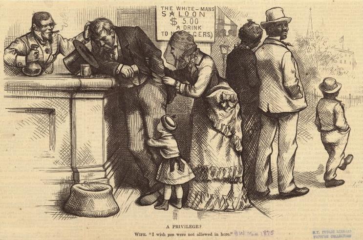
Text:
A PRIVILEGE?
Wife, “I wish you were not allowed in here.”
It’s a fascinating example of the use of institutionalized racial inequalities that hurt African Americans to, instead, garner sympathy for White women and children and present African Americans as, really, better off.
Another, published in Life in 1899, implies African American men are burdens on their families, making their wives take on the role of providing for everyone:
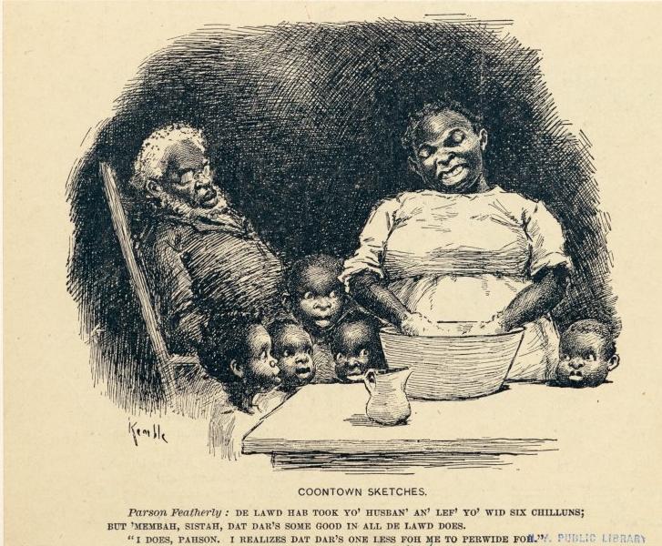
Text:
Parson Featherly: De Lawd hab took yo’ husban’ an’ lef’ yo’ wid six chilluns; but ‘membah, Sistah, dat dar’s some good in all de Lawd does.
“I does, Parson. I realizes dat dar’s one less for me to perwide foh.”
This 1860 cartoon from Harper’s Weekly shows an African American woman (presumably a slave) in the South using the “Bobolitionists” — that is, abolitionists, who wanted to outlaw slavery — as a threat, a type of monster that will come steal him if he’s not good:
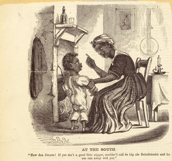
Text:
“Now den Julius! If yer ain’t a good litte nigger, mudder’l call de big old Bobolitionist and let um run away wid yer.”
I’m sure it must have been very comforting to some readers to think of slaves viewing abolitionists as threats rather than potential allies.
Other cartoons mock African Americans’ physical attributes, marking them as laughable or even grotesque:
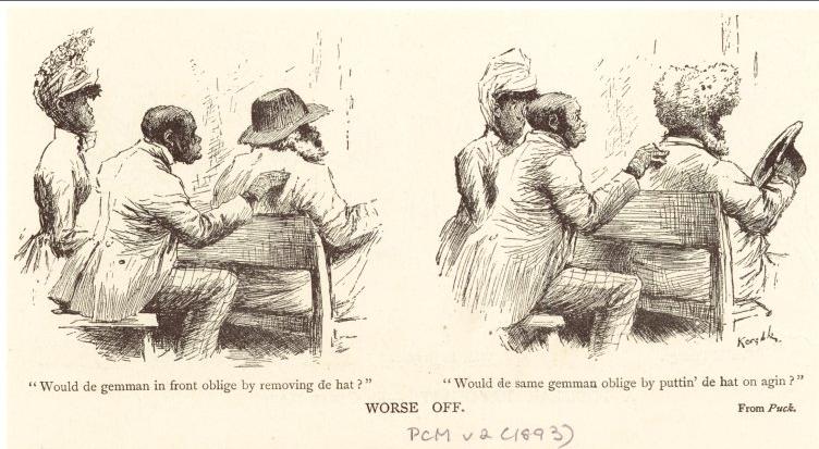
Text:
“Would de gemman in front oblige by removing de hat?”
“Would de same gemman oblige by puttin’ de hat on agin?”
(Details.)
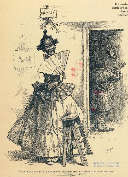
Text:
“Now we’ll see ef dat sawed off Peterson man kin escape de issue dis time.”
(Details.)
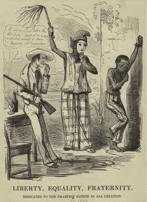
There are also examples that criticized U.S. race relations, such as this 1848 cartoon from Punch [Note: a reader thinks this might be about France, which banned slavery in 1848, but the NYPL has it listed as relevant to U.S. slavery, so there may be so lost context here]:
Enjoy!
[Note: A commenter has expressed concern that I ended this post with “Enjoy!” I apologize for my insensitivity. I meant it in terms of “Enjoy browsing this fascinating archive,” of which racist imagery is only a small part, not, I hope it would be clear, “Enjoy looking at racist cartoons!” I wasn’t thinking about how it might appear immediately after those set of images, and I should have been more careful.]


