modern/primitive

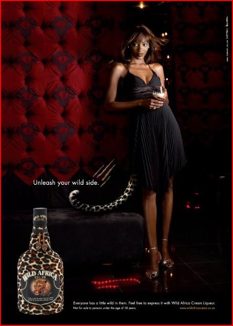
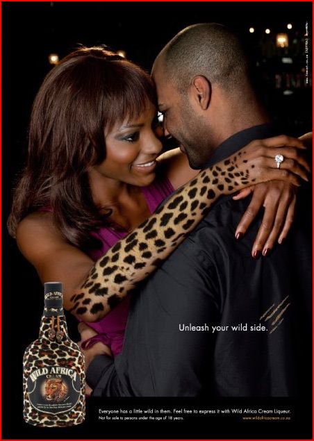
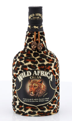
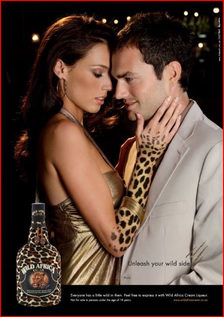
AdFreak drew my attention to a South African liqueur called Wild Africa Cream.  The advertising suggests that drinking it will “unleash your wild side.”
wac-bottle_white

We have posted before about the tendency to associate black people, especially black women, with animals (see here, here, here, and here), as well as the historical roots of this discourse.  But, in this case, the advertising uses both black and white, male and female models.
capture1

capture2

capture3

capture4

I think what is interesting here is the association of Africa itself with animalism and primitiveness (an association that no doubt also colors our thinking about black people).  (Notice that the first and only Disney film to be set in Africa, The Lion King, included only animals.)  Catherine MacKinnon coined the term “anachronistic space” to refer to the idea that different parts of the globe represent different historical periods.  See other examples of representing Africa in this way here, here, here, and here.

In line with this tendency to think in this way, in this advertising it’s almost as if black Africans are meant to represent white humans’ own more primitive past (ergo the drink “unleashing your wild side,” whoever you are).

I like to point out to my students that Americans are not more modern than Africans (purposefully eliding the abstract meaning of “modern” in a way that tends to surprise them out of their easy associations).  It is 2009 there, also, and human evolution has progress no further from the “wild” in either place.

—————————

Lisa Wade is a professor of sociology at Occidental College. You can follow her on Twitter and Facebook.

In the opening essay to the book Shared Visions: Native American Painters and Sculptors in the Twentieth Century, Rennard Strickland and Margaret Archuleta write,

J.J. Brody in his classic study, Indian Painters & White Patrons, identified the colonial nature of a patronage system that narrowly defined and dictated what was “Indian art”…It seems almost as if definitionally…that paintings by Indians can be considered only in a primitive, aboriginal context. (p. 9)

They discuss Oscar Howe:

…[he was] thwarted in developing new directions in painting and striving to break away from the old stereotypes limiting Indian art…one of Howe’s Cubist style paintings was rejected from the 1959 Indian Artists Annual because it was “non-Indian” and embodied a “non-traditional Indian style.” (p. 9)

Strickland and Archuleta quote a letter from Howe to a friend:

“There is much more to Indian Art, than pretty, stylized pictures…Are we to be held back forever with one phase of Indian painting…?” (p. 10)

What Strickland, Archuleta, and Howe (as well as other contributors to Shared Visions) are discussing is the pressure American Indian artists have often faced to create a certain type of art. This pressure may come from other Indians or from non-Indians. Non-Indians have often had significant power over Indian artists because of their role as benefactors (providing money for artists to attend The Studio at the Santa Fe Indian School, for instance) and because non-Indians are the majority of buyers of art created by American Indian artists. And benefactors and art collectors often have a certain idea of what “Indian art” is, which includes assumptions about both themes and styles. Specifically, they want “traditional” images that depict Native Americans in a pre-modern world, often including images of animals.

I couldn’t help but think of that book when I recently picked up a tourist-oriented guide to Taos, New Mexico. Now, don’t get me wrong: I’m not saying there is anything necessarily wrong with any of the particular art pieces (or with “traditional” type Indian art more broadly). I’m also not claiming these particular artists feel their artistic expression is limited by preconceived notions of what counts as “Indian art.”

What struck me was just the homogeneity of the images found in the guide, which seemed to more or less fit the mold of the stereotypical idea of “Indian art.” It brings up the question: what is Indian art? Is it any art made by an American Indian? Or does it only count if it fits in with non-Indians’ preferences for what Indian art should look like? What if a White person, say, masters the “traditional” style–is it Indian art then? Over the years a number of American Indian artists have created art to intentionally challenge the idea of the romanticized 19th-century Indian as well as what Indian art can be. For instance, Fritz Scholder painted “Indian Wrapped in Flag” in 1976, in an attempt to deconstruct images of Native Americans (p. 16 of Shared Visions).

Both Indians and non-Indians picketed some of Scholder’s shows in protest.

Similarly, T.C. Cannon painted “Osage with Van Gogh” (I’ve also seen it titled “Collector #5“; from around 1980), which reverses our idea of who collects or appreciates which type of art by showing a Native American collecting a European artist’s work. Another great piece is “When Coyote Leaves the Reservation (a portrait of the artist as a young Coyote)” by Harry Fonseca (1980). See images here.

So are those pieces Indian art? Does it count as “Indian art” only if it contains specific styles and themes?  In which case, does it remain a sub-genre of art–part of “ethnic” art, as opposed to the neutral, non-marked mainstream art world?  Are Indians who paint or sculpt or play music in ways that don’t fit the existing idea of Indian art not “authentic” Indian artists?  If we accept that premise, “Indian art” is, as Howe said, “held back forever,” with themes and styles frozen in time and artists discouraged from experimenting or innovating in their work, as Howe learned so clearly. This tendency is apparent in other elements of U.S. culture, of course: movies like “Dances with Wolves,” books about “noble savages,” and conflicts over what types of technologies American Indians can use when spear fishing (with non-Indians arguing Indians should only be able to use the methods that their tribes used in the 1800s) all indicate a wider perception that “authentic” Indians should inhabit a time-warp universe in which their cultures and lifestyles have remained basically unchanged since the late 1800s or early 1900s, a requirement we don’t ask of other groups.

For more evidence that Indians are represented, and expected to represent themselves, anachronistically, see this post.

UPDATE: Commenter Camilla points out a documentary that asks similar questions about “African” art:

Christopher B. Steiner produced a fantastic anthropological documentary about the market for “African” art that addressed many of these same issues. It’s called “In and Out of Africa”…It explores the issue of how ideas such as “authenticity” and “tradition” are socially constructed phenomena. It also questions why particular types of “ethnic” art are successful in Western markets, while others are not.

Gwen Sharp is an associate professor of sociology at Nevada State College. You can follow her on Twitter at @gwensharpnv.

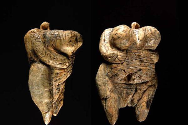
I have been fascinated over the past week by news coverage of the newly discovered “Venus” figurine that is believed to be the oldest human carving ever found. In this post, I’m trying to work out my thoughts.

picture1

News coverage has described the figurine with terms like “sexy,” “erotic,” “sexually-suggestive,” “sexually-charged,” “busty,” “pornographic,” and “pin up.” I’m not sure what to make of this.  There is no possible way that we could understand the meaning–or, let’s face it, multitude of contested meanings–that such a figure could have carried for those who made it.  All interpretations are projections of our own contemporary sensibilities.

Perhaps especially because of this, I am dumbfounded as to the ease with which news coverage describes the figurine as sexy.

From a contemporary U.S. perspective, the figure would not be considered sexy. Bodies such as that portrayed in this “Venus” are considered grotesque today and people who are sexually attracted to such bodies are considered deviant. It’s amazing to me that this is so completely unnoticed in news coverage. Instead, the figure is seen as obviously sexual exactly because the body is fat.

I think this could be explained with our contemporary social construction of fatness. Fat symbolizes excess. Fat people are presumed to have appetites in excess, for sex as well as for food. Fat women in the media are often portrayed as highly, even aggressively, sexual (think Mimi from The Drew Carey Show, the way that Star Jones’ role developed on The View, even Karen Walker on Will & Grace who, by modern standards and compared to Grace, was “curvy”).  The figurine is described as somehow obviously in excess.  The coverage includes terms like “protruding,” “exaggerated,” “grossly exaggerated,” “enormous,” “aggressive,” “enlarged,” “bloated,” “huge,” “bulbous,” “oversized,”  “outsized,” “distorted,” “swollen,” and “with breasts that make Dolly Parton look flat-chested.”  Granted, the figure may be somewhat disproportionate (and I emphasize may be), but our interest in its disproportionality seems somewhat disproportionate as well.

Maybe this is intersecting with our own assumptions as to the primitiveness of the people who carved the figure. The primitive is also a socially constructed idea and we often think that primitive people have closer ties to their baser instincts.  From that perspective, maybe being sexually attracted to excessive sexuality makes sense.

So maybe the combination of our social construction of fat and our social construction of the primitive explains why the contradiction–the figurine is obviously sexy, but women who have that body today are considered the antithesis of sexy–is going unmarked. I’m not sure. I’d like to hear your thoughts.

Lisa Wade, PhD is an Associate Professor at Tulane University. She is the author of American Hookup, a book about college sexual culture; a textbook about gender; and a forthcoming introductory text: Terrible Magnificent Sociology. You can follow her on Twitter and Instagram.

We’re pleased to feature a post by Robert Hariman.  Robert is a professor of Rhetoric and Public Culture in the Department of Communication Studies of Northwestern University.  Robert blogs at No Caption Needed, where we saw this great post:

—————————

I am suspicious of references to “the Arab Street,” particularly when the phase is applied–as it often is–to nations and other vast swaths of territory that are not Arab or not exclusively Arab. Several years ago Christopher Hitchens declared that it was a vanquished cliche but he was misusing it himself and not surprisingly as he was blowing the war trumpet for the Bush administration. And he wasn’t speaking of its persistence as a visual convention.

The caption of this photograph at The Guardian says only, “Nowruz celebrations in Afghanistan.” Nowruz is the name of the Iranian New Year, which is celebrated in a number of countries by people of several faiths. The baskets of dried fruits eaten during the holiday provide the only visual connection to the colorful festivities, and you have to know more than the paper tells you to see that. For many viewers, this will a thoroughly conventional image of the Middle East.

That image is one of throngs of working class men massed together in the street. What little business is there is in the open air markets lining each side of the densely packed urban space. We see small batches of everyday goods on display–probably to be bartered for, no less. The open baskets of food are a sure marker of the underdeveloped world. (Imagine how many packages it would take to wrap up all that fruit for individual snacks to be sold in the US; and even in Whole Foods the unpackaged food is in closed bins.) Everything fits together into a single narrative, but the masses of men and boys make the scene politically significant. This is the place where collective delusions take hold, where mobs are formed, and where unrest can explode into revolutionary violence and Jihad.

Which is why I get a kick out of this photograph of another Nowruz celebration.

The caption reads, “An Iranian man skewers chicken for grilling as he picnics with his family.” My first thought when I saw the image was to check and make sure it wasn’t taken in Chicago. This also is a very familiar scene: grass, blankets, families and friends, plastic containers of food, dad getting ready to do the grilling.

What is astonishing is that I was able to see them at all. A typical summer holiday photo becomes a radical disruption of Western visual conventions when taken in Iran and shown in the US. Of course, it wasn’t shown in the US: this, too, is from the UK paper.

In this photo, there is no Arab street nor Iranian masses dominated by Mullahs and demagogues. A middle class tableau reveals that so much of what is in fact ordinary life for many people in Iran and elsewhere in the Middle East is never seen in the US. And it isn’t seen because it doesn’t fit into simplistic categories, outdated stereotypes, and a dominant ideology. All that is shown and implied in the cliches is of course also there, but it is there as part of a much more complex and varied social reality.

As evidence of how things might appear a bit different, notice how seeing the second image can affect perception of the first one. In the second, it seems evident that the family is posing for the photograph. They’re doing exactly what they would have been doing but now with the additional, amused awareness that it is, for a moment, also an act. And sure enough, if you look back to the first photo, you can see the same thing. And if you can see that, they no longer need appear as a mass, or poor, or threatening, or anything but people enjoying a holiday. Much like people in the US were doing this past weekend to celebrate St. Patrick’s day, thronged together, in the street.

Photographs by Natalie Behring-Chisholm/Getty Images and Behrouz Mehri/AFP-Getty Images.

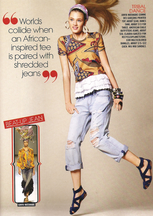
A while back Laura M.D. sent us this image from the March issue of Teen Vogue (found at Jezebel):

tvafricanvogue

Really? This is all it takes to have a cross-cultural experience these days? It’s also interesting to me that this is defined as “African-inspired,” because I’ve seen “Asian-inspired” items that have a very similar look (though not the dark-skinned person in a hammock; maybe that’s the African element). We see this a lot in fashion–the attribution of vaguely “ethnic”-looking things to some part of the world, or specific culture, that may or may not be particularly associated with the supposed traditional fashion or artistic style.

If they wanted to talk about this outfit as a global collision, they might have discussed where all the different items (and the materials for them) were manufactured compared to where they are sold and worn.

See other posts on representing Africa, “ethnic” fashion, and more “ethnic” fashion.

UPDATE: In a comment, jfruh says,

Can I just say that one of my very least favorite adjectives is “tribal” (in the top right corner), which seems to be used indiscriminately to refer to any art with the whiff of the primitive about it? Vaguely Polynesian-looking tattoos, vaguely African-sounding drums, etc. It’s bad enough that the political organizational structures of wildly disparate cultures are lumped together under the word “tribe” just because they’re at a smaller scale than modern nation-states; now any art form that resonates at all with any culture perceived as primitive gets labelled tribal as well.

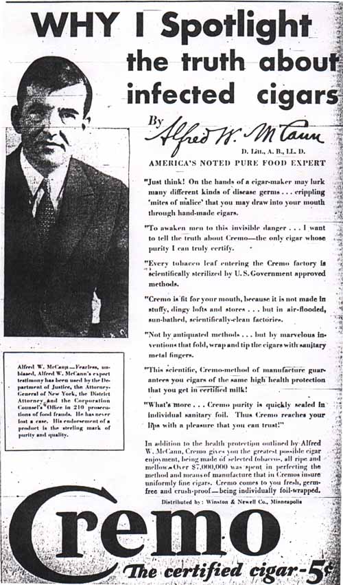
In case you thought the craze for sanitary or anti-bacterial products was new, here’s a Cremo cigar ad from the 1920s (found at the Microfilm Gallery) that scares consumers with the specter of cigars covered in “mites of malice”:

Text:

Just think! On the hands of a cigar-maker may lurk many different kinds of disease germs…crippling ‘mites of malice’ that you may draw into your mouth through hand-made cigars. To awaken men to this invisible danger…I want to tell the truth about Cremo–the only cigar whose purity I can truly certify. Every tobacco leaf entering the Cremo factory is scientifically sterilized by U.S. Government approved methods. Cremo is fit for you mouth, because it is not made in stuffy, dingy lofts and stores…but in air-flooded, sun-bathed, scientifically-clean factories. Not by antiquated methods…but by marvelous inventions that fold, wrap, and tip the cigars with sanitary metal fingers. This scientific, Cremo-method of manufacture guarantees you cigars of the same high health protection that you get in certified milk! What’s more…Cremo purity is quickly sealed in individual sanitary foil. Thus Cremo reaches your lips with a pleasure that you can trust!

What I like here is the total faith in technology and mass production. It’s safer! It’s innovative! It’s sanitary! It’s a striking contrast to the concerns often expressed about scientific innovations and their possible negative effects. It would also be a good example for talking about the way that perceptions of manufacturing methods have changed. In the 1920s, the idea of mass-produced cigars was exciting and modern. The fact that they were made with “metal fingers” was a selling point. Today, on the other hand, the techniques referred to in this ad as “antiquated” might be called “artisanal,” a word that connotes craftsmanship and quality. According to About.com,

The novice smoker may be tempted to start by trying those machine made brands sold in Drug Stores, such as Dutch Masters or El Producto. However, the aspiring connoisseur should consider spending a few more pennies and moving up to hand rolled cigars, which are sold online or at a local tobacconist.

Maybe someday we’ll think of soap that isn’t anti-bacterial as a high-quality, artisanal product.

From AdGoodness come these three print ads for a new digital camera, the Nikon S60, which apparently has a feature that allows it to auto-detect and focus on faces. The three examples include a bunch of people rubber-necking at two young “porn lesbians” [the top one of which has a horribly Photoshopped head!], a bunch of people of color sneaking up on a white safari dude, and a bunch of ghosts looking at a woman in a hotel room.  Of all the possible examples that could be used to highlight this face-finding feature, who thought it was a good idea to use some hackneyed stereotypes about sexual orientation and race?

Parameswaran (2002) writes:

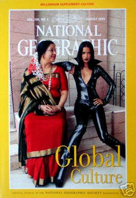
The [National] Geographic’s August 1999 cover dramatically deploys women’s bodies as detailed blueprints, maps that busy readers could use to instantly trace the passage of non-Western cultures from tradition to global modernity…

More of her description of this cover after the image (found here):


An older middle-aged Indian woman, with streams of white and orange flowers pinned to her hair at the base of her neck, symbolizes tradition. The deep red silk sari with a gold border, the gold necklaces around her neck, and the thick gold bangles on her wrists clearly mark her as a traditional upper-class woman… The older Indian woman’s body and posture also announce her alignment with tradition. She is heavyset, almost stocky, and her sari demurely covers her large breasts. Her feet are placed moderately close together and her folded hands rest in her lap. Avoiding the direct eye of the camera, her face, with the trademark dot of the Hindu tradition etched between her eyes, is turned sideways as she bestows a tender maternal gaze on the young woman sitting beside her…

In contrast to the gentle passivity and the slack middle-aged body that index tradition, bold assertiveness, feminine youthfulness, and an androgynous firm body register cosmopolitan modernity in the cover of image. These biological and emotional transformations in the modern, non-Western woman’s physical appearance and personal demeanor appear to be wrought by Westernization. The young, slender Indian woman sitting next to the middle-aged woman has short, shoulder length hair framing her face. The marked absence of the dot on her forehead as well as her clothing, instantly herald her identity as a modern woman. She is dressed in a black, shiny PVC catsuit, unzipped down to the middle of her chest to display her small, almost flat breasts, while her feel are encased in sharply pointed black boots. Disdaining the gaze of the older woman directed towards her, she defiantly stares at the camera and claims her personal space with arrogant confidence. Her legs and felt, unlike the older woman’s feet, are splayed wide apart and her knees point in opposite directions. Her left arm is poised akimbo style while her left palm grips her hip in a strong masculine gesture.

In the magazines sharply polarized, binary rendering of the “new and hip” as radically different from the “old and outmoded,” one woman symbolizes ethnic tradition and the other global modernity…

Citation:  Parameswaran, Radhika. 2002. Local Culture in Global Media: Excavating Colonial and Material Discourses in National Geographic. Community Theory 12, 3: 287-315.