intersectionality

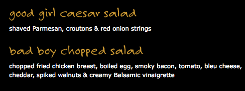
We’ve collected many images of the gendering and sexualization of food, where foods are turned into sexy female bodies or are shown alongside sexy women. Miriam sent us a link to Brick House Tavern & Tap, which markets itself as a Hooters-lite for-the-guys restaurant. The menu includes some sexualized elements, and is based on a clear gendering of items. Clearly it’s objectifying women (check out the website), but what interests me is the message we get about masculinity.

There are salads for men and women; the male version includes two types of meat and boiled egg:
Picture 1

Men are supposed to control things; foods are described as dominant or submissive. I presume the “man-cave” dish would fall into the dominant category:
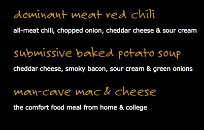
Picture 2

Men’s foods are unhealthy. Steamed, rather than fried, options? Those are for the ladies:
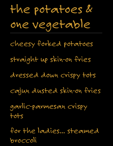
Picture 3

Real manliness is associated with guns:

Picture 4

UPDATE: Reader Lisa says,

I thought the “gun show” reference was to biceps – e.g. men have muscles and women don’t. (e.g. Do you have your tickets to the gun show? har har har)

That makes total sense. I’ve had the good luck to never have heard that particular joke until now.

There’s also a class element:

Picture 5

And desserts are “the happy ending,” with “double d” cupcakes and “sweet, innocent” (girl)-next-door apple crumble:
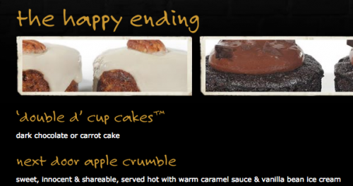
Picture 6

It’s a common theme (see Lisa’s post on frozen dinners): real men need big meals with lots of meat. They don’t worry about health–they want you to deep-fry everything, dammit! Trying to eat a healthy, low-fat diet is for women. And foods are depicted as parts of women’s bodies (“double d”) or associated with sex (“the happy ending”).

See also Campbell’s ad saying beef soup is for men only.

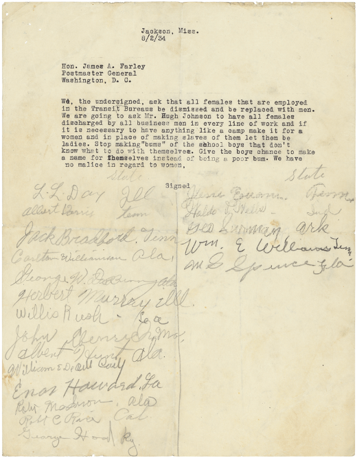
Ryan A. sent in this image of a letter (found at Letters of Note) sent to the Postmaster General in 1934, in which men ask for women to be fired so that men can have jobs:

4013497117_be9b6c7448_o

Notice that work is depicted as an oppressive burden for women (“…in place of making slaves of them let them be ladies”). Men, on the other hand, are entitled to take employment from women if they are in need of it to avoid being “bums” (and apparently it’s ok to make slaves of them).

Now, don’t get me wrong: I actually have sympathy for the psychological distress these and other men must have felt at the time. When manhood is highly associated with the ability to support a family on your income alone, job loss and poverty is not just embarrassing, it is a threat to your very identity as a man. The plea for jobs to help young men “make a name for themselves” is partly a call to let them become responsible adult men in good social standing, rather than bums (a term loaded with moral judgment).

So I have sympathy for the men struggling with the feeling of failure that came with joblessness. But it’s still noteworthy that the letter indicates a sense of entitlement to women’s jobs (much like veterans returning from World War II felt toward women who had taken jobs outside the home). Women, presumably, had a husband to support them and it was his duty to not be a bum so that she wouldn’t need to take a job from another man.

In the U.S. today, men enroll in college at a lower rate and drop out at a higher rate. In 2005, there were 57 women on campus for every 43 men.

This is such a significant problem, that college admissions officers are letting in a larger percentage of male applicants, even sometimes admitting less qualified men over more qualified women.

But this isn’t just a gender story.

A USA Today story offered this data from the ACE Center for Policy and Analysis:

Capture

Looking at the very bottom line of the table (and just at 2003/2004), you can see that the gender gap is largest among lower income students.  Men make up 40% of undergraduates 18-24 when you consider low-income students only, and 49% when you look at upper income students.

The gender gap also correlates with race.  Asian students show the smallest gender gap, whites the next smallest, with Hispanics and blacks trailing.

You might notice that the correlation of the gender gap with race mirrors the class correlation.  That is, income and wealth data for racial categories follows the same pattern with Asians out earning whites (categorically speaking) and whites out earning Hispanics and blacks.  So there may be an interesting exacerbation effect here.

The gender gaps for each racial/ethnic group, however, decreases as the students’ families get richer.  And, among the upper income groups, the racial difference shrinks to only three percentage points (from 11 among low- and middle-income kids).

So, it’s not just about race, it’s not just about class, and it’s not just about gender.  Then, what is it about being poor, black or Hispanic, andmale that results in low male enrollment in college and a higher drop out rate?

—————————

Lisa Wade is a professor of sociology at Occidental College. You can follow her on Twitter and Facebook.

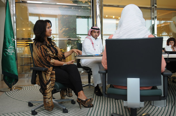
A gallery at Time Magazine offered a set of photographs that counter the frequent representations of Saudi women as (veiled) and downtrodden.  The slide show features professional women at work.

Daneh Abuahmed, Rotana’s head of information technology:

saudi_12

Dr. Maha Al Muneef, Executive Director of the National Family Safety Program:

saudi_19

Sultana al Rowaili, the head of human resources at Rotana:

saudi_14

Members of the National Family Safety Program:

saudi_2

Norah Al Malhooq, administrator King Faisal Specialist Hospital and Research Centre:

saudi_24

—————————

Lisa Wade is a professor of sociology at Occidental College. You can follow her on Twitter and Facebook.

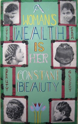
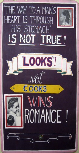
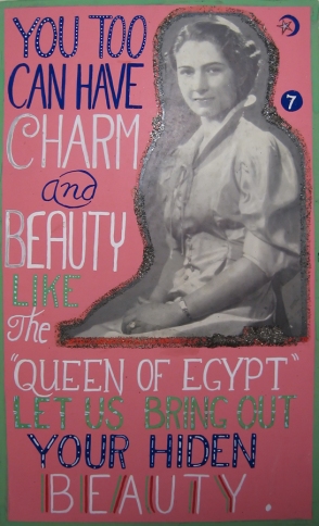
Mary M., of Cooking with the Junior League, took a moment out of her busy Dodgers-watching schedule to send me a link to some posters for products aimed at African American women. They were displayed at the Negro Industrial Fair in NYC in 1939 and contain some fascinating ideas about femininity, beauty, and attracting a man.

Given that a woman’s best chance at economic stability was often through marriage, this one probably wasn’t all that off-base:

jwj_mss_47_placard_05

Of course, it takes an enormous amount of time, energy, and money to be sure your beauty is “constant.” But it’s necessary, because beauty is the true way to get a husband:

jwj_mss_47_placard_06

Notice the message in that one: you might be incredibly skilled in some areas of traditional femininity (say, cooking), but it’s not enough if you can’t combine it with beauty. And you can get charm and beauty through purchasing the right products:

jwj_mss_47_placard_011

See also our post on Chris Rock’s documentary “Good Hair“and a woman gets fired for having an Afro.

I love beer. I also love wine and liquor, but beer’s what I come back to. Beer is plain ol’ delicious: every brand has a distinct flavor and it goes well with food or alone. It’s just intoxicating enough: if I don’t feel like getting wasted, one or two will do me, but steady drinking will get the job done fine if I’m in a partying mood.

My fella and I get tired of the same old, same old beer selection at our local Kroger, so when we travel out of state, we often pick up a lot of regional beers – up to 12 six packs when we have the cash! The beer boxes are my second favorite part of buying the beer after drinking it. Beer packaging is colorful and diverse, and often beautiful*:


The boxes serve as a runner around our walls. They’re a fascinating and unique decorative element of which I’m quite proud and which get a lot of comments from our friends. It’s a good record of our travels and our life together. They are not meant and usually are not read as endorsements of every beer we drink, but are in the context of over a hundred other examples of packaging. Pedestrian PBR is next to regional Yuengling, and obscure Backfin is next to a sampler pack. Every box that we (or occasionally a friend who works at a beer store) consume goes up on our wall, regardless of aesthetic or political merit: they are meant to provoke critique and examination of the relative merits and values in different packages of different beer.

Since I’m surrounded by the boxes all day, I begin to pick up on elements of their design. Namely, that males and whiteness are constantly normalized within the design of the boxes**:


Excepting the daguerreotype-esque Southern Ale, all of the men above are shown enjoying the beer, usually while engaging in their daily duties or in making the beer. The cottonwood man is not actively engaged, but he is holding the wheat that will make the beer, thus conferring involvement in the beer on him. The Highlands man is somewhat othered by the bagpipes, and I’m not sure how the man in the Rogue ale is constructed, but both are drinking and enjoying the beer they’re intended to represent. They are active and involved – not passive, not just drinking the beer, not just there. They are constructed as dynamic and effectual as they drink the beer. And they are all white: men of color are erased in beer packaging as far as I’ve seen.

Now, let’s look at the women that show up on the wall:

Women love to drink. Women love beer. But you would never know it from their scarce representation in beer packaging.

In the beer packages I’ve got up, women are not engaged in the act of drinking the beer that they represent. In fact, they’re not engaged in anything. Except opening their mouths, or, um, being on fire. They’re… objects. More specifically, sexual objects that have in most cases been disembodied. They’re floating heads, with their mouths open.

It gets worse when you look at how, specifically, the women of color are constructed. Look at the “Bad Penny” packaging above, and this one that I recently saw at a music festival:

The black women are constructed as reductive, exotic others, black women whose sexuality exists for the inebriated male gaze. It is not a coincidence that both have afros. Natural hair beautiful and laudatory, but there is only one kind of natural hair here: the style that is often problematized as dangerous and exotic, as another element that makes them an exotic experience for the male drinker.

Their sexuality is especially lacking in agency: the naked woman in the sexual chocolate ads is literally presented as an offering to the male gaze. She’s not engaged with the viewer by drinking, or by making eye contact. She is passive, and coded as naked: she is wearing a tube top, but it’s obscured by lettering of the same color as the top. A cartoon figure, she is not active; she is just there, waiting to be debased.

The “Bad Penny” character is making eye contact, but her eyes are heavily lidded, unlike the white women above. I took the “bad” in the name of the beer to be capitalization on blaxploitation by an alcohol company that aligns itself with kyriarchical forces: it’s the “Big Boss”. If the producer of this beer is the boss, where does that leave the women who hawk it?

Speaking of othering, let’s look at another one I found online:

Note again the heavily lidded eyes, the more explicit nudity. Though she is at least shown to be holding liquid, she’s not drinking it or enjoying it; she’s pandering to the male gaze with an oh-so-subtle finger in her mouth.

This is supposed to construct Aztec culture (which I am not well-versed in discussing). Please note the feathers, the background, and the jewelry as elements of othering and exoticization that I can’t fully articulate. Also not that this is not in a stein, as with most males shown with beer, but in some kind of “primitive”-looking stone goblet.

Women in the marketing of beer is a grim, grim field. Beer is a man’s drink, and women are excluded from independent enjoyment of it. They are not the drinkers of beer; they’re the sex that sells the beer, the static objects of intoxicated lust.

To end on a less grim note, I did come across one ad that struck me as positive:

This woman is not being objectified, or reduced to an othered sexual object. She is normalized by her whiteness, but also by her active enjoyment of beer. She’s drinking, which is what women do with beer.

ETA: meloukhia pointed out this label, which I’d seen before:

While the legs are somewhat sexual, and her eyes are closed, this woman is engaged and active – she is enjoying the beer, and life. Check out the comments for more beer packaging and discussion.

*It should be noted that while I appreciate the aesthetics of this example of packaging, this is an example of how voodoo is problematized and othered – especially when paired with a loaded word like “Dixie”.

**Many, though not all, of these packages repeat the imagery shown here in packaging of other varieties of beer.

—————————–

Rachel McCarthy James is a writer and tutor living in Virginia. She writes about feminism and stuff at Deeply Problematic.

If you would like to write a post for Sociological Images, please see our Guidelines for Guest Bloggers.

Brandon H. let me know about two viral Smirnoff videos that humorously illustrate some of the differences (perceived and real) between “old money” families and the newly rich.

The old money/East Coast version:

Argyle sweaters! White pants! Pearls!

The nouveau riche West Coast version:

Massages! Spray tans! Collagen implants!

Of course, there’s other interesting stuff going on here, too–the typical “women as background dancers/accessories” theme, the lack of non-White people, the way that moisturizer and lip balm is associated with a laughable masculinity. Of course, by current popular ideals of masculinity, both of these groups of men come up lacking, and in fact, rich men are often both idolized and portrayed as intellectual but not really “manly” (which is reserved for hard-workin’ midwestern types).

Also: Joe’s Crab Shack, what does rich look like?, masculinize your sissy upper-class dogs with Alpo, women as prizes for rich men, representing the working class at Honfest, evoking class with literary references, upper-class luxury in ads, communicating class in Cadillac ads, “class is forever“, and old money is old-fashioned.

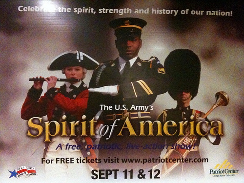
Jamy B. snapped this photo of an ad for a U.S. Army “live action” show in the D.C. metro:

3928437675_ec49ef44a6

The show is called “Spirit of America” and the slogan along the top reads: “Celebrate the spirit, strength and history of our nation!”   The inclusion of a white woman and a black man alongside what appears to be a white man, suggests that the ad-makers want us to understand that the “spirit of America” involves racial and gender inclusiveness.  Of course, this is in contrast to historical fact.   Being “patriotic,” I guess, means erasing historical injustices.

Frankly, I have some sympathy for the promoters of this event.  Inclusiveness is a nice idea.  Unfortunately, they’re stuck between a rock and a hard place in trying to bring together ideology and reality.

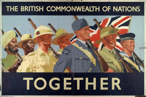
NEW! Simon H. sent in a British poster (found at Free Market Fairy) urging men to sign up to serve in World War I. In this case, the British Empire is portrayed as a family of nations, all happily working together with the same patriotic aims:

British War Posters 4

—————————

Lisa Wade is a professor of sociology at Occidental College. You can follow her on Twitter and Facebook.