In light of Romney’s comments regarding those who depend on the government, we thought we’d re-post this great data showing that many people who are using government social programs don’t know they are doing so.
————————
Dolores R. sent in a fascinating image posted at boingboing. It comes from a paper by Suzanne Mettler, a professor in the Department of Government at Cornell. Mettler first asked survey participants whether they had ever used a federal U.S. government program. Then later in the survey she specifically asked respondents whether they had ever benefited from or participated in specific federal programs. As it turns out, large number of people who have benefited from various federal programs or policies do not recognize themselves as having done so. This table shows what percent of people who said they had participated in or used these 19 federal programs had earlier in the surveys said they had never used any social program:
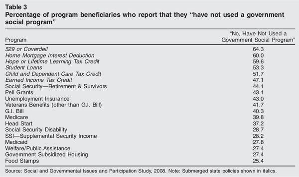
Mettler argues that recipients are less likely to recognize themselves as benefiting from programs that are part of what she calls the “submerged state” — programs and policies that provide incentives and motivations for particular behaviors in the private sector, rather than overtly directing behavior. If you receive food stamps, you interact directly with a government agency, are required to periodically meet with a government worker and reapply to re-establish eligibility, and can point to a specific thing that links you to the program (these days usually a debit-type card rather than the old style coupons/stamps).
On the other hand, if you participate in the government’s mortgage interest deduction program, which encourages home ownership by allowing people to deduct the cost of mortgage interest from their taxable income (which you can’t do with rent costs, for instance), it’s less noticeable that you are benefiting from a federal policy. You get a form from your mortgage company that provides the relevant number, and you transfer it over to the correct line when you’re filling out taxes.
Notably, the programs recipients seem least likely to recognize as a government program are among those the middle (and higher) classes are most likely to use, while those more common among the poor are more clearly recognizable to those using them as government programs. Yet allowing you to write off mortgage interest (but not rent), or charitable donations, or the money you put aside for a child’s education, are all forms of government programs, ones that benefit some more than others. But the “submerged” nature of these policies hides the degree to which the middle and upper classes use and benefit from federal programs.