Yesterday I stumbled upon a really great interactive graphic posted by the Guardian that summarizes the degree to which a number of rights and benefits are available to gays and lesbians in the U.S., by state. Each state is represented as a segment radiating out from the center of the circle; each colored ring represents a particular right, benefit, or protection:
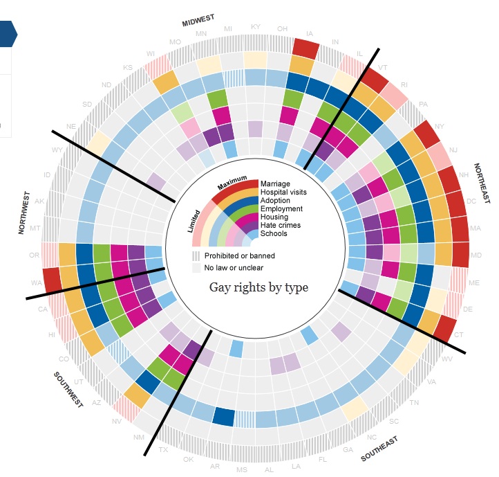
- Light blue = whether state has a law addressing discrimination or bullying in the school system
- Purple = state-level hate-crime laws
- Pink = protection against housing discrimination
- Green = protection against employment discrimination
- Blue = right to adopt (lighter shade indicates individuals are allowed; darker shade means gay and lesbian couples are allowed to jointly adopt)
- Yellow = right to visit partner in the hospital
- Red = marriage
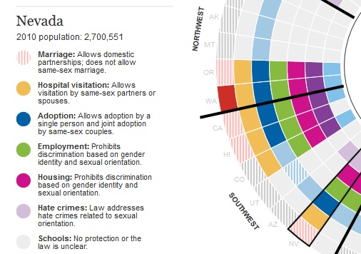
The different shades indicate differences in the scope of coverage (say, full marriage rights vs. domestic partnership — and it has been updated to reflect yesterday’s passage of the bill outlawing same-sex marriage in North Carolina — or whether a law bans discrimination based on sexual orientation but not gender identity); the Guardian website explains each issue. Their post also allows you to hover over a state and get a more detailed summary. Here’s the info for Nevada, for instance:
The graphic also lets you scale states by population if you want to get a better sense of the proportion of the U.S. population living in areas that do or do not provide these protections.