housing/residential segregation

Cross-posted at The Wild Magazine.

Poverty in the United States is stereotypically associated with racial minorities in urban centers. However, a closer look at social geography reveals a more complex situation: a majority of poor people are white and live in the suburbs. This makes sense when you consider that whites are the largest racial group in the U.S., making up 75% of the population, and that there are three times as many suburbanites than urbanites.

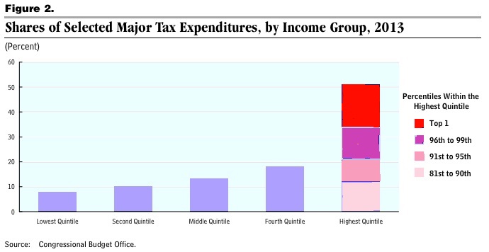
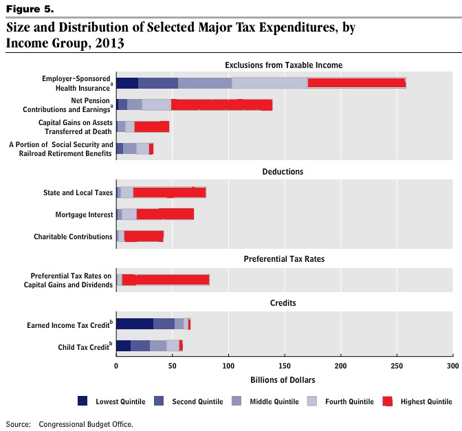
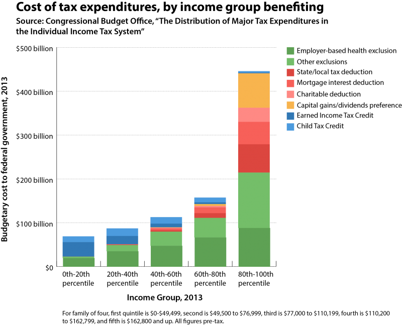
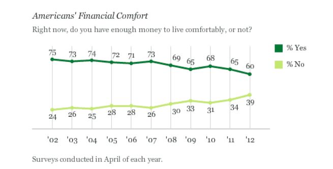
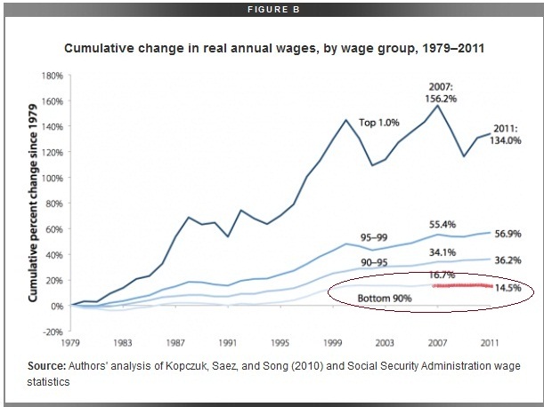
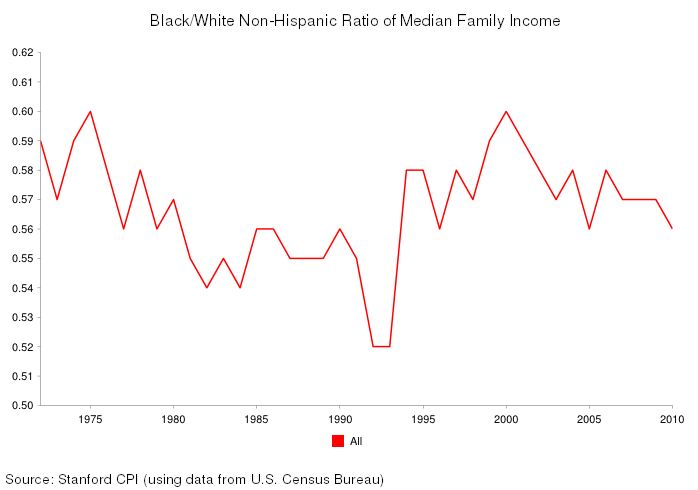
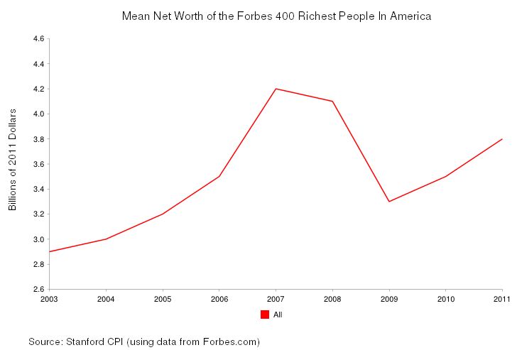
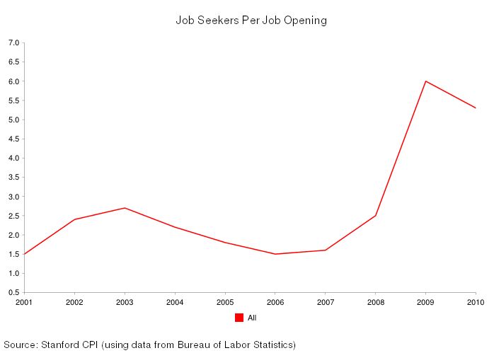
A majority of Americans are losing wealth, and we know it’s going straight to the top. This is not a conspiracy theory, but the economic arrangement of the last 40 years. The New Deal, which created the middle class and the American Dream, was systematically dismantled by elite interest. The revolving door, the shuffling of elites in top positions of power between the public and private sectors, made this possible. The New Deal was abandoned for neoliberal policy. As a result, the comfortable middle class lifestyle was replaced by unemployment and working class struggle.

Suburban poverty normally reflects the spread of metropolitan poverty, but in recent years, suburban poverty has been growing at a faster rate. From 2010-2011, poverty in America’s 100 largest metro areas increased by 5.9% overall. Suburban poverty grew at a rate of 6.8%, while urban poverty grew only 4.7%. In general, the poverty rates in urban areas are still higher (21%) than those in the suburbs (11%). Most notable is the rate of change in the suburbs, which can be attributed to increasing inequality, the housing market crash, gentrification, efforts to make low-income people more mobile, and public housing vouchers.

Screenshot_1

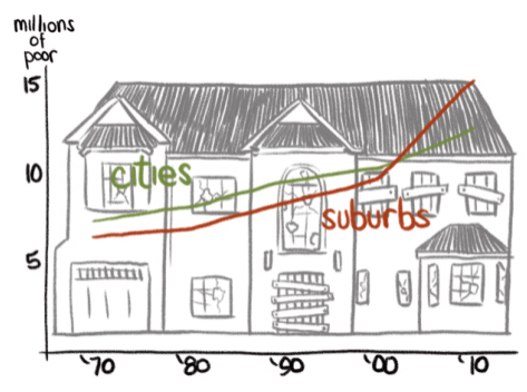
For the past decade, suburbanites commuted between suburbs rather than into cities for work. More affluent, nearby suburbs provide low-wage service jobs in food and retail. Poverty rates in suburbia are rising due to a crumbling middle class, but the poor are still mainly concentrated in inner-ring suburbs close to cities, and on the fringe — former rural areas consumed by suburban sprawl.

Poverty’s expansion to the suburbs is a symptom of an increasingly unequal society. The geographic isolation of the suburban poor in the inner and outer rings of suburbia troubles the validity of the claim that poverty moved to the suburbs. More accurately, people are getting poorer and more people live in the suburbs—or areas now designated as such. It’s plausible that economic inequality and leapfrog developments have changed the sociogeographic landscape. Low-income earners are displaced to the outskirts of the city (inner-ring of the suburbs) due to gentrification, and the rural poor are now more easily counted among the suburban poor due to suburban sprawl. Whatever the case, suburban poverty presents unique challenges to policy makers because federal antipoverty resources are tailored for densely populated urban areas. The stereotypical images of inner city poverty and suburban affluence are the ultimate fiction.

Kara McGhee is a PhD student in sociology at the University of Missouri specializing in culture, identity, and inequalities. She is a regular contributor for The WILD Magazine

Cross-posted at Montclair Socioblog.

We got another reminder last week that despite complaints about federal government programs that give money to the poor, when it comes to taxes, the government is much more generous to the wealthy.  The news came from a report from the Congressional Budget Office on tax expenditures.

These are the ways that the government uses the tax system to give money to people. Some expenditures are tax credits, which can take the form of cash payments.  Others are tax breaks — taxing people less than the going rate. For example, if I am in the 35% tax bracket, but the government charges me only 15% on the $100,000 I made playing the stock market, the government is giving me $20,000 it could otherwise have had me pay in taxes. That’s an expense. The preferential rate for my luck in the market costs the government $20,000.

The justification for these expenditures is that they are a way the government can encourage people to do something that it wants them to do.  With tax breaks, the government is basically paying people by not charging them full tax fare — encouraging them to buy a house or give to charity or get health insurance at their work.  Similarly with the tax credits that go mostly to the poor. We want people to hold a job and to care for their kids.  The child tax credit gives people more money to care for their children.  The Earned Income Tax Credit pays them for working, even at jobs that pay very little.  By the same logic, the government is paying me to invest my money in companies — or put another way, to play the stock market.

This government largesse, however, benefits some people more than others:

1

About half of all tax expenditures go to the top quintile (top 20% of income earners).  The bottom 80% of earners divide the other half.  And within that richest quintile, the top 1% receive 15% of all tax expenditures (this distribution of tax breaks roughly parallels the distribution of income). Were you really expecting Sherwood Forest?

Here is a breakdown of the costs of these different tax expenditures:

2

The Earned Income Tax Credit, which benefits mostly the poor, costs less than $40B.  The tab for the low tax on investment income (capital gains and dividends) is more than twice that, and nearly all of that goes to the top quintile.  More than two-thirds goes to the richest 1%.

Dylan Matthews at the Washington Post WonkBlog regraphed the numbers to show the total amounts overall plus the amounts in each category for each income group:

3

The point? People complain about government payments to the poor, but tax breaks are also payments, though less obviously so, to the rich.  And those tax breaks cost the government a lot more money.

Jay Livingston is the chair of the Sociology Department at Montclair State University. You can follow him at Montclair SocioBlog or on Twitter.

Cross-posted at Montclair SocioBlog.

The magic of demographic knowledge is a memorable moment in John Sayles’s 1984 movie “Brother From Another Planet.” On the A train, a young man shows an elaborate card trick to the title alien, who looks like an African American but seems to have no understanding of the trick. So the magician offers another.

From 59th St. to 125th St. is one stop on the express.  But as the movie shows, that short ride covers a large demographic change, and it’s not just racial.  The New Yorker has posted interactive graphics showing the median income of the census tracts surrounding subway stations.

1

Take the A train one stop — from the southern border of Central Park to a few blocks above its northern border — and see median income drop by $100,000.

Many other lines travel the extremes of economic inequality.  My line is the 2:

2

In the early morning commute, I see blue collar workers in their hoodies or rough jackets and steel-toe boots next to well-dressed people reading The Wall Street Journal.  They didn’t get on at the same stop.  The people who live in and work in the Wall Street census tract, which includes Park Place, are not on the train.  Here’s what their housing looks like:

BATTERY PARK CITY: as a pioneer. It's all Green, environmentally friendly.

And here is Franklin St., Brooklyn:

4

The subway demographic trick is not limited to New York. Here’s a time-lapse video of the Red Line of Chicago’s CTA.

Despite the social class segregation in housing, in cities like New York and Chicago, people of vastly different economic circumstances are likely to share the same subway car, at least for a few stops.  Yet I don’t get a sense of strong resentment or even envy among the have-nots (though I wish I had systematic data on this).  This is similar to the findings of Rachel Sherman, who studied how workers at high-end hotels thought of their guests.

New York and Chicago, however, are also where the rich are more likely to be liberal and in favor of redistributionist policies.  As Andrew Gelman has shown, the wealthy in rich states are far more liberal than the wealthy in poor states.  That may be partly because in rich states, the wealthy live in the large cities.  It would be interesting to see if we saw the same effect if we looked at Upstate New York, Downstate Illinois, or Massachusetts outside Rte. 128.

HT: Jenn Lena for the link.

Jay Livingston is the chair of the Sociology Department at Montclair State University. You can follow him at Montclair SocioBlog or on Twitter.

Cross-posted at Montclair SocioBlog.

The Wall Street Journal had an op-ed this week by Donald Boudreaux and Mark Perry claiming that things are great for the middle class.  Here’s why:

No single measure of well-being is more informative or important than life expectancy. Happily, an American born today can expect to live approximately 79 years — a full five years longer than in 1980 and more than a decade longer than in 1950.

Yes, but.  If life-expectancy is the all-important measure of well-being, then we Americans are less well off than are people in many other countries, including Cuba.

The authors also claim that we’re better off because things are cheaper:

…spending by households on many of modern life’s “basics” — food at home, automobiles, clothing and footwear, household furnishings and equipment, and housing and utilities — fell from 53% of disposable income in 1950 to 44% in 1970 to 32% today.

Globalization probably has much to do with these lower costs.  But when I reread the list of “basics,” I noticed that a couple of items were missing, items less likely to be imported or outsourced, like housing and health care.  So, we’re spending less on food and clothes, but more on health care and houses. Take housing.  The median home values for childless couples increased by 26% between just 1984 and 2001 (inflation-adjusted); for married couples with children, who are competing to get into good school districts, median home value ballooned by 78% (source).

The authors also make the argument that technology reduces the consuming gap between the rich and the middle class.  There’s not much difference between the iPhone that I can buy and the one that Mitt Romney has.  True, but it says only that products filter down through the economic strata just as they always have.  The first ball-point pens cost as much as dinner for two in a fine restaurant.  But if we look forward, not back, we know that tomorrow the wealthy will be playing with some new toy most of us cannot afford. Then, in a few years, prices will come down, everyone will have one, and by that time the wealthy will have moved on to something else for us to envy.

The readers and editors of the Wall Street Journal may find comfort in hearing Boudreaux and Perry’s good news about the middle class.  Middle-class people themselves, however, may be a bit skeptical on being told that they’ve never had it so good (source).

Some of the people in the Gallup sample are not middle class, and they may contribute disproportionately to the pessimistic side.  But Boudreaux and Perry do not specify who they include as middle class.  But it’s the trend in the lines that is important.  Despite the iPhones, airline tickets, laptops and other consumer goods the authors mention, fewer people feel that they have enough money to live comfortably.

Boudreaux and Perry insist that the middle-class stagnation is a myth, though they also say that

The average hourly wage in real dollars has remained largely unchanged from at least 1964—when the Bureau of Labor Statistics (BLS) started reporting it.

Apparently“largely unchanged” is completely different from “stagnation.”  But, as even the mainstream media have reported, some incomes have changed quite a bit (source).

The top 10% and especially the top 1% have done well in this century.  The 90%, not so much. You don’t have to be too much of a Marxist to think that maybe the Wall Street Journal crowd has some ulterior motive in telling the middle class that all is well and getting better all the time.

—————————

Jay Livingston is the chair of the Sociology Department at Montclair State University.  You can follow him at Montclair SocioBlog or on Twitter.

Cross-posted at Reports from the Economic Front.

One of the subthemes of current discussions about how best to reduce our national debt is that we must rein in out-of-control spending on federal safety net programs.   The reality is quite different.

The chart below shows spending trends in terms of GDP for the ten major needs-tested benefit programs that make-up our federal social safety net. The programs, in the order listed on the chart, are:

  • The refundable portion of the health insurance tax credit enacted in the 2010 health care reform law
  • Medicaid and the Children’s Health Insurance Program (CHIP)
  • The Supplemental Nutrition Assistance Program (SNAP)
  • Financial assistance for post-secondary students (Pell Grants)
  • Compensatory Education Grants to school districts
  • Assisted Housing
  • The Earned Income Tax Credit (EITC)
  • The Additional Child Tax Credit (ACTC)
  • Supplemental Security Income (SSI)
  • Family Support Payments

lowincprogs

As Jared Bernstein explains:

…for all the popular wisdom that programs to help low-income people are swallowing the economy, the truth is that like so much else that plagues our fiscal future, it’s all about health care spending.  The figure shows that as a share of GDP, prior to the Great Recession, non-health care spending was cruising along at around 1.5% for decades.  It was Medicaid/CHIP (Medicaid expansion for kids) that did most of the growing.

The takeaway from this: we need a new health care system (think single payer).

Regardless, the recent explosion in the ratio of Medicare/CHIP spending to GDP is largely due to the severity of the Great Recession, not the generosity of the programs. The recession increased poverty and thus eligibility for the programs, thereby pushing up the numerator, while simultaneously lowering GDP, the denominator.   Moreover, spending on all non-health care safety net programs is on course to dramatically decline as a share of GDP. Even Medicare/Chip spending is projected to stabilize as a share of GDP.

These programs are essential given the poor performance of the economy, and in most cases poorly-funded. Cutting their budgets will not only deny people access to health care, housing, education, and food, it will also further weaken the economy, in both the short and long run.

—————————

Martin Hart-Landsberg is a professor of Economics and Director of the Political Economy Program at Lewis and Clark College.  You can follow him at Reports from the Economic Front.

For the last week of December, we’re re-posting some of our favorite posts from 2012. Originally cross-posted at Inequality by Interior Design.

There is not actually a great deal of literature on “man caves,” “man dens,” and the like–save for some anthropological and archeological work using the term a bit differently.  There is, however, a substantial body of literature dealing with bachelor pads.  The “bachelor pad” is a term that emerged in the 1960s.  It was a style of masculinizing domestic spaces heavily influenced by “gentlemen’s” magazines like Esquire and Playboy.  Originally referred to as “bachelor apartments,” “bachelor pad” was coined in an article in the Chicago Tribune, and by 1964 it appeared in the New York Times and Playboy as well.

It’s somewhat ironic that the “bachelor pad” came into the American cultural consciousness at a time when the median age at first marriage was at a historic low (20.3 for women and 22.8 for men).  So, the term came into usage at a time when heterosexual marriage was in vogue.  Why then?  Another ironic twist is that while the term has only become more popular since it was introduced, “bachelorette pad” never took off–despite the interesting finding that women live alone in larger numbers than do men.  I think these two paradoxes substantiate a fundamental truth about the bachelor pad–it has always been more myth than reality (see herehereherehere, and here).

The gendering of domestic space had been a persistent dilemma since the spheres were separated in the first place.  Few men were ever able to afford the lavish, futuristic and hedonistic “pads” advertised in Esquireand Playboy.  But they did want to look at them in magazines.

A small body of literature on bachelor pads finds that they played a significant role in producing a new masculinity over the course of the 21st century.  As Bill Ogersby puts it, “A place where men could luxuriate in a milieu of hedonistic pleasure, the bachelor pad was the spatial manifestation of a consuming masculine subject that became increasingly pervasive amid the consumer boom of the 1950s and 1960s” (here).  The really interesting thing is that few men were actually able to luxuriate in these environments.  Yet Playboy — along with a host of copycat magazines — spent a great deal of money, time, and effort perpetuating a lifestyle in which few men engaged.  Indeed, outside of James Bond movies and the Playboy Mansion, I wonder how many actual bachelor pads exist or ever existed.

In the 1950s — despite a transition into consumer culture — consumption was regarded as a feminine practice and pursuit.  Bachelor pads — and the magazines that sold the images of these domestic spaces to men around the country — helped men bridge this gap.  More than a few have noted the importance of Playboy’s (hetero)sexual content in helping to sell consumption to American men.  Barbara Ehrenreich said it this way: “The breasts and bottoms were necessary not just to sell the magazine, but to protect it” (here).  Additionally, the masculinization of domestic space took many forms in early depictions of bachelor pads with ostentatious gadgetry of all types, beds with enough compartments and features to be comparable to Swiss Army knives, and each room designed in anticipation of heterosexual conquest at a moment’s notice.

Paradoxically, bachelor pads seem to have been produced to sell men thehistorically “feminized” activity of consumption.

I’m guessing that many of the “man caves” I’ll see in my research wouldn’t necessarily fit the image most of us conjure in our minds.  But the ways men with caves talk about them are replete with images not yet fully realized by men who are most often economically incapable of architecturally articulating domestic spaces without which they may never feel “at home.”

———————

Tristan Bridges is a sociologist of gender and sexuality.  He starts as an Assistant Professor of Sociology at the College at Brockport (SUNY) in the fall of 2012.  He is currently studying heterosexual couples with “man caves” in their homes.  Tristan blogs about some of this research and more at Inequality by (Interior) Design.  You can follow him on twitter @tristanbphd.

Lisa Wade, PhD is an Associate Professor at Tulane University. She is the author of American Hookup, a book about college sexual culture; a textbook about gender; and a forthcoming introductory text: Terrible Magnificent Sociology. You can follow her on Twitter and Instagram.

Cross-posted at The Huffington Post.In most densely-packed urban cities, one will be able to observe a disturbing phenomenon: wealthy people marching past the homeless, day in and day out.  Often, the residents of the street and the residents of the apartments recognize each other and even know each other’s routines.  And, yet, familiarity doesn’t breed concern.

Psychologists Lasana Harris and Susan Fiske were able to detect a neurological process behind the ability to get used to seeing others suffer. Using functional MRIs, they exposed individuals to images of the homeless.  These images tended to activate parts of the brain associated with disgust.  This, they argue, supports the idea that “extreme out-groups may be perceived as less than human…”  It is easy to overlook the suffering of the homeless, then, because we dehumanize them.

In an effort to disrupt this cognitive process, documentary film maker Goro Toshima has released a new film, Broken Doors.  The 36-minute documentary follows a young homeless couple in Los Angeles, Starr and Rico.  Not only does it put faces and names to an otherwise reviled and ignored population, the documentary shows viewers just how difficult it can be to survive on the streets and to get off.

Lisa Wade, PhD is an Associate Professor at Tulane University. She is the author of American Hookup, a book about college sexual culture; a textbook about gender; and a forthcoming introductory text: Terrible Magnificent Sociology. You can follow her on Twitter and Instagram.

The Russell Sage Foundation and the Stanford Center on Poverty and Inequality have put together Recession Trends, an interactive website that lets you create graphs about issues related to the recession. It takes a couple of steps to get to the database (you have to agree to the terms before entering), but once you’re there, you can choose data about a variety of topics — crime, housing, immigration, income, political attitudes, family life, and a lot more. It’s a great way to quickly get an overview of many aspects of life in the U.S.

I looked at the ratio of median family income between African American and White families. Between the early 1970s and 2010, we’ve seen a consistent gap in earnings, with Black median household income hovering between about 52 and 60% that of Whites:

The graph of the mean net worth of the individuals on Forbes’s list of the 400 richest people in the U.S. shows that while they certainly saw their wealth take a tumble during the recession — it fell to a mere $3.3 billion or so — they’re recovering well:

Unsurprisingly, the number of job seekers per job opening went up sharply after 2007; it’s finally starting to drop off slightly, though we still have about 5 people looking for every 1 job that’s available:

You can add more than one dataset for many topics. Here’s the growth in the prison population since 1980, by gender:

There’s lots, lots more. Whatever topic you’re particularly interested in, there’s a good chance there’s something there that’ll grab your attention for a bit.

Gwen Sharp is an associate professor of sociology at Nevada State College. You can follow her on Twitter at @gwensharpnv.