housing/residential segregation

Daniel T. Lichter and Domenico Parisi provide a couple of interesting images using 2000 Census data in a recent article about rural poverty. They use Census block-group data (block-groups are significantly smaller than counties) to identify non-metro areas of concentrated poverty. This map shows all block-groups with more than 20% poverty in 2000:

picture-17

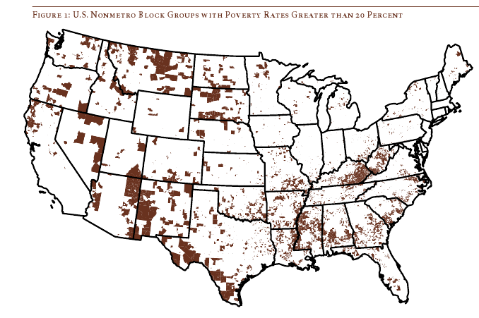
If you overlaid this map onto a map of American Indian reservations, you’d notice that many of these high-poverty block-groups are on reservations–particularly in the Dakotas, Idaho, Montana, Arizona, and New Mexico.

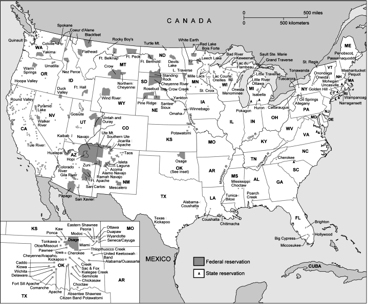
UPDATE: Here’s a map of state and federal reservations put out by Pearson (you can find very detailed maps of individual reservations at the Census Bureau):

indian91

And TOTALLY AWESOME reader Matt Wirth overlaid the poverty map on the reservations map. The two maps weren’t exactly the same so some of the state outlines don’t line up perfectly, but you can get a good sense of how high-poverty block-groups (blue areas) and reservations (red areas) overlap:

poverty-over-20-and-indian-reservations

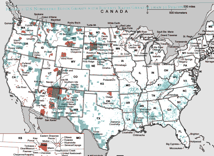
Clearly there are many poor block-groups in the west that aren’t associated with reservations, but we see an awful lot of overlap of blue on red, as well as in the regions directly surrounding reservations. Thanks so much, Matt!

We also see a band of high-poverty block-groups in border counties in Texas with high numbers of Latino residents, and of course the band along the Mississippi River and through the Black Belt up to North Carolina, and the ever-present Appalachian section.

Another note about the map: As Lichter and Parisi point out, if they had mapped poverty at the county level instead of the block-group level, many of these areas of high poverty would not have shown up. These are areas of concentrated poverty in counties that are not, overall, particularly poor. The authors note that studies of poverty that look at county-level data often miss isolated rural areas with extremely high poverty rates.

On a side note, see that little blotch of brown in north-central Oklahoma? That’s where I grew up! According to the 2000 Census, my specific hometown has a 17.6% individual poverty rate and the median home value is $24,400. That doesn’t matter to you, I know, but it does make me acutely aware of the problems of rural poverty.

The following bar graph shows how geographically concentrated poverty is among three racial groups. The graph shows what percent live in Census blocks of concentrated poverty–that is, areas where 20% or more of the population is poor (20% is the standard baseline among researchers for defining an area as “high poverty”):

picture-26

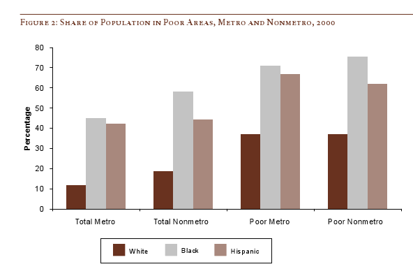
Clearly, in both metro and non-metro areas, a much higher percentage of all Blacks and Hispanics (both the poor and non-poor) than Whites live in areas of concentrated poverty. Notice (in the last two sets of bars) that less than 40% of poor Whites live in neighborhoods with such high proportions of poverty, whereas the vast majority of both Blacks and Hispanics who are poor live in areas where many of their neighbors are poor as well.

Lichter and Parisi argue that the concentration of poverty matters, particularly when it indicates that the poor are socially isolated. Such isolation can mean lack of access to social services, decent schools, and the types of social networks that provide job leads, recommendations, and so on. This type of social isolation can be much more harmful than being poor in and of itself, a topic also investigated by William Julius Wilson in When Work Disappears: The World of the New Urban Poor and The Truly Disadvantaged.

From “Concentrated Rural Poverty and the Geography of Exclusion,” Rural Realities, Fall 2008, p. 1-7, available from the Rural Sociological Society.

Chelsea C. brought our attention to this billboard for McDonald’s coffee or McCafe:

90210 is the zip code for Beverly Hills, a notoriously rich neighborhood in California. And, Chelsea explains, 48503 is a zip code in Flint, Michigan.

The ad is interesting to me because of the double meaning of taste (hello Bourdieu!). Taste refers to how things taste on your tongue (literally the taste of the coffee), but it also refers to who has good versus bad taste (people with good taste are “high class” and they like things like classical music and caviar). The idea that this ad is capitalizing (pun intended!) on both meanings of the word taste is supported by the use of the term “cafe” in “McCafe” and the portrayal of a fancy coffee drink (“Mochas”).

So the ad is saying that, even if you live in Flint and don’t have the economic resources of someone who lives in Beverly Hills, you can have the taste of expensive coffee because, of course, expensive coffee is to your taste.

There is something interesting here that ties into our consumer culture and wide range of advertising, television programming, and Paris Hilton-watching that encourages us to aspire to be just like the rich. This means buying expensive things that you can’t really afford and/or valuing things that mark you as a high class person with good taste (such as Mochas from McCafe, if that’s the best you can do). There is no questioning as to whether it’s a good idea for everyone to aspire to such heights, whether there is something problematic in the disparity between 90210 and 48503, or even whether it’s true that the rich have better “taste.” So, ultimately, the hierarchy goes unchallenged while we all just jocky for position.

This reminds me of the moment in the Sex and the City movie when Carrie realizes that her assistant, Louise, rents super-expensive purses even though she is too poor to buy them.  Carrie is impressed by Louise’s “taste” and her dedication to having “the best” things even if they are completely inessential and renting them only exacerbates the fact that she doesn’t have oodles of cash.

So, yeah, I think this billboard plays into that.

Between 1864 and 1923, there were 14 forced county-wide expulsions of African Americans (alongside many town expulsions).  The figure below shows the percentage of African Americans living in Vermillion County, Indiana in the years before and after an expulsion.

Click here for an interactive website with information about these expulsions made by the Austin American Statesman newspaper.  See also our post about “Sundown Towns,” which kept Blacks out by making it illegal for them to be there after sundown.

Via Jose at Thick Culture.

Here are some graphs on the income and wealth gap between Whites and Blacks in the U.S.

This next one shows homeownership rates. I know some people are going to point out that Blacks are more concentrated in urban areas than Whites are, and so it might make more sense to break down homeownership by area (rural, urban, suburban). While that might be a legitimately useful comparison, it also brings up the question of why African Americans would be more concentrated in urban areas, which could lead to a discussion of government programs that encourage Whites to buy homes in the suburbs after WWII while denying those opportunities to Blacks.

One way of explaining higher unemployment rates among Blacks is that there is some individual or cultural deficiency–African Americans are lazy, or want a hand-out, or don’t look for work, etc. etc. I like to show trend comparisons like these because they undermine those types of explanations. If African American unemployment was due to laziness, a “culture of poverty,” or other deficiencies, it would be unlikely for Black and White unemployment rates to show the same pattern (or, for that matter, any pattern–unless you believe African Americans just got a lot lazier in, say, 1982). What we see here is that Black and White unemployment rates follow a very similar pattern, but that during hard economic times, sugh as the early 1980s and around 1992, African Americans suffer disproportionately.

This one shows the slow but steady trend toward resegregation of our schools:

All of these were found at the Working Group on Extreme Inequality website.

The following graphs all show how much of American’s wealth is (or, um, was) in the form of home equity. They are all based on 2002 data, several years before housing prices hit their peaks, which means by the time the housing bubble burst, home equity was an even larger proportion of all net worth.

It’s not that I didn’t already know the economy was in trouble. That’s obvious–I live in Vegas, all I have to do is drive around a little and see all the houses sitting empty. But looking at these images I kept thinking, “a good portion of that home equity wealth is just gone.” On paper, we had all this wealth, and people borrowed based on it…and a lot of it is simply gone. Just…poof. Gone!

This one shows what percent of all net worth in the U.S. falls into various categories.

Here we have median net worth in 2002 for different age groups…and then the lighter purple bar, which is median net worth if you took out home equity:

A similar breakdown, except by race, not age this time. Notice how much Blacks and Hispanics lag behind Asians, and how much they lag behind non-Hispanic Whites in terms of net worth:

On the up side, if the stock market keeps going down, then home equity as a percent of our net worth will go up again because we’ll have lost so much in stocks. So, you know, look on the bright side!

All of these graphs came from “Net Worth and the Assets of Households: 2002,” written by Alfred O. Gottschalck and published by the U.S. Census Bureau in April 2008.

The presence of lead paint on toys made in China this year brought the threat of lead poisoning to the forefront of the American mind. Parents, pundits, and politicians called on the U.S. government to DO SOMETHING. But lead poisoning was a problem for low-income families long before the China toy scandal and there was little to no outcry in the popular press.

Lead poisoning in children can increase the risk of cognitive delay, hyperactivity, and antisocial behavior. Many older homes and apartments available for rental in low-income neighborhoods still have lead paint and ingesting paint dust and paint chips is the most common way to get lead poisoning. Blood tests show that children living in poverty show much higher exposure to lead than other children.

According to William Ryan, if you are a landlord, renting out a residence with lead paint without making tenants aware of it is a crime. But, instead of enforcing compliance among landlords, the most common response to the threat of lead poisoning has been to warn mothers. Here is a representative poster:

Ryan writes that, while lead poisoning is often described as a problem involving negligent or ignorant mothers, it:

…is more accurately analyzed as the result of a systematic program of lawbreaking by one interest group in the community [landlords], with the toleration and encouragement of the public authority charged with enforcing that law.

So as long as the threat of lead poisoning was more-or-less restricted to the poor in the U.S., it was considered the problem of individuals (mothers) and the state refrained from doing much more than promoting individual responsibility. But, as soon as the lead poisoning threat affected middle class children through the toys from China, state intervention seemed appropriate.

Ryan again:

To ignore these continued and repeated law violations [by landlords who rent residences with lead paint], to ignore the fact that the supposed law enforcer actually cooperates in lawbreaking [by ignoring landlord infractions], and then to load a burden of guilt on the mother of a dead or dangerously ill child is an egregious distortion of reality. And to do so under the guise of public-spirited and humanitarian service to the community is intolerable.

CITATION: Ryan, William. 1998. Blaming the Victim. In Race, Class, and Gender in the United States. See also his book.

In his book Sundown Towns: A Hidden Dimension of American Racism (2005; New York: Touchstone), James Loewen discusses cities that had a “no Blacks after dark” policy. They were called “sundown towns” because African Americans were actively informed that they should be out of town by sundown; if not, they were subject to arrest or violence. Of course, the purpose of these regulations was to keep Blacks from settling permanently in these towns. If they couldn’t be in town limits after dark, they clearly couldn’t live there. Here is an example of a sundown town: this ad encouraging people to move to Siloam Springs, Arkansas, says, over in the lower right corner, “No Malaria, No Mosquitoes, No Negroes.”

Found here.

NOTE: As Mr. Loewen pointed out in a comment, I had originally said he discussed “cities in the South,” as though that was all his book concentrated on. That was poor wording on my part, as I had been reading the sections of the book that covered some areas in the South I was specifically interested in (particularly Oklahoma). I did not mean to imply that sundown towns existed only in the South or that Mr. Loewen only discusses the South.


This clip, from the newly televised This American Life, shows what happens when (mostly) black women and (mostly) white men living in racially-segregated Chicago are brought together and the social rules of decorum are suspended. It is highly, highly disturbing. I’d love it if some social psychologists could comment on what we see happening here!

[youtube]http://www.youtube.com/watch?v=vo1LPf9mnyU[/youtube]