health/medicine

Cross-posted at Montclair SocioBlog.

Sometimes public relations efforts are in such extraordinarily poor taste that it’s difficult to tell whether they’re real or a spoof.

In the 1950s, as the evidence on smoking was becoming undeniable, someone suggested that the cigarette companies were about to launch a new ad campaign: “Cancer is good for you.”

It was a joke, of course. But how about “A really bad recession is good for your marriage”? No joke. The National Marriage Project has released a report with a section claiming that the current economic crises has produced “two silver linings” for marriages. (Philip Cohen at Family Inequality eviscerates this report with the level of snark that it deserves.)  A bad recession is good for crime too, or so says the title of James Q. Wilson’s article in last Sunday’s Wall Street Journal, “Hard Times, Fewer Crimes.”*

And now welcome Peabody Energy, the world’s largest private coal company, which spends millions each year lobbying against clean-air legislation.  Last month, Peabody was the object of Coal Cares, a clever spoof Website.

(click to enlarge; source: Wired)

It was Peabody’s press release in response that makes them the clear winner of the Cancer-Is-Good-For-You competition.

The United Nations has linked life expectancy, educational attainment and income with per-capita electricity use, and the World Resources Institute found that for every tenfold increase in per-capita energy use, individuals live 10 years longer.

The spurious logic — the implied fallacy of composition and the attempt to fob off correlation as cause — is so obvious that it could easily be part of the Coal Cares spoof.  But no, it was for real, at least while it lasted.  Unfortunately, Peabody removed the document before we could award them the CIGFY trophy .

What the UN data actually show is not surprising: Richer countries produce more electricity. They also have better health, education, and income. The message Peabody wants us to get takes the global and misapplies it locally, and it reverses cause and effect: If you want to be long-lived, educated, and rich, live near a coal-driven power plant.  Cancer, asthma, and heart disease are all good for you.

——————————

*I don’t know if Wilson also wrote that title. Unlike the post-hoc logic suggested by the title, Wilson does not argue that the recession caused the decrease. But he does imply that the recession did not exert any upward force on crime.

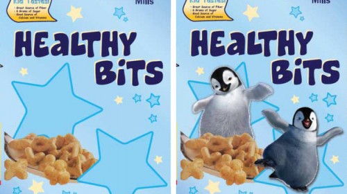
Bryan L. sent us a link to an NPR story about the effects of using cartoon characters to market food to kids. The study, conducted by researchers at Yale University’s Rudd Center for Food Policy and Obesity, had 80 children between the ages of 4 and 6 eat what they were told was a “new” cereal. The cereal was either called Sugar Bits or Healthy Bits, and in each case, half of the boxes included cartoon penguins and half didn’t. Here’s are the two options for Healthy Bits:

Kids were  then asked to rate the taste of the cereal, using a 5-point smiley face scale. Interestingly, kids rated the taste of Healthy Bits more highly than that of Sugar Bits (overall mean rating of 4.65 vs. 4.22). Less surprisingly, the presence of a cartoon character on the box led kids to think the cereal taste better (overall mean rating of 4.70 with a character, vs. 4.16 without).

You can read an overview of the article, “Influence of Licensed Spokescharacters and Health Cues on Children’s Ratings of Cereal Taste, which was published in the Archives of Pediatrics & Adolescent Medicine.

So it appears that kids are getting some of the message about nutrition and healthy eating, and that describing something as having lots of sugar leads them to evaluate it more negatively than they might have otherwise. (I couldn’t help but wonder if there might be a contrast effect, also. Maybe kids expect something  called Healthy Bits to be really gross and, if it doesn’t, evaluate it more positively than they would have, while they expect Sugar Bits to be super awesome and rate it particularly harshly if it doesn’t live up to their hopes. I know that type of comparative priming effect occurs with adults, where our initial expectations influence our later subjective assessment, but I have no idea to what degree that occurs with kids. Anybody know enough about childhood development to comment?)

However, cartoon characters have a strong influence on how kids evaluate the taste of cereal, enough to override their nutritional concerns. Put a cute penguin on Sugar Bits, and it suddenly tastes as good as a box of Healthy Bits without the penguin. Another study from researchers at the Rudd Center found that kids preferred to eat graham crackers, gummy snacks, and even carrots more if they were in a package with a popular cartoon character.

So the good news here is that kids may be willing to make better eating choices than we often give them credit for, and describing something as “healthy” isn’t the kiss of death we might expect. But the use of cartoon characters, such as tie-ins from TV shows and movies, is a powerful form of marketing. If such characters — especially, I assume, highly recognizable and popular ones — appear more often on less healthy options, they undermine efforts to guide children to develop healthy eating habits.

UPDATE: Reader qwirkle was able to get a copy of the entire article, which does make clear that the kids rating Sugar Bits lower than Healthy Bits wasn’t just an “expectations effect”:

Another explanation for the difference in children’s assessments of the cereal involves their expectations of the cereal taste based on the name. Specifically, the cereal used for this study had only a moderately sweet taste. Consequently, children may have been disappointed by the lack of sugary flavor in the cereal named Sugar Bits and pleasantly surprised by the sugary flavor in the cereal named Healthy Bits. At 6 g of sugar per serving, however, the sugar content was comparable to that of other commonly available sweet cereals (eg, 6 g in Honey Kix and 9 g in Honey Nut Cheerios). Nevertheless, whether the children were reacting to their expectations of the cereal’s taste or expressing their skepticism of the merits of sugary products, when the character was present on the box, children reported a more favorable subjective experience with the product.”

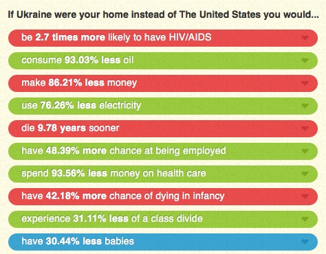
Dmitriy T.M. sent in a link to the website If It Were My Home. The site allows you to select two nations and then explains how your life would compare if you lived in each one in terms of rates of HIV/AIDS, employment, energy consumption, infant mortality, class inequality, and other factors (based on CIA data). As an example, Dmitriy chose to compare the U.S. and Ukraine, “the 2 greatest countries in the world, as determined by the poll conducted in my head”:

You can then choose one of the items for more details; I selected life expectancy:

The site is set up with the U.S. as one of the default comparisons, but at the top there’s a button that lets you select a non-U.S. comparison. (Note: Reader Parodie says it appears to detect whatever country you’re accessing the site from and set that as one of the default comparisons.) It’s a fun site that you can spend quite a bit of time playing around with.

UPDATE: Just a caution–a couple of readers seem to have found situations where the math doesn’t add up in the comparisons of some countries. And other readers noted that this does an enormous amount of averaging, which definitely hides the differences in quality of life in various countries, which are so extreme in some nations that “averages” might be nearly meaningless.

A number of celebrities, including Meghan McCain — daughter of Senator John McCain of Arizona — recently posed naked (visible from the shoulders up) in a skin cancer prevention awareness ad. Meghan’s father had to have melanoma removed from his face, prompting her interest in the issue. Here’s the ad:

Christie W. sent in a segment (via The Pragmatic Progressive Forum) from Glenn Beck’s radio show in which he reacts to the video, and particularly to the image of Meghan McCain in it…by pretending to throw up violently. In this 8-minute clip from his show (audio only), Beck repeatedly pretends to puke, and someone says, at about 5:28, “Has she thought about, like, a burqa, so she’s extra safe?” and “I’m not sure that covers enough, because you can get skin cancer of the eyeballs” (I can’t distinguish all the voices, so I’m not sure who is speaking). They say she looks like “John McCain with long blonde hair” and, at 6:35, mockingly refer to her as “luscious” repeatedly:

Criticizing Glenn Beck for being mean-spirited is really a pointless task — I might as well go yell at the tree in my yard for shedding leaves — so I’m not going to expend much energy on it. But it’s a good example of policing of women’s bodies and fat-shaming (when McCain is described as “luscious,” it clearly isn’t a compliment). Who cares about the message? Never mind about skin cancer! Those women are so gross they make me sick!

Sigh.

The phrase “environmental racism” was coined to draw attention to the ways in which exposure to environmental toxins like air pollution and lead is not even across cities and states, but tends to be higher in low income neighborhoods — especially those that are disproportionately Black and Latino — ones that are also more likely than others to be home to garbage dumps, sewage treatment plants, and power plants.  As a result, poor children and children of color are more likely to suffer the consequences of environmental pollution, like asthma and lead poisoning.

Prevention efforts, however, tend to focus on parents’ responsibility for protecting their children from these threats instead of the state or city’s failure to keep all neighborhoods equally safe. For example, even though it’s illegal for landlords to rent out a house or apartment with lead paint, poisoning prevention efforts tend to focus on educating parents.  I thought of this tendency to blame the victim when I noticed a set of billboards going up in my neighborhood in Los Angeles, Highland Park.  Meant to encourage parents not to smoke, they read (in English and in Spanish): “I gave you love, you gave me asthma.”

(source)

Highland Park is a low-income neighborhood.  And given what we know about the inclination for cities to tolerate environmentally harmful conditions in low income neighborhoods, this seems to me a particularly nasty message to send.  It erases the role of the city in protecting children and places 100% of the blame on parents (“you gave me asthma”), and then it twists the knife (“I gave you love”). Even if they are smokers, poor parents can only do so much to protect their children from things that the city is all-to-comfortable letting slide.

Lisa Wade, PhD is an Associate Professor at Tulane University. She is the author of American Hookup, a book about college sexual culture; a textbook about gender; and a forthcoming introductory text: Terrible Magnificent Sociology. You can follow her on Twitter and Instagram.

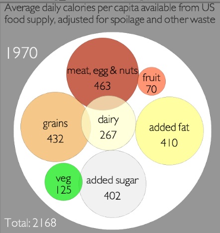
Jeff H. sent in a link to a graphic at Civil Eats that lets you see the rise in U.S. daily caloric availability between 1970 and 2008, and where the additional calories are coming from. They are based on USDA data on food available for human consumption, minus what is wasted through being thrown out, spoiling before making it to the store, etc., to approximate average daily calorie consumption. It’s a rough measure, and clearly actual consumption will vary widely, but the overall changes provide some insights into the changing U.S. diet.

Note: I sometimes used the word “consumption,” “consumed,” etc., in the post since availability is an approximation of it, but as a reader pointed out, I should have been more careful, so I’ve fixed it throughout the post.

In 1970, we consumed had available an average of 2,168 calories per day, and the single largest source was meat/eggs/nuts:

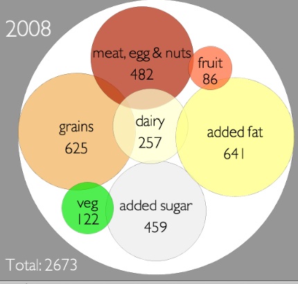
By 2008, we had 2,673 calories available on average. The big jumps were in added fat — there are 231 more calories a day available per person, and it’s now the single largest source of calories — and grains. I was surprised to see how small the increase in added sugars was…and calories available from vegetables and dairy actually went down:

Overall, that’s an increase in available calories of 23.3% during this 38-year time frame.

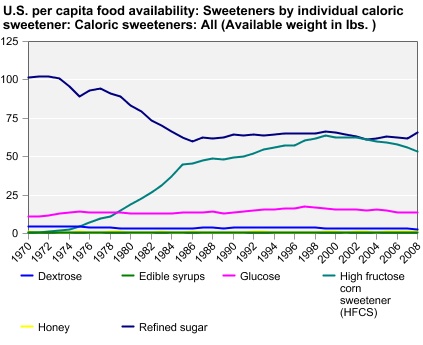
You can go to the Economic Research Service website and create charts or tables of caloric availability for specific food groups. For instance, the chart on changes in sweeteners shows the jump in use of high-fructose corn syrup, and an accompanying decrease in dextrose:

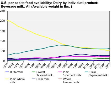
There’s a lot less whole milk than there used to be:

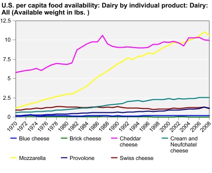
But we’ve grown to love mozzarella and make a lot more of it:

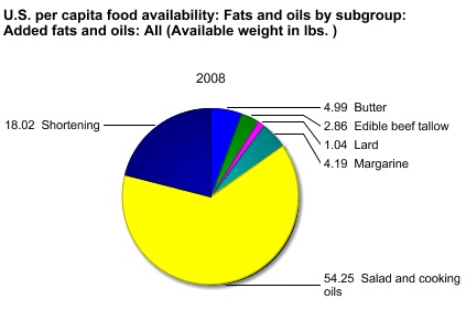
Or instead of looking at trends over time, you can get the breakdown for one particular year. Here are the sources of our added fats for 2008:

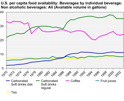
Non-alcoholic drinks (excluding milk):

I warn you, this is one of those things where it seems like you’ll just look for a second, and the next thing you know you’ve spent 45 minutes making customized charts of every possible category of food.

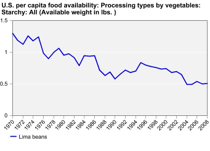
Also, we do not like lima beans:

UPDATE: Reader Chorda provides some context that I think is helpful:

The added fat looks impressive, but because fat has 9 calories per gram that increase ends up only being 25.6 grams of fat over the 1970 amount, or 0.903013 ounce. Yes, less than an ounce of fat can add 231 calories. On the other hand, the additional grains and sugar combined would be 62.51 grams of carbohydrates, or 2.20497 ounces dry weight and 250 new calories from carbohydrate sources.

Just over three ounces of food can make a difference of 481 calories. Eating that extra 3.1 ounces every day for a week is 3,367 calories. One pound of fat is equal to 3,500 calories.

Take two tablespoons of oil. Combine with three tablespoons flour and one tablespoon sugar. That is the largest difference between 1970 and 2008. Could you even get a single pancake out of that?

Cross-posted at Jezebel.

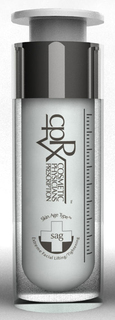
There was a time when the idea of sticking needles into one’s face was something that was to be avoided at all costs.  Then there was botox.  And it didn’t take long before certain segments of society were flocking to the needlers, begging to be stuck.  Face needling has become so commonplace — so desirable, even — that non-needly products have been disguising themselves as needles, so as to attract consumer dollars.

Of what am I speaking?  A product sent in by Ella Dilkes-Frayne.  Ella saw posters in a mall in Melbourne, Australia for non-injectable beauty products sold in containers that mimicked syringes.   The product, hoping to capitalize on the new acceptance of and desire for botox, is a great example of how socially and personally acceptable bodily intervention is always changing.

Lisa Wade, PhD is an Associate Professor at Tulane University. She is the author of American Hookup, a book about college sexual culture; a textbook about gender; and a forthcoming introductory text: Terrible Magnificent Sociology. You can follow her on Twitter and Instagram.

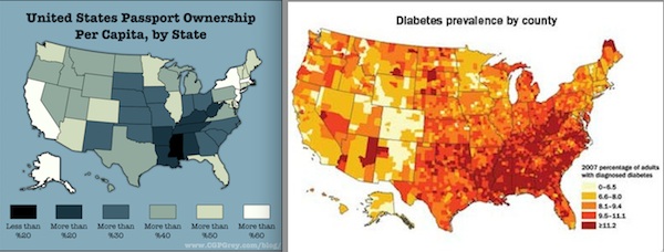
Dolores R. sent along an illustration of the nature of spurious relationships. A spurious relationship is one in which two variables appear to be related, but are in fact both caused by a third, “confounding” variable. Drawing on Andrew Sullivan’s map of passport ownership and data on Type 2 diabetes posted at the US News and World Report, Mark Frauenfelder at BoingBoing suggested, with tongue-in-cheek, that owning a passport prevents Type 2 diabetes.  In fact, both are probably related to a third variable, class: having the money to travel also usually means having access to healthy foods and sufficient health insurance.

Lisa Wade, PhD is an Associate Professor at Tulane University. She is the author of American Hookup, a book about college sexual culture; a textbook about gender; and a forthcoming introductory text: Terrible Magnificent Sociology. You can follow her on Twitter and Instagram.