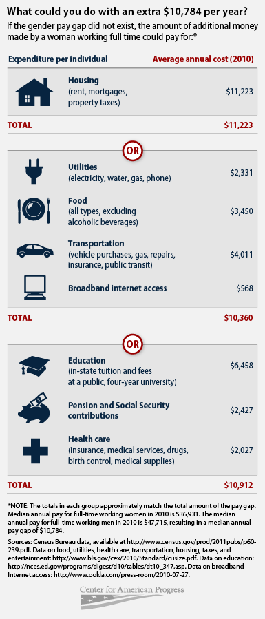
While income inequality between the sexes has decreased in recent decades, women still only make seventy-seven cents for every dollar a man is paid. Matt Separa from the Center for American Progress illustrated what could be bought with those lost wages to help us conceptualize how wide the wage gap is.
His first chart shows how the $10,784 in underpaid wages would almost cover annual housing costs or could pay the combined costs of a year’s worth of utilities, food, transportation, and internet access with a few hundred dollars to spare. The lost wages could also almost pay all the expenses for annual in-state tuition at a public university, twelve months of contributions to Social Security, and basic medical care for a year:
His second chart illustrates how across a lifetime, the lost wages ($431,360) could buy two houses, seven degrees from public universities, fourteen cars, or pay for a family of four to eat for thirty-seven years. Many of Spera’s examples, including real estate, tuition and retirement savings, are especially powerful because they show how the lost wages could be turned into capital and wealth that would pay even more dividends on top of the lost income:
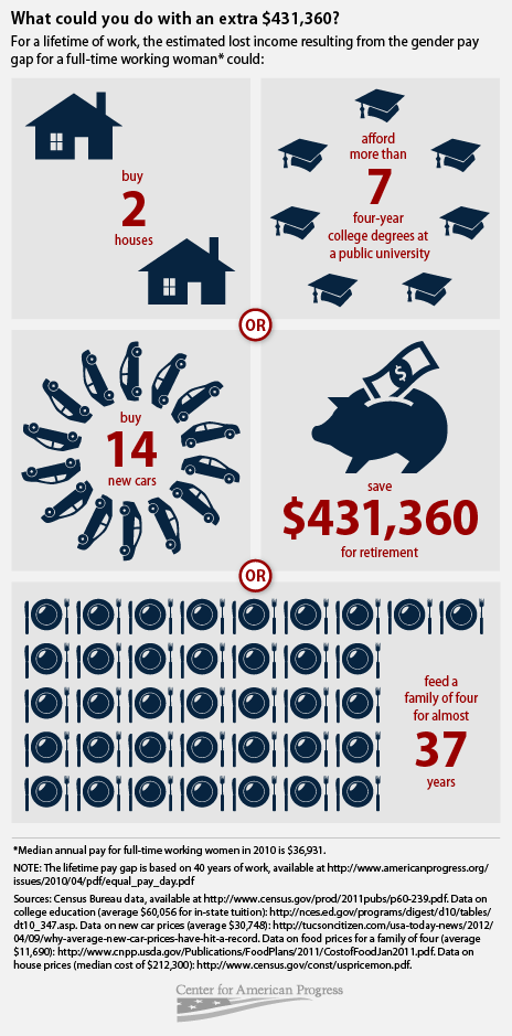
Overall, the graphs do a nice job of making the implications of the gender wage gap concrete.
—————
Jason Eastman is an Assistant Professor of Sociology at Coastal Carolina University who researches how culture and identity influence social inequalities.