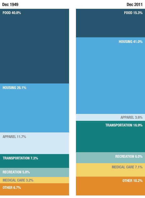
Recently we posted a comparison of the types of jobs Americans held in 1940 and 2010, based on Census data. Now NPR has posted an interesting image showing how spending on different categories has changed:
Source: Bureau of Labor Statistics. Credit: Lam Thuy Vo / NPR
[Note: Sorry I initially accidentally left out the link to the original NPR story!]
The change in spending on food is especially noteworthy, given the role that cost of food plays in determining the poverty line in the U.S. It is still based on a calculation developed in the 1960s, which assumed that the average family spent about a third of its income on food. To figure out how much a family needed to survive, the minimum cost of a nutritionally-complete diet for a particular family size was calculated; multiplying it by three provided the poverty line. It was then adjusted over time. This is the number generally used to determine eligibility for government assistance programs.
But since then, food prices have fallen significantly, while other necessities, such as housing and medical care, have often gotten more expensive. Many have criticized the poverty line calculation, including the National Academy of Sciences, arguing that as food has gotten cheaper, the official poverty line does a worse and worse job of capturing exactly how much it costs to survive in the U.S.
NPR also provided a more detailed breakdown of spending on a number of major categories in 2011:
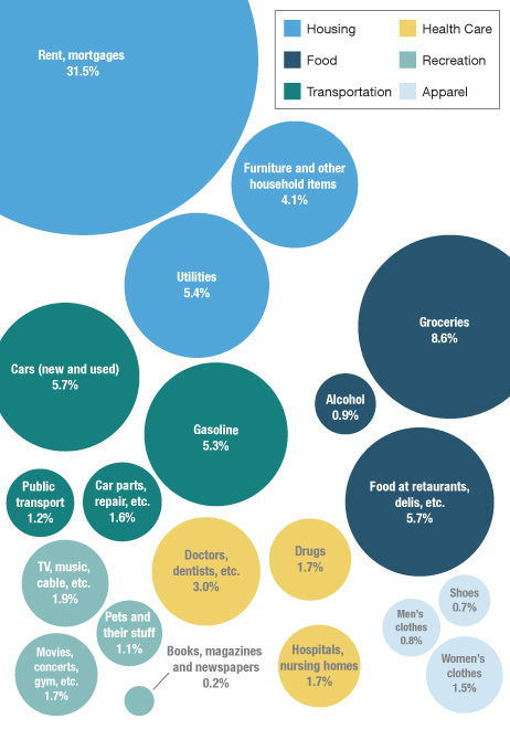
Source: Bureau of Labor Statistics. Credit: Lam Thuy Vo / NPR
Thanks to my friend Kathy B. for letting me know!