economics

This 48-second ad is a fantastic example of framing, as well as a super-ridiculous blast-from-the-past.  Paid for by the movie theater industry, the ad attacks the idea of cable.  Cable, of course, was going to deliver more content to television sets and potentially compete for the business movie theaters enjoyed. So they frame cable as “pay tv” and counterpose it to “free tv.”  They don’t, you might notice, frame cable as “pay tv” and the movie theaters as “pay movies” because that comparison is not as useful for them.  Instead, without drawing attention to the fact that they charge for entertainment, they try to delegitimate the idea of paying for on-screen entertainment at home.

They also try to argue that cable tv will bring scary monsters into your living room.  So cute.  In an era where millions of instances of pornifed violence are just a click away, it is almost incomprehensible to imagine wanting to make sure that scary movies stayed at the theater.

Via BoingBoing.

Lisa Wade, PhD is an Associate Professor at Tulane University. She is the author of American Hookup, a book about college sexual culture; a textbook about gender; and a forthcoming introductory text: Terrible Magnificent Sociology. You can follow her on Twitter and Instagram.

Technically yesterday was tax day, but since it fell on a weekend and today is a holiday in Washington, D.C. (Emancipation Day), Americans actually got two extra days to file. Whether you’re already done or are wildly rushing to finish up, you might enjoy this short video by political economist Robert Reich, explaining how the concentration of wealth, and the ability of the very wealthy to redesign the tax code to their advantage have affected the overall economy:

Via The Sociology Cinema.

The Numbers

Types of Taxes as a Percent of GDP (1937-2014)
Historical Comparison of Top Tax Brackets (1945-2010)
Tax Receipt for 2009

The Winners and the Losers

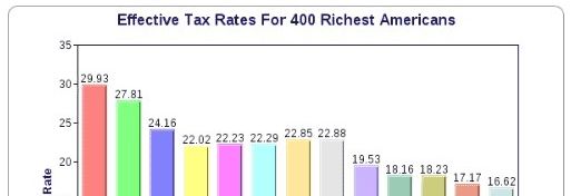
Recent Trends in US Income Inequality and the Tax Rate (1990-2010) (pictured)
Social Class and the Tax Burden
Donation and Welfare States
Corporate Tricks of the Trade
Who Benefited from the Bush Tax Cuts

Tax Cultures

Collecting Taxes in Pakistan
Danish vs. American Attitudes Towards Taxes
TurboTax Maps Out a (Conventional) Future

Lisa Wade, PhD is an Associate Professor at Tulane University. She is the author of American Hookup, a book about college sexual culture; a textbook about gender; and a forthcoming introductory text: Terrible Magnificent Sociology. You can follow her on Twitter and Instagram.

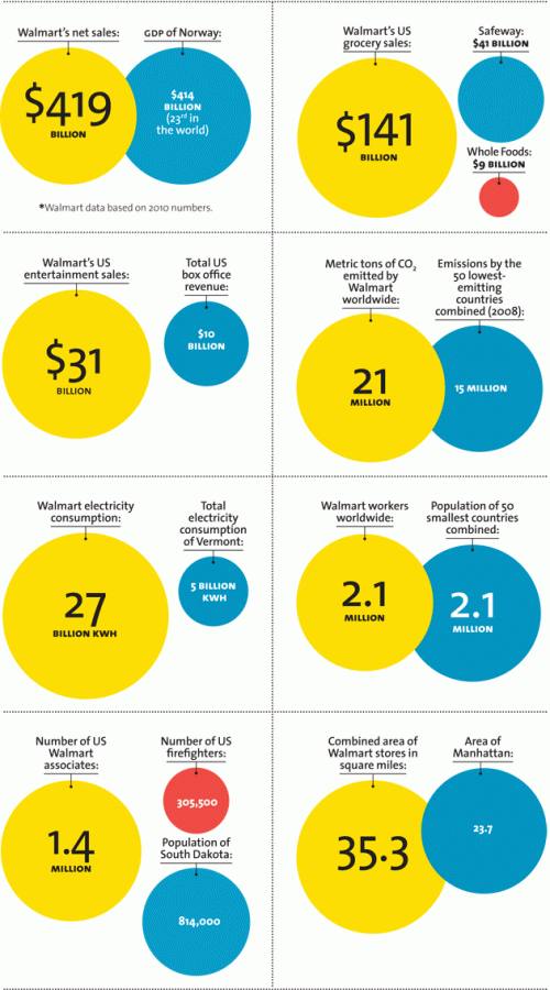
Mother Jones magazine offers some comparisons. Highlights:

  • Its net sales is greater than the GDP of Norway.
  • Its entertainment sales is triple that of Hollywood.
  • It emits more CO2 than the 50 lowest-emitting countries together.
  • It employs a workforce the size of the population of the 50 smallest countries in the world.
  • Its square-footage exceeds that of the island of Manhattan.

The data:


Via SocProf.

Lisa Wade, PhD is an Associate Professor at Tulane University. She is the author of American Hookup, a book about college sexual culture; a textbook about gender; and a forthcoming introductory text: Terrible Magnificent Sociology. You can follow her on Twitter and Instagram.

The presence of vintage cars on Cuban roads is one of the  most iconic consequences of the 50-year-old U.S. trade embargo on the communist country.  Cubans, however, have had to preserve many other types of items that Americans routinely replace, while making do with the gradual deterioration that comes with age.

Offering another peek into this life, Ellen Silverman has been photographing Cuban kitchens.  NPR describes how they capture, among other things, the “grand, but crumbling” architecture,” mismatched kitchenware, and vintage appliances:

See the photographs of Cuban kitchens and more at her webpage.

Lisa Wade, PhD is an Associate Professor at Tulane University. She is the author of American Hookup, a book about college sexual culture; a textbook about gender; and a forthcoming introductory text: Terrible Magnificent Sociology. You can follow her on Twitter and Instagram.

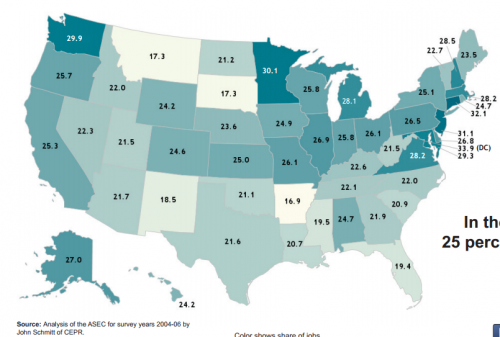
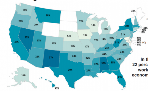
P. Mae Cooper sent in a report from the Center for Economic and Policy Research that looked at economic insecurity in the U.S. Using data from the Census Bureau’s Annual Social and Economic Supplement, the authors calculate the percentage of good jobs in each state. They define a good job as one that pays at least $17/hr (the inflation-adjusted median income for men in 1979), which for a full-time year-round worker would mean an annual income around $35,000, and which provides health insurance and retirement benefits. Overall, about 1 in 4 jobs fit this definition of a good job, with quite a bit of variation by state:

The data was for 2003-2005, so this doesn’t reflect any effect of the recession on the types of jobs available.

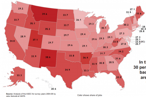
They also calculated the % of jobs that don’t meet any of the elements of a good job — that is, they pay under $17/hr, they don’t provide health insurance, and they don’t have any retirement plan available. These are more common than good jobs, making up about a third of all jobs in the typical state:

One criticism of the official poverty line is that it doesn’t account for regional differences in cost of living, as well as supplementary forms of income supports (Social Security, unemployment, etc.). The authors used Survey of Income and Program Participation data to calculate economic insecurity by taking into account regional costs of living.

The calculations include data for 1) working families and 2) only those families that have 1 or 2 adults and o to 3 children, so it excludes families where not adults are employed or that have 4 or more children. And the data are for 2001-2003, so again, it doesn’t reflect the recession. This map shows the % of the included families whose total income is less than the basic budget standard (that is, actual market costs of essential goods and services in over 400 localities) where they live. About 22% of families were economically insecure, with a lot of variation by state:

I really hope someone updates this analysis, given the recession, but the report provides a general illustration of an important aspect of our economy, and the limitations of a measure of poverty that entirely ignores regional costs of living.

Cross-posted at Reports from the Economic Front.

While the press cheers on every sign of private sector job creation, little attention is being paid to public sector job destruction.  As the Economic Policy Institute reports, while there has been an increase of some 2.8 million private sector jobs since June 2009, public sector employment (federal, state, and local governments combined) has actually fallen by approximately 600,000.  As the figure below reveals, this is a very unusual development .

wwwepiorg.png

According to the Economic Policy Institute, if the percentage growth of public sector employment in this recovery had followed past recovery trends, we would have an additional 1.2 million public sector jobs and some 500,000 additional private sector jobs. A separate reason for concern about this trend is that lost public sector jobs generally means a decline in the services that we need to sustain our communities.  The withering away of our public sector during a period of expansion should worry us all.

Recently we posted a comparison of the types of jobs Americans held in 1940 and 2010, based on Census data. Now NPR has posted an interesting image showing how spending on different categories has changed:

Source: Bureau of Labor Statistics. Credit: Lam Thuy Vo / NPR

[Note: Sorry I initially accidentally left out the link to the original NPR story!]

The change in spending on food is especially noteworthy, given the role that cost of food plays in determining the poverty line in the U.S. It is still based on a calculation developed in the 1960s, which assumed that the average family spent about a third of its income on food. To figure out how much a family needed to survive, the minimum cost of a nutritionally-complete diet for a particular family size was calculated; multiplying it by three provided the poverty line. It was then adjusted over time. This is the number generally used to determine eligibility for government assistance programs.

But since then, food prices have fallen significantly, while other necessities, such as housing and medical care, have often gotten more expensive. Many have criticized the poverty line calculation, including the National Academy of Sciences, arguing that as food has gotten cheaper, the official poverty line does a worse and worse job of capturing exactly how much it costs to survive in the U.S.

NPR also provided a more detailed breakdown of spending on a number of major categories in 2011:

Source: Bureau of Labor Statistics. Credit: Lam Thuy Vo / NPR

Thanks to my friend Kathy B. for letting me know!