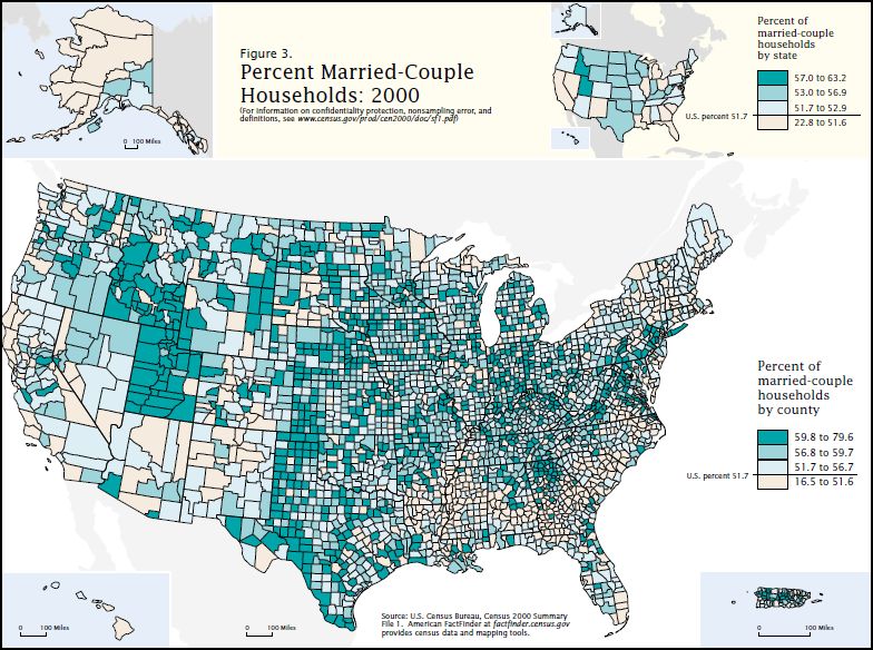
The US Census Bureau put together the map below. It shows what percentage of households in any given county include a married couple. In the counties colored with the darkest turquoise, between 59.6 and 79.6% of households consist of a married couple. In the counties colored white, less than 51.6 do.
I think it’s interesting to speculate as to how the reasons why there are more or less married couple households might vary by place. For example, some places may have disproportionate numbers of gay and lesbian residents who cannot, legally, get married. Others may have higher rates of poverty, which has been shown to decrease relationship stability, leading to less marriage and more divorce. Still others may have normative or religious pressures in favor of marriage (Utah strongly stands out as the most marriage-prone state). The racial/ethnic make-up of counties may contribute to marriage rates; we know, for instance, that black women marry at a lesser rate than white women for a whole host of reasons. Racial/ethnic homogeneity may play a factor too, since interracial marriage is still uncommon and asymmetrical when it does occur. Some counties have more disproportionate ratios of males and females, which may also shape marriage rates. What do you think? More hypotheses? Arguments one way or another?
Lisa Wade, PhD is an Associate Professor at Tulane University. She is the author of American Hookup, a book about college sexual culture; a textbook about gender; and a forthcoming introductory text: Terrible Magnificent Sociology. You can follow her on Twitter and Instagram.

