class

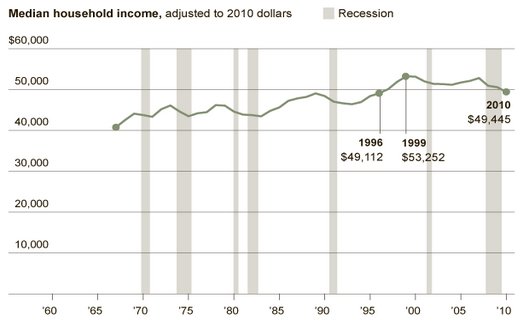
The Census Bureau just published new data revealing trends in living standards as of 2010.  The trends are troubling to say the least. Median household income (adjusted for inflation) fell to $49,445.  That means that the median household now earns less than it did a decade ago.  This marks the first decade since the Great Depression without an increase in real median income.

According to Lawrence Katz, a labor expert and Harvard economist:

This is truly a lost decade.  We think of America as a place where every generation is doing better, but we’re looking at a period when the median family is in worse shape than it was in the late 1990s.

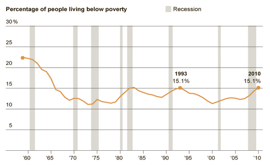
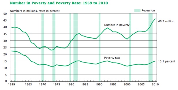
The percentage of Americans living in poverty hit 15.1 percent, the highest percentage since 1993.  There are now 46.2 million people living below the poverty line, the greatest number ever recorded by the Census Bureau. Child poverty stood at 22 percent.

Things are unlikely to get better this year.  State and local governments are slashing employment and programs and the federal government is now moving into cutting mode itself.

This depressing situation is not simply a recession phenomenon.  As the New York Times reports, the expansion period of 2001 to 2007 “was the first… on record where the level of poverty was deeper, and median income of working-age people was lower, at the end than at the beginning.”

Of course, while the great majority of people are struggling, a small minority have been doing very well.  One consequence, as the chart below highlights, is a strong growth in inequality (as measured by the Gini coefficient with higher numbers reflecting greater inequality).  As I noted in a previous post, over the years 2002 to 2007, the top 1% of households captured 58% of all the income generated.

inequality-2.jpg


In brief, there is a small minority that is doing very well and a great majority that is struggling, with a significant number in free fall.

A QR, or Quick Response, code on a bulletin board of a college campus:

Steve Grimes shared this image and some interesting thoughts about how Quick Response codes, or QR codes, can contribute to inequality. That is, QR codes such as these serve to make certain content and information “exclusive” to those who have smartphones. He states,

There is a general thinking that technology can create a level playing field (an example of this is can be seen with the popular feelings about the internet). However, technology also has a great ability to create and widen gaps of inequality.

In a practical sense the company may be looking for students who are tech savvy. Using the matrix barcode may serve that purpose. However, the ad also shows how technology can exclude individuals; primarily in this case, students without smart phones. Ironically it is especially the students who need work (“need a job”) who may not have the money to afford a smart phone to read the ad.

Grimes’ thoughts are judicious, and reveal the inherent structural difficulties in alleviating inequality.  QR codes are one form of “digital exclusivity,” the tendency of technology to re-entrench (mostly) class disparities in access to information. Though they may be able to access the information later when they have access to a computer, the person who has the smartphone is certainly living in a much more augmented world than the person without.

If we take as our assumption that access to information is a form of capital, than we can easily see how such technologies are implicated in the field of power. We can also see how digital exclusivity can contribute to the larger digital divide. In this sense, digital exclusivity, as a characteristic of particular technologies and forums (in this case as an access-point to particular forms of knowledge and information), contributes to larger inequalities of power and access to information in the digital age.

QR codes, though, may not be the best example of a digitally-exclusive technology. That is, QR codes have yet to serve as a common conduit of important information—access to such information has similarly meant little in terms of social or economic capital. It turns out that even most people with smartphones don’t know what they are or aren’t interested in using them. Grimes’ understandable frustration the digital divide, combined with the uneven usage of QR codes among mobile phone-using countries, leads us to believe that those black and white squares do more to instill a feeling of digital exclusivity than anything else.

—————————

David Paul Strohecker (@dpsFTW) is getting his PhD from the University of Maryland, College Park. He is currently doing work on the popularization of tattooing, a project on the revolutionary pedagogy of public sociology, and more theoretical work on zombie films as a vehicle for expressing social and cultural anxieties.

David A. Banks (@DA_Banks) is a M.S./Ph.D. student at Rensselaer Polytechnic Institute.  His research interests include space, place, cyborgs, and networked bodies.  He is currently working under the NSF’s GK-12 fellowship program, teaching science in urban school districts and developing new learning technologies. More at www.davidabanks.org.

Strokecker and Banks both blog at Cyborgology.

If you would like to write a post for Sociological Images, please see our Guidelines for Guest Bloggers.

The Atlantic posted several graphs from a recent Census Bureau report on income and poverty as of 2010. The racial differences in median household income are truly awful; half of African American families make less than $32,000 a year. Stop and just seriously think, for a second, about the dramatic difference in access to resources — decent housing, some savings for emergencies, retirement accounts, etc. — these numbers translate into:

Not surprisingly, the percentage of Americans falling below the poverty line rose:

For more on income, poverty, and health insurance coverage, check out the full Census Bureau report.

According to a 2008 market research study, 72% of yoga practitioners in the U.S. are women; 71% are college educated and 27% have postgraduate degrees; and 44% have annual incomes of $75,000 or more.  Yoga practitioners, then, do not reflect the general population.

So how inclusive is yoga?  A collection of covers from the magazine Yoga Journal, spanning the years 1975 to 2010, sent in by Janet T., gives us a clue.

As she points out, the historical progression of covers illustrates how the magazine started out with explicit connections to India and traditional yogis (below) and gradually moved towards featuring (and thus creating) western yoga superstars.

Of the 186 Yoga Journal covers that include a photograph (not an illustration) 78% show only white people. Though a 1997 issue with a story on “yoga in the inner-city” features a man of color:

66% of single-person photos are of a woman.  At least two covers include a story on yoga for people who aren’t necessarily young, thin, and able-bodied, but show a photograph women who are.


Although the feminization of yoga has been noted (and conversely, the need to masculinize yoga in order to appeal to men), it is rarely acknowledged that while women make up the majority of yoga practitioners, studio owners are more likely to be men.  Moreover, yoga superstars, such as Bikram Choudhury (the creator of the Bikram style of yoga practiced in a heated room), with incomes in the multi-millions, are overwhelmingly men.

In addition, while most yoga practitioners are female, the language of yoga is male, and assumes a gender-conforming (and often athletic and thin) body.  Some bloggers have called attention to raced, classed, gendered, sizist, and transphobic practices in American yoga culture that can be alienating and discouraging to current or would-be yogis, thus denying the potentially therapeutic elements of yoga to much of the U.S. population.  For example, the costs associated with yoga practice (classes, equipment, etc.) make it out of reach for most low-income people, while the gendered way that yoga philosophy understands the human body can make it uncomfortable for some transgender folks.

So, through the past 35 years of Yoga Journal covers, we can see how the representation of yoga in America both creates and reinforces a symbolic understanding of a practice intended for a very particular audience.

——————————

Christie Barcelos is a doctoral student in Public Health at the University of Massachusetts who rarely sees anyone who looks like her in yoga class.

If you would like to write a post for Sociological Images, please see our Guidelines for Guest Bloggers.

There are few social facts that spread themselves out evenly across social class. Most everything — how healthy we are, what we do for leisure, how we dress, etc — is correlated with income.  Twitter, I learned today, is an exception.   According to a Pew study, internet users across a wide array of income brackets are using Twitter at about the same rate.

Income and % of internet users who use Twitter:

When we look at variables that correlate with income, however, such as race and education, we see an uneven distribution.

Race and % of internet users who use Twitter:

Education and % of internet users who use Twitter:

So people with more education are more likely to use Twitter, but Whites (who, on average, get more education than Blacks and Hispanics) are less likely.  There’s something really interesting going on here.  Any idea what?

Lisa Wade, PhD is an Associate Professor at Tulane University. She is the author of American Hookup, a book about college sexual culture; a textbook about gender; and a forthcoming introductory text: Terrible Magnificent Sociology. You can follow her on Twitter and Instagram.

Cross-posted at Family Inequality.

The grandparent spike spikes on.

Last fall I learned that the number of children who live with at least one grandparent had spiked upward over the last half decade or so. The one-year update of that trend was dramatic enough to justify a yikes-edition update.

Again, the non-poor and near-poor lead the upward trend, while the highest rates are among near-poor. Although there were upward movements in the years before 2008, for the present I think we should file this under recession studies.

(For more on grandparents providing care for children, see this Pew report from last fall.)

Cross-posted at Reports From the Economic Front.

The media generally talk about the economy in national terms — as if economic trends affect us all equally and we all share a common interest in supporting or opposing the same economic policies.  This comforting view tends to promote political passivity — since we are all in the same “boat,” it makes sense to leave policy making to the experts.

A recently published study on income distribution by economists Anthony Atkinson, Thomas Piketty and Emmanuel Saez stands as a welcome corrective.  Uwe E. Reinhardt discusses some of the main implications of their work in his New York Times blog.

Reinhardt’s Figure 1 shows average annual income growth for households in the United States and the different experiences of the top 1% and the bottom 99%.  From 1976 to 2007, average household income grew at an average annual rate of 1.2%.  Over the same period, the top 1% of households experienced an average annual income gain of 4.4% while the bottom 99% of households gained only 0.6% a year.  Household income gains were higher in both subperiods (1993-2000 and 2002-2007), in large part because these subperiods were recession free.

02economix-growth-chart1-blog480.jpg

Figure 2 shows the share of total income growth in each time period that was captured by the top 1% of households.  Over the years 1976 to 2007, these households captured 58% of all income generated.  Their share was an astounding 65% in the period 2002 to 2007.

02economix-growth-chart2-blog480.jpg

This skewed income distribution means that average income figures present a highly misleading picture of the American experience.  As Reinhardt explains:

So if an American macroeconomist — a specialist who tends to think of nations as people — or high-level government officials or politicians mimicking a macroeconomist boasted on a television talk show that “average family income grew by 3 percent during 2002-7, more than in most European economies,” about 99 percent of American viewers, reflecting on their own experience, would probably scratch their heads and wonder, “What is this guy talking about?”

Figure 3 highlights the growth in real GDP per capita and median household income from 1975 to 2007.  The data show a growing divergence between what working people produced and what the average household received from that production.  Real GDP per capita rose by an annual compound rate of 1.9% while real median household income increased by less than 0.5%.

02economix-growth-chart3-blog480.jpg

As Reinhardt points out: “Other than national pride in league tables, that 1.9 percent average economic growth does not mean much for the experience of the median household in the United States.”

This brings us back to the issue of whether it makes sense to talk in “national” terms, especially given the dominance of the top 1% of households.  According to Anthony Atkinson, Thomas Piketty and Emmanuel Saez:

Average real income per family in the United States grew by 32.2 percent from 1975 to 2006, while they grew only by 27.1 percent in France during the same period, showing that the macroeconomic performance in the United States was better than the French one during this period. Excluding the top percentile, average United States real incomes grew by only 17.9 percent during the period while average French real incomes — excluding the top percentile — still grew at much the same rate (26.4 percent) as for the whole French population. Therefore, the better macroeconomic performance of the United States and France is reversed when excluding the top 1 percent.

None of this is to suggest that U.S. society is best understood in terms of a simple division between the top 1% and the bottom 99%; the latter group is far from homogeneous.  Still, this division alone is big enough to establish that talking in simple national terms hides more than it illuminates about the American experience.  Said differently, just because the top 1% of U.S. households have reason to celebrate the U.S. economic model doesn’t mean that the rest of us should join in the celebration.

In honor of Labor Day here in the U.S., my coworker Pete posted this video someone put together of images from various labor strikes, protests, etc., set to the Dropkick Murphy’s version of “Which Side Are You On?”, originally written by Florence Reece in 1931 in response to intimidation of her family during struggles between workers and coal mine owners in Harlan County, Kentucky:

The Dropkick Murphys’ “Worker’s Song” seems equally apropos: