class

Shamus Khan posted a link to a great slideshow put together by the Business Insider that summarizes the current state of our economy. It’s a one-stop illustration of, in their words, “What the Wall Street protestors are so angry about,” and definitely worthy of clicking over to see the whole thing. I’m posting just a few of the images here.

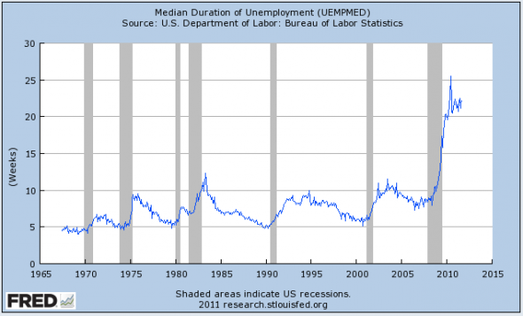
The median length of unemployment for those who lose their jobs is now over 20 weeks:

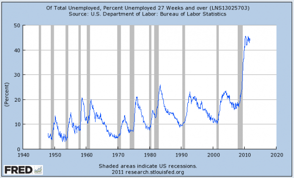
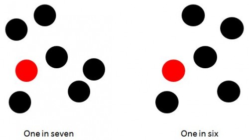
About 45% of the currently unemployed have been without a job for at least 27 weeks — six to seven months without a job:

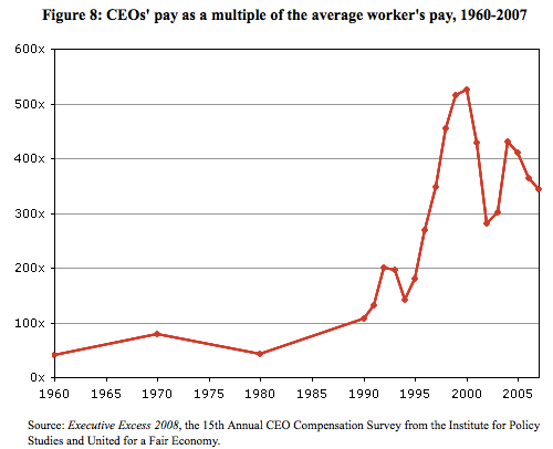
CEO pay is now roughly 350 times higher than the average worker’s:

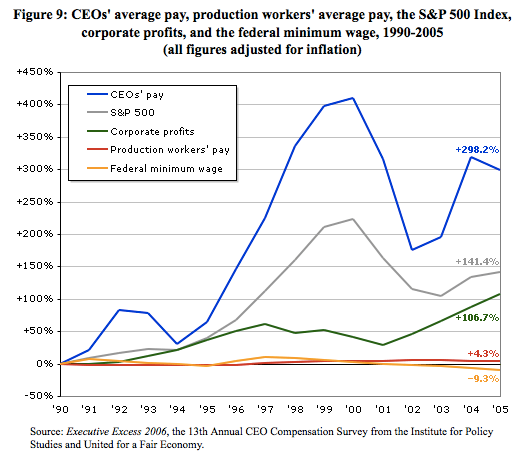
And CEO pay has grown dramatically since the early ’90s, though production workers’ pay has barely budged and the minimum wage has actually dropped if you adjust for inflation:

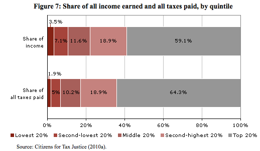
We often hear that the extremely wealthy pay a very disproportionate amount of U.S. taxes. It is true that they pay a large share. But it’s not so imbalanced compared to how much of all income they earn. For instance, the richest 20% of earners receive 59.1% of all U.S. income but pay 64.3% of taxes:

There’s much, much more in the full slideshow; go check it out.

An April 2011 Gallup poll found that 29% of Americans thought that the U.S. economy was in a depression.  Another 26% thought it was only a recession.   This is scary since, according to the National Bureau of Economic Research, we have been in an economic expansion since June 2009.

Why would so many Americans feel this way you might ask.  Here is one reason.  According to recent Census Bureau data, during the recession, which lasted from December 2007 to June 2009, inflation-adjusted median household income fell by 3.2%.  Between June 2009 and June 2011, a period of economic expansion, inflation-adjusted median household income fell by 6.7%.   This decline is illustrated in the New York Times chart below.

1010-nat-incomeweb.jpg

I recently appeared on the Alliance for Democracy’s “Populist Dialogue” TV show to talk about our economic crisis and possible responses to it.  You can watch the show here or below.

Children are our most important resource.  Everyone says it, but we don’t really mean it.

Exhibit one: the percentage of children under the age of 18 that live in poverty. In 2007, at the peak of our previous economic expansion, the child poverty rate was 18%.  In 2009, it hit 20%.  The figure below provides a look at child poverty rates in each state.  New Hampshire had the lowest rate: 11%.  Mississippi the highest rate: 31%. According to a recently released Census Bureau study, the 2010 national child poverty rate was 22%.


poverty.jpg


How Do We Measure Poverty?

Children under the age of 18 are counted as poor if they live in families with income below U.S. poverty thresholds.  There are a range of poverty thresholds which are based on family size and number of children.  These poverty thresholds are far from generous.  The 2009 poverty threshold for a family of two adults and two children was$21,756.

Sadly our poverty rates understate the seriousness of our poverty problem, for children and adults.  The history of how we developed and calculate our official poverty thresholds provides perhaps the clearest proof of the inadequacy of current statistics.  First introduced in 1965, the thresholds were based on previous work by the Department of Agriculture (DOA).  The DOA created an “economy” food plan in the 1950s that was designed for “temporary or emergency use when funds are low.”  DOA surveys had also established that families of three or more persons spent approximately one-third of their after tax income on food.  Our initial thresholds were set by multiplying the cost of the economy food plan (adjusted for family size) by three.

From 1966 to 1969, these poverty thresholds were revised annually by the yearly change in the cost of the items contained in the economy food plan.  After 1969, and still today, the poverty thresholds were adjusted by the rise in the consumer price index.

Our poverty rates are calculated by comparing pre-tax family incomes to these thresholds.

Why the Poverty Threshold is Deficient

This methodology has produced a poverty standard and estimates of poverty that are deficient for several important reasons:

First, our knowledge of nutrition has significantly changed since the 1950s.

Second, families now spend approximately one-fifth of their after-tax income on food, not one-third.  That correction alone would mean that the food budget should be multiplied by 5 rather than 3, thereby producing higher thresholds and poverty rates.

Third, poverty is best thought of as a relative condition, which means that it should not be measured by comparing incomes to an unchanging standard based on the cost of a 1950’s economy food plan.

Fourth, poverty rates should be calculated using after-tax family income adjusted to include the value of government support programs like food stamps (which are also fluctuating and often cut in hard times), not unadjusted pre-tax family income.

A Better Measure

Researchers, drawing on the work of the National Academy of Sciences Panel on Poverty and Family Assistance Economists, have developed an alternative experimental approach to measuring poverty.  They start with a reference family, two adults and two children.  Then, using Consumer Expenditure Surveys, they calculate the dollar amount of spending on food, clothing, shelter, utilities and medical care by all reference families in a given year.

The poverty threshold for the reference family is set at the midpoint between the 30th and 35th percentile of the spending distribution for all families with two adults and two children.  Small multipliers are then used to add spending estimates for other needs, such as transportation and personal care, slightly raising the poverty threshold.   This threshold is adjusted for families of other compositions.

The chart below shows national poverty rates for the years 1996 to 2005.  We see that the rates produced by this experimental methodology are significantly higher than the official rates.

comparison.jpg

Strikingly, while the official poverty rate is lower in 2005 than in 1996, the 2005 experimental poverty rate is the highest in the period.  The difference is largely explained by the fact that the experimental measure incorporates changes in the availability of social programs and the relative importance of non-food goods and services in family spending.

Returning to the issue of child poverty, the table below highlights the difference between the two measures for specific demographic groups.  Notice that the child poverty rate calculated using the experimental measure is always higher than the official rate.  As previously stated, the official 2010 child poverty rate is 22 percent.  The experimental rate would no doubt be several percentage points higher, closing in on 25 percent.

poverty-table.jpg

What can one say about a situation where between one-fifth and one-fourth of all children in the United States live in poverty?  Language like “outrageous,” “unacceptable,” and “indicator of a flawed economic system” comes to mind.  What also comes to mind is the fact that these poverty statistics rarely get the attention they deserve, as does the question of why that is so.


Last month I posted a video from the PBS series on U.S. inequality, showing the misperceptions many Americans have about the level of economic stratification in the U.S. In a new segment in the series, PBS looks at the often hidden health impacts of this economic inequality:

Watch the full episode. See more PBS NewsHour.

Full transcript available here.

Recently, Elizabeth Warren — Harvard Law professor and Massachusetts Senate candidate — was filmed discussing arguments that efforts to raise taxes on extremely high income earners is “class warfare,” an increasingly common refrain. She responds to this line of argument by questioning the individualist narrative of wealth — that is, that people who are rich did it all on their own, and thus owe nothing to society. As she points out, taxpayer-funded infrastructure and services — from highways to law enforcement to widely-available education — are essential elements of such financial success stories. But current discourse about wealth and taxes obscures the social nature of wealth creation, portraying taxation as unfair taking rather than a fair return on the public’s investment:

Transcript after the jump.

more...

Everyone says that they want an economic recovery.  So, why don’t we have one?  Most surveys of business people tell the same story: there is no recovery because business owners are unwilling to hire and they are unwilling to hire because people are not spending.

So, why aren’t people spending?  One reason is that many people are unemployed.  Another reason, one that business leaders doesn’t like to discuss, is that business has been boosting its profits by cutting worker pay.  And not just for the less educated who are said to be the unfortunate victims of technology and globalization.  Rather, as the chart below shows, for workers in almost all educational categories.

na-bn371_census_g_20110919135704.jpg

The average earnings of workers in almost all educational categories declined between 2000 and 2010.  Talk about a lost decade for working people!  Only those with an MD, JD, MBA or PhD enjoyed a real increase over the period, and those workers make up only 3% of the workforce.

The average earnings of college graduates, 19.5% of the workforce, declined (adjusted for inflation) by approximately 8%.  Interestingly, the average earnings of high school graduates, 30.7% of the workforce, actually suffered a smaller decline.

These numbers make clear that the solution to our economic problems is not more education.  Even those with Masters Degrees lost money on average.  Recovery will require real structural change in the way our economy operates.

The U.S. Census Bureau reported last week that there were 46.2 million people in poverty in 2010, out of a population of 305.7 million. That is 15.1%, or if you prefer whole numbers, call it 151 out of every 1,000.

Most news reports seem to prefer reducing the rate to a numerator of one — which makes sense since it uses the smallest whole number possible, for your mental image. In that case, you could accurately call it one out of every 6.6, but no one did. Like the Washington Post and NPR, most called it some version of “nearly one in six.” That’s OK, if you’re willing to call 15.1 “nearly 16.7.”

Using percentages, here’s the difference:

A substantial minority of reports on the poverty report took the low road of rounding the fraction in the direction of their slant on the story. Some reports just went with “one in six,” including people on the political left who may be inclined to enlarge the problem, such as Democracy Now and the labor site American Rights at Work.

On the right, the Heritage Foundation’s Robert Rector and Rachel Sheffield called it “one in seven” in a column carried by the Boston Herald and others. (Their point, repeated here when the new numbers came out, is that the poor aren’t really poor anymore since they have many more amenities than they used to.) That’s cutting 15.1% down to 14.3%, which is actually closer to the truth than 16.7%:

It’s not that far off, but if your story is about the increase in poverty rates, it’s unfortunate to round down exactly to last year’s rate: 14.3%.

Then there are the people who may have just gotten stuck on the math and couldn’t decide which way to go, like the columnist who called it “essentially one in six” (which was ironic, because the point of his post was, “That’s the nice thing about most statistics, handled deftly, they can say just about anything you want them to.”) In some cases headline writers seem to have been the culprits, shortening the writer’s “almost one in six” to just “one in six.”

The worst exaggeration was from Guardian correspondent Paul Harris, who wrote, “the US Census Bureau has released a survey showing that one in six Americans now live in poverty: the highest number ever reported by the organisation.” The number — 46.2 million — is the highest ever reported, but the percentage was higher as recently as 1993.

If the point is to conjure an image that helps make the number seem real to people, it probably doesn’t matter — you may as well just go for accuracy and say “fifteen percent.” (You definitely shouldn’t use pie charts, which are hard for viewers to judge.) That’s because most people can’t immediately make an accurate mental image of either six or seven — after four they count. But I could be wrong about that. Consider these images — would the choice of one over the other change your opinion about the poverty problem?

They both create a reasonable image. But the choices people made are revealing about their biases  — and the unfortunate state of numeracy in America. Because it does matter that the number of people in poverty rose by 2,611,000.

Maybe more important is who and where these poor people are. Here’s two other ways of representing it, with very different implications.

Fifteen percent over there:

Fifteen percent spread according to a random number generator:

Note that those are just abstractions for visualizing the overall percentage of poverty. But there is a real geographic distribution of rich and poor, described in recent research by Sean Reardon and Kendra Bischoff (free version here). They found that, not surprisingly, as income inequality has grown, so has income segregation — the tendency of rich and poor to live in different parts of town. And that probably makes reality even more abstract — and more subject to media construction — for people who aren’t poor.

In a previous post I discussed data showing the growing income inequality in the U.S.: the middle class is shrinking, the poor are getting poorer, and the rich are getting richer. It turns out that corporations understand what is happening and they are responding.  In brief, they are letting go of the middle class as a market and restructuring their offerings to appeal to the top and bottom of the income distribution.

Below the jump (warning, it automatically starts playing with sound) is an enlightening five minute discussion of this new business strategy on Daily Ticker video:

more...