Search results for feed

One way to study social problems is to take a social constructionist approach.  This approach suggests that the degree to which a social problem is perceived as problematic, as well as the kind of problem it is understood to be, is a function of social interaction.  For example, many Americans consider drunk driving to be a very bad thing and a serious threat.  Drunk driving is not only embarrassing, it is punishable by law, and a conviction could result in social opprobrium.  It wasn’t always that way, and it still isn’t all that stigmatized in some parts of the U.S. and, of course, elsewhere.

So, social problems aren’t immediately obvious, but need to be interpreted and presented to us.  And, of course, some people have more power to deliver a message to the public than others.

Artist Susannah Hertrich developed this graphic (via) designed to bring to consciousness the difference between the likelihood of harm from certain threats and public outrage:

susanna_hertrich_reality

I am unsure as to how she measured both “public outrage” and “actual hazard” but, giving her the benefit of the doubt and assuming that this information is based on some reasonable systematic measurement, the image nicely draws our attention to how some social problems can receive a disproportionate amount of outrage, contributing to their social construction as significant or insignificant social problems (or, alternatively, their social construction as public problems for which outrage is appropriate and useful, versus private problems that have no public policy dimensions).

So, for example, heat is seen as relatively harmless even though, as Eric Klinenberg shows in his book Heat Wave: A Social Autopsy of Disaster in Chicago, it kills many, many people every year and is severely exacerbated by social policies both directly and indirectly related to weather.  But the people who die from heat, and those who love them, tend to be relatively powerless members of our society: usually the elderly poor.

Conversely, the threat of terrorism attracts a great deal of public outrage, but is not a significant threat to our individual well-being.  Still, certain members of our society with an ease of access to the media and authoritative roles in our society (mostly politicians and pundits) can raise our fears of terrorism to disproportionate levels.

Similarly, bird flu makes for a fun story (as all gruesome health scandals can) and gun crime feeds “mainstream” fears of the “underclasses” (often perceived as black and brown men).  Both make for good media stories.  Less so, perhaps, pedestrian accidents.

—————————

Lisa Wade is a professor of sociology at Occidental College. You can follow her on Twitter and Facebook.

In 2000, at the University of Wisconsin – Madison (UW), Diallo Shabazz was my student.  He was a senior.  At the very beginning of his Frosh year, someone snapped this picture:

Picture5

From that point forward, Diallo was featured in UW promotional materials again and again.  He became accustomed to seeing that smile everywhere.  Because diversity has become such a popular, even trendy thing for a college to have, many students of color find themselves used as representatives of their colleges disproportionately.

But Shabazz’s story takes a fascinating turn.  At the end of his senior year he paged through the next year’s application and didn’t see himself.  Hmmm.  Then, someone asked if he saw himself on the cover.  And he looked and didn’t see it and then he did.  Do you?

Capture1

That’s Diallo behind the excited girl on the left.  Except Diallo had never been to a UW football game.  You might recognize his face, transposed, from the original picture.  Indeed, someone at UW had photoshopped Diallo into the image below in order to give the impression that attendance at the game was more diverse than it was.  No Diallo:

Capture2

In that year 100,000 admission booklets went out with his face.  More insidiously, 100,000 admission booklets went out using his face to give the illusion of diversity at the University of Wisconsin – Madison.

Diallo sued.  He didn’t ask for a settlement.  He said that he wanted a “budgetary apology.”  He asked that, in compensation, the University put aside money for actual recruitment of minority students.  He won.  Ten million dollars was earmarked for diversity initiatives across the UW system.  The irony in the whole thing is that UW requested photos of Shabazz shaking administrators’ hands in reconciliation (i.e., photographic proof that everything was just fine).  Oh, and also, the Governor vetoed part of the earmark and many initiatives wore off with turnover.

What does this teach us?

First, notice that we have a commodification of diversity.  It is considered useful for selling an institution.

Second, if real diversity isn’t possible, cosmetic diversity will do.

Third, Shabazz himself was dismissed even as his image was used over and over.  Not only did they own the rights to his image and include him in many materials without the requirement that they ask or inform him, they literally took his image, cut it up, and used it to create a false picture.  When Shabazz complained, they first tried to blow him off.  So he wasn’t important to them, even as what he represented clearly was.

This suggests, fourth, that there was a real lack of a substantive dialog about and investment in race and diversity on the campus.  Talk: difficult.  Recruitment of minorities to a mostly white campus: tricky.  Addressing the systematic educational underinvestment in minorities prior to arriving at UW: expensive.  Retaining minorities in that environment: challenging.  Photoshop: easy.

Macon D., at Stuff White People Do, featured a similar situation in which Toronto’s Fun Guide (badly) photoshopped a black man onto their cover because their “goal was to depict the diversity of Toronto and its residents” (story here) (images also sent in by fds and Michael G.):

FUNphotoshop2

Original photo:

FUNphotoshop1

All of this puts into some perspective the recent Microsoft scandal that Jon S. and Dmitriy T. M. asked us to blog about.  If you were in the U.S. you would see the first image on the Microsoft webpage (with, as far as we know, real minorities) and, if you were in Poland, you would have seen the second image (with the black man replaced by a white man):

msft_sux_engadget

NEW! (Nov ’09):

Arturo Garcia pointed out that U.S. advertising for Couples Retreat included a black couple, but the advertising in the U.K. did not.

U.S. poster:

4113140933_210b27e6b6

U.K. poster:

4113141007_5a64763a21

The willingness to play with the presence of minorities–both by photoshopping them in and out–suggests that companies are making strategic, not ethical, decisions about what kind of public face (forgive the pun) to put on.  All of this avoids any real engagement with diversity itself.  This is probably largely because diversity is a minefield.  It’s incredibly difficult to even figure out how to define it, let alone how to build it, or how to manage it once you have it (something that my current institution struggles with).  And yet, these are the things that we must do.  Otherwise all of these strategic moves, both towards and away from minorities, are suspect.

NEW! In our comments, Jackie and Jasmine drew our attention to another example.  This is from the University of Texas, Arlington:

utarlington

See also our series on how people of color are included in advertising aimed primarily at white people, starting here.

If you’re really interested in these ideas, you might want to read MultiCultClassics, a blog specializing in how companies try to recruit minorities and present themselves as diverse institutions.

—————————

Lisa Wade is a professor of sociology at Occidental College. You can follow her on Twitter and Facebook.

Lisa Wade, PhD is an Associate Professor at Tulane University. She is the author of American Hookup, a book about college sexual culture; a textbook about gender; and a forthcoming introductory text: Terrible Magnificent Sociology. You can follow her on Twitter and Instagram.

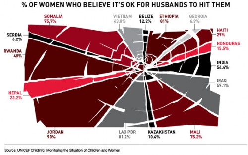
Teresa C. sent in this image created using UNICEF data to show what percent of women surveyed in various countries said it was acceptable for their husbands to hit them:

international-womens-attitudes-towards-domestic-v-28079-1250786064-13

(Found at BuzzFeed.)

You can find the data and a breakdown of UNICEF data collection methods here. The data for many more countries are available there too. I can’t quite figure out why these particular countries were used in the image; they aren’t all of the countries with the highest percentages. As far as I can tell, the UNICEF data table only includes numbers for the “developing” nations and some countries from eastern Europe, which is UNICEF’s focus. But I do wonder what the numbers would be if you asked women in the U.S. a question along the lines of “is it ever acceptable for a man to hit a woman?” or “can you think of any situation where it might be understandable that a man would hit his wife or girlfriend?” You might get higher “support” for violence against women than you’d think. The UNICEF page doesn’t provide the wording of this question, which would be interesting to know.

That’s not to downplay the issue of women justifying or accepting violence against women, just that those of us in the “developed” nations need to be sure not to pat ourselves on the back too much about how enlightened we are about domestic violence.

And I can’t help but dislike the image, in that at first glance it would appear to be a pie chart in which all of the sections add up to 100%; really a bar graph would be a better way to illustrate this. But then, I had a dissertation advisor with a 5-page single-spaced document outlining his standards for data presentation.

UPDATE: Reader P. makes the point I was getting at above (that the wording might greatly impact how much “support” you find for violence against women) much better than I did:

What they were actually asked, in the MICS and the DHS (the two primary sources for the data), was this question:

“Sometimes a husband is annoyed or angered by things that his wife does.  In your opinion, is a husband justified in hitting or beating his wife in the following situations:

– If she goes out with out telling him?
– If she neglects the children?
– If she argues with him?
– If she refuses sex with him?
– If she burns the food?”

I bet you get very different rates for different “justifications,” which is important both for data-gathering/presentation and for anti-domestic violence campaigns. And, again, I bet if you broke down various “reasons” for hitting a woman, I bet you’d get higher-than-expected acceptance of them in countries in the “developed” countries that weren’t presented in the table.

In a list of 15 contrasting billboards on Buzzfeed, I found these three:

Picture1Picture2Picture3

I usually think of public service announcements as a form of education.  Presumably there’s a harmful ignorance out there somewhere that can be corrected.  But these contrasts bring into stark relief the fact that public service announcements aren’t only fighting ignorance, they’re fighting corporations.  The battle isn’t just between misinformation and information, it’s between for-profit and non-profit organizations.

—————————

Lisa Wade is a professor of sociology at Occidental College. You can follow her on Twitter and Facebook.

The idea that work and home are in different places was institutionalized only recently in human history (and is still not reality everywhere).  In early American history, most people were farmers.  Both men and women worked at home.  The technological advances that brought industrialization removed work from home.  The factory was invented to house large machinery and many workers.  Enter: wage work, the commute, and wives that “just” stayed home.

Today, the idea that work and home are separate places is largely taken for granted (though this may be reversing a bit) and is, in fact, institutionalized with zoning laws that specify whether space is to be used for work (and what kind), living, or both.

Dmitriy T.M. sent us a link to the images below.  They compare the population of New York City and its boroughs the bottom two-thirds of Manhattan and parts of New Jersey, Brooklyn, and Queens during the day and night.  It reveals nicely how we are organized so as to use different spaces differently.

8GFwg

—————————

Lisa Wade is a professor of sociology at Occidental College. You can follow her on Twitter and Facebook.


Jason S. sent in this (pretty hilarious) three-minute “ad” for Zima.  While modern motherhood takes many different forms, the ad is a great illustration of one stereotype of the modern mother:

So, according to the ad, moms…

1. …are middle class. She and her husband can afford a nice, new minivan.

2. …provide their children with active social and educational lives. Since they live in the suburbs, she spends a lot of time shuttling them from place to place.

3. …are frazzled. Likely a full time wage worker and the primary care taker for the children, the condition of the inside of the minivan suggests that she does not have time to clean or organize her family’s life.

4. …feed their kids fast food (french fries) because, being overwhelmed, she doesn’t have time to feed them what she’d thinks they should eat.

5. …have husbands who still take on the masculine jobs but, being white collar workers, no longer have the skill to effectively perform them.

—————————

Lisa Wade is a professor of sociology at Occidental College. You can follow her on Twitter and Facebook.

Way back in April Taylor sent in a link to a post at Media Assassin about some interesting depictions of Black women in a couple of ads. This one is for Lord and Taylor:

3623v2_01

Apparently the Black woman just can’t control her naughty self.

The rest of the post is not safe for work–the first image mildly so, the second one definitely not safe.

more...

We recently critiqued Facebook’s “neutral” avatar for appearing both white and male.  Both Abby J. and Noah Brier pointed us to the fact that Rob Walker at Murketing has been collecting default avatars.  His collection is really interesting.  First, it demonstrates that the avatars don’t need to be gendered at all.

Flikr:

flickr-buddyicon

Hotmail:

hotmail

Google:

googleyeyes

Vimeo:

vimeo

My space:

myspacenophoto

Friendfeed:

nomugshot-large

Yahoo:

nopic_192

Youtube:

youtube140

Second, it demonstrates that the avatars don’t have to human at all:

Twitter:

twitter

Posterous:

posterous

Third, his collection also suggests that, when the avatar is human and discernibly gendered, it usually appears to be male.  There’s the Facebook avatar, as well as…

EBay:

ebay

Car Domain:

cardomain-avatar

Topix:

topix

Yammer:

yammer

The avatar tends to be male, unless the company produces a default male and a default female.

Blip FM:

blipfm

Goodreads:

goodreads-f

goodreads-m

This collection reveals that the appearance of a company’s default avatar is by no means inevitable or accidental.  Companies must make choices and they are, indeed, making choices about what kind of person is the default person.

Check out his whole collection.  It is growing.

Jamie R. sent in a link to a video that presents a lot of attention-grabbing statistics (which may or may not be accurate). At first it appears that the avatar could be unisex, but then at about 1:18, we see the “female” avatar:

Did You Know? from Amybeth on Vimeo.

At no other place in the video do we see the female avatar except when the “neutral” one is presented as married…indicating, from the context of the video, that it is not unisex or neutral, but male.

MORE! You may have noticed that our revamping of the site involved putting our names up.  Lo and behold, these male avatars popped up next to our names.

Capture

So we went into the admin page to see if we had some other option, like maybe something non-human or a female avatar if necessary.  These were our options:

Capture1

First, blank is really the avatar you see in the first screenshot, it’s neutral which, in reality, is male.  So there is no way to opt out of having an avatar (our tech guy, Jon, is still working on it).

Second, there is no female avatar option.

Third, though there is no female avatar, there is a Monster and a Wavatar option, whatever the hell that is.   So WordPress is allowing you to represent yourself as a Wavatar, but you’re not allowed to be a chick.

Amazing.

NEW (Apr. ’10)! Keri sent a screenshot of her WordPress menu which, she noted, represents the users with two different skin colors.  It’s a nice counterpoint to much of what we see above:

For more on how certain kinds of people get imagined as just people, while others get imagined as certain kinds of people, visit our posts on the Body Worlds exhibit, “flesh” colored products, Pixar films, gender and clothes, and Plan and Playmobile toys.