
I love gender and sexual demography. It’s incredibly important work. Understanding the size and movements of gender and sexual minority populations can help assess what kinds of resources different groups might require and where those resources would be best spent, among others things. Gary J. Gates and Frank Newport initially published results from a then-new Gallup question on gender/sexual identity in 2012-2013 (here). At the time, 3.4% of Americans identified as either lesbian, gay, bisexual, or transgender. It’s a big deal – particularly as “identity” is likely a conservative measure when it comes to assessing the size of the population of LGBT persons. After I read the report, I was critical of one element of the reporting: Gates and Newport reported proportions of LGBT persons by state. As data visualizations go, I felt the decision concealed more than it revealed.
From 2015-2016, Gallup collected a second round of data. These new data allowed Gates to make some really amazing observations about shifts in the proportion of the U.S. population identifying themselves as LGBT. It’s a population that is, quite literally on the move. I posted on this latter report here. The shifts are astonishing – particularly given the short period of time between waves of data collection. But, again, data on where LGBT people are living was reported by state. I suspect that much of this has to do with sample size or perhaps an inability to tie respondents to counties or anything beyond state and time zone. But, I still think displaying the information in this way is misleading. Here’s the map Gallup produced associated with the most recent report:
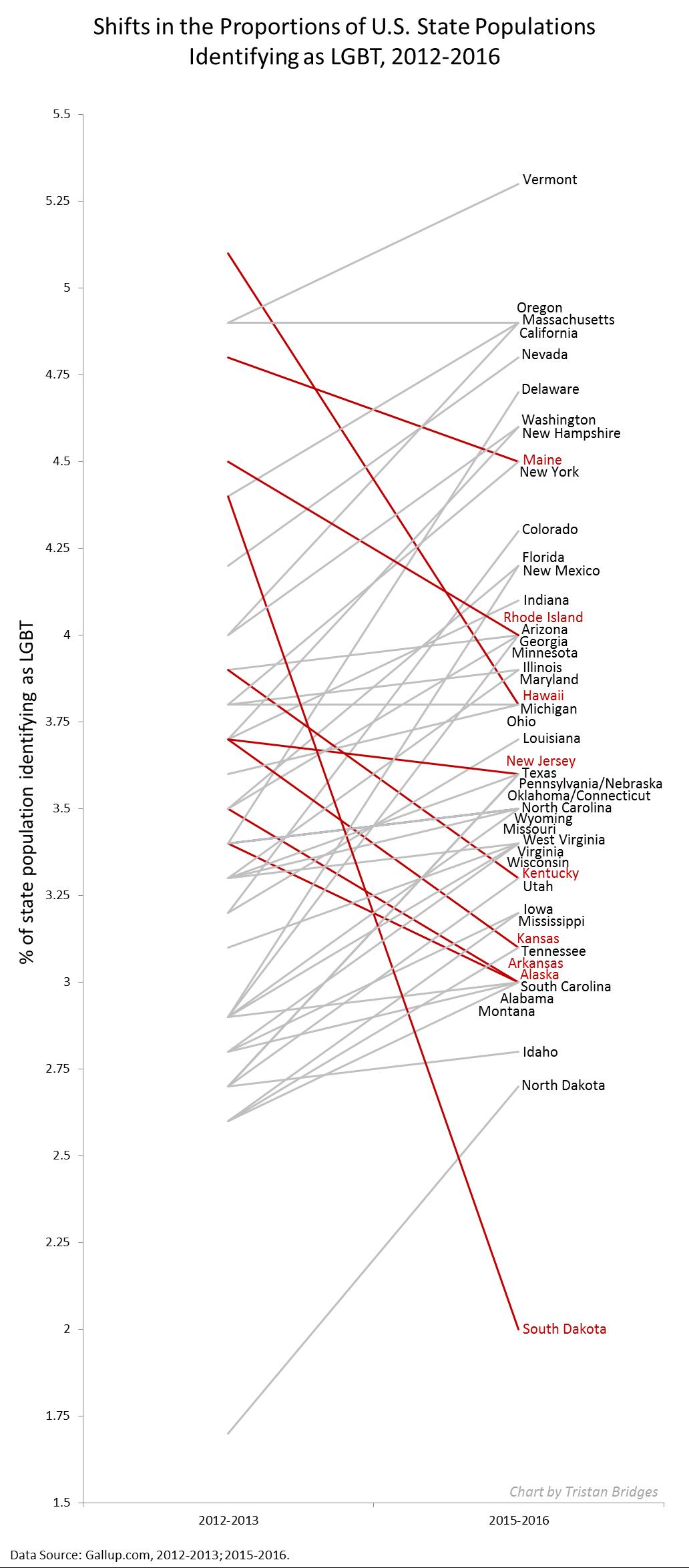
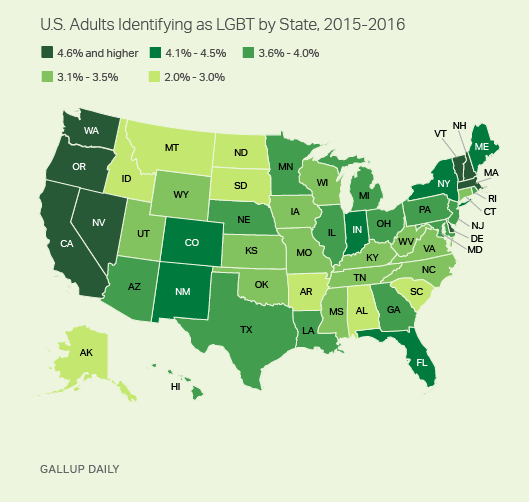 During the 2012-2013 data collection, Hawaii led U.S. states with the highest proportions of LGBT identifying persons (with 5.1% identifying as LGBT)–if we exclude Washington D.C. (with 10% identifying as LGBT). By 2016, Vermont led U.S. states with 5.3%; Hawaii dropped to 3.8%. Regardless of state rank, however, in both reports, the states are all neatly arranged with small incremental increases in the proportions of LGBT identifying persons, with one anomaly–Washington D.C. Of course, D.C. is not an anomaly; it’s just not a state. And comparing Washington D.C. with other states is about as meaningful as examining crime rate by European nation and including Vatican City. In both examples, one of these things is not like the others in a meaningful sense.
In my initial post, I suggested that the data would be much more meaningfully displayed in a different way. The reason D.C. is an outlier is that a good deal of research suggests that gender and sexual minorities are more populous in cities; they’re more likely to live in urban areas. Look at the 2015-2016 state-level data on proportion of LGBT people by the percentage of the state population living in urban areas (using 2010 Census data). The color coding reflects Census regions (click to enlarge).
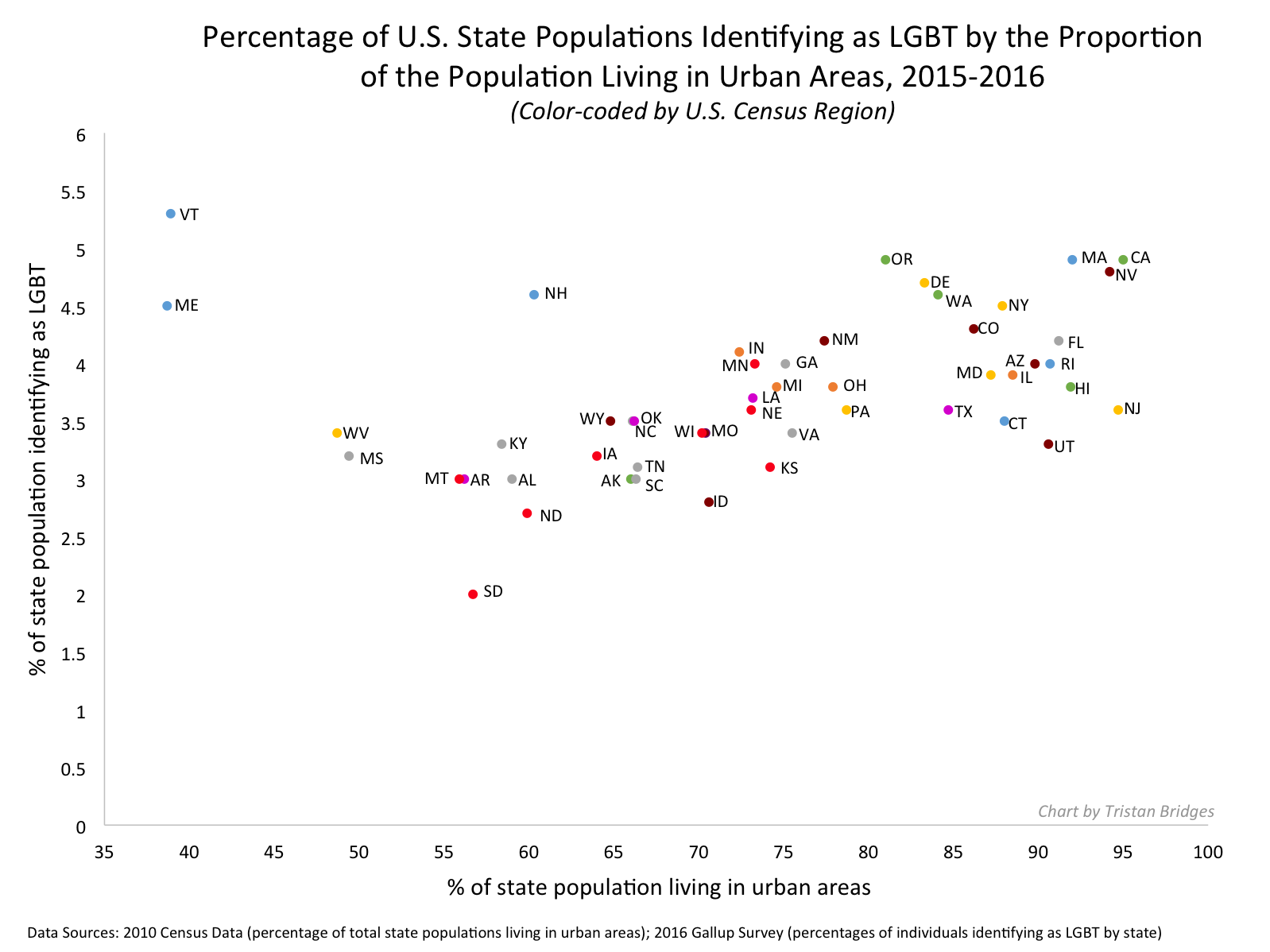 Vermont is still a state worth mentioning in the report as it bucks the trend in an impressive way (as do Maine and New Hampshire). But I’d bet you a pint of Cherry Garcia and a Magic Hat #9 that this has more to do with Burlington than with thriving communities of LGBT folks in the towns like Middlesex, Maidstone, or Sutton.
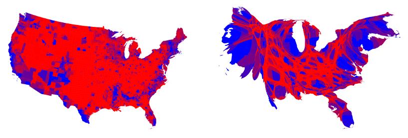
I recognize that the survey might not have a sufficient sample to enable them to say anything more specific (the 2015-2016 sample is just shy of 500,000). But, sometimes data visualizations obscure more than they reveal. And this feels like a case of that to me. In my initial post, I compared using state-level data here with maps of the U.S. after a presidential election. While the maps clearly delineate which candidate walked away with the electoral votes, they tell us nothing of the how close it was in each state, nor do they provide information about whether all parts of the state voted for the same candidates or were regionally divided. In most recent elections traditional electoral maps might leave you wondering how a Democrat ever gets elected with the sea of red blanketing much of the nation’s interior. But, if you’ve ever seen a map showing you data by county, you realize there’s a lot of blue in that red as well–those are the cities, the urban areas of the nation. Look at the results of the 2016 election by county (produced by physicist Mark Newman – here). On the left, you see county level voting data, rather that simply seeing whether a state “went red” or “went blue.” On the right, Newman uses a cartogram to alter the size of each county relative to its population density. It paints a bit of a different picture, and to some, it probably makes that state-level data seem a whole lot less meaningful.
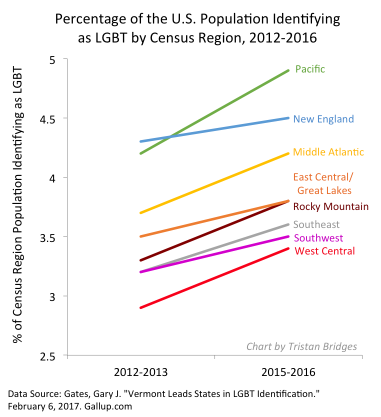
The more recent report also uses that state-level data to examine shifts in LGBT identification within Census regions as well. Perhaps not surprisingly, there are more people identifying as LGBT everywhere in the U.S. today than there were 5 years ago (at least when we ask them on surveys). But rates of identification are growing faster in some regions (like the Pacific, Middle Atlantic, and West Central) than others (like New England). Gates suggests that while this might cause some to suggest that LGBT people are migrating to different regions, data don’t suggest that LGBT people are necessarily doing that at higher rates than other groups.
 The recent shifts are largely produced by young people, Millennials in the Gallup sample. And those shifts are more pronounced in those same states most likely to go blue in elections. As Gates put it, “State-level rankings by the portion of adults identifying as LGBT clearly relate to the regional differences in LGBT social acceptance, which tend to be higher in the East and West and lower in the South and Midwest. Nevada is the only state in the top 10 that doesn’t have a coastal border. States ranked in the bottom 10 are dominated by those in the Midwest and South” (here).
When we compare waves of data collection, we can see lots of shifts in the LGBT-identifying population by state (see below; click to enlarge). While the general trend was for states to have increasing proportions of people claiming LGBT identities in 2015-2016, a collection of states do not follow that trend. And this struck me as an issue that ought to provoke some level of concern. Look at Hawaii, Rhode Island, and South Dakota, for example. These are among the biggest shifts among any of the states and they are all against the liberalizing trend Gates describes.
 Presentation of data is important. And while the report might help you realize, if you’re LGBT, that you might enjoy living in Vermont or Hawaii more than Idaho or Alabama if living around others who share your gender or sexual identity is important to you, that’s a fact that probably wouldn’t surprise many. I’d rather see maps illustrating proportions of LGBT persons by population density rather than by state. I don’t think we’d be shocked by those results either. But it seems like it would be provide a much better picture of the shifts documented by the report than state-level data allow.
Comments 19
I Dominguez-Urban — March 3, 2017
I agree that Gallup's results would be more meaningful if they used Metropolitan Statistical Areas - the Census equivalent of cities. There is however another significant problem with these Gallup findings, and that is the small sample size. According to Gallup, "The margin of error for each region varies from ±0.1 to ±0.4 percentage points at the 95% confidence level and varies among states from ±0.2 to ±1.6 percentage points, depending on sample size." As a result of that, very small differences between regions and even 0.4 to 3.2% differences between states could just be a result of sampling error.
Therefore, conclusions need to be taken with a grain of salt.
Thunder Wolf — November 19, 2024
The question of “Where do LGBT people in the U.S. live?” is both fascinating and significant. Tracking the distribution of gender and sexual minorities across states helps identify where resources and support systems are most needed. The work of Gary J. Gates and Frank Newport, leveraging Gallup data, was groundbreaking, but there’s room for improvement in how such data is visualized and interpreted. Beyond raw percentages by state, a deeper look into community dynamics, policy environments, and access to services could provide a fuller picture. On a lighter note, while diving into this, consider taking a break with Cricfy TV for iPad —it’s a great app to stay entertained!
Jennifer Thomas — June 25, 2025
It is good, and we can learn how we are dealing with it. While using these updates, I got the solutions here tophandymangoldcoast.com.au as it provides great results to us.
Zoya — May 5, 2026
Managing your Concora Credit Card account is a seamless process, allowing you to easily access and monitor your finances ConcoraCard
Sammy McCray — June 10, 2026
The game Basketball Stars has realistic movements and stunning visuals. An immersive experience is enhanced by the court designs, ball mechanics, and character movements.
basketball stars
Ferran Torrs — August 11, 2026
LGBT people live throughout the United States, with larger communities often found in major cities and urban areas. However shipment tracker supports reliable delivery monitoring through integrated courier tracking systems. Shipment history helps verify package movement efficiently.
Grace — September 4, 2026
This article highlights how demographic data can reveal important patterns about where LGBT populations live and how those patterns change over time. It also shows why clear and detailed data visualization is important when interpreting population trends. teen patti world combines immersive gameplay, reliable performance, and updated features for mobile users.
Olivia Jack — September 5, 2026
This article highlights how demographic data can reveal important patterns in where LGBT populations live across the United States. It also makes a strong case for using detailed and meaningful data visualizations when presenting population trends.Choosing an earning app usually comes down to withdrawal speed, minimum deposit size, and how transparent the bonus terms are. Reading reviews before depositing helps players avoid platforms with slow payouts.
Marry Jack — September 6, 2026
This article highlights how demographic data can help us understand where LGBT communities are located and where resources may be needed. Using clear data visualization can make these population patterns easier to understand and discuss.Updating the 3 patti blue online apk regularly keeps performance smooth and access to the newest game additions available. Skipping updates for long periods sometimes causes compatibility issues with newer servers.
Mia Zoe — September 6, 2026
Demographic data can provide valuable insight into where LGBT communities are located and where resources may be needed. Clear research and data visualization can help make these population patterns easier to understand and discuss. 345come searches sometimes surface unrelated content mixed in with genuine 345Win guides and reviews. Cross referencing multiple pages helps separate reliable information from unrelated results.
Zaf David — September 6, 2026
This article shows how demographic data can help us understand where LGBT communities are located and how those patterns may change over time. Presenting the information clearly through maps and data visualization can make these population trends easier to understand.The cd44 game carries a file size small enough to fit on phones with limited storage space. Installation typically finishes within a minute on a stable connection.
Diffense12 — September 11, 2026
Beğendiğin içeriği hemen Pinterest video indir aracıyla tek tıkla telefonuna kaydet. Bağlantıyı yapıştır, formatı seç ve birkaç saniye içinde dosyan hazır olsun. pinterest video indir
Edward Steves — September 11, 2026
This article offers an interesting look at geographic patterns and how communities are distributed across the United States. A game that runs smoothly on budget phones without overheating or draining battery deserves more recognition. Performance matters just as much as gameplay when you are playing for hours.
Damon Lucas — September 11, 2026
A thoughtful topic that gives readers an opportunity to explore demographic patterns and regional differences in the U.S. Games marketed toward beginners usually emphasize a simple interface and short tutorials over complex rule sets. That approach helps new players start without feeling overwhelmed.
Michael Devis — September 11, 2026
Interesting discussion—data visualization can really influence how we understand demographic patterns and communities. ok222 download Complete your OK222 download in under two minutes and claim your welcome bonus the moment registration finishes. Free credits let you explore the entire game library before investing your own money.
Mia Zoe — September 15, 2026
The article shows how demographic data and thoughtful visualization can improve our understanding of population patterns and resource needs.Play at real money tables designed for serious players chasing real rewards. Entry limits suit both beginners and high rollers.
Zaf David — September 15, 2026
The article demonstrates how demographic data can reveal population patterns and help researchers better understand where communities are concentrated.
Complete your Y333 game download in under two minutes using our verified step by step guide for Android devices. The latest version includes slots, aviator, live dealer rooms, and card tables all unlocked.
Olivia Jack — September 16, 2026
The discussion shows how demographic research and data visualization can help reveal patterns in where LGBT populations are located across the United States.
New players get guided tutorials on every Card Rummy game explaining valid melds, scoring rules, and joker strategy clearly. Practice modes with virtual chips build skills before you wager real money at cash tables.
Download here — September 18, 2026
Excellent guide! I was looking for information about 6NNN Game, and this article answered many of my questions. Thanks for sharing.