Search results for day care

Jeff H. sent in a link to a graphic at Civil Eats that lets you see the rise in U.S. daily caloric availability between 1970 and 2008, and where the additional calories are coming from. They are based on USDA data on food available for human consumption, minus what is wasted through being thrown out, spoiling before making it to the store, etc., to approximate average daily calorie consumption. It’s a rough measure, and clearly actual consumption will vary widely, but the overall changes provide some insights into the changing U.S. diet.

Note: I sometimes used the word “consumption,” “consumed,” etc., in the post since availability is an approximation of it, but as a reader pointed out, I should have been more careful, so I’ve fixed it throughout the post.

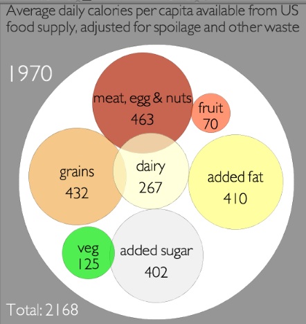
In 1970, we consumed had available an average of 2,168 calories per day, and the single largest source was meat/eggs/nuts:

By 2008, we had 2,673 calories available on average. The big jumps were in added fat — there are 231 more calories a day available per person, and it’s now the single largest source of calories — and grains. I was surprised to see how small the increase in added sugars was…and calories available from vegetables and dairy actually went down:

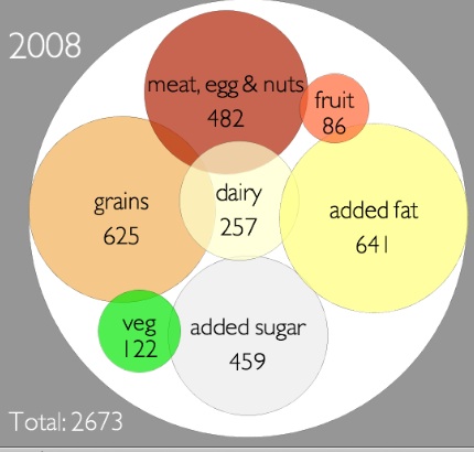
Overall, that’s an increase in available calories of 23.3% during this 38-year time frame.

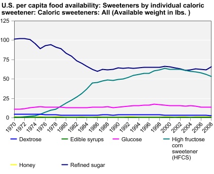
You can go to the Economic Research Service website and create charts or tables of caloric availability for specific food groups. For instance, the chart on changes in sweeteners shows the jump in use of high-fructose corn syrup, and an accompanying decrease in dextrose:

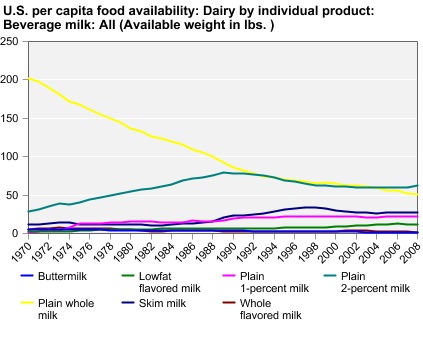
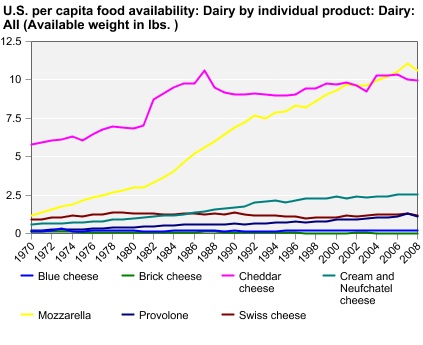
There’s a lot less whole milk than there used to be:

But we’ve grown to love mozzarella and make a lot more of it:

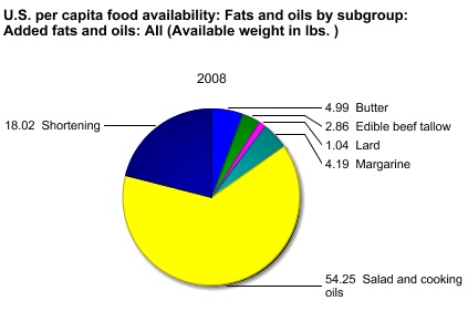
Or instead of looking at trends over time, you can get the breakdown for one particular year. Here are the sources of our added fats for 2008:

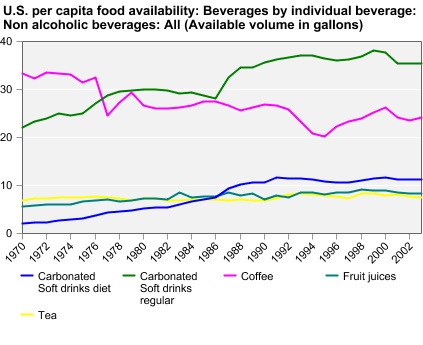
Non-alcoholic drinks (excluding milk):

I warn you, this is one of those things where it seems like you’ll just look for a second, and the next thing you know you’ve spent 45 minutes making customized charts of every possible category of food.

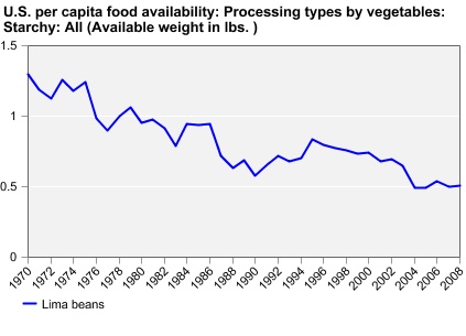
Also, we do not like lima beans:

UPDATE: Reader Chorda provides some context that I think is helpful:

The added fat looks impressive, but because fat has 9 calories per gram that increase ends up only being 25.6 grams of fat over the 1970 amount, or 0.903013 ounce. Yes, less than an ounce of fat can add 231 calories. On the other hand, the additional grains and sugar combined would be 62.51 grams of carbohydrates, or 2.20497 ounces dry weight and 250 new calories from carbohydrate sources.

Just over three ounces of food can make a difference of 481 calories. Eating that extra 3.1 ounces every day for a week is 3,367 calories. One pound of fat is equal to 3,500 calories.

Take two tablespoons of oil. Combine with three tablespoons flour and one tablespoon sugar. That is the largest difference between 1970 and 2008. Could you even get a single pancake out of that?

My great-grandma was born in 1914 and lived until 2005, so she witnessed an enormous amount of technological and cultural change during her life. I asked her once what single thing she found most impressive or was most grateful had been invented. She answered, without hesitation, “the electric washing machine.” As the mother of 7 children with a husband who did not do housework, laundry had been the bane of her existence. Getting a washing machine that had a hand-powered wringer helped, but it was still exhausting. The way she saw it, getting an electric washing machine changed her life. Her fear of ever again having to do laundry by hand with a washboard was so great that she kept the hand-crank-powered washer next to her electric one until the early 1990s, just in case.

In this TED clip, “Hans Rosling and the Magic Washing Machine,” sent in by Dmitriy T.M., Rosling discusses the ethical problems involved in efforts to combat climate change that rest primarily on telling individuals in developing nations that because we need to use less energy globally, they just can’t have the same appliances and conveniences, like electric washing machines, that those of us living in (post-) industrialized nations do:

Transcript after the jump.

more...

Feminist Frequency‘s Anita Sarkeesian has released the first of her series of short videos examining the roles women are often assigned in movies and television.  In this one she goes after the “manic pixie dream girl,” or the female side character who helps the male main character find himself, love life again, or overcome some obstacle.  This character, Sarkeeisan argues, is problematic because she “perpetuates the myth of women as caregivers at our very core”; her main role is to “‘fix’ these lonely sad men, so that they can go ‘fix the world.'”  The women themselves?  They’re too busy being adorable.

(Transcript after the jump.)

more...

Cross-posted at Racialicious.

We owe many iconic images of American Indians to photographer Edward S. Curtis. Growing up in Wisconsin and Minnesota, Curtis began photographing Indians in 1895 and, in 1906, was offered $75,000 by JP Morgan to continue documenting their lives (wikipedia).  The 1,500 resulting photographs inevitably impacted the image of Indians in the American imagination.

Later it came to light that Curtis’ photographs weren’t exactly pure representations.  In some photographs, for example, he erased signs of modernity.   The first photograph below, the un-edited version, includes a clock between the two men, whereas the edited version does not.

Curtis also sometimes staged scenes and dressed paid participants in costumes, as in this photograph:

12

According to Wikipedia contributors:

In Curtis’ picture, Oglala War-Party, the image shows 10 Oglala men wearing feather headdresses, on horseback riding down hill. The photo caption reads, “a group of Sioux warriors as they appeared in the days of inter tribal warfare, carefully making their way down a hillside in the vicinity of the enemy’s camp.”  In truth headdresses would have only been worn during special occasions and, in some tribes, only by the chief of the tribe.  The photograph was taken in 1907 when natives had been relegated onto reservations and warring between tribes had ended. Curtis paid natives to pose as warriors at a time when they lived with little dignity, rights, and freedoms.

Curtis’ photographs, then, pushed his subjects back into a false past that non-Indian Americans would misrecognize as authentic for a hundred years.

The problem of misrepresentation of groups who have little power to control their own images is a widespread one.  Shelby Lee Adams’ work was mired in controversy, with critics suggesting that he contributed to the belief that Appalachians were backward, imbred, and unintelligent.   We might apply the same critical eye to representations of marginalized peoples today, like the representation of Arabs in video games and Italian-Americans on Jersey Shore and spin-offs.

Thanks to Dolores R. and Adrienne at Native Appropriations for the post idea.

Lisa Wade, PhD is an Associate Professor at Tulane University. She is the author of American Hookup, a book about college sexual culture; a textbook about gender; and a forthcoming introductory text: Terrible Magnificent Sociology. You can follow her on Twitter and Instagram.

Kristina K. sent in a link to an interactive map at the New York Times that shows the results of Gallup’s 2010 polls of well-being. [UPDATE: Reader Danielle pointed out I forgot to provide a link to the map. Sorry! You can find it here.] Gallup surveys 1,000 people per day about a variety of indicators of well-being, including questions about physical, mental, and emotional health, various health-related behaviors, ability to access health care, access to adequate food and housing, and perceptions of their communities. Here are the overall composite scores, by congressional district (a higher score is better):


The general geographic pattern indicates a swath of relatively low well-being curving from Louisiana up through Michigan, while those in the upper Great Plains and the inter-mountain West are doing better than average.

Percent reporting experiencing a lot of stress:

Percent who have ever been told they have depression:

Of course, this may reflect differences in rates of depression, but it could also reflect differences in medical professionals’ likelihood of identifying a set of symptoms as depression and bringing it up with a patient. For example, we see significant differences by state in the frequency of Caesarean sections among pregnant women.

Percent of people who smoke:

Percent reporting an inability to buy sufficient food:

The Gallup page on well-being presents more data. Here is a map of 2009 overall well-being that is a bit easier to read since it’s presented by state rather than congressional district:

Hawaii had the highest overall score, at 70.2; West Virginia had the lowest, 60.5. If you go to their site and click on a state, you can get a breakdown of scores in each area (emotional well-being, physical health, healthy behaviors, and so on).

Finally, the NYT provides some demographic information on who was most likely to have said they spent a lot of the previous day laughing or smiling vs. being sad:

The sexual assault of CBS reporter Lara Logan in Tahrir Square last week has resulted in two predictable, but utterly depressing types of commentary.

Muslims are backwards

On the one hand are the anti-Islam culture warriors, eager to find in this incident proof of how degenerate Muslims (and Arabs) are. This, despite the fact that there’s no proof the assailants were Muslims, nor that they had any connection to the overwhelmingly peaceful and harassment-free demonstrations. In fact, there’s reason to believe that Logan’s attackers may have been pro-Mubarak thugs or apolitical opportunists. The right wing response to this story was inevitable, but liberal response was also problematic. Film critic and outspoken liberal Roger Ebert tweeted this today:

“The attack on Lara Logan brings Middle East attitudes toward women into sad focus.”

Oy.

I’d like to call Roger Ebert’s attention to the case of Roman Polanski, who has enjoyed a long and celebrated movie career, in spite of his status as a fugitive child rapist. When Polanski was arrested in September of 2009, while attempting to accept an award at a film festival in Switzerland, supporters circulated a petition on his behalf. Over a hundred people in the film industry signed that petition which gratuitously called Polanski’s crime “a case of morals.” Some weeks later, Gore Vidal went so far as to smear Polanski’s 13 year old victim as “a young hooker.”

Has Ebert ever decried the Polanski case for the way it “brings Hollywood’s attitudes towards women into sad focus?” Has he ever criticized Polanski, Vidal, David Lynch, Wong Kar Wai, Harvey Weinstein or any of the dozens of cinematic luminaries who signed off on this petition? Nope. On the contrary, he gave a big thumbs up to a documentary which argued Polanski should be given a pass for his crime.

I hardly expected Russ Meyers’ former writing pal to be an exemplar of feminist discourse, but his tweet yesterday was especially myopic. Does he really believe that the West is so much more enlightened about rape and sexual violence than those primitive, backwards Middle Easterners?

The opportunistic use of feminism is a common feature of the “liberal” discourse in the culture war against Islam. Just look at how Ayaan Hirsi Ali is trotted out by the media (especially Bill Maher and Steven Colbert) to justify imperialist wars and burqa bans, all in the name of protecting Arab and Muslim women from their own cultures. Meanwhile, many of these same commentators ignore the fact that rape and misogyny are also endemic to our own culture. (And that includes our movies, Roger.)

Rape is sexy

The other type of response to Logan’s assault was the usual victim blaming, made extra creepy by the focus on Logan’s good looks and alleged sexual history. The worst offender was LA Weekly blogger Simone Wilson, who, in an extraordinarily trashy piece of writing had this to say:

Logan was in Tahrir Square with her “60 Minutes” news team when Mubarak’s announcement broke. Then, in a rush of frenzied excitement, some Egyptian protesters apparently consummated their newfound independence by sexually assaulting the blonde reporter.

Wilson conflates the historic Egyptian revolution with gang rape. Classy stuff. But she’s not through. In addition to “blonde reporter” we’re also treated to these descriptors of Logan:

“it girl”
“firecracker”
“shocking good looks”
“Hollywood good looks”
“gutsy stunner”
“homewrecker”
(this courtesy of a NY Post article from 2008)

As has already been noted, focusing on a sexual assault victim’s good looks and allegedly dubious sexual character amounts to victim blaming. But it also does something even more insidious. It makes rape sexy.

This is par for the course at the LA Weekly, where almost anything can be sexed up. LA Weekly‘s cover art department in the last couple of years has managed to make nearly every topic sexy, from murder to toxic mold and overpopulation.

Murder is sexy:

Toxic mold is sexy:

Overpopulation is sexy:

Rarely do the sexy women adorning the covers of the LA Weekly figure as the subjects of these stories. They’re splayed on the cover to boost circulation, because sex sells and, after all, “what’s wrong with being sexy?” (This isn’t even to mention the content of the Weekly– its abundance of ads for plastic surgery, or its routine back page ads from American Apparel– subjects for a longer post.)

Given this particular aesthetic, it is not at all surprising that an LA Weekly blogger would choose to play up the sexy side of the Logan assault story, taking extra pains to emphasize her “Hollywood good looks.” Even an “alternative” newspaper upholds the local value system. Arab Muslim rapists are bad. Sexy women make great victims. And cinematic geniuses should get a pass.

UPDATE, after the jump:

more...

Cross-posted at Ms.

Kelly V. suggested that I check out the book Traffic: Why We Drive the Way We Do (and What It Says about Us), by Tom Vanderbilt. The book is fascinating, covering everything from individual-level psychological and perceptual factors that affect our driving to system-level issues like why building additional roads often simply creates more traffic rather than alleviating it.

Among other things, it turns out that there are clear gender patterns in our driving; in particular, women do more driving as part of their family responsibilities. As Alan Pisarski, a traffic policy consultant, explains,

If you look at trip rates by male versus female, and look at that by size of family…the women’s trip rates vary tremendously by size of family. Men’s trip rates look as if they didn’t even know they had a family. The men’s trip rates are almost independent of family size. What it obviously says is that the mother’s the one doing all the hauling. (p. 135)

Nancy McGuckin and Yukiko Nakamoto looked at “trip chaining,” or making short stops on the way to or from work. They report that women tend to work closer to home (measured “as the crow flies,” or the great circle distance — GCD) than men in the same occupational categories (McGuckin and Nakamoto, p. 51)):

Research suggests a couple of possibilities for this pattern. Women, taking into account their family responsibilities, may look for closer jobs than men do so it will be easier to balance work and home life. It may also be that the types of jobs women are more likely to hold are more decentralized than men’s jobs and so more likely to be found closer to residential neighborhoods (although the graph above is broken down by occupational category, we see significant gender segregation in jobs within those broad categories).

Overall, men drive more total miles, and spend more time driving, per day, but women make more trips, particularly once they have children (p. 51):


Women are more likely to engage in trip chaining, and men and women differ in the types of stops they make. Men and women both stop to grab meals or coffee for themselves (in fact, the increase in these types of stops by men is so striking it earned a name, the “Starbucks effect”). However, more of the stops women make are to “serve passengers” — that is, going somewhere only because the passenger needs to, such as dropping a child off at school or childcare — or to complete shopping or family errands (p. 54):

Overall, 2.7 million men and 4.3 million women pick up or drop off (or both) a child during their work commute, according to federal data. Among households with two working parents who commute, women make 66% of the trips for drop offs/pick ups (p. 53)

This next graph isn’t related, but I’m throwing it in as a bonus. Sirkku Laapotti found that in both 1978 and 2001, men rated their own driving skills higher, on average, than women rated theirs…but both sexes thought they were way better drivers than people in 1978 did:

[Both papers are from Research on Women’s Issues in Transportation — Report of a Conference. Volume 2: Technical Papers. Conference Proceedings 35 (2005). Washington, D.C.: Transportation Research Board. The McGuckin and Nakamoto paper, “Differences in Trip Chaining by Men and Women,” is found on p. 49-56. Laapotti’s paper, “What Are Young Female Drivers Made Of? Differences in Driving Behavior and Attitudes of Young Women and Men in Finland,” is on p. 148-154.]

Lisa and I have posted before about the way that food products are often marketed by conflating them with women’s bodies and reinforcing that the desirable female body is thin, but with the right type of curves. Non-food items are marketed this way too — for example, in one ad, Sunsilk Shampoo’s packaging underwent “a little nip, a little tuck” and came out a bit curvier.

In another perfect example of this, Mary R., Megan D., and Carey Faulkner, who is a Visiting Assistant Professor of sociology at Franklin & Marshall College, let us know about a new container from Pepsi. The new Diet Pepsi “skinny” can is, according to the company, “sassier” and a “celebration of beautiful, confident women.” The can will debut this month, in conjunction with New York’s fashion week. Reinforcing the conflation of thinness, beauty, and fashion, their chief marketing officer, Jill Beraud, said, “Our slim, attractive new can is the perfect complement to today’s most stylish looks”:

Just so we don’t miss the point, the Pepsico press release refers to the can as “attractive” three times, twice with the phrase “slim, attractive.” Because ladies, never, ever forget: thin = beautiful. Always.

Pepsi has also partnered with a number of designers for the advertising campaign, including everything from a window display by Simon Doonan to a t-shirt “inspired” by Diet Pepsi by Charlotte Ronson to giving away Diet Pepsi in the skinny can at a number of fashion boutiques in several major cities.

Don’t worry, though — CNN reports that if you prefer your soda “short and fat,” the regular cans will remain on shelves.