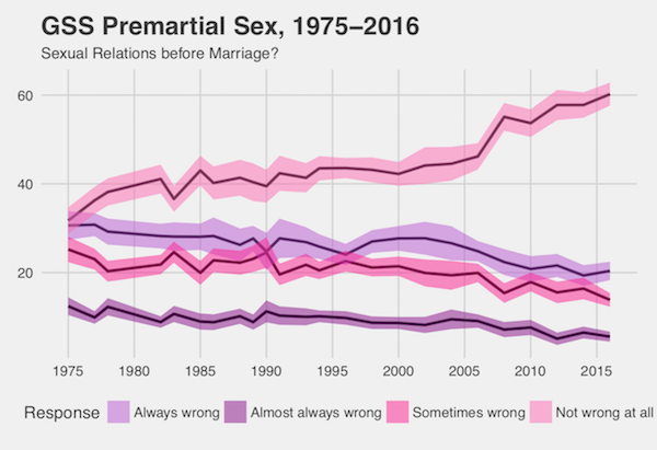
Valentine’s Day is upon us, but in a world of hookups and breakups many people are concerned about the state of romance. Where do Americans actually stand on sex and relationships? We took a look at some trends from the General Social Survey. They highlight an important point: while Americans are more accepting of things like divorce and premarital sex, that doesn’t necessarily mean that both are running rampant in society.
For example, since the mid 1970s, Americans have become much more accepting of sex before marriage. Today more than half of respondents say it isn’t wrong at all.
However, these attitudes don’t necessarily mean people are having more sex. Younger Americans today actually report having no sexual partners more frequently than people of the same age in earlier surveys.
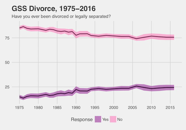
And what about marriage? Americans are more accepting of divorce now, with more saying a divorce should be easier to obtain.
But again, this doesn’t necessarily mean everyone is flying the coop. While self-reported divorce rates had been on the rise since the mid 1970s, they have largely leveled off in recent years.
It is important to remember that for core social practices like love and marriage, we are extra susceptible to moral panics when faced with social change. These trends show how changes in attitudes don’t always line up with changes in behavior, and they remind us that sometimes we can save the drama for the rom-coms.
Inspired by demographic facts you should know cold, “What’s Trending?” is a post series at Sociological Images featuring quick looks at what’s up, what’s down, and what sociologists have to say about it.
Ryan Larson is a graduate student from the Department of Sociology, University of Minnesota – Twin Cities. He studies crime, punishment, and quantitative methodology. He is a member of the Graduate Editorial Board of The Society Pages, and his work has appeared in Poetics, Contexts, and Sociological Perspectives.
Evan Stewart is a Ph.D. candidate in sociology at the University of Minnesota. You can follow him on Twitter.
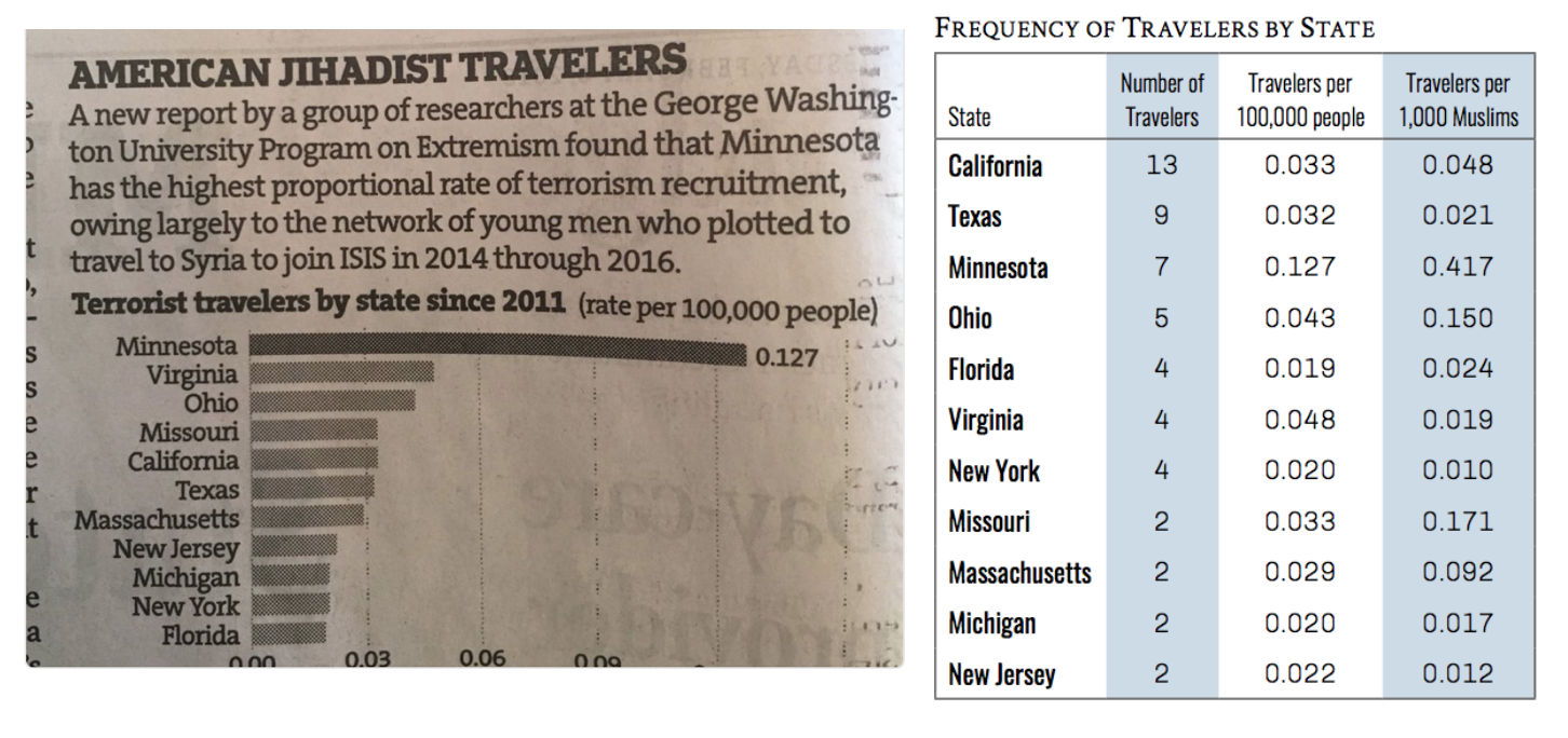
The Star Tribune recently ran an article about a new study from George Washington University tracking cases of Americans who traveled to join jihadist groups in Syria and Iraq since 2011. The print version of the article was accompanied by a graph showing that Minnesota has the highest rate of cases in the study. TSP editor Chris Uggen tweeted the graph, noting that this rate represented a whopping seven cases in the last six years.
Here is the original data from the study next to the graph that the paper published:
(Click to Enlarge)
Social scientists often focus on rates when reporting events, because it make cases easier to compare. If one county has 300 cases of the flu, and another has 30,000, you wouldn’t panic about an epidemic in the second county if it had a city with many more people. But relying on rates to describe extremely rare cases can be misleading.
For example, the data show this graph misses some key information. California and Texas had more individual cases than Minnesota, but their large populations hide this difference in the rates. Sorting by rates here makes Minnesota look a lot worse than other states, while the number of cases is not dramatically different.
As far as I can tell, this chart only appeared in the print newspaper photographed above and not on the online story. If so, this chart only went to print audiences. Today we hear a lot of concern about the impact of “filter bubbles,” especially online, and the spread of misleading information. What concerns me most about this graph is how it shows the potential impact of offline filter bubbles in local communities, too.
Evan Stewart is an assistant professor of sociology at University of Massachusetts Boston. You can follow his work at his website, or on BlueSky.
Recent reports indicated that FEMA was cutting—and then not cutting—hurricane relief aid to Puerto Rico. When Donald Trump recently slandered Puerto Ricans as lazy and too dependent on aid after Hurricane Maria, Fox News host Tucker Carlson stated that Trump’s criticism could not be racist because “Puerto Rico is 75 percent white, according to the U.S. Census.”
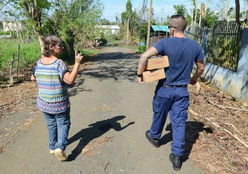
Photo Credit: Coast Guard News, Flickr CC
This statement presents racism as a false choice between nonwhite people who experience racism and white people who don’t. It ignores the fact that someone can be classed as white by one organization but treated as non-white by another, due to the way ‘race’ is socially constructed across time, regions and social contexts.
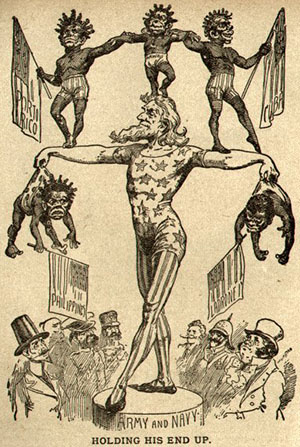
Whiteness for Puerto Ricans is a contradiction. Racial labels that developed in Puerto Rico were much more fluid than on the U.S. mainland, with at least twenty categories. But the island came under U.S. rule at the height of American nativism and biological racism, which relied on a dichotomy between a privileged white race and a stigmatized black one that was designed to protect the privileges of slavery and segregation. So the U.S. portrayed the islanders with racist caricatures in cartoons like this one:
Clara Rodriguez has shown how Puerto Ricans who migrated to the mainland had to conform to this white-black duality that bore no relation to their self-identifications. The Census only gave two options, white or non-white, so respondents who would have identified themselves as “indio, moreno, mulato, prieto, jabao, and the most common term, trigueño (literally, ‘wheat-colored’)” chose white by default, simply to avoid the disadvantage and stigma of being seen as black bodied.
Choosing the white option did not protect Puerto Ricans from discrimination. Those who came to the mainland to work in agriculture found themselves cast as ‘alien labor’ despite their US citizenship. When the federal government gave loans to white home buyers after 1945, Puerto Ricans were usually excluded on zonal grounds, being subjected to ‘redlining’ alongside African Americans. Redlining was also found to be operating on Puerto Rico itself in the insurance market as late as 1998, suggesting it may have even contributed to the destitution faced by islanders after natural disasters.
The racist treatment of Puerto Ricans shows how it is possible to “be white” without white privilege. There have been historical advantages in being “not black” and “not Mexican”, but they have not included the freedom to seek employment, housing and insurance without fear of exclusion or disadvantage. When a hurricane strikes, Puerto Rico finds itself closer to New Orleans than to Florida.
Jonathan Harrison, PhD, is an adjunct Professor in Sociology at Florida Gulf Coast University, Florida SouthWestern State College and Hodges University whose PhD was in the field of racism and antisemitism.
That large (and largely trademarked) sporting event is this weekend. In honor of its reputation for massive advertising, Lisa Wade tipped me off about this interesting content analysis of last year’s event by the Media Education Foundation.
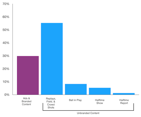
MEF watched last year’s big game and tallied just how much time was devoted to playing and how much was devoted to ads and other branded content during the game. According to their data, the ball was only in play “for a mere 18 minutes and 43 seconds, or roughly 8% of the entire broadcast.”
MEF used a pie chart to illustrate their findings, but readers can get better information from comparing different heights instead of different angles. Using their data, I quickly made this chart to more easily compare branded and non-branded content.
Data Source: Media Education Foundation, 2018
One surprising thing that jumps out of this data is that, for all the hubbub about commercials, far and away the most time is devoted to replays, shots of the crowd, and shots of the field without the ball in play. We know “the big game” is a big sell, but it is interesting to see how the thing it sells the most is the spectacle of the event itself.
Evan Stewart is an assistant professor of sociology at University of Massachusetts Boston. You can follow his work at his website, or on BlueSky.
In the United States we tend to think children develop sexuality in adolescence, but new research by Heidi Gansen shows that children learn the rules and beliefs associated with romantic relationships and sexuality much earlier.
Gansen spent over 400 hours in nine different classrooms in three Michigan preschools. She observed behavior from teachers and students during daytime classroom hours and concluded that children learn — via teachers’ practices — that heterosexual relationships are normal and that boys and girls have very different roles to play in them.
In some classrooms, teachers actively encouraged “crushes” and kissing between boys and girls. Teachers assumed that any form of affection between opposite gender children was romantically-motivated and these teachers talked about the children as if they were in a romantic relationship, calling them “boyfriend/girlfriend.” On the other hand, the same teachers interpreted affection between children of the same gender as friendly, but not romantic. Children reproduced these beliefs when they played “house” in these classrooms. Rarely did children ever suggest that girls played the role of “dad” or boys played the role of “mom.” If they did, other children would propose a character they deemed more gender-appropriate like a sibling or a cousin.
Preschoolers also learned that boys have power over girls’ bodies in the classroom. In one case, teachers witnessed a boy kiss a girl on the cheek without permission. While teachers in some schools enforced what the author calls “kissing consent” rules, the teachers in this school interpreted the kiss as “sweet” and as the result of a harmless crush. Teachers also did not police boys’ sexual behaviors as actively as girls’ behaviors. For instance, when girls pulled their pants down teachers disciplined them, while teachers often ignored the same behavior from boys. Thus, children learned that rules for romance also differ by gender.
Allison Nobles is a PhD candidate in sociology at the University of Minnesota and Graduate Editor at The Society Pages. Her research primarily focuses on sexuality and gender, and their intersections with race, immigration, and law.
In a tainted Halloween candy study, Best and Horiuchi followed up on media accounts to confirm cases of actual poisoning or serious injury, and they found many cases couldn’t be confirmed or were greatly exaggerated. So, I followed the data on detergent digestion.
It turns out, there is a small trend. According to a report from the American Association of Poison Control Centers,
…in 2016 and 2017, poison control centers handled thirty-nine and fifty-three cases of intentional exposures, respectively, among thirteen to nineteen year olds. In the first fifteen days of 2018 alone, centers have already handled thirty-nine such intentional cases among the same age demographic.
That said, this trend is only relative to previous years and cannot predict future incidents. The life cycle of internet jokes is fairly short, rotating quickly with an eye toward the attention economy. It wouldn’t be too surprising if people moved on from the pods long before the panic dies out.
Evan Stewart is an assistant professor of sociology at University of Massachusetts Boston. You can follow his work at his website, or on BlueSky.
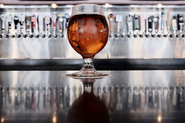
The rise of craft beer in the United States gives us more options than ever at happy hour. Choices in beer are closely tied to social class, and the market often veers into the world of pointlessly gendered products. Classic work in sociology has long studied how people use different cultural tastes to signal social status, but where once very particular tastes showed membership in the upper class—like a preference for fine wine and classical music—a world with more options offers status to people who consume a little bit of everything.
Photo Credit: Brian Gonzalez (Flickr CC)
But who gets to be an omnivore in the beer world? New research published in Social Currents by Helana Darwin shows how the new culture of craft beer still leans on old assumptions about gender and social status. In 2014, Darwin collected posts using gendered language from fifty beer blogs. She then visited four craft beer bars around New York City, surveying 93 patrons about the kinds of beer they would expect men and women to consume. Together, the results confirmed that customers tend to define “feminine” beer as light and fruity and “masculine” beer as strong, heavy, and darker.
Two interesting findings about what people do with these assumptions stand out. First, patrons admired women who drank masculine beer, but looked down on those who stuck to the feminine choices. Men, however, could have it both ways. Patrons described their choice to drink feminine beer as open-mindedness—the mark of a beer geek who could enjoy everything. Gender determined who got “credit” for having a broad range of taste.
Second, just like other exclusive markers of social status, the India Pale Ale held a hallowed place in craft brew culture to signify a select group of drinkers. Just like fancy wine, Darwin writes,
IPA constitutes an elite preference precisely because it is an acquired taste…inaccessible to those who lack the time, money, and desire to cultivate an appreciation for the taste.
Sociology can get a bad rap for being a buzzkill, and, if you’re going to partake, you should drink whatever you like. But this research provides an important look at how we build big assumptions about people into judgments about the smallest choices.
Evan Stewart is an assistant professor of sociology at University of Massachusetts Boston. You can follow his work at his website, or on BlueSky.
During a year marked by social and political turmoil, the media has found itself under scrutiny from politicians, academics, the general public, and increasingly self-reflexive journalists and editors. Fake news has entered our lexicon both as a form of political meddling from foreign powers and a dismissive insult directed towards any less-than-complimentary news coverage of the current administration.
Paying attention to where people are getting their news and what that news is telling them is an important step to understanding our increasingly polarized society and our seeming inability to talk across political divides. The insight can also help us get at those important and oh-too common questions of “how could they think that?!?” or “how could they support that politician?!?”
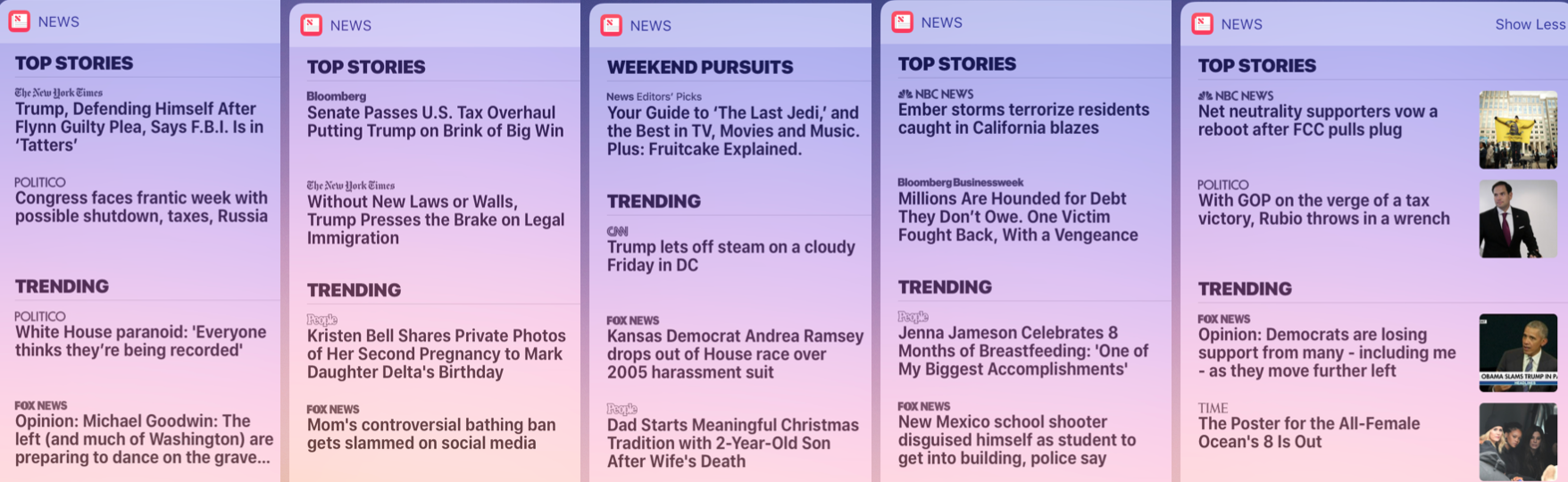
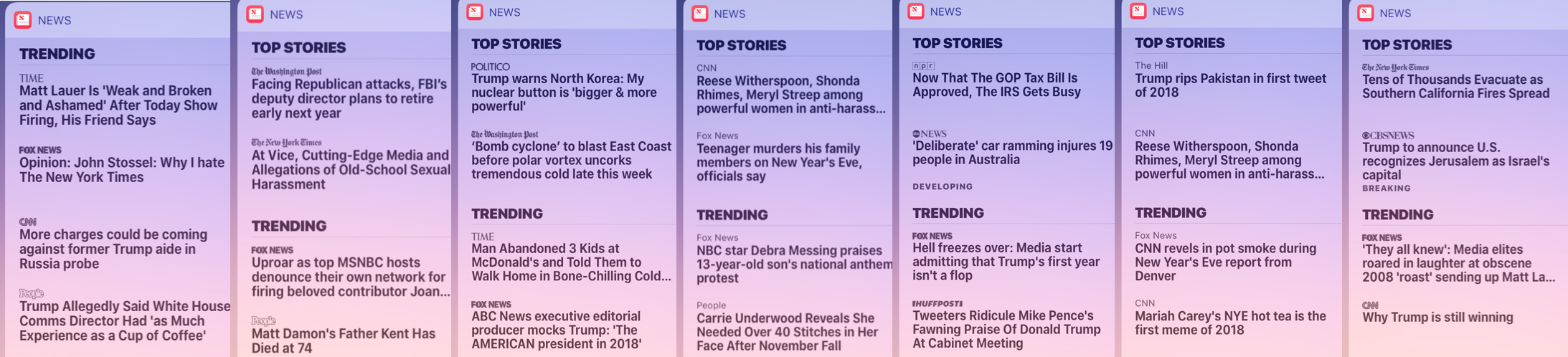
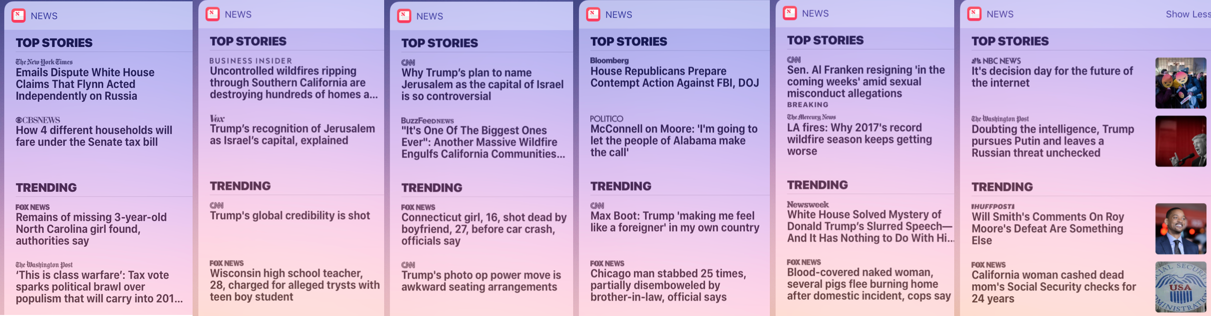
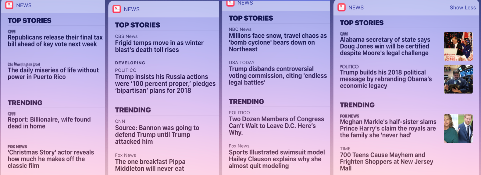
My interest in this topic was sparked a few months ago when I began paying attention to the top four stories and single video that magically appear whenever I swipe left on my iPhone. The stories compiled by the Apple News App provide a snapshot of what the dominant media sources consider the newsworthy happenings of the day. After paying an almost obsessive attention to my newsfeed for a few weeks—and increasingly annoying my friends and colleagues by telling them about the compelling patterns I was seeing—I started to take screenshots of the suggested news stories on a daily or twice daily basis. The images below were gathered over the past two months.
It is worth noting that the Apple News App adapts to a user’s interests to ensure that it provides “the stories you really care about.” To minimize this complicating factor I avoided clicking on any of the suggested stories and would occasionally verify that my news feed had remained neutral through comparing the stories with other iPhone users whenever possible.
Some of the differences were to be expected—People simply cannot get enough of celebrity pregnancies and royal weddings. The Washington Post, The New York Times, and CNN frequently feature stories that are critical of the current administration, and Fox News is generally supportive of President Trump and antagonistic towards enemies of the Republican Party.
(Click to Enlarge)
However, there are two trends that I would like to highlight:
1) A significant number of Fox News headlines offer direct critiques of other media sites and their coverage of key news stories. Rather than offering an alternative reading of an event or counter-coverage, the feature story undercuts the journalistic work of other news sources through highlighting errors and making accusations of partisanship motivations. In some cases, this even takes the form of attacking left-leaning celebrities as proxy to a larger movement or idea. Neither of these tactics were employed by any of the other news sources during my observation period.
(Click to Enlarge)
2) Fox News often featured coverage of vile, treacherous, or criminal acts committed by individuals as well as horrifying accidents. This type of story stood out both due to the high frequency and the juxtaposition to coverage of important political events of the time—murderous pigs next to Senate resignations and sexually predatory high school teachers next to massively destructive California wildfires. In a sense, Fox News is effectively cultivating an “asociological” imagination by shifting attention to the individual rather than larger political processes and structural changes. In addition, the repetitious coverage of the evil and devious certainly contributes to a fear-based society and confirms the general loss of morality and decline of conservative values.
(Click to Enlarge)
It is worth noting that this move away from the big stories of the day also occurs through a surprising amount of celebrity coverage.
(Click to Enlarge)
From the screen captures I have gathered over the past two months, it seems apparent that we are not just consuming different interpretations of the same event, but rather we are hearing different stories altogether. This effectively makes the conversation across political affiliation (or more importantly, news source affiliation) that much more difficult if not impossible.
I recommend taking time to look through the images that I have provided on your own. There are a number of patterns I did not discuss in this piece for the sake of brevity and even more to be discovered. And, for those of us who spend our time in the front of the classroom, the screenshot approach could provide the basis for a great teaching activity where the class collectively takes part in both the gathering of data and conducting the analysis.
Kyle Green is an Assistant Professor of Sociology at The College at Brockport, State University of New York. He is a proud TSP alumnus and the co-author /co-host of Give Methods a Chance.
About Sociological Images
Sociological Images encourages people to exercise and develop their sociological imaginations with discussions of compelling visuals that span the breadth of sociological inquiry. Read more…