Over at Bloomer Girls Blog, a site devoted to sports and gender, Lydia posted about ESPN’s online resources for the NCAA March Madness basketball tournaments. The layout of the site, and the format of the brackets, makes the women’s basketball tournament relatively invisible.
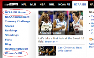
As we often see in sports, the men’s version is taken as the default. The apparently neutral “NCAA BB Home” link goes to the men’s tournament, specifically. To get information on the women’s tournament, you have to choose the “Women’s BB link” lower on the page:
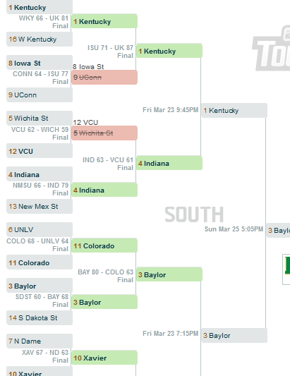
Lydia also found differences in the features available on the brackets you can fill out. The men’s bracket provides a range of features that encourage ongoing participation. While a game is occurring, the bracket is updated with the current score and how much time is left in the game, cluing potential viewers in to particularly close (and exciting) games. After a game, the final score is posted; you can also see the scheduled time of upcoming games:
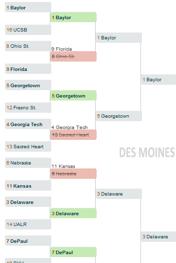
None of these features that add to the value of the bracket were integrated into the women’s brackets — no updates of the scores of games that are in progress (so no chance of drawing in viewers to a particularly exciting or intense game), no schedule to tell you when the next game is, not even the final scores of past games:
Lydia argues that by making the men’s tournament resources more engaging and informative, it reinforces the sense that the women’s tournament is a side event, not worth the same level of attention as the men’s. As she points out, ESPN probably devoted less time and energy to the women’s tournament website because they assume fewer people will sign up and use it. But by creating less engaging resources, they provide less incentive for fans to bother signing up, creating a self-fulfilling prophecy.


