Search results for census

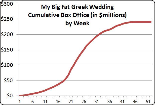
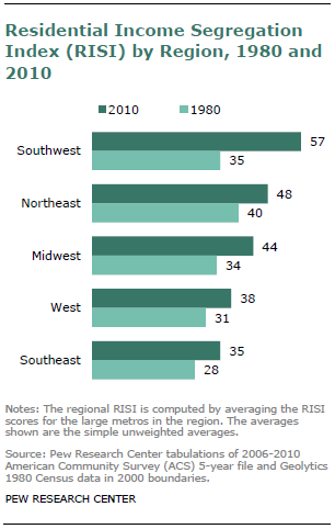
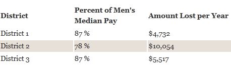
The National Partnership for Women & Families has posted an interactive map that displays the gender pay gap in each state and in the Congressional districts within the state. It uses Census Bureau data comparing full-time, year-round workers (that is, the scenario in which we’d expect women’s income to be closest to men’s). When you click on any state, it brings up information about it. For instance, in Nevada, women make 85% of what men do. Women working full-time have a median income of $35,484, while men’s median income is $41,803. The gap is smallest in the 1st and 3rd districts (both including parts of the greater Vegas metro area), but significantly larger in District 2, which covers the rest of the state, much of it rural:

Here are the 10 U.S. Congressional districts with the largest gender gap in median pay:

They don’t list the state or districts with the smallest gap. Just from casually and non-systematically clicking around, the state with the most parity that I found was in Washington D.C., where women make 90% as much as men. Let us know in the comments if you find anywhere with an even smaller gap.

Cross-posted at Family Inequality.

In 2010, 28% of wives were earning more than their husbands. And wives were 8-times as likely as their husbands to have no earnings.

I still don’t have my copies of The End of Men, by Hanna Rosin, or The Richer Sex, by Liza Mundy. But I’ve read enough of their excerpts to plan out some quick data checks.

Both Rosin and Mundy say women are rapidly becoming primary earners, breadwinners, pants-wearers, etc., in their families. It is absolutely true that the trend is in that direction. Similarly, the Earth is heading toward being devoured by the Sun, but the details are still to be worked out. As Rosin wrote in her Atlantic article:

In feminist circles, these social, political, and economic changes are always cast as a slow, arduous form of catch-up in a continuing struggle for female equality.

Which is right. So, where are we now, really, and what is the pace of change?

For the question of relative income within married-couple families, which is only one part of this picture — and an increasingly selective one — I got some Census data for 1970 to 2010 from IPUMS.

I selected married couples (called “heterogamous” throughout this post) in which the wife was in the age range 25-54, with couple income greater than $0. I added husbands’ and wives’ incomes, and calculated the percentage of the total coming from the wife. The results show and increase from 7% to 28% of couples in which the wife earns more than the husband (defined as 51% or more of the total income):

(Thanks to the NYTimes Magazine for the triumphant wife image)

Please note this is not the percentage of working wives who earn more. That would be higher — Mundy calls it 38% in 2009 — but it wouldn’t describe the state of all women, which is what you need for a global gender trend claim. This is the percentage of all wives who earn more, which is what you need to describe the state of married couples.

But this 51% cutoff is frustratingly arbitrary. No serious study of power and inequality would rest everything on one such point. Earning 51% of the couple’s earnings doesn’t make one “the breadwinner,” and doesn’t determine who “wears the pants.”

Looking at the whole distribution gives much more information. Here it is, at 10-year intervals:

These are the points that jump out at me from this graph:

  • Couples in which the wife earns 0% of the income have fallen from 46% to 19%, but they are still 8-times as common as the reverse — couples where the wife earns 100%.
  • There have been very big proportionate increases in the frequency of wives earning more — such as a tripling among those who earn 50-59% of the total, and a quadrupling among those in which the wife earns it all.
  • But the most common wife-earning-more scenario is the one in which she earns just over half the total. Looking more closely (details in a later post) shows that these are mostly in the middle-income ranges. The poorest and the richest families are most often the ones in which the wife earns 0%.

Maybe it’s just the feminist in me that brings out the stickler in these posts, but I don’t think this shows us to be very far along on the road to female-dominance.

Previous posts in this series…

  • #1 Discussed The Richer Sex excerpt in Time (finding that, in fact, the richer sex is still men).
  • #2 Discussed that statistical meme about young women earning more than young men (finding it a misleading data manipulation), and showed that the pattern is stable and 20 years old.
  • #3 Debunked the common claim that “40% of American women” are “the breadwinners” in their families.
  • #4 Debunked the description of stay-at-home dads as the “new normal,” including correcting a few errors from Rosin’s TED Talk.
  • #5 Showed how rare the families are that Rosin profiled in her excerpt from The End of Men

Scholars are busy attempting to predict the effects of climate change, including how it might harm people in some parts of the globe more than others.  A recent report by The Pacific Institute, sent in by Aneesa D., does a more fine-grained analysis, showing which Californians will be the most harmed by climate change.

They use a variety of measures for each Census tract to make a Vulnerability Index, including natural factors (like tree cover), demographic factors (like age), and economic factors (like income).  At the interactive map, you can see the details for each Census tract.  Their compiled index looks like this:

You can also see the Vulnerability Index for each measure individually.  Here is the data for the percent of people over age 65 who live alone, a variable we know increases the risk of death from heat wave.

And here’s the data for the percent of workers who labor outside:

There’s lots more data at the site, but what’s interesting here is that, even in incredibly wealthy parts of the world, climate change is going to have uneven effects.  When it does, the most vulnerable people in the more vulnerable parts of the state are going to migrate to the other parts.  Most Californians don’t imagine that their cities will be home to refugees, but this is exactly what will happen as parts of California become increasingly difficult to live in.

Lisa Wade, PhD is an Associate Professor at Tulane University. She is the author of American Hookup, a book about college sexual culture; a textbook about gender; and a forthcoming introductory text: Terrible Magnificent Sociology. You can follow her on Twitter and Instagram.

Cross-posted at Family Inequality.

It is great to acknowledge and celebrate the increase in father involvement in parenting. But it is not helpful to exaggerate the trend and link it to the myth-making about looming female dominance. Yesterday’s feature in the Sunday New York Times does just that, and reminds me that I meant to offer a quick debunking of Hanna Rosin’s TED talk.

The story is headlined “Just Wait Till Your Mother Gets Home.” The picture shows a group of dads with their kids, as if representing what one calls “the new normal.” Careful inspection of the caption reveals it is a “daddy and me” music class, so we should not be surprised to see a lot of dads with their kids.

The article also makes use of a New Yorker cover, which captures a certain gestalt — it’s a funny exaggeration — but should not be confused with an empirical description of the gender distribution of parents and playgrounds:

Naturally, the story is in the Style section, so close reading of the empirical support is perhaps a fool’s errand. However, I could not help noticing that the only two statistics in the story were either misleading or simply inaccurate. In the category of misleading, was this:

In the last decade, though, the number of men who have left the work force entirely to raise children has more than doubled, to 176,000, according to recent United States census data. Expanding that to include men who maintain freelance or part-time jobs but serve as the primary caretaker of children under 15 while their wife works, the number is around 626,000, according to calculations the census bureau compiled for this article.

The Census Bureau has for years employed a very rigid definition of stay-at-home dads, which only counts those who are out of the labor force for an entire year for reasons of “taking care of home and family.” This may seem an overly strict definition and an undercount, but if you simply counted any man with no job but with children as a stay-at-home dad, you risk counting any father who lost a job as stay-at-home. (A former student of mine, Beth Latshaw, now at Appalachian State University, has explored this issue and published her results here in the journal Fathering.)

In any event, those look like big numbers, but one should always be wary of raw numbers in the news. In fact, when you look at the trend as published by the Census Bureau, you see that the proportion of married couple families in which the father meets the stay-at-home criteria has doubled: from 0.4% in 2000 to 0.8% today. The larger estimate which includes fathers working part-time comes out to 2.8% of married couple families with children under 15. The father who used the phrase “the new normal” in the story was presumably not speaking statistically.

(Source: My calculations from Census Bureau numbers [.xls file]. Includes only married-couple families with children under age 15.)


That’s the misleading number. The inaccurate number is here:

About 40 percent of women now make more than their husbands, the bureau’s statistics show, and that may be only the beginning of a seismic power shift, if new books like “The Richer Sex: How the New Majority of Female Breadwinners Is Transforming Sex, Love, And Family,” by Liza Mundy, and “The End of Men: And the Rise of Women,” by Hanna Rosin, are to be believed.

I guess in these troubled times for the newspaper business it might be acceptable to report X and Y statistic “if so-and-so is to be believed.” But it is a shame to do so when the public is paying the salary of people who have already debunked the numbers in question. Just the other day, I wrote about that very statistic: “Really? No. I don’t know why this keeps going around.” Using freely available tables (see the post), I calculated that a reasonable estimate of the higher-earning-wife share is 21%. In fact, on this point Liza Mundy and Hanna Rosin and are not to be believed.

(Source: My graph from Census Bureau numbers.)


TED: Misinformation Frequently Spread

There is a TED talk featuring Hanna Rosin from the end of 2010, and I finally got around to watching it. Without doing a formal calculation, I would say that “most” of the statistics she uses in this talk are either wrong or misinterpreted to exaggerate the looming approach of female dominance. For example, she says that the majority of “managers” are now women, but the image on the slide which flashes by briefly refers to “managers and professionals.” Professionals includes nurses and elementary school teachers. Among managers themselves, women do represent a growing share (although not a majority, and the growth has slowed considerably), but they remain heavily segregated as I have shown here.

Rosin further reports that “young women” are earning more than “young men.” This statistic, which has been going around for a few years now, in fact refers to single, child-free women under age 30 and living in metropolitan areas. That is an interesting statistic, but used in this way is simply a distortion. (See this post for a more thorough discussion, with links.)

Rosin also claims that “70% of fertility clinic patients” prefer to have a female birth. In her own article in the Atlantic, Rosin reports a similar number for one (expensive, rare) method of sex selection only (with no source offered) — but of course the vast majority of fertility clinic patients are not using sex selection techniques. In fact, in her own article she writes, “Polling data on American sex preference is sparse, and does not show a clear preference for girls.”

Finally, I don’t think I need to offer statistics to address such claims as women are “taking control of everything”and “starting to dominate” among “doctors, lawyers, bankers, accountants.” These are just made up. Congress is 17% female.

Philip N. Cohen is a professor of sociology at the University of Maryland, College Park, and writes the blog Family Inequality. You can follow him on Twitter or Facebook.

Cross-posted at Montclair SocioBlog.

Isabella was the second most popular name for baby girls last year.  She had been number one for two years but was edged out by Sohpia.  Twenty-five years ago Isabella was not in the top thousand.

How does popularity happen?  Gabriel Rossman’s new book Climbing the Charts: What Radio Airplay Tells Us about the Diffusion of Innovation offers two models.*   People’s decisions — what to name the baby, what songs to put on your station’s playlist (if you’re a programmer), what movie to go see, what style of pants to buy —  can be affected by others in the same position.  Popularity can spread seemingly on its own, affected only by the consumers themselves communicating with one another person-to-person by word of mouth.  But our decisions can also be influenced by people outside those consumer networks – the corporations or people produce and promote the stuff they want us to pay attention to.

These outside “exogenous” forces tend to exert themselves suddenly, as when a movie studio releases its big movie on a specified date, often after a big advertising campaign.  The film does huge business in its opening week or two but adds much smaller amounts to its total box office receipts in the following weeks.   The graph of this kind of popularity is a concave curve.  Here, for example, is the first  “Twilight” movie.

Most movies are like that, but not all.  A few build their popularity by word of mouth.  The studio may do some advertising, but only after the film shows signs of having legs (“The surprise hit of the year!”).  The flow of information about the film is mostly from viewer to viewer, not from the outside.

This diffusion path is “endogenous”; it branches out among the people who are making the choices.  The rise in popularity starts slowly – person #1 tells a few friends, then each of those people tells a few friends.  As a proportion of the entire population, each person has a relatively small number of friends.  But at some point, the growth can accelerate rapidly.  Suppose each person has five friends.  At the first stage, only six people are involved (1 + 5); stage two adds another 25, and stage three another 125, and so on.  The movie “catches on.”

The endogenous process is like contagion, which is why the term “viral” is so appropriate for what can happen on the Internet with videos or viruses.   The graph of endogenous popularity growth has a different shape, an S-curve, like this one for “My Big Fat Greek Wedding.”

By looking at the shape of a curve, tracing how rapidly an idea or behavior spreads, you can make a much better guess as to whether you’re seeing exogenous or endogenous forces.  (I’ve thought that the title of Gabriel’s book might equally be Charting the Climb: What Graphs of Diffusion Tell Us About Who’s Picking the Hits.)

But what about names, names like Isabella?  With consumer items  – movies, songs, clothing, etc. – the manufacturers and sellers, for reasons of self-interest, try hard to exert their exogenous influence on our decisions.  Nobody makes money from baby names, but even those can be subject to exogenous effects, though the outside influence is usually unintentional and brings no economic benefit.  For example, from 1931 to 1933, the first name Roosevelt jumped more than 100 places in rank.

When the Census Bureau announced that the top names for 2011 were Jacob and Isabella, some people suspected the influence of an exogenous factor — “Twilight.”

I’ve made the same assumption in saying (here) that the popularity of Madison as a girl’s name — almost unknown till the mid-1980s but in the top ten for the last 15 years — has a similar cause: the movie “Splash” (an idea first suggested to me by my brother).  I speculated that the teenage girls who saw the film in 1985 remembered Madison a few years later when they started having babies.

Are these estimates of movie influence correct? We can make a better guess at the impact of the movies (and, in the case of Twilight, books) by looking at the shape of the graphs for the names.

Isabella was on the rise well before Twilight, and the gradual slope of the curve certainly suggests an endogenous contagion.  It’s possible that Isabella’s popularity was about to level off  but then got a boost in 2005 with the first book.  And it’s possible the same thing happened in 2008 with the first movie. I doubt it, but there is no way to tell.

The curve for Madison seems a bit steeper, and it does begin just after “Splash,” which opened in 1984.   Because of the scale of the graph, it’s hard to see the proportionately large changes in the early years.  There were zero Madisons in 1983, fewer than 50 the next year, but nearly 300 in 1985.  And more than double that the next year.  Still, the curve is not concave.  So it seems that while an exogenous force was responsible for Madison first emerging from the depths, her popularity then followed the endogenous pattern.  More and more people heard the name and thought it was cool.  Even so, her rise is slightly steeper than Isabella’s, as you can see in this graph with Madison moved by six years so as to match up with Isabella.

Maybe the droplets of “Splash” were touching new parents even years after the movie had left the theaters.

————————

* Gabriel posted a short version about these processes when he pinch hit for Megan McCardle at the Atlantic (here).

When we talk about residential segregation, we’re generally focusing on race, and for good reason — many cities in the U.S. still have incredibly high rates of racial segregation. However, a recent Pew Research Center report looks at economic segregation, which is increasing in U.S. neighborhoods.

Economic segregation refers to the degree to which people in different social classes live mostly among other people of their class. In 2010, the majority (76%) of people in the U.S. lived in middle-class or mixed-income neighborhoods. But economic segregation has increased in the last few decades. More of both lower-income and upper-income households live in Census tracts made up of households primarily like themselves:

The RISI index for a city just combines the % of both groups that live in tracts dominated by their own income group (so the maximum score is 200). Looking at RISI scores by region, we see that the Southwest has the most economic segregation, and has increased more than any other region in the past 30 years:

The Pew report argues that this is related to the general increase in income inequality, with less than half of the U.S. population falling into the middle class by 2010, and the upper class (here defined as those making more than $104,000) increasing:

Economic segregation is still a less prominent feature of cities than racial segregation is. But given its steady increase, it’s worth thinking about the consequences of the relative isolation of different social classes from one another. When the rich, poor, and middle-income groups live in different parts of town, who will have the political influence to draw municipal spending to their neighborhoods? How will this growing residential pattern affect who has access to nice parks, public facilities such as libraries and recreation centers, and maintenance for schools and roads — or, alternatively, whose neighborhoods become the location for generally undesirable or unpleasant industries or land uses?

The U.S. Census Bureau recently posted some visualizations of data related to urbanization and the distribution of the U.S. population. One shows changes in the regional distribution of the population from 1790 to 2010. I can’t embed it, but I took a couple of screencaps, but it’s much more striking to watch it and see when various trends (say, the surge of population in the Midwest in the late 1800s) first appear, so I’d go check it out at the Census site.

In 1850, the South and Northeast had about equal portions of the population, and the West was just barely in the picture (I presume the 1850 Census data excludes Native Americans living in the West; if anyone is certain, let us know in the comments):

By 2010, we see a smaller percent of the population living in the Northeast, which has been overtaken by the West (though the Northeast is also the smallest of the four geographic areas, so it’s still overall more densely settled than the West):

There’s also an animated graph showing urbanization in the U.S. between 1790 and 1890. Here’s 1840:

And fifty years later:

Finally, there’s a map showing all cities that have ever been in the top 20 largest cities in the U.S. since 1790. If you click on a city name, you can see

Los Angeles:

And for Dmitriy T.C., here’s New Orleans:

The Census site lets you click through for the data each visualization is based on, so there’s lots to dig through if you’re really excited about this type of thing, as I am.

Cross-posted at Family Inequality.

Lots of buzz over a New York Times article about men moving into female-dominated occupations, which reported that “more and more men are starting to see the many benefits of jobs long-dominated by women.”

The Times produced this table, which shows the fastest growing occupations for (for some reason) college-educated White men, ages 25-39:

The ones with the pink dots are 70% female or more. The increase of young college educated White men in these occupations over 10 years appears striking, but the numbers are small. For example, compare that increase of (round numbers) 10,000 young White male registered nurses to the 1,900,000 full-time year-round nurses there were in 2010.

Moreover, consider that increase of 10,000 nurses in light of the overall growth of registered nurses from 2000 to 2010: about 500,000. Overall, the representation of men among full-time year-round registered nurses increased from 9.4% to 10.3% during the decade.

The Times article attempts to describe a broad trend of men moving into “pink-collar” jobs:

The trend began well before the crash, and appears to be driven by a variety of factors, including financial concerns, quality-of-life issues and a gradual erosion of gender stereotypes. An analysis of census data by The New York Times shows that from 2000 to 2010, occupations that are more than 70 percent female accounted for almost a third of all job growth for men, double the share of the previous decade.

Bold claims. But check the next sentence: “That does not mean that men are displacing women — those same occupations accounted for almost two-thirds of women’s job growth.” So, lots more men are in these jobs, but even more women are? How does that reflect an “erosion of gender stereotypes”? It seems like it reflects an increase in the size of female-dominated occupations.

In fact, as I reported briefly before, occupational gender segregation dropped barely a hair in the 2000s, from 51 to 50 on a scale of 0 to 100, compared with drops of 5 or 6 points in the decades before 1990. That is a lost decade for integration.

And if you look specifically at the category the Times chose — occupations that are 70% female or more — the percentage of men in those occupations increased, but only from 5.0% to 6.1%. And nurses? In 2010, 0.4% of all full-time year-round working men were nurses, up from 0.3% in 2000. Women are still 11-times more likely to be nurses than men.

Now that’s what you call a “gradual erosion of gender stereotypes.”

Sources: U.S. Census tables for 2000 and 2010 (table B24121).