Search results for census

Cross-posted at Family Inequality and The Atlantic.

The problem of income inequality often gets forgotten in conversations about biological clocks.

The dilemma that couples face as they consider having children at older ages is worth dwelling on, and I wouldn’t take that away from Judith Shulevitz’s essay in the New Republic, “How Older Parenthood Will Upend American Society,” which has sparked commentary from Katie RoipheHanna RosinRoss Douthat, and Parade, among many others.

The story is an old one — about the health risks of older parenting and the implications of falling fertility rates for an aging population — even though some of the facts are new. But two points need more attention. First, the overall consequences of the trend toward older parenting are on balance positive, both for women’s equality and for children’s health. And second, social-class inequality is a pressing — and growing — problem in children’s health, and one that is too easily lost in the biological-clock debate.

Older mothers

First, we need to distinguish between the average age of birth parents on the one hand versus the number born at advanced parental ages on the other. As Shulevitz notes, the average age of a first-time mother in the U.S. is now 25. Health-wise, assuming she births the rest of her (small) brood before about age 35, that’s perfect.

Consider two measures of child well-being according to their mothers’ age at birth. First, infant mortality:

(Source: Centers for Disease Control)

Health prospects for children improve as women (and their partners) increase their education and incomes, and improve their health behaviors, into their 30s. Beyond that, the health risks start accumulating, weighing against the socioeconomic factors, and the danger increases.

Second, here is the rate of cognitive disability among children according to the age of their mothers at birth, showing a very similar pattern:

(Source: Calculations made for my working paper)

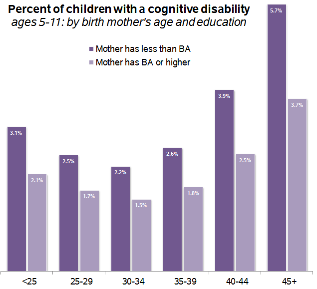
Again, the lowest risks are to those born when their parents are in their early 30s, a pattern that holds when I control for education, income, race/ethnicity, gender, and child’s age.

When mothers older than age 40 give birth, which accounted for 3 percent of births in 2011, the risks clearly are increased, and Shulevitz’s story is highly relevant. But, at least in terms of mortality and cognitive disability, an average parental age in the late 20s and early 30s is not only not a problem, it’s ideal.

Unequal health

But the second figure above hints at another problem — inequality in the health of parents and children. On that purple chart, a college graduate in her early 40s has the same risk as a non-graduate in her late 20s. And the social-class gap increases with age. Why is the rate of cognitive disabilities so much higher for the children of older mothers who did not finish college? It’s not because of their biological clocks or genetic mutations, but because of the health of the women giving birth.

For healthy, wealthy older women, the issue of aging eggs and genetic mutations from fathers’ run-down sperm factories are more pressing than it is for the majority of parents, who have not graduated college.

If you look at the distribution of women having babies by age and education, it’s clear that the older-parent phenomenon is disproportionately about more-educated women. (I calculated these from the American Community Survey, because age-by-education is not available in the CDC numbers, so they are a little different.)

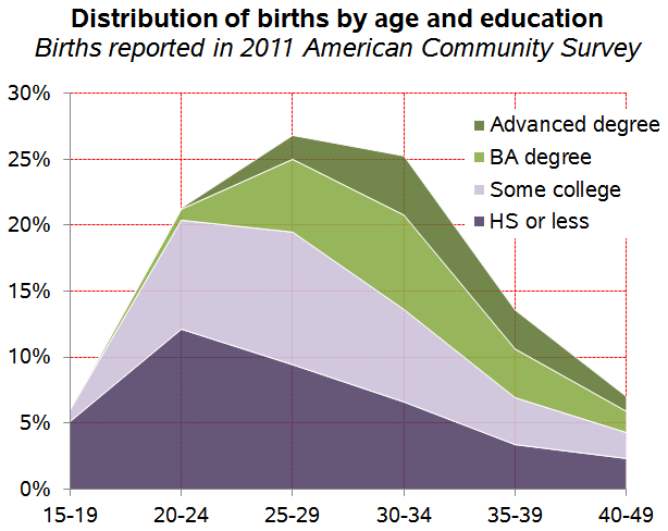
Most of the less-educated mothers are giving birth in their 20s, and a bigger share of the high-age births are to women who’ve graduated college — most of them married and financially better off. But women without college degrees still make up more than half of those having babies after age 35, and the risks their children face have more to do with high blood pressure, obesity, diabetes, and other health conditions than with genetic or epigenetic mutations. Preterm births, low birth-weight, and birth complications are major causes of developmental disabilities, and they occur most often among mothers with their own health problems.

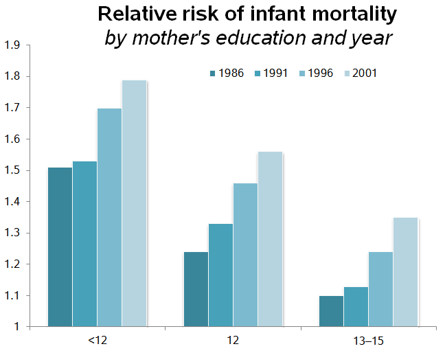
Most distressing, the effects of educational (and income) inequality on children’s health have been increasing. Here are the relative odds of infant mortality by maternal education, from 1986 to 2001, from a study in Pediatrics. (This compares the odds to college graduates within each year, so anything over 1.0 means the group has a higher risk than college graduates.)

This inequality is absent from Shulevitz’s essay and most of the commentary about it. She writes, of the social pressure mothers like her feel as they age, “Once again, technology has given us the chance to lead our lives in the proper sequence: education, then work, then financial stability, then children” — with no consideration of the 66 percent of people who have reached their early 30s with less than a four-year college degree. For the vast majority of that group, the sequence Shulevitz describes is not relevant.

In fact, if Shulevitz had considered economic inequality, she might not have been quite as worried about advancing parental age. When she worries that a 35-year-old mother has a life expectancy of just 46 more years — years to be a mother to her child — the table she consulted applies to the whole population. She should breathe a little bit easier: Among 40-year-old white college graduates women are expected to live an average extra five years compared with those who have a high school education only.

When it comes to parents’ age versus social class, the challenges are not either/or. We should be concerned about both. But addressing the health problems of parents — especially mothers — with less than a college degree and below-average incomes is the more pressing issue — both for potential lives saved or improved and for social equality.

Philip N. Cohen is a professor of sociology at the University of Maryland, College Park, and writes the blog Family Inequality. You can follow him on Twitter or Facebook.

Gwen and I ran our favorite posts from 2012 over the last six days.  Just in case you missed them, here’s our best of 2012!

Social Theory

Parenting

Race and Ethnicity

Transnational Politics and Neocolonialism

Class

Gender and Sexual Orientation

Health and Body Weight

History and Vintage Stuff

Media

See also, last year’s highlights:

And a Happy New Year to everyone!!!

Lisa Wade, PhD is an Associate Professor at Tulane University. She is the author of American Hookup, a book about college sexual culture; a textbook about gender; and a forthcoming introductory text: Terrible Magnificent Sociology. You can follow her on Twitter and Instagram.

For the last week of December, we’re re-posting some of our favorite posts from 2012. Cross-posted at Pacific Standard and Global Policy TV.

The United States is unusual among developed countries in guaranteeing exactly zero weeks of paid time-off from work upon the birth or adoption of a child. Japan offers 14 weeks of paid job-protected leave, the U.K. offers 18, Denmark 28, Norway 52, and Sweden offers 68 (yes, that’s over a year of paid time-off to take care of a new child).

The U.S. does guarantee that new parents receive 12 weeks of non-paid leave, but only for parents who work in companies that employ 50 workers or more and who have worked there at least 12 months and accrued 1,250 hours or more in that time.  These rules translate to about 1/2 of women.  The other half are guaranteed nothing.

Companies, of course, can offer more lucrative benefits if they choose to, so some parents do get paid leave.  This makes the affordability of having children and the pleasure and ease with which one can do so a class privilege.  A new report by the U.S. Census Bureau documents this class inequality, using education as a measure.  If you look at the latest data on the far right (2006-2008), you’ll see that the chances of receiving paid leave is strongly correlated with level of education:

Looking across the entire graph, however, also reveals that this class inequality only emerged in the early 1970s and has been widening ever since.  This is another piece of data revealing the way that the gap between the rich and the poor has been widening.

Just to emphasize how perverse this is:

  • People with more education, who on average have higher incomes, are often able to take paid time off; but less-economically advantaged parents are more likely to have to take that time unpaid.  During the post-birth period, then, the economic gap widens.

There’s more:

  • Many less-advantaged parents can’t afford to take time off un-paid, so they keep working.  But even this widens the gap because their salary is lower than the salary the richer person continues to receive during their paid time off of work.  So the rich get paid more for staying home than the poor get for going to work.

We often use the minimizing word  “just” when  describing what stay-at-home parents do.  “What are you doing these days?” asks an old friend at a class reunion.  “Oh, just staying home and taking care of my kids,” a parent might say, as if raising kids is “doing nothing.”  We trivialize what parents do.  But, in fact, raising children is a valuable contribution to the nation.  We need a next generation to keep moving forward as a country.  Unfortunately the U.S. continues to treat having kids like a hobby (something its citizens choose to do for fun, and should pay for themselves).  Without state support for early parenting, being present in those precious early months is a class-based privilege, one that ultimately exacerbates the very class disadvantage that creates unequal access to the luxury of parenting in the first place.

Lisa Wade, PhD is an Associate Professor at Tulane University. She is the author of American Hookup, a book about college sexual culture; a textbook about gender; and a forthcoming introductory text: Terrible Magnificent Sociology. You can follow her on Twitter and Instagram.

Cross-posted at Kieran Healy’s blog.

The chart in “America is a Violent Country” has been getting a lot of circulation. Time to follow up with some more data. As several commentators at CT noted, the death rate from assault in the U.S. is not uniform within the country. Unfortunately, state-level and county-level mortality data are not easily available for the time period covered by the previous post — though they do exist, going back to the 1940s. What I have to hand is a decade’s worth of US mortality data courtesy of CDC WONDERcovering 1999 to 2009. I extracted the assault deaths according to the same criteria the OECD uses (for the time period in question, ICD-10 codes X85-Y09 and Y87.1). The estimates are adjusted to the 2000 U.S. population, which isn’t identical to the standard OECD adjustment. But the basic comparability should be OK, for our purposes.

First, it’s well-known that there are strong regional differences in the assault death rate in the U.S. by state and region. Here’s what the patterns look like by state from 1999 to 2009 (click for a larger PNG or PDF):

This figure excludes the District of Columbia, which has a much higher death rate but is also a city. Also missing are a few states with small populations and low absolute numbers of assault deaths — Wyoming, North Dakota, Vermont — such that the CDC can’t generate reliable age-adjusted estimates for them. If you want a “small-multiple” view with each state shown separately from high to low, here you go.

The legend for the figure above arranges the states from high to low, reading top to bottom and left to right. Although it’s clear that geographical region isn’t everything, those tendencies are immediately apparent. Let’s look at them using the official census regions (click for a larger PNG or PDF):

As is well known, the South is more violent than the rest of the country, by some distance. Given the earlier post, the natural thing to do is to put these regional trends into the cross-national comparison and see — for the decade we have, anyway — how these large U.S. regions would fare if they were OECD countries. Again, bear in mind that the age-adjustment is not quite comparable (click for a larger PNG or PDF):

Despite their large differences, all of the U.S. regions have higher average rates of death from assault than any of the 24 OECD countries we looked at previously. The placid Northeast comes relatively close to the upper end of the most violent countries in our OECD group.

Finally, there’s the question of racial and ethic incidence of these deaths within the United States. Here are the decade’s trends broken out by the race of the victim, rather than by state or region (click for a larger PNG or PDF):

The story here is depressing. Blacks die from assault at more than three times the U.S. average, and between ten and twenty times OECD rates. In the 2000s the average rate of death from assault in the U.S. was about 5.7 per 100,000 but for whites it was 3.6 and for blacks it was over 20. Even 3.6 per 100,000 is still well above the OECD-24 average, which – if we exclude the U.S. – was about 1.1 deaths per 100,000 during the 2000s, with a maximum value of 2.9. An average value of 20 is just astronomical. And this is after a long period of decline in the death rate from assault.

—————————

Kieran Healy is a professor of sociology in the Kenan Institute for Ethics at Duke University.  His research is primary concerned with the moral order of a market society. You can follow him on twitter and at his blog.

This month the Census Bureau released a supplemental poverty report to provide a broader picture of the poor in the U.S. The official poverty rate is based on a measure developed in the early 1960s. Researchers at the time determined that families spent about 1/3 of their income on food, so they calculated the lowest possible cost of a minimally nutritionally sufficient diet for a particular family size, multiplied it by 3, and the resulting number determined who was defined as poor. The amount has been adjusted for inflation but otherwise the measure is the same.

Critics argue this definition may no longer make sense. Since the 1960s, food has generally gotten cheaper while housing has become a much bigger portion of many families’ budgets. The measure doesn’t account for the different costs of living (especially for housing) in different parts of the U.S. It also doesn’t take government benefits a family might be receiving into account.

The supplemental measure is meant to address some of these problems; it will be released each year along with the standard poverty measure. It attempts to determine how much is needed to cover housing, food, clothing, utilities, and a bit for other needs (transportation, personal care items, etc.), while taking public assistance benefits into account.

The supplemental poverty measure (SPM) showed a somewhat higher poverty rate overall (16.1% vs. 15% with the official poverty rate). Because it takes benefits such as daycare subsidies, nutritional assistance programs, etc., into account, the SPM actually showed a lower poverty rate for children under 18 than the official rate does. However, adults were more likely to be defined as poor with the SPM. This is especially true for older adults. For those over 65, 8.7% are officially poor, but with the SPM, it’s 15.1%:

Dylan Matthews, at the Washington Post, created a graph to show the impact of some important expenses and government assistance programs on poverty, since the SPM takes benefits, and a greater range of expenses, into account in its measure. The graph shows how much each program/expense reduced the adjusted poverty rate, based on data presented in the report.

Social Security has the single biggest impact; it reduced the SPM by 8 percentage points. That is, if they had not included Social Security benefits in the measure, the SPM poverty rate would have been 24.1%, not 16.1%. On the other hand, taking Temporary Aid to Needy Families (TANF), the cash assistance program created in the welfare reform process in the 1990s, into account did little to affect the calculated poverty rate, indicating it does little to alleviate poverty (intentionally so, many would argue). Note the axis is percentage points, not percent:

At the bottom of the graph we see several items that increased the supplemental poverty rate: looking at how much income tax people paid (countering the myth that low-income people don’t pay income taxes), payroll axes, expenses related to work, and medical expenses, with out-of-pocket medical expenses being the largest factor.

There’s tons of data in the tables that show which groups would be more or less likely to be defined as poor in the official and supplemental poverty rates. Check out the full report.

Gwen Sharp is an associate professor of sociology at Nevada State College. You can follow her on Twitter at @gwensharpnv.

Last week I posted about voter turnout patterns. In 2008, about 64% of eligible citizens voted. So what reasons do non-voters give for not taking part in the election? The Census Bureau asked. I created a chart of the data found on p. 14 of the report by Thom File and Sarah Crissey.

UPDATE: Please note this data is for registered non-voters; about 89% of this group votes, significantly higher than that for eligible citizens overall. I apologize that I didn’t make the distinction clearer in my initial post.

Here are the reasons registered non-voters gave:

So the single most common reason (17.5%) for not voting was that the person was too busy or their schedule conflicted with available voting hours (at least those the respondent was aware of). Other common reasons were illness or disability (14.9%), the person just wasn’t interested in the election (13.4%), didn’t like the candidates or issues (12.9%), and other (11.3%).

Many of these barriers to voting could likely be addressed by the same basic changes: expanding voting options. Scheduling conflicts, being too busy or out of town, lack of transportation, and problems caused by illness or disability might all be ameliorated by expanded early voting and/or making it easy to vote by mail.

These issues were not equally problematic for all racial/ethnic groups. For instance, Asian-Americans and Hispanics (of any race) were more likely to report being too busy or that voting conflicted with their schedule than were White non-Hispanics or African Americans:

White non-Hispanics were more likely than other groups to say they didn’t vote because they didn’t like the candidates or issues:

The report also breaks responses down by age and education, so check out p. 14 if you’re interested in the patterns based on those demographics. It also includes data on why people don’t register, either — the most common being lack of interest or involvement in politics.

Gwen Sharp is an associate professor of sociology at Nevada State College. You can follow her on Twitter at @gwensharpnv.

Now that we’re in the last full week of the presidential campaign, let’s look at voting patterns in the U.S. Who votes in national elections? And how many of us do so?

Voter turnout data is often somewhat misleading. The turnout rate is often reported as a % of the total voting-age population — that is, what percentage of people over age 18 voted? But that broad measure of voter turnout will be artificially low because it includes non-citizens living in the U.S., who aren’t eligible to vote. A more accurate measure would be to look at turnout among citizens over age 18; as we see in the data from the 2008 presidential election, the difference between these two measures of voter turnout was more than 5 percentage points:

It’s worth noting that the citizen measure doesn’t reflect those citizens who have been disenfranchised because they live in a state where individuals convicted of felonies lose the right to vote, often permanently.

If we look at voter turnout among citizens in 2008, we see significant differences by race/ethnicity. White non-Hispanics have the highest turnout, with African Americans about 5-7 percentage points behind, though the gap narrowed in 2008. Asian Americans and Hispanics are less likely to vote, with just under half of eligible citizens from these two groups voting in 2008:

Both parties are keenly aware of the steady growth in voter turnout among Hispanics; as the largest racial/ethnic minority group in the U.S., increasing participation in elections promises growing political influence in the future, a source of both opportunities and challenges for the parties as they vie for those votes.

Not surprisingly, age and education affect voting behavior. Within every educational level, the voting rate goes up steadily with age.

For more information on voting patterns, the Census Bureau has an interactive website that lets you select elections between 1996 and 2010 and see a map and graphs broken down by sex, race/ethnicity, age, and so on.

Gwen Sharp is an associate professor of sociology at Nevada State College. You can follow her on Twitter at @gwensharpnv.

The Census Bureau has created an interactive map that lets you see median household income by county. Median household income for the entire U.S. is $51,914, but of course there is enormous variety around the country. The map lets you select an amount and see which counties have medians below that level.

Three counties — Owsley and Breathitt in Kentucky and Brooks in south Texas — have median household incomes below $20,000 a year (the white spot in Louisiana is water):

So half of households in those areas are living on less than $20,000 a year.

If we go up to $30,000 a year, we see a clear pattern. The counties are particularly concentrated in the South, especially along the Mississippi River, in Appalachia, in southern Texas, a few areas of New Mexico, and several counties in South Dakota that include Native American reservations:

If we look at the $52,000 mark — right at the overall U.S. median — we see, unsurprisingly, a lot of counties on the coasts or that have at least mid-sized cities in them, though there are certainly some counties that don’t fit that pattern:

On the upper end, there are six counties where the median household income is above $100,000 — Hunterdon, in New Jersey; Howard, in Maryland; Los Alamos, New Mexico; and three Virginia counties, Fairfax, Falls Church, and Loudoun:

You can see the Census Bureau’s table of median household income in every county in the U.S. here.